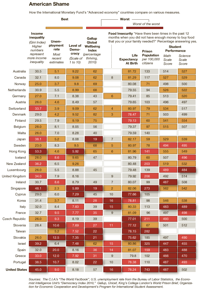
An infographic accompanying an article at the New York Times reveals how “advanced economies” compare on various measures of equality, well-being, educational attainment, and more.  To illustrate this, for each measure countries that rank well are coded tan, countries that rank poorly and very poorly are coded orange and red respectively, and countries that are in the middle are grey.  The countries are then ranked from best to worst overall, with Australia coming in #1 and the United States coming in last.  You might be surprised how some of these countries measure up.

Thanks to Dmitriy T.M. for the link.

Lisa Wade, PhD is an Associate Professor at Tulane University. She is the author of American Hookup, a book about college sexual culture; a textbook about gender; and a forthcoming introductory text: Terrible Magnificent Sociology. You can follow her on Twitter and Instagram.

The blog Of Another Fashion, by Minh-Ha T. Pham, serves as “an alternative archive of the not-quite-hidden but too often ignored fashion histories of U.S. women of color.” The collection includes images taken from public sources as well as photos sent in by readers and provides a contrast to fashion exhibits that usually present fashion trends as almost entirely White experiences.

While the collection is fascinating overall and definitely worth a look, I was particularly struck by the photos of life among Japanese Americans forced to live in internment camps during World War II.

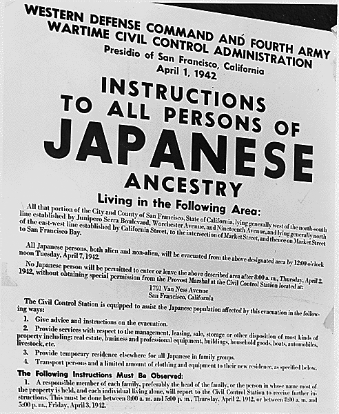
A legal notice requiring Japanese Americans on the West Coast to relocate voluntarily to internment camps or face arrest:

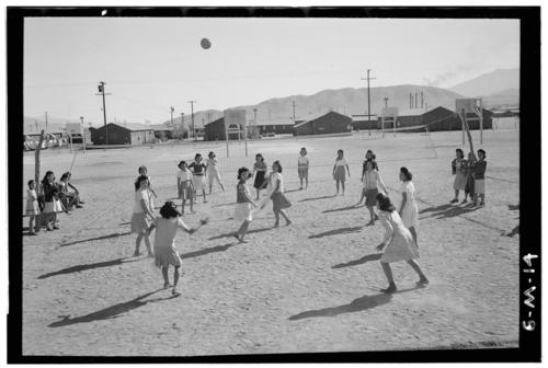
Women playing volleyball:

(Library of Congress. Photo by Ansel Adams.)

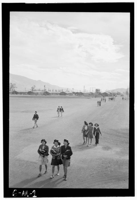
Walking to school at the Manzanar camp:

(Library of Congress. Photo by Ansel Adams.)

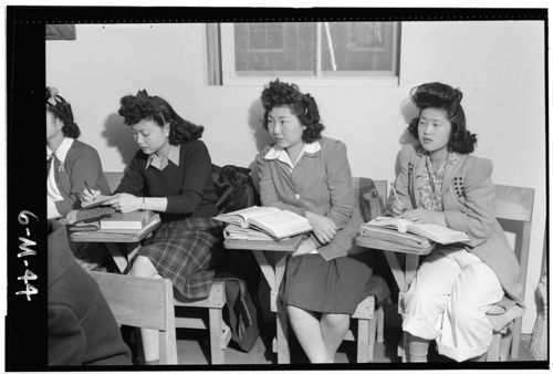
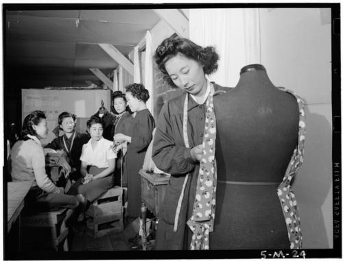
Women in biology and dressmaking classes:

(Both images by Ansel Adams, 1943; Library of Congress.)

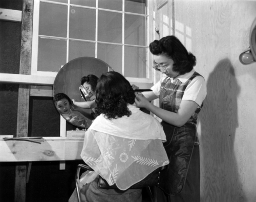
One camp’s version of a beauty salon:

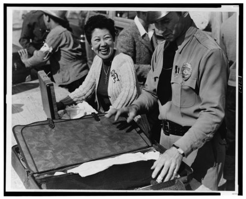
Intake processing at the Santa Anita center:

(From the Library of Congress’ Farm Security Administration and Office of War Information Collection (April 1942). Photographer unknown.)

Pham discusses the fact that in many of the photos of the processing centers, the women are smiling and look very happy, despite going through what had to be an upsetting, frightening, and humiliating experience. Japanese Americans were not allowed to bring their own cameras into the camps; the photos were taken by others, including Dorothea Lange and Ansel Adams. And they found their subjects didn’t always cooperate with the images they were planning to provide of the camps:

According to Sue Kunitomi Embrey the chair of the Manzanar Committee, Adams hoped to capture the despair of camp life in order to stir some public sympathy for Japanese Americans but was frustrated by all the primping and posing Japanese Americans did when he was photographing.

…I hope that images of smiling and fashion-conscious Japanese American women…adds to and deepens our appreciation of the small acts of feeling, creativity, and resistance that happen everyday in spite of huge limitations. In an act as seemingly trivial and trite as smiling for the camera, these women interrupt and take some control of the historical, political, and visual frames through which they’re being viewed.


What is a norm?  How important is it that we follow them?  And what happens when we break one?

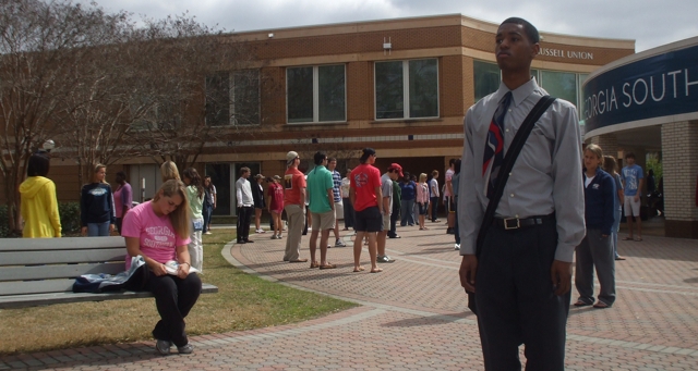
Nathan Palmer, a lecturer at Georgia Southern University and founder of the blog Sociology Source, recruited his entire class of 262 students to go into the world and do nothing (an idea he borrowed from Karen Bettez Halnon).  It was sort of like a flash mob in which absolutely nothing happens.

Palmer’s aim was to reveal a norm (in this case, that we all must always be doing something), expose his students to the feelings one has when breaking a norm (even a consequence-less one like this), and show them the range of reactions that observers have to norm breaking.  And he recorded the whole thing for us:

Read Palmer’s entire write-up of the experiment at Sociology Source.

Lisa Wade, PhD is an Associate Professor at Tulane University. She is the author of American Hookup, a book about college sexual culture; a textbook about gender; and a forthcoming introductory text: Terrible Magnificent Sociology. You can follow her on Twitter and Instagram.
Lindsey V., who recently sent in the excellent film clip in which “scientists” “tested” gendered battle gear, also sent us a link to images showing that the breast size of two video game characters — “Ivy” from “Soul Caliber” and, to a lesser extent, Lara Croft from “Tomb Raider” — have increased over time (source).

Ivy:

Lara Croft:

What might drive their ever-inflating breasts?

Speaking in terms of advertising, Sut Jhally wrote that advertisers must:

…now worry about clutter and noise. That is, how do you make your ads stand out from the [5,000] commercial impressions that people are exposed to [every day].  So if you’re Pepsi, you’re not just competing with Coke anymore. You’re competing with every other advertiser who wants our attention. As advertising takes over more and more space in the culture, the job of the individual advertiser gets harder and harder.

Martin Barron and Michael Kimmel make a similar argument about the rise of “extreme” and violent sexual acts in pornography.  The increase in the sheer amount of porn that emerged with the Internet has created a competitive market in which “sexual victimization of women is a currency” (p. 350).  You have to get noticed somehow.

So, insofar as this boob inflation is a trend, we may be able to explain it, at least in part, with the greater number of cultural products.  Proliferation creates conditions in which each one has to up the ante to “stand out” against the “clutter and noise.”

Sources:

  • Barron, M., & Kimmel, M.S. (2010).  Sexual violence in three pornographic media. Journal of Sex Research, 37, 161-169.
  • Jhally, S. (2000). Advertising at the edge of the apocalypse. In Anderson, R., & Strate, L., Eds. Critical studies in media commercialism. New York: Oxford University Press, 27-39.

Thanks also to Caroline Heldman; I borrowed some of the text in this post from a forthcoming co-authored essay.

Lisa Wade, PhD is an Associate Professor at Tulane University. She is the author of American Hookup, a book about college sexual culture; a textbook about gender; and a forthcoming introductory text: Terrible Magnificent Sociology. You can follow her on Twitter and Instagram.

Some of you may have heard about the anti-Muslim protest outside a charity event in Orange County on February 13th. A local chapter of the Islamic Circle of North America (ICNA) Relief, a Muslim charity organization that raises money for women’s shelters, food pantries, disaster relief, and other humanitarian work, sponsored a fundraiser at the Yorba Linda Community Center.

Chrissy Y. sent in a video of the protest. It includes chants of “Go back home!”, “USA!”, and “terrorist!” amid loud boos as individuals walked into the center. At around 3:10 a woman accuses a man of beating his wife and being a child molester. Between the conflation of Muslim with being inherently un-American, the conflation of all Muslims with terrorists, and the reliance on the stereotype of Muslim men as brutal oppressors of victimized women, it is an ugly, ugly example of anti-Muslim sentiment:

Disneyland markets itself as “The Happiest Place on Earth” and goes to great pains to create a visual experience that defies our everyday realities, but these photos by Arin Fishkin, of bored kids waiting in line, contrasts starkly with Disney’s claims.   I’ve always thought it was really interesting how companies that sell “fun” (theme parks, obviously, but also places like casinos and dance clubs) do so by downright insisting “this is what fun looks like!”   “There are flashing lights! Fun! There are bright colors! Fun! There is happy music! Fun! This is what fun looks like and you are having it!!!”  Anyway, just because Disneyland says it’s fun, doesn’t mean it is.

Via BoingBoing.

Lisa Wade, PhD is an Associate Professor at Tulane University. She is the author of American Hookup, a book about college sexual culture; a textbook about gender; and a forthcoming introductory text: Terrible Magnificent Sociology. You can follow her on Twitter and Instagram.
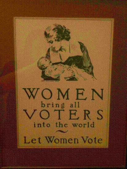
The décor in my childhood home was unusual. Interspersed with photographs of my sister and me were vintage political posters, inherited from my late grandparents. The most startling of these were the posters promoting women’s right to vote: as I grew up, I realized that the viewpoints they depicted contrasted starkly with the narrative of women’s suffrage that I had learned in my history classes.

This poster supports women’s right to vote not by asserting their equality with men, but by appealing to their ability to bear children:

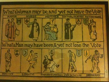
By contrast, this poster actively highlights woman’s ability to contribute to society beyond stereotypically female roles: women were not only nurses and mothers, but doctors and mayors. Yet at the same time, the image disparages the mentally and physically ill by painting men with these conditions as inherently lesser.

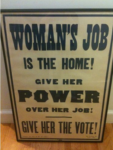
Lastly, a picture that speaks for itself.  Women should have suffrage, says the poster, but they must always remember where they truly belong.

Although the right to vote politically empowered the women of Western society, many of the proponents of the women’s suffrage movement espoused ideologies that would not be considered feminist or politically correct today. My history classes dwelt only briefly on these unpalatable schools of rhetoric, but the images in my home allowed me to glimpse a debate that was just as complex and fragmented as the political disputes we face today.

———————————-

Alison Marqusee is a high school senior from Massachusetts.  In addition to sociology, her interests include linguistics, psychology, and physics.  She looks forward to attending Haverford College.

If you would like to write a post for Sociological Images, please see our Guidelines for Guest Bloggers.


One of my colleagues, Kate Hahn, sent me a link to an interactive map at The Chronicle of Higher Education website that presents data on the proportion of U.S. adults with a bachelor’s degree over time. In 1940, in the vast majority of counties no more than 10% of the population had graduated from college (the national average was 4.6%):

Now the national average is 27.5%:

You can also compare counties to the national average. Green counties are above the national average, brown ones are below and, not surprisingly, we see clear regional variations in rates of college education, with Colorado and the Northeast doing particularly well and the South and Appalachian regions lagging:

Wealthy counties (those with a median income of $60,000+) in general have higher than average rates of bachelor’s degrees, with the exception of a few counties in the Mountain West, Alaska, and a few scattered areas:

We see the opposite with poor counties (median income under $30,000):

You can break down any of the comparisons by sex or race/ethnicity, and/or look only at  counties with 20% or more Hispanic or Black residents.  You can also select a particular county for more detailed information. For instance, here’s the info on Clark County, Nevada, where I live:

By comparing the maps over time, you can easily track a number of changes: the increase in college degrees overall, of course, but also changes in education such as the dramatic gains women have made in earning college degrees in the past few decades — the gender gap in college degrees was over 7 percentage points in 1980 but only about 1.5 points today.