Cross-posted at Reports from the Economic Front.

There are those that argue that lowering the top marginal tax rates on “ordinary” income (from wages or salary) and capital gains will stimulate economic growth.  Thomas L. Hungerford, in a Congressional Research Report, tests and rejects this claim.

He finds no statistical relationship between changes in either of these top tax rates and private savings, investment, productivity, or real per capita GDP growth.  However, he does find a strong statistical relationship between changes in these tax rates and income inequality.  More specifically, raising top tax rates can be expected to promote greater income equality without causing harm to the economy.

Tax Trends

There are two main tax concepts: the marginal tax rate, which is the tax paid on the last dollar of income received, and the average tax rate, which is the proportion of all income that is paid in taxes.  How much a person pays on the last dollar received depends on whether it is classified as ordinary income or capital gains.

Most importantly, as the chart below shows, the very top tax payers have enjoyed a steady decline in their average tax rate.

The next chart shows trends in top marginal tax rates on ordinary income and capital gains.  The top marginal tax rate on ordinary income has clearly been on the decline: from 91% in the 1950s, 70% in the 1960s and 1970s, to a low of 28% in 1986.  It now stands at 35%.  The top marginal capital gains tax rate has not changed as much.  It was 25% in the 1950s and 1960s, 35% in the 1970s, and is now 15%.

The Tests

Hungerford used econometric methods to test whether changes in top marginal tax rates affect private savings, investment, productivity, and/or per capita GDP growth.  Simply plotting the movement of top tax rates and each of these variables suggests that a decline in top tax rates is associated with a positive movement in each of these economic variables.

However, as Hungerford correctly states, correlation is not the same as causation.  Using regression analysis, he found that the relationships were only coincidental or spurious; there was no statistically significant connection between changes in the top tax rates and movements in any of the variables.

Hungerford also tested to see if changes in top marginal tax rates had any effect on the distribution of income.  The first chart below shows the scatter plot of top tax rates and the share of income going to the top 0.1% for the years 1945-2010.  The second shows the same with the top 0.01% of income earners.

As we can see the fitted lines suggest a very strong relationship between the variables.  As before, Hungerford used regression analysis to determine whether the relationships were statistically significant.  This time his answer was yes in both cases; changes in top marginal tax rates do affect income concentration.  In other words, lowering the top rates increases income inequality, raising them reduces it.

It is time for us to start agitating for raising the top tax rates.

The NFL referees have been on strike.  In their place the league has hired replacements in order to keep the season underway.  Word on the street is that the replacements are doing a distinctly terrible job. Writes Ed at Gin and Tacos:

Since professional and amateur football have different rules — in some cases very different — the results have been predictably disastrous. From their failure to do basic things like spot the ball and operate the game clock to major rules of which they appear to be totally ignorant, they have proven thus far that there is nothing they can’t botch.

Others, too, are finding humor in their ineptitude.

Ed wonders if NFL fans are internalizing the economic lesson in this debacle:

In a surplus labor market you can always find someone willing to do a job for less, but they’re probably not going to do it well. Even the type of person who blames the work stoppage on the union… can’t deny that the end result is the replacement of trained, experienced professionals with a clown car load of knuckleheads who act like they’ve never seen a football before.

He concludes, suggestively: “maybe all human capital is not interchangeable …and maybe there are some noticeable downsides to a market in which whoever will work for the least gets the job.”

The NFL, being entertainment and all, isn’t the best example, but when we apply the same logic to occupations like school teachers and air traffic controllers, we should sit up and notice.  Maybe at this moment, when something so beloved is at stake, it’ll raise America’s consciousness just a little bit.  Ed, for what it’s worth, isn’t optimistic.

Lisa Wade, PhD is an Associate Professor at Tulane University. She is the author of American Hookup, a book about college sexual culture; a textbook about gender; and a forthcoming introductory text: Terrible Magnificent Sociology. You can follow her on Twitter and Instagram.

Cross-posted at Family Inequality.

You can’t get 18 pages into Hanna Rosin’s blockbuster myth-making machine The End of Men, before you get to this (on page 19):

One of the great crime stories of the last twenty years is the dramatic decline of sexual assault. Rates are so low in parts of the country — for white women especially — that criminologists can’t plot the numbers on a chart. “Women in much of America might as well be living in Sweden,* they’re so safe,” says criminologist Mike Males.

That’s ridiculous, as I’ll show. Rape is difficult to measure, partly because of limiting state definitions, but the numbers are consistent enough from different sources to support the conclusion that reported rape in the United States has become less common in the last several decades — along with violent crime in general. This is good news. Here is the rate of reported “forcible rape” (of women) as defined by the FBI’s crime reporting system, the Uniform Crime Reports.**  See the big drop — and also that the rate of decline slowed in the 2000s compared with the 1990s:

(Source: Uniform Crime Reports, 2010)

The claim in Rosin’s book — which, like much of the book, is not sourced in the footnotes — is almost too vague to fact-check. What is “much of the country,” and what is a number “so low” that a criminologist “can’t plot” it on a chart? (I’m no criminologist, but I have even plotted negative numbers on a chart.)

Even though she makes things up and her publisher apparently doesn’t care, we must resist the urge to just ignore it. The book is getting a lot of attention, and it’s climbing bestseller lists. Just staying with the FBI database of reported rates, they do report them by state, so we can look for that “much of the country” she’s talking about. I made a map using this handy free tool.

(Source: FBI Uniform Crime Reports, 2010, Table 47)

The lowest state rate is 11.2 per 100,000 (New Jersey), the highest is 75 (Alaska). You can also get the numbers for 360 metropolitan areas. For these, the average rate of forcible rape reported was 31.5 per 100,000 population. One place, Carson City, Nevada, had a very low rate (just one reported in 2010), but no place else had a rate lower than 5.1. (you can see the full list here). I have no trouble plotting numbers that low. I could even plot numbers as low as those reported by police in Europe, where, according to the European Sourcebook of Crime and Criminal Justice Statistics, for 32 countries in 2007, the median rate was just 5 per 100,000 — which is lower than every U.S. metropolitan area for 2010 (except Carson City, Nevada).

These police reports are under-counts compared with population surveys that ask people whether they have been the victim of a crime, regardless of whether it was reported to police. According to the government’s Crime Victimization Survey (CVS), 65% of rape/sexual assault is not reported. The CVS rate of rape and sexual assault (combined) was 70 per 100,000 in 2010. That does reflect a substantial drop since 2001 (although there was also a significant increase from 2009 to 2010).

And what about the “for white women especially” part of Rosin’s claim? According to the Crime Victimization Survey (Table 9), the white victimization rate is the same as the national average: 70 per 100,000.

I hope it’s true, as Rosin says, that “what makes [this era] stand out is the new power women have to ward off men if they want to.” But it’s hard to see how that cause is served by inventing an end of rape.

—————————

*That is an unintentionally ironic reference, because Sweden actually has very high (for Europe) rate reported rape, which has been attributed to its broad definition and aggressive attempts at prosecution and data collection.

** Believe it or not, this was their definition: “the carnal knowledge of a female forcibly and against her will. Attempts or assaults to commit rape by force or threat of force are also included; however, statutory rape (without force) and other sex offenses are excluded.” That is being changed to include oral and anal penetration, as well as male victims, but data based on those changes aren’t reported yet.

Check the Hanna Rosin tag for other posts in this series.

In “Rule Enforcement without Visible Means,” Theodore Caplow discusses conformity to the norms that guide the practice of celebrating Christmas. These norms are informal — that is, they aren’t enforced in any official way and aren’t encoded in policy — yet Caplow found consistent agreement on expectations, as well as conformity to them. Some of these are easily identifiable, such as the Wrapping Rule, which requires that gifts be wrapped in Christmas-appropriate wrapping paper (or at least marked with a bow if they’re too large or irregularly-shaped to be wrapped).

Others aren’t so readily apparent. For instance, Caplow discusses the Scaling Rule, which guides our purchases of gifts based on the relationship with the recipient. Everyone agreed that a spouse should get the single most valuable gift you buy; kids come next (and should have equal amounts spent on them), then parents/in-laws (who should get similarly valuable presents), and so on. There is a widely-accepted unspoken hierarchy for giving gifts. While we say “it’s the thought that counts,” we also believe that the gifts we give carry social messages about how much we care. Regardless of intent, giving a gift that is perceived as nicer or more expensive to a coworker than to your spouse, or spending more on friends than your kids, would likely be taken as a sign of inappropriate or misplaced loyalties.

Caplow’s point is that social interactions are highly regulated by informal norms, ones we learn and follow often without ever openly recognizing them. Will LaSuer sent in a video that illustrates this point. The video explains etiquette in men’s restrooms: proper spacing when selecting a urinal, flushing, making eye contact or speaking to others in the restroom, and so on. It’s an explicit discussion of the usually taken-for-granted norms of daily life.

One note: The first 4:40 of the video covers these basic norms. After that, it goes on to a long scenario that you may want to skip. While, as Will says, the language and imagery is nothing you wouldn’t see in, say, South Park, if you’re thinking of using the clip in class to illustrate norms, I’d definitely stop at the 4:40 point, both because of the content and because I don’t think the rest of the video contributes anything to the basic sociological point.

Will suggests using the video along with John Paul’s “urinal game” to help students grasp the concept of informal norms.

Caplow, Theodore. 1984. “Rule Enforcement without Visible Means: Christmas Gift Giving in Middletown.” American Journal of Sociology 89(6): 1306-1323.

Paul, John. 2006. “‘Flushing’ Out Sociology: Using the Urinal Game and Other Bathroom Customs to Teach the Sociological Perspective.” Electronic Journal of Sociology. ISSN: 1198 3655.

Katrin sent in a set of signs and advertisements, collected at Buzzfeed, urging young people to refrain from doing methamphetamine, or “meth.”

What I found interesting was how many home made signs in rural areas were included.  It suggests that many people in small towns feel that their children are under attack.  Meanwhile, there’s no big money in drug addiction prevention.  Hence the town-specific, home made signs that contrast so starkly to the generic, glossy, high-production value advertising we are so used to seeing.

Many examples at Buzzfeed.

Lisa Wade, PhD is an Associate Professor at Tulane University. She is the author of American Hookup, a book about college sexual culture; a textbook about gender; and a forthcoming introductory text: Terrible Magnificent Sociology. You can follow her on Twitter and Instagram.

Cross-posted at Caroline Heldman’s Blog.

On Monday, Mother Jones released a video recorded in May of presidential candidate Mitt Romney speaking at a $50,000-a-plate fundraiser in the Boca Raton home of “private equity party boy” and “sexy party” host, Marc Leder. A hidden camera caught controversial remarks about IsraelIran, and a joke about being more electable if his parents had been born in Mexico, but the topic of this post is Romney’s use of the 47% Meme.

The 47% Meme is the idea that half of Americans take from rather than contribute to tax coffers. It sometimes surfaces in the form of the “takers vs. makers” frame. I have encountered this “argument” for years on Fox News, so it is surprising to see it gaining national attention now. Romney did a superb job articulating the 47% Meme in response to a question of how he might win in November:

There are 47 percent of the people who will vote for the president no matter what. All right, there are 47 percent who are with him, who are dependent upon government, who believe that they are victims, who believe the government has a responsibility to care for them, who believe that they are entitled to health care, to food, to housing, to you-name-it. That that’s an entitlement. And the government should give it to them.

Many myths start with a kernel of truth. The 47% Meme is loosely based on the statistic that 47% of Americans pay no income tax (down to 46% in 2011). This meme is wildly dishonest since people pay a host of other federal, state, and local taxes. It’s about as honest as saying a person doesn’t eat vegetables because she only eats carrots, celery, bell peppers, cucumbers, and cabbage, but not broccoli.

So who is paying taxes, and what taxes are they paying?


Federal Income Tax

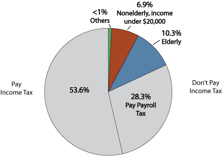
The Tax Policy Center finds that two main groups comprise the 46% who do not pay federal income tax: (1) The poor whose subsistence-level income is not taxable, and (2) those who receive tax expenditures. This chart shows that the lion’s share of tax expenditures goes to senior citizens, children, and the working poor, with the notable exception of 7,000 millionaires who paid no income tax in 2011.


Other Federal Taxes

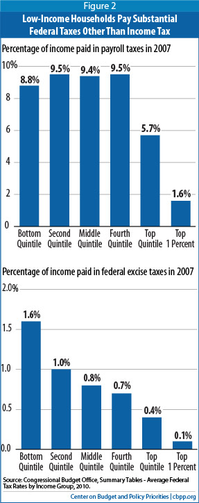
But enough about income tax since this narrow focus only serves to further the misleading 47% Meme. The chart below shows a more accurate picture of who pays federal taxes. If we don’t count retirees, only 8% of Americans pay no income or payroll taxes.

Americans also pay federal excise tax on gas, liquor, cigarettes, airline tickets, and a long list of other products, so virtually every American pays federal taxes in some form. And contrary to the 47% Meme, poor and middle-class Americans actually pay a greater percentage of their income in federal payroll and excise taxes than wealthier Americans.

State and Local Taxes

When it comes to state and local taxes, the Institute on Taxation and Economic Policy finds that the poor pay more in state and local taxes in every state except Vermont. As the chart below indicates, state and local taxes are regressive, meaning that those who can least afford to pay, pay more.

Romney has apologized for the inelegance of his statements, but stands by their substance, despite ample data debunking the dependency (above) and entitlement bases for the 47% Meme. I don’t believe that Romney believes that half of the people in the U.S. are pathetically entitled “victims.” He is a smart person, and this is a ludicrous line of reasoning. But what does it say about our bitterly partisan nation that heaping unmitigated scorn on the poor brings in big bucks from the base?

In light of Romney’s comments regarding those who depend on the government, we thought we’d re-post this great data showing that many people who are using government social programs don’t know they are doing so.  

————————

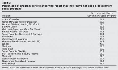
Dolores R. sent in a fascinating image posted at boingboing. It comes from a paper by Suzanne Mettler, a professor in the Department of Government at Cornell. Mettler first asked survey participants whether they had ever used a federal U.S. government program. Then later in the survey she specifically asked respondents whether they had ever benefited from or participated in specific federal programs. As it turns out, large number of people who have benefited from various federal programs or policies do not recognize themselves as having done so. This table shows what percent of people who said they had participated in or used these 19 federal programs had earlier in the surveys said they had never used any social program:

Mettler argues that recipients are less likely to recognize themselves as benefiting from programs that are part of what she calls the “submerged state” — programs and policies that provide incentives and motivations for particular behaviors in the private sector, rather than overtly directing behavior. If you receive food stamps, you interact directly with a government agency, are required to periodically meet with a government worker and reapply to re-establish eligibility, and can point to a specific thing that links you to the program (these days usually a debit-type card rather than the old style coupons/stamps).

On the other hand, if you participate in the government’s mortgage interest deduction program, which encourages home ownership by allowing people to deduct the cost of mortgage interest from their taxable income (which you can’t do with rent costs, for instance), it’s less noticeable that you are benefiting from a federal policy. You get a form from your mortgage company that provides the relevant number, and you transfer it over to the correct line when you’re filling out taxes.

Notably, the programs recipients seem least likely to recognize as a government program are among those the middle (and higher) classes are most likely to use, while those more common among the poor are more clearly recognizable to those using them as government programs. Yet allowing you to write off mortgage interest (but not rent), or charitable donations, or the money you put aside for a child’s education, are all forms of government programs, ones that benefit some more than others. But the “submerged” nature of these policies hides the degree to which the middle and upper classes use and benefit from federal programs.

One of our very first posts on SocImages was a Wrestle Mania billboard.  It featured a bunch of muscle-bound men without shirts, but their nipples were photoshopped out. They were too suggestive of women’s nipples (which are obscene, obviously) and possibly against the law.

Nipple-phobia is back with a particularly amusing example from Facebook.  Company policy requires deleting images of “female nipple bulges” (defined as “naked ‘private parts'”; male nipples, with or without bulges, are excluded from the ban).  This prompted Facebook to take down a New Yorker cartoon by Mick Stevens, see if you can figure why.

Robert Mankoff mocked the incident.

To be fair, and here I begin my own mockery, we are talking about Eve here.  And she had lost her innocence — and the innocence of the entire human race — with her “original” idea.  So… you know, she was a dirty, dirty gal who did a bad, bad thing and would realize the importance of covering up those “dirty pillows” sooner or later.  Facebook was just ahead of the curve. I guess.

Lisa Wade, PhD is an Associate Professor at Tulane University. She is the author of American Hookup, a book about college sexual culture; a textbook about gender; and a forthcoming introductory text: Terrible Magnificent Sociology. You can follow her on Twitter and Instagram.