I guess I’m a little bit of a masochist, so I watched the trailer for Disney’s Cinderella re-make, due out in 2015. All they do is show a shoe, but what a shoe it is! Notice anything different?

1 (2) - Copy

Point to Gail Dines; Pamela Paul; Carmine Sarracino and Kevin Scott; and Kaarina Nikunun, Susanna Paasonen, and Laura Saarenmaa, all who argue that we’re seeing a “pornification” of everyday life.

Lisa Wade, PhD is an Associate Professor at Tulane University. She is the author of American Hookup, a book about college sexual culture; a textbook about gender; and a forthcoming introductory text: Terrible Magnificent Sociology. You can follow her on Twitter and Instagram.

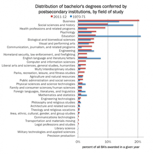
How has the distribution of college majors changed? This graph, borrowed from A Backstage Sociologist, shows bachelor’s degrees conferred in the 1970-71 academic year and those conferred 41 years later.

1 (2) - Copy

Lisa Wade, PhD is an Associate Professor at Tulane University. She is the author of American Hookup, a book about college sexual culture; a textbook about gender; and a forthcoming introductory text: Terrible Magnificent Sociology. You can follow her on Twitter and Instagram.

Flashback Friday.

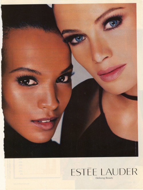
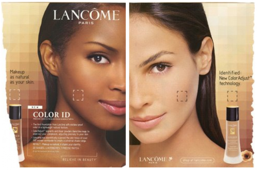
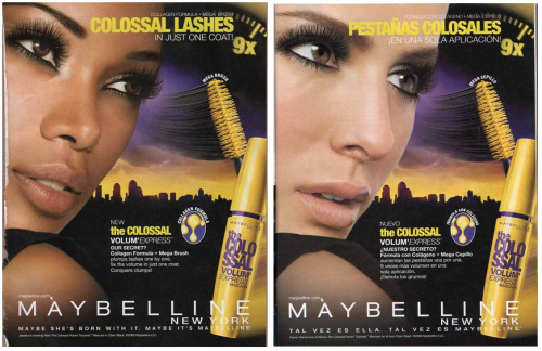
One manifestation of white supremacy is the use of whiteness as the standard of beauty.  When whiteness is considered superior, white people are considered more attractive by definition and, insofar as the appearance of people of other races deviates from that standard, they are considered ugly.

Non-white people are still allowed to be considered beautiful, of course, as long as they look like white people.

This collection of images is a nice illustration of the way in which black women, in particular, are expected to look white in order to qualify as beautiful. The images are powerful because the black models look almost identical to the white models, but also because they are ads for make-up. So the ads are literally selling beauty.

1 (3)11 (2) 1 (3)

This is Flashback Friday, so these are ads I collected and posted in 2008.  Have things changed or stayed the same? Or, am I being unfair? Most white women do not look like these women either.  And the women of color in the images are, in fact, women of color.  Who am I to say they don’t look “black”?  Is there something else going on here?  I’m happy for the conversation.

Lisa Wade, PhD is an Associate Professor at Tulane University. She is the author of American Hookup, a book about college sexual culture; a textbook about gender; and a forthcoming introductory text: Terrible Magnificent Sociology. You can follow her on Twitter and Instagram.

In case you were wondering, race is still important in the U.S., including in American sports. Deadspin put out a neat tool just in time for NFL draft weekend, allowing readers to see for themselves just how often different words are used to describe white and black athletes in draft scouting reports.  It turns out, for example, that a black prospect’s report is more likely to mention his “motor,” while the typical white player is more likely to be called a “worker.” “Freakish” shows up five times in black reports, and never in a white player’s. Black players are also more likely to be called “coachable.”

I downloaded the data to find out just what the “blackest” and “whitest’ words were. I then drew out the 50 words most likely associated with black and white athletes, respectively. The words are all vaguely football-ish, but upon reflection distinctive patterns emerge.

Some words leap out immediately. Reports on black athletes are far more likely to include the word “mother.” Conversely, white athletes’ reports mention “brothers” more often.  Black players’ reports more often include “driving”; reports on white athletes mention “drive.”

Dig a bit deeper, and some groupings appear. I created five rough categories for the most common “black” words, and another four for the most common white words:

Table 1: black word groups
Physicality upright, leaping, acceleration, pedal, driving, talented, runs, bounce, accelerates, chase, closes, tightness, track, radius, flexible, coordination, physicality
Violence jam, violent, disruptive
Positional all-purpose, cutback, touches, safety, open-field, pass-rush, cornerback, return, returner, cuts, gaps, gap, wr
Development loose, currently, support, stop, drop, interception, terms, directions
Other jones, auburn, vj, instead, wrap, disengage


 Table 2: white word groups
Quarterback delivery, accuracy, velocity, accurate, mobility, short-to-intermediate, throwing, placement, pocket, passer, release, throw, passing, arm, throws
Other positional leg, center, pressure, targets, touch, guard, under, offense, rushers, blocking, keeps, tackle
Intelligence intangibles, understands, intelligence, all-conference, smart,
experienced, sound, leader
Other onto, brother, backup, drive, 50, ends, base, ten, four-year, keeping, punch, left, timing

I was quite surprised just how pervasive the old tropes of the smart white leader athletes, and the talent and physical black athletes remain. The word “accuracy” is more than twelve times more likely to be associated with a white player than his black counterpart. Likewise, the words “understands,”(3.9 times) “intelligence” (3.0 times), and the sneaky “intangibles” (3.9 times) are all far more likely to be associated with white athletes.

Conversely, reports on black athletes are more likely to include “leaping” (6.3 times), “upright” (10.4 times), and “violent” (5.1 times). They comparatively rarely include words associated with quarterbacking, intelligence, or leadership.

What the numbers can’t tell us is how much of the difference can be ascribed to the scouts themselves allowing biases to creep in, and how much reflects ways in which athletes have been shaped to this point (i.e., coached to be violent,  encouraged to become leaders, etc). This is obviously an important question, but either way it is clear that race remains a hugely important filter affecting life chances, even in something as supposedly meritocratic as professional and near-professional sports.

A longer version of this post, with more details on methods, can be found at Politics All the Way Down.  Photo credit: Ron Almog, via wikimedia commons.

Stewart Prest is a PhD candidate in political science at the University of British Columbia in Vancouver, Canada.  You can follow him at his blog, Politics All the Way Down, and on Twitter.  Cross-posted at Pacific Standard.

On any given workday, over 31 million lunches are served to children in school cafeterias. Part of the U.S. Department of Agriculture’s (USDA) nutritional assistance efforts, the National School Lunch Program (NSLP) aims to deliver affordable and nutritious meals to the nation’s schoolchildren. After all, food plays a key part in helping them learn, grow, and thrive.

To reach those who need it most, the federal and local governments work together to offer free lunch to children whose parents cannot afford to pay for it. But money is just one way a meal can be compensated for: the ‘free’ school lunch comes at other costs.

First, there are the health costs. At its inception, the NSLP was not designed as a social program. Instead, it was a response to agricultural overproduction and a surplus of farm produce, writes historian Susan Levine. The policymakers’ goal was to get rid of excess foods while supporting domestic production.

As a result, nutrition was of secondary concern to them: one year, eggs would be on the menu daily; another, they would hardly make an appearance. It wasn’t until the war, when politicians grew concerned about the ability of the nation’s men to fight, and until it became apparent hungry children don’t do well in classrooms they were newly required to sit in, that anyone took a serious look at what kids at school were actually eating.

By that time, it was too late. The program was already run like a business, and not even the introduction of nutritional standards helped. Today, these normatives are outdated – children snack rather than eat three square meals, and are less physically active, requiring fewer calories – and almost impossible to follow with the budget restrictions school lunch planners face.

The private industry was quick to offer solutions, but is more interested in profits than schoolchildren’s waistlines. Enriched and fortified chips and candies of otherwise dubious nutritional value appear in school cafeterias and vending machines, often a more popular choice with kids than apples. Frozen and convenience foods are replacing fresh meals cooked on premises. And the labyrinthine regulations of meal calorie contents coupled with cafeteria financial realities often mean adding more sugar to students’ plates is the only thing that can bring down its fat content, for example.

The food itself is not the only factor contributing to children’s undesirable health outcomes. Economist Rachana Bhatt finds the amount of time students have to enjoy lunch also matters. Students tight on time – they must squeeze all getting to the cafeteria, standing in line, eating their food, and cleaning up into their lunch break – might choose to skip the meal, leading them to overeat later, or eat quicker, leading them to consume more due to the delay in feeling full. Even if all school lunches offered healthy options, time would complicate their relationship with health outcomes: Bhatt found students who had less time for lunch were more likely to be overweight.

The lunch may be free when children choose their meal and sit down to eat it, then. But it may come at a substantial cost several years down the line, when a young adult is paying for diabetes medication and visits to the doctor to monitor their blood pressure.

Read Part II of “No Such Thing as a Free School Lunch.”

Teja Pristavec is a graduate student in the sociology department, and an IHHCPAR Excellence Fellow,  at Rutgers University. She blogs at A Serving of Sociology, where this post originally appeared. Cross-posted at Pacific Standard.

The short answer is, pretty well. But that’s not really the point.

In a previous post I complained about various ways of collapsing data before plotting it. Although this is useful at times, and inevitable to varying degrees, the main danger is the risk of inflating how strong an effect seems. So that’s the point about teen test scores and adult income.

If someone told you that the test scores people get in their late teens were highly correlated with their incomes later in life, you probably wouldn’t be surprised. If I said the correlation was .35, on a scale of 0 to 1, that would seem like a strong relationship. And it is. That’s what I got using the National Longitudinal Survey of Youth. I compared the Armed Forces Qualifying Test scores, taken in 1999, when the respondents were ages 15-19 with their household income in 2011, when they were 27-31.

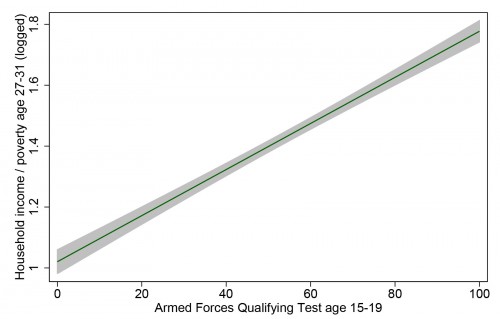
Here is the linear fit between between these two measures, with the 95% confidence interval shaded, showing just how confident we can be in this incredibly strong relationship:

1 (2) - Copy

That’s definitely enough for a screaming headline, “How your kids’ test scores tell you whether they will be rich or poor.” And it is a very strong relationship – that correlation of .35 means AFQT explains 12% of the variation in household income.

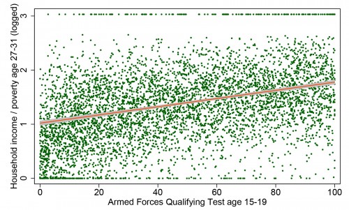
But take heart, ye parents in the age of uncertainty: 12% of the variation leaves a lot left over. This variable can’t account for how creative your children are, how sociable, how attractive, how driven, how entitled, how connected, or how White they may be. To get a sense of all the other things that matter, here is the same data, with the same regression line, but now with all 5,248 individual points plotted as well (which means we have to rescale the y-axis):

1 (2)

Each dot is a person’s life — or two aspects of it, anyway — with the virtually infinite sources of variability that make up the wonder of social existence. All of a sudden that strong relationship doesn’t feel like something you can bank on with any given individual. Yes, there are very few people from the bottom of the test-score distribution who are now in the richest households (those clipped by the survey’s topcode and pegged at 3 on my scale), and hardly anyone from the top of the test-score distribution who is now completely broke.

But I would guess that for most kids a better predictor of future income would be spending an hour interviewing their parents and high school teachers, or spending a day getting to know them as a teenager. But that’s just a guess (and that’s an inefficient way to capture large-scale patterns).

I’m not here to argue about how much various measures matter for future income, or whether there is such a thing as general intelligence, or how heritable it is (my opinion is that a test such as this, at this age, measures what people have learned much more than a disposition toward learning inherent at birth). I just want to give a visual example of how even a very strong relationship in social science usually represents a very messy reality.

Cross-posted at Family Inequality and Pacific Standard.

Philip N. Cohen is a professor of sociology at the University of Maryland, College Park, and writes the blog Family Inequality. You can follow him on Twitter or Facebook.

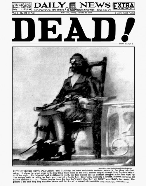
In 1928 readers of the New York Daily News were shocked by this cover.  It was the first photograph ever taken of an electrocution.

1

The executed is a woman named Ruth Snyder, convicted of murdering her husband.  The photographer was a journalist named Tom Howard.  Cameras were not allowed in the execution room, but Howard snuck a device in under his pant leg.  Prison officials weren’t  happy, but the paper was overjoyed.

The fact that the image was placed on the front page with the aggressive headline “DEAD!” suggests that editors expected the photograph to have an impact.  Summarizing at Time, Erica Fahr Campbell writes:

The black-and-white image was shocking to the U.S. and international public alike. There sat a 32-year-old wife and mother, killed for killing. Her blurred figured seemed to evoke her struggle, as one can imagine her last, strained breaths. Never before had the press been able to attain such a startling image—one not made in a faraway war, one not taken of the aftermath of a crime scene, but one capturing the very moment between life and death here at home.

It is one thing to know that executions are happening and another to see it, if mediated, with one’s own eyes.

Pictures can powerfully alter the dynamics of political debates.  Lennart Nilsson‘s famous series of photographs of fetuses, for example, humanized and romanticized the unborn.  They also erased pregnant women, making it easier to think of the fetus as an independent entity. A life, even.

Unfortunately, Campbell’s article doesn’t delve any further into the effect of this photograph on death penalty debates.  To this day, however, no prisons allow photography during executions.  What if things were different?  How might the careful documentation of this process — with all our technology for capturing and sharing images — change the debate today?  And whose interests are most protected by keeping executions invisible?

Cross-posted at Pacific Standard.

Lisa Wade, PhD is an Associate Professor at Tulane University. She is the author of American Hookup, a book about college sexual culture; a textbook about gender; and a forthcoming introductory text: Terrible Magnificent Sociology. You can follow her on Twitter and Instagram.
Screenshot_3Please enjoy these posts from Mother’s Days past:

Lisa Wade, PhD is an Associate Professor at Tulane University. She is the author of American Hookup, a book about college sexual culture; a textbook about gender; and a forthcoming introductory text: Terrible Magnificent Sociology. You can follow her on Twitter and Instagram.