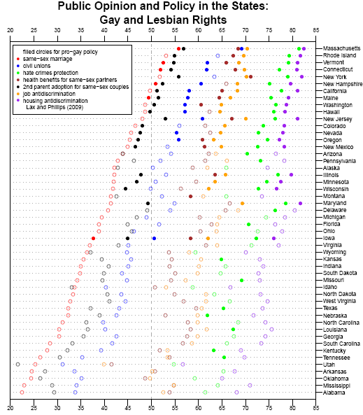
Andrew Gelman, over at FiveThirtyEight, presents a graph from data put together by Jeff Lax and Justin Phillips regarding opinions about various policies affecting gays and lesbians:

gay1

In another post, Nate Silver asks how public opinion about same-sex marriage might change if polls worded the question somewhat differently. Instead of asking “should the government allow same-sex couples to marry?”, we could just as well ask “should the government prevent same-sex couples from marrying?” He suggests that pro-gay-marriage groups might also frame the issue in this way–of keeping the government from taking away rights that people presumably already have rather than as the government giving new rights. It’s an interesting thought, and illustrates the role that question wording can play in affecting how survey respondents think about an issue.

UPDATE: Well, I was taken to task for not providing a better explanation of the graph. However, commenter Christopher explains it pretty well:

For each state, the status of seven public policies is listed as either pro- or anti-gay with seven colored circles which are either filled or empty with respect to the status. In addition, the position of the circle reflects the status of public opinion for each policy.

That is, each color represents one of the policies listed in the legend in the upper-left corner, so, for instance, red = public support for same-sex marriage. If the dot is filled in, it means gay-friendly legislation about the issue was actually passed in the state. If the dot is an empty circle, it means no gay-friendly legislation exists in the state. And the position of the circle tells you what percent of people in each state support each policy.

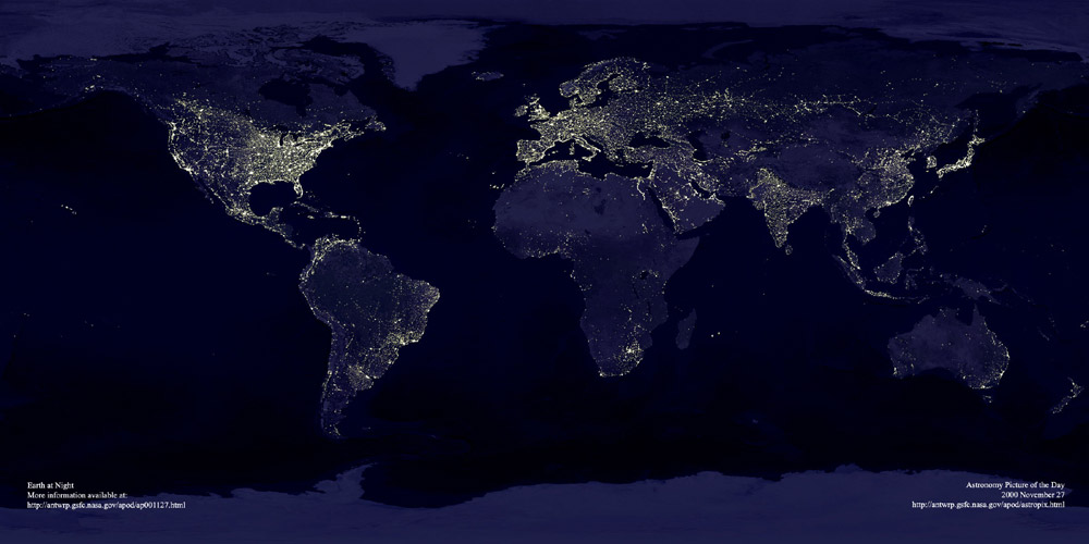
This image, found at International Networks, depicts the globe at night.  The areas bathed in electricity reveal “the global spread of industrialization, as evidenced by the lights of human civilization”:

lights_earth

I think it’s interesting to compare this image with a world population map (link):

g-gpw-population-map

At first the two maps seem to overlap pretty nicely, but if you look closely there are plenty of interesting discrepancies, especially in Africa.

Thanks to Toban B. for the link that got me to the graphic that inspired this post.

NEW (Apr. ’10)!  In the comments, Brendon linked to this great image of the Korean peninsula at night that reveals an amazing difference between North and South Korea:

—————————

Lisa Wade is a professor of sociology at Occidental College. You can follow her on Twitter and Facebook.

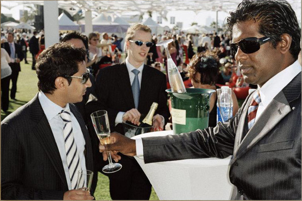
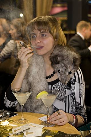
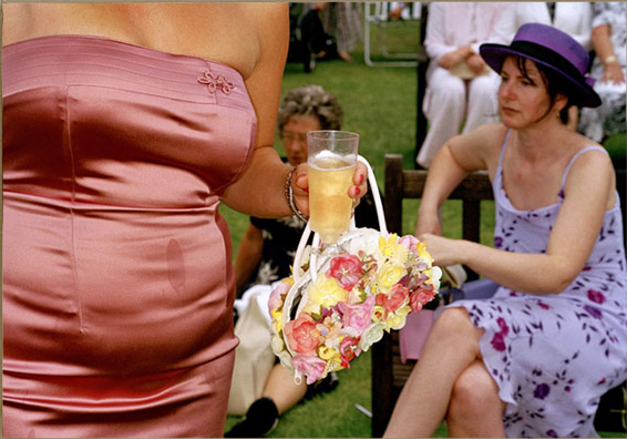
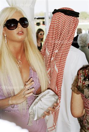
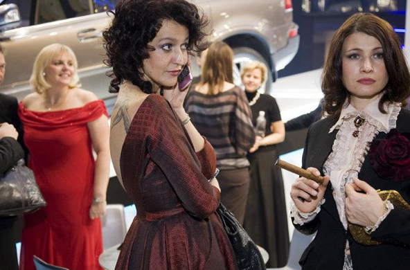
Photographer Martin Parr has decided to photograph the rich in their habitat, exposing an elite world for the rest of us.  He writes:

Shot in various locations, from art fairs to horse racing, and in many countries, I have selected situations where people are comfortable showing off their wealth. Designer clothes, champagne and parties are all part of this repertoire.

Traditionally the portrayal of poverty has been the domain of the “concerned photographer” [see, for example, here], but I photograph wealth in the same spirit.

What I like about his photographs is the realistic portrayal of the rich.  Unlike the way in which wealth is glamorized in popular culture (see, for example, here, here, here, here, and here), these are real people, with all of their imperfections, showing off all of their money.

The pictures are (as far as I’ve been able to determine) from the U.S., Moscow, and Dubai:

2martinluxury
3martinluxury
artwork_images_111979_464027_martin-parr
1martin_luxury
dubai1

picture14

russia12
picture23

(Images from here, here, here, here, here, here, and here.)

—————————

Lisa Wade is a professor of sociology at Occidental College. You can follow her on Twitter and Facebook.

In the opening essay to the book Shared Visions: Native American Painters and Sculptors in the Twentieth Century, Rennard Strickland and Margaret Archuleta write,

J.J. Brody in his classic study, Indian Painters & White Patrons, identified the colonial nature of a patronage system that narrowly defined and dictated what was “Indian art”…It seems almost as if definitionally…that paintings by Indians can be considered only in a primitive, aboriginal context. (p. 9)

They discuss Oscar Howe:

…[he was] thwarted in developing new directions in painting and striving to break away from the old stereotypes limiting Indian art…one of Howe’s Cubist style paintings was rejected from the 1959 Indian Artists Annual because it was “non-Indian” and embodied a “non-traditional Indian style.” (p. 9)

Strickland and Archuleta quote a letter from Howe to a friend:

“There is much more to Indian Art, than pretty, stylized pictures…Are we to be held back forever with one phase of Indian painting…?” (p. 10)

What Strickland, Archuleta, and Howe (as well as other contributors to Shared Visions) are discussing is the pressure American Indian artists have often faced to create a certain type of art. This pressure may come from other Indians or from non-Indians. Non-Indians have often had significant power over Indian artists because of their role as benefactors (providing money for artists to attend The Studio at the Santa Fe Indian School, for instance) and because non-Indians are the majority of buyers of art created by American Indian artists. And benefactors and art collectors often have a certain idea of what “Indian art” is, which includes assumptions about both themes and styles. Specifically, they want “traditional” images that depict Native Americans in a pre-modern world, often including images of animals.

I couldn’t help but think of that book when I recently picked up a tourist-oriented guide to Taos, New Mexico. Now, don’t get me wrong: I’m not saying there is anything necessarily wrong with any of the particular art pieces (or with “traditional” type Indian art more broadly). I’m also not claiming these particular artists feel their artistic expression is limited by preconceived notions of what counts as “Indian art.”

What struck me was just the homogeneity of the images found in the guide, which seemed to more or less fit the mold of the stereotypical idea of “Indian art.” It brings up the question: what is Indian art? Is it any art made by an American Indian? Or does it only count if it fits in with non-Indians’ preferences for what Indian art should look like? What if a White person, say, masters the “traditional” style–is it Indian art then? Over the years a number of American Indian artists have created art to intentionally challenge the idea of the romanticized 19th-century Indian as well as what Indian art can be. For instance, Fritz Scholder painted “Indian Wrapped in Flag” in 1976, in an attempt to deconstruct images of Native Americans (p. 16 of Shared Visions).

Both Indians and non-Indians picketed some of Scholder’s shows in protest.

Similarly, T.C. Cannon painted “Osage with Van Gogh” (I’ve also seen it titled “Collector #5“; from around 1980), which reverses our idea of who collects or appreciates which type of art by showing a Native American collecting a European artist’s work. Another great piece is “When Coyote Leaves the Reservation (a portrait of the artist as a young Coyote)” by Harry Fonseca (1980). See images here.

So are those pieces Indian art? Does it count as “Indian art” only if it contains specific styles and themes?  In which case, does it remain a sub-genre of art–part of “ethnic” art, as opposed to the neutral, non-marked mainstream art world?  Are Indians who paint or sculpt or play music in ways that don’t fit the existing idea of Indian art not “authentic” Indian artists?  If we accept that premise, “Indian art” is, as Howe said, “held back forever,” with themes and styles frozen in time and artists discouraged from experimenting or innovating in their work, as Howe learned so clearly. This tendency is apparent in other elements of U.S. culture, of course: movies like “Dances with Wolves,” books about “noble savages,” and conflicts over what types of technologies American Indians can use when spear fishing (with non-Indians arguing Indians should only be able to use the methods that their tribes used in the 1800s) all indicate a wider perception that “authentic” Indians should inhabit a time-warp universe in which their cultures and lifestyles have remained basically unchanged since the late 1800s or early 1900s, a requirement we don’t ask of other groups.

For more evidence that Indians are represented, and expected to represent themselves, anachronistically, see this post.

UPDATE: Commenter Camilla points out a documentary that asks similar questions about “African” art:

Christopher B. Steiner produced a fantastic anthropological documentary about the market for “African” art that addressed many of these same issues. It’s called “In and Out of Africa”…It explores the issue of how ideas such as “authenticity” and “tradition” are socially constructed phenomena. It also questions why particular types of “ethnic” art are successful in Western markets, while others are not.

Gwen Sharp is an associate professor of sociology at Nevada State College. You can follow her on Twitter at @gwensharpnv.

3615989327_e3474289ca

“Pregnant? Scared?”  They don’t mean hemorrhoids and contractions; they mean social opprobrium and economic ruin due to stingy social services.

Jill at I Blame the Patriarchy writes:

There is only one reason that pregnancy should “scare” you: your culture hates women and kids. It especially hates teenage women. It especially hates pregnant teenage women. It especially hates teenage pregnant women who get knocked up under unapproved circumstances.

It had never occurred to me before that a generalized fear of getting pregnant is a culturally and historically contingent state of mind.  But, of course, it is.

—————————

Lisa Wade is a professor of sociology at Occidental College. You can follow her on Twitter and Facebook.

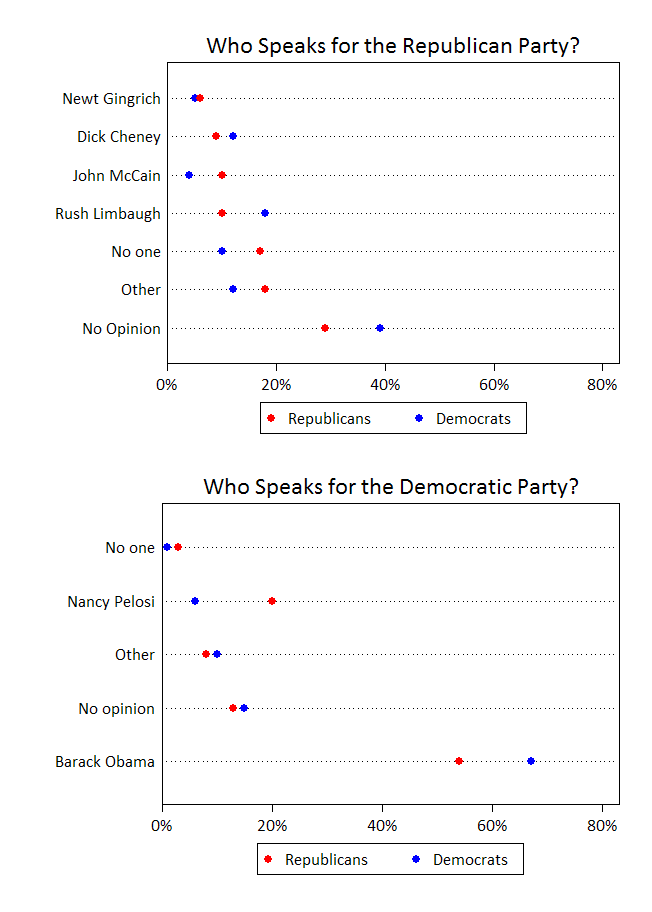
Some interesting data on who Republicans and Democrats feel represents them and the opposing party:

speaksforparties

Gallup data borrowed from The Monkey Cage (via Matthew Yglesias).

—————————

Lisa Wade is a professor of sociology at Occidental College. You can follow her on Twitter and Facebook.

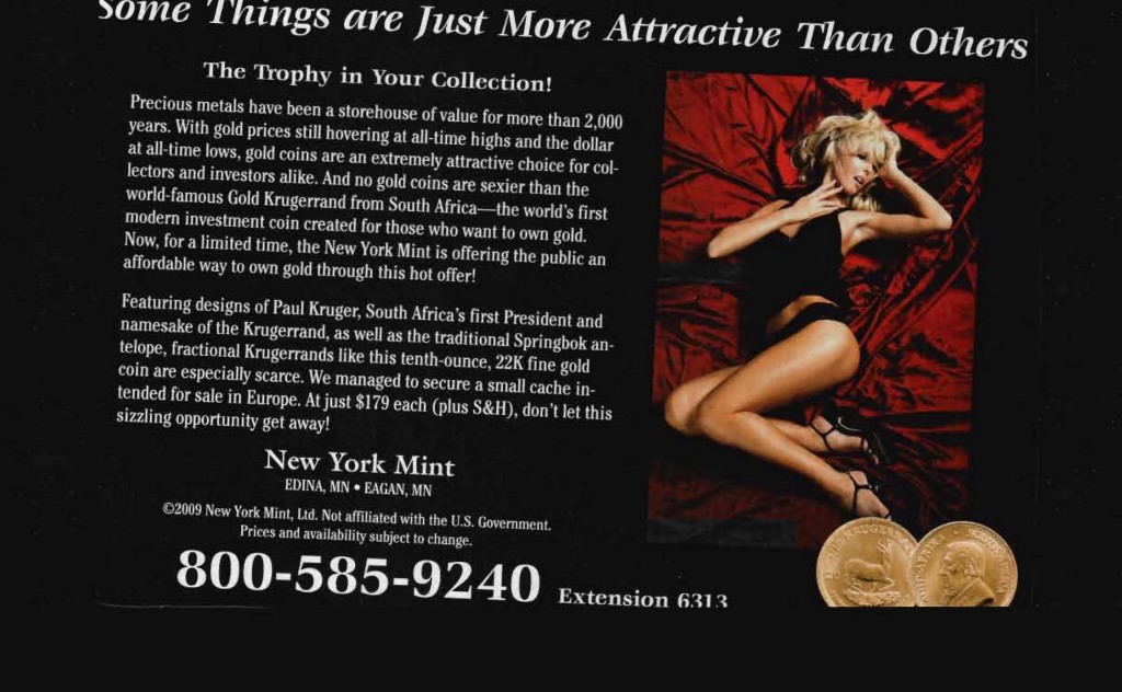
Given how common they are, ads that use a woman in a sexy pose for no good reason don’t really surprise me anymore. But every once in a while I come across one that makes me do a double-take, such as this advertisement for gold coins:

attractive2

Really? A woman in what appears to be a sexually aroused state? Who can apparently be the “trophy in your collection,” a statement which is all kinds of creepy? I also like the naturalization of current female beauty standards–thin, long-legged blond women who will lie around in lingerie and heels are “just more attractive”! It’s, like, a universal law, just the way it is.

Ugh. That is all.

Toban B. sent us a link to an infographic that included data that put U.S. spending on the military into perspective:

capture7

See also this post looking at where our tax dollars go.

—————————

Lisa Wade is a professor of sociology at Occidental College. You can follow her on Twitter and Facebook.