While America has taken great steps in recent decades toward gender equality, this progress seems lacking in politics. No elected legislative body in the U.S. has ever come close to being half female—the proportion we would expect if it were truly representative of the populace. R.W. Connell argues patriarchy is replicated and reinforced partially through our individual gender practices that cumulatively make social institutions operate.  In daily life, all men and women are socially pressured to embody the gender traits prescribed for their sex.

Kathleen Hall Jameson argues the ways we judge others’ masculine and feminine selves creates a double bind dilemma for women in leadership; a problem that is especially salient in politics, where winning is contingent upon candidates being both personally liked and thought of as competent leaders.  Men have no problem being respected both personally and as leaders because acting strong, confident, and in-charge is expected of both males and authority figures.  However, when women present themselves as leaders by acting dominant, they are likely to be judged as overly harsh, or even “bitchy.”  Yet when women act feminine, they are often judged as unfit for authority because they lack leadership qualities.  In electoral politics, it is very difficult for women to walk the tightrope between being a competent leader and also connecting with voters personally.

We can see the double-bind at work in Saturday Night Live’s now famous, or infamous, parodies of Hillary Clinton and Sarah Palin during the 2008 Presidential campaigns.  Tina Fey’s Grammy-winning depiction of Sarah Palin exaggerates femininity, often portraying the former Alaska governor as if she is competing in a beauty pageant.  Amy Poehler’s masculine portrayal of Hillary Clinton as overly-aggressive, combative, and filled with anger exemplifies the other side of the double bind dilemma.  One skit bringing these characters together to speak out against sexism in the campaign is especially revealing:

Fey presents Palin as accommodating, saying “I was so excited when I was told Senator Clinton and I would be addressing you tonight,” to which Poehler-as-Clinton uncooperatively says, “I was told I would be addressing you alone.” Similarly, a capitulating Palin says “Hillary and I don’t agree on everything,” to which Clinton combats “we don’t agree on anything.” Later in the skit, Poehler-as-Clinton takes firm policy stances while Fey-as-Palin gives ‘pageant’ answers. After Clinton speaks out against the Bush Doctrine, Fey as Palin claims “I don’t know what that is.” Clinton says “I believe diplomacy should be the cornerstone of any foreign policy;” Palin responds “and I can see Russia from my house.” In the SNL skit, Palin tells political pundits to quit using words “that diminish us like pretty, attractive, beautiful …” while Clinton interrupts, “harpy, shrew, boner-shrinker.” Throughout the skit Clinton becomes increasingly agitated and then rips apart the podium in anger. Poehler’s masculine portrayal becomes literal when she says “I invite the media to grow a pair, and if you can’t, I will lend you mine.”

The overly-effeminate portrayal of Palin reflects one side of the double-bind where many people judge feminine women as lacking the appropriate characteristics for leadership. On the other side of the double-bind, the unfeminine portrayal of Clinton illustrates how women who act powerful and confident are subject to character attacks. However, because leadership qualities are expected of men, male politicians are not subject to this critique when they act like leaders. For example, Poehler as Clinton describes her “road to the White House” as “I scratched, and I clawed,”—words with negative connotations which would never be used to describe competitive men with ambition.

While political comedy depicting our leaders as inept has been a mainstay of our electoral process since our country’s founding; we should be cognizant that parodies of female politicians often draw upon very real aspects of gender that make it difficult for women to achieve positions of leadership.

———-

Jason Eastman is an Assistant Professor of Sociology at Coastal Carolina University who researches how culture and identity influence social inequalities.

If you would like to write a post for Sociological Images, please see our Guidelines for Guest Bloggers.


Terri Oda, a PhD student in computer science, put together this fun and quick slideshow explaining why sex differences in math ability can’t explain why there are so few women in computer science. It’s great:

Found at Geek Feminism. Thanks to Peter S. for the submission!

Lisa Wade, PhD is an Associate Professor at Tulane University. She is the author of American Hookup, a book about college sexual culture; a textbook about gender; and a forthcoming introductory text: Terrible Magnificent Sociology. You can follow her on Twitter and Instagram.

Geographer Derek Watkins put together an interesting visualization of the expansion of the U.S. by showing the distribution of post offices between 1700 and 1900. The distribution of post offices reflects a number of important social and political events — the sudden emergence of post offices on the West Coast in the late 1840s, around the time of the gold rush and California becoming a state, patterns in Kansas and Nebraska in the 1870s clearly showing how population growth followed railroad lines, and so on:

Posted: Visualizing US expansion through post offices. from Derek Watkins on Vimeo.

You can read Watkins’s caveats about the data (it doesn’t include closures of some post offices during that time, and he was unable to determine the location of about 10% of post office branches) here. Thanks to Jeremy Freese, at Scatterplot, for posting it!

Dmitrity T.M. and Larry Harnisch (of The Daily Mirror) let us know that Stanford University’s Rural West Initiative put together a map showing the spread of newspapers across the U.S. between 1690 and 2011, based on Library of Congress listings. The results illustrate many of the same major social and political changes and trends as the post office map:

The Growth of US Newspapers, 1690-2011 from Geoff McGhee on Vimeo.

The website allows you to see the map for any individual year, and awesomely, you can filter by language, illustrating a number of periods of high immigration and common destination locations. Here’s the map of German-language newspapers in 1900:

And Spanish today:

HAPPY SEPTEMBER!

News, Publications, and Appearances:

We are super grateful to Karen McCormack for her positive and insightful review of SocImages in Visual Sociology.  Thanks so much Karen!

We’re pleased to report that our short essay on Banal Nationalism was published in Contexts magazine this month.

Guest Blogger Christina Barmon made a big splash this month with her post, To Sit or Not to Sit: Gendering How We Pee.  Maybe we can get it up to 500 Facebook likes today!  If you’d like to be a part of our Guest Blogger Team, with access to the best reader submissions, send us a note at socimages@thesocietypages.org.

Contributor Caroline Heldman made nine appearances on Fox and the Fox Business channel this month, in addition to writing a fantastic series marking the anniversary of Hurricane Katrina and kicking off our Election 2012 Sexism Watch.

Lisa was also quoted in an Inside Higher Ed article about the American Sociological Association’s annual conference in Las Vegas.  And she chatted for a few minutes about the sexualization of girls with sexologist Logan Levkoff on CKNW’s Bill Good Show.

Course Guides:

Classes are in full swing for the SocImages team!  Gwen is getting started on a Course Guide for Introduction to Sociology, a list of topic-specific quality SocImages material arranged in a way that we hope instructors will find familiar and convenient.  We’d love to see more!  If you are teaching this semester and would like to be forever inscribed on our pages as a generous soul, check out our Instructors Page for more information.

Featured Reader!

This is a shout out to our long-time reader and prolific idea submitter, Katrin.  Katrin is at the University of Cambridge in Politics, Psychology, Sociology, and International Studies, researching climate change. She stumbled across the blog while searching some OECD statistics… and says she then spent the entire rest of the day flicking through ALL the other posts.  She’s also a Shakesville superfan, as we are.

Social Media ‘n’ Stuff:

Finally, this is your monthly reminder that SocImages is on Twitter and Facebook.  Learn more about your editors at Lisa’s and Gwen’s websites.  And a bunch of us are having fun on twitter: @lisadwade@gwensharpnv@familyunequal@carolineheldman, and @jaylivingston.

Time for another collection of gendered kids’ stuff!

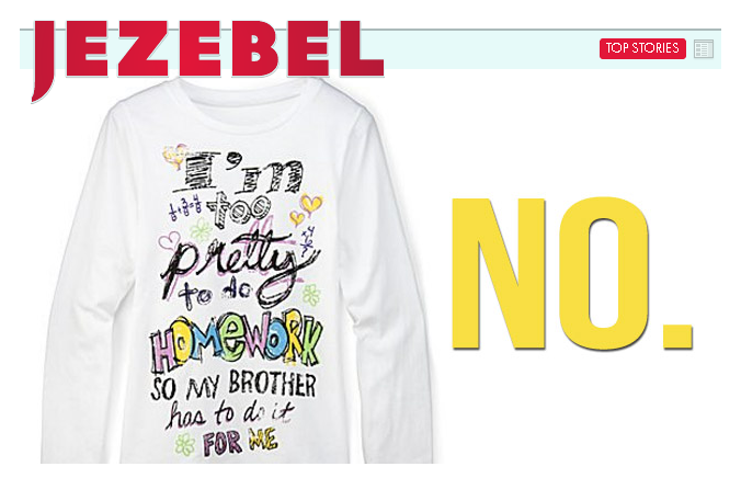
First, the blog-o-sphere is all over this one already and apparently JC Penney has already pulled the t-shirt, reading “I’m to pretty to do homework so my brother has to do it for me.”  Really? I like how Jezebel framed the issue with a big “NO”:

Thanks for Caroline Heldman, Tom Megginson, Mana T., Carmel L., Heidi S., Melissa B., Alli, and Ed A.-N. (on our Facebook page) for sending in that doozy.

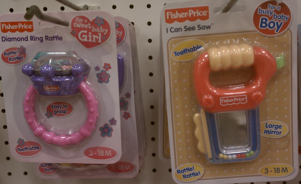
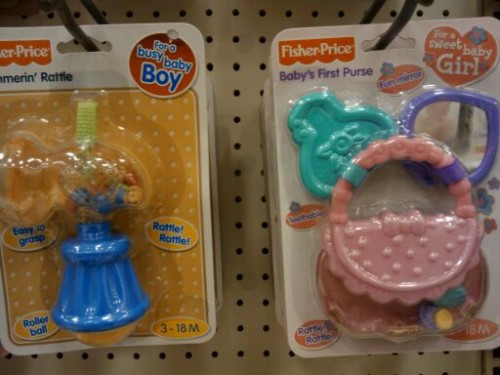
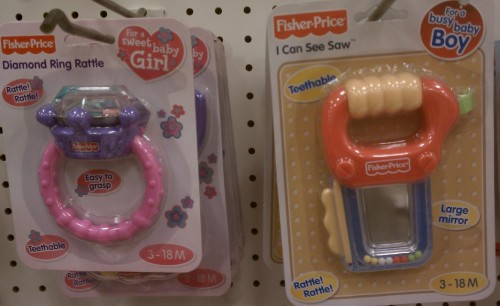
Next, Jessica M. and Amanda G. each sent in a photo of gendered baby rattles, both in terms of the design (girls get a purse and diamond ring, boys get a hammer and saw) but also in the description — girls are “sweet,” boys are “busy”:

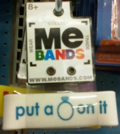
Don’t worry; once your daughter outgrows the diamond ring rattle, there are other products available to remind her that the most important thing in the world is to get a diamond ring, specifically in the form of an engagement ring. Liz saw this for sale in the toy section at Wal-Mart, which was a relief, because as she said, girls these days just “don’t have enough pressure to get hitched at age 8+”:

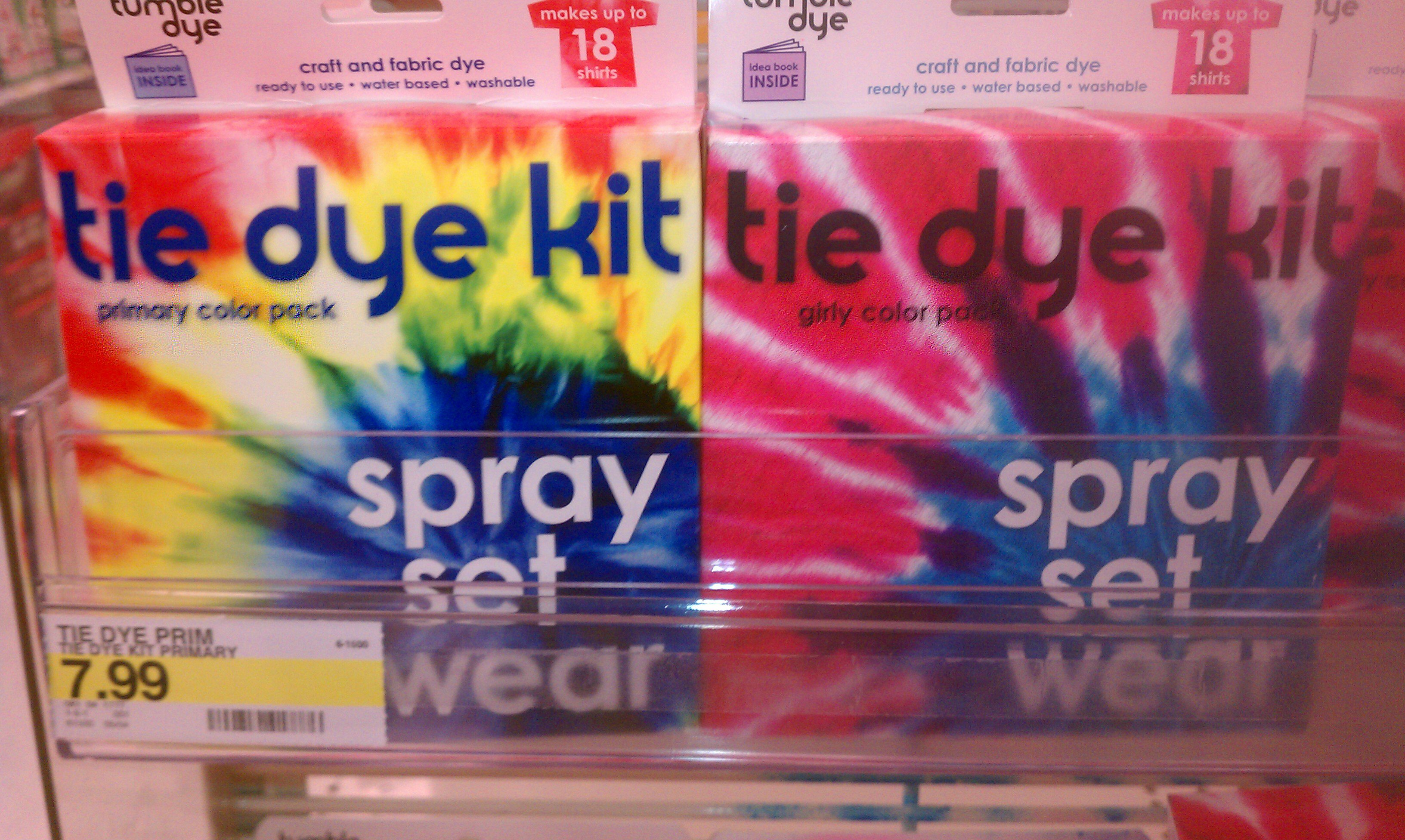
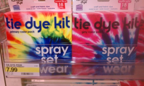
Hishaam S. noticed that Target had four tie-dye kits — camo, neon, primary, and girly:

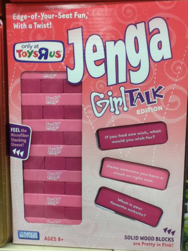
Laura M. sent us an image Jenga Girl Talk Edition, originally posted by Elena Barbarich. The game (which comes in two versions, pastel blue and purple and “exclusive pink”) includes blocks with girl-specific questions to stimulate conversation, such as who you have a crush on and the truly brilliant “What is your favorite website?”

There are many versions of Jenga — Donkey Kong, the Nightmare before Christmas, Transformers, and so on — but there doesn’t appear to be a version specifically labeled for boys. [NOTE: Reader JF says there’s a board game called Girl Talk, so this is being cross-branded with it.]

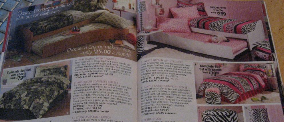
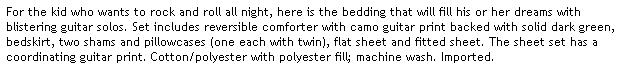
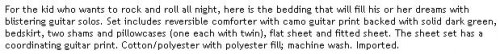
Esther M.-E. noticed a recent Seventh Avenue catalog contains an example of the “masculinized things are for everyone, but feminized things are only for girls” cultural pattern. The catalog had two facing pages of bed sets, the one on the left called Air Guitar (featuring guitars on the sheets, in a blue room with a basketball on the floor) and the one on the right called Jungle Queen (in a pink room with a cat):

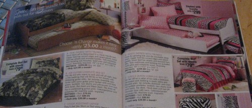
The description of the Air Guitar set, however, describes it as appropriation for boys or girls, while the Jungle Queen set doesn’t include the same language (and its very name specifically genders it):

Seventh Avenue, of course, is marketing in this manner — actively including girls in the product that might otherwise be defined as masculine while not doing the same for boys with the feminized product — because our cultural norms surrounding gender value the masculine over the feminine. Girls who like “boy” things are often seen as cool, sassy, even smart. Boys who like “girly” stuff, though, are not cool. Even if a boy asked for a pink animal-print bedroom set, his parents are less likely to support the choice than if a daughter chose a masculine-gendered item. Seventh Avenue is simply writing copy based on this larger cultural pattern, and in so doing, reinforcing it.

And now, something that just goes in the “wtf?” category, which I include here for no reason other than the pure surreality of its existence. J.O. was looking at the girls’ toys section at All Modern Baby, and among the Fashion and Beauty Fun there were several sets of rubber bands in various shapes, including…the Kama Sutra package, with four positions:


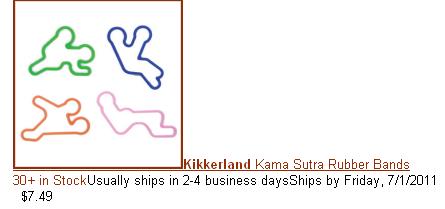
You won’t be surprised to learn they have been removed from the site, and I found a few other kid-related websites that had them listed as no longer available as well, though if you’re dying for a set, several non-child-oriented sites carry them. The perils of modern inventory management: you order a bunch of perfectly ordinary sets of silly bands, and among the space ship and animal shapes, no one catches that you’ve also posted a sex-themed version.

If I ran the Federal scary anti-smoking image warning program, I might show smokers the list of health-related terms that show up most in the states with the highest cigarette smoking rates.

If you take the smoking rates by state, and throw them into the Google Correlate hopper, you can see the 100 search terms that are most highly correlated with that reported smoking behavior. That is, the terms that are most likely to be used in high-smoking states and least likely to be used in the low-smoking states.

Is the result just a lot of noise? Maybe, but I don’t think so. Here are the smoking-related terms in the top 100:

  • camel no 9
  • cigarette coupon
  • cigarette coupons
  • marlboro coupons
  • my time to quit
  • safe cigarettes
  • stopping smoking
  • time to quit
  • fire safe cigarettes
  • ways to stop smoking

So that’s good for face validity — a list of random search terms isn’t likely to have all those smoking terms on it.

But after the smoking terms, the thing that jumps out is the health-related terms. We know from the Google flu tracker that people search for their symptoms. So these caught my eye.

Here is a screen shot of the first page of results:

I selected “stages of copd” as the term to map. The map on the left is the smoking rates; the one on the right is the relative frequency of searches for “stages of copd.” That is, chronic obstructive pulmonary disease, a nasty disease the most common cause of which is smoking.

Here is the complete list of health-related terms among the top-100 correlates with smoking rates:

Lymph node swelling, which is implicated in the jaw and neck searches, most often reflects infection — which smoking causes.

How strong are the connections? They’re not the strongest I’ve seen on Google Correlate. The “stages of copd” search is correlated with smoking rates at .77 on a scale of 0 to 1. It’s not uncommon to find correlations of .93 (which is the relationship between “quiche” and “volvo v70 xc”).

But considering the smoking rates come from a sample survey (the National Survey on Drug Use and Health) which includes random error, and states are somewhat arbitrary geographic units, that correlation seems pretty high to me. Here’s the scatterplot:

What is the correlation causality story here? I can’t say. But the simplest explanation is that these are the terms smokers (and maybe those who know or care for them) are most likely to Google relative to non-smokers — not that they are the most common searches smokers do, of course, but the searches that differentiate them from non-smokers. The simplest explanation is the best place to start.

I like this list of conditions because in my experience smokers sometimes have the attitude of “you have to die of something.” But it’s not just the chance of dying that smoking increases — it’s a lot of possible forms of suffering along the way.

——————————

The Google Correlate tool is showing the great potential for using Internet search activity to investigate layers of behavior and meaning behind other observable social phenomena, such as race/ethnic compositionhealth behavior, and family patterns.

Whether you are in college or not, fall semester 2011 is upon us. Below, courtesy of Everyday Sociology, is a graph illustrating the rising cost of college, controlled for inflation.

Public College/University Tuition, Room and Board (held constant in 2007-2008 dollars):

Consequent to this increase, the average student in 2008 graduated with twice the debt as a student in 1996, from $12,750 to $23,200.

The pay-off of a college education, however, is higher than ever. So why don’t more people go?

In the seven-and-a-half minute video below, UC Berkeley Professor Michael Hout gives a history of higher education putting all of this in perspective. The answer is class-specific and how different classes think about debt and possibility. More:

Lisa Wade, PhD is an Associate Professor at Tulane University. She is the author of American Hookup, a book about college sexual culture; a textbook about gender; and a forthcoming introductory text: Terrible Magnificent Sociology. You can follow her on Twitter and Instagram.

We have posted a number of times about the unequal effects of the current economic crisis: the worsening of the racial gap in homeownership, the more severely negative economic situation of African Americans and Latinos than of Whites, including among African American and White college graduates, higher unemployment for men than for women (this post also has a lot of info about race, sex, and job loss), the fact that older workers who lose their jobs remain unemployed longer than younger workers, that job losses have been accompanied by increased corporate profits, and that wealthier households have weathered the crisis better than less prosperous ones.

Dmitriy T.M. sent along an April 2011 Gallup poll that asked 1,013 Americans about their perceptions of the economy. Overall, results were more positive than when the same question was asked in September 2008, when the economic meltdown really became apparent. Though more than half of respondents said the U.S. is in either a recession or a depression, that’s down significantly from the 69% who said so in late 2008, while the 27% who said the economy is growing is an enormous jump compared to the mere 3% who thought it was in September 2008:

But perceptions of the economy differed significantly by income level. Nobody thought it was doing great; over half of every income group still thought the economy was in either a recession or a depression. However, those making less than $30,000 a year had a notably more negative outlook on the economy than those with higher incomes. Not only were they more likely to think the economy is doing poorly, but nearly half thought we’re experiencing a depression — twice as high as the proportion of those making $75,000/year who thought so:

Interestingly, perceptions of the economy also varied widely by political affiliation, with Democrats feeling much more positive about the economy than any other group, and Republicans and Tea Party supports feeling markedly more negative:

Meanwhile, the Gallup daily tracker poll on the state of the economy (which only shows overall results) shows a marked downturn in Americans’ perceptions of the economy throughout the summer of 2011, with 77% now reporting the economy is “getting worse”:

For more on the economic crisis and its uneven effects, see Philip Cohen’s post on race and job loss, differences in optimism about the future, unemployment by race/sex/education, occupation, median earnings, and race, and the geography of job loss.