Check out PHD Comics’ take on changing ambitions over time.
Thanks, Kelly V.!
Gwen Sharp is an associate professor of sociology at Nevada State College. You can follow her on Twitter at @gwensharpnv.
Check out PHD Comics’ take on changing ambitions over time.
Thanks, Kelly V.!
Gwen Sharp is an associate professor of sociology at Nevada State College. You can follow her on Twitter at @gwensharpnv.This ad, playing on white resentment about affirmative action, ran during the 1990 North Carolina Senate race between Harvey Gantt and Jesse Helms:
Before the ad ran (during the last week of the campaign), Gantt was ahead in the polls. The ad is widely believed to be the reason Helms won.
Might be good to pair with the infamous Willy Horton ad from the 1988 Presidential campaign in a discussion of how images of minorities have been used to frighten white voters.
These images were all used (along with lots of others) in a 2003 campaign in which PETA, obviously, compared modern agricultural practices and eating meat with the Holocaust:
Found here.
Found here.
Found here.
I assume it will not surprise anyone to learn that many people were offended by the campaign. I can imagine using these images in courses on food/agriculture, social movements, natural resources and the environment (especially in discussions of what rights non-human animals have), and even lectures about historical memory (for instance, when and how does it become acceptable to use historical tragedies like the Holocaust as symbols in other arguments, rather than as events in and of themselves?).
Thanks to an anonymous poster for pointing this campaign out!
NEW: Elizabeth (from Blog of Stench) sent in this ad (found here) PETA apparently attempted to run in the Portage Daily Graphic in Manitoba, Canada:
The ad references an incident on a bus in Manitoba where a man beheaded a fellow passenger and compares it to the slaughtering of animals.
Thanks, Elizabeth!
This article on modesty was in Women’s Care, a free magazine that showed up in my mailbox yesterday.
I assume the way the girl is posed and the look on her face are supposed to imply immodesty. Her clothes don’t strike me as at all problematic (I mean, are peace signs sexy?), so if it’s supposed to be an image of the “comeback” of modesty, the pose and look are extra creepy.
Some quotes from the 1-page article:
The Wall Street Journal recently reported that Victoria’s Secret executives who have long asked, ‘What is sexy?’ are now trying to figure out, ‘What’s too sexy?’…The revamping of the company’s product lines follows a drop in sales. Questions to chat about: Is modesty making a comeback or is the decrease in Victoria’s Secret’s sales the results of a sluggish economy?
Where can mothers find modest clothing for females from little girls to teens?
Again we see the assumption that caring for kids is women’s work–it’s not parents who are looking for clothing for their kids, it’s mothers.
In addition to the cut and length of clothing, the article discusses “slogan” tees that say things like “So many boys, so little time.” There is no mention whatsoever of boys’ slogan tees, which are also often offensive or at least questionable. We only need to worry about modesty in reference to girls, apparently.
Jennifer E.-B. sent in these three images.
The text on the website for this men’s t-shirt:
What goes into being a Dad? You’ll find 100% leadership, 100% guidance, 100% sacrifice, and 24/7 dedication. These Christian Dad Facts and more are printed on this inspirational tribute. A loving gift, comfy 100% cotton tee is machine washable and made in the USA.
The “ingredients” on the t-shirt include dedication, love, wisdom, and leadership. The “serving size” is “2 helpings of advice.”
The website for this women’s shirt says:
Ever wonder what makes up a Mom? Well, there’s 100% sugar, 100% sacrifice, 100% caring, and 24/7 comforting. These Christian Mom Facts and more are printed on this inspirational tribute. A sweet gift, comfy 100% cotton tee is machine washable and made in the USA.
The “ingredients” include comforting, love, wisdom, total compassion, sugar, sacrifice, and caring. The “serving size” is 5 hugs per day.
Then there is this child’s t-shirt that says “Daddy did my hair”:
As Jennifer points out,
I think it brings up a lot of unspoken norms about parental responsibility and ability. First, it indicates that it is the norm for mommy to do the daughter’s hair, but out of the norm for daddy to do it–we don’t see t-shirts saying mommy did my hair, right? (I searched and didn’t find any.) Because that’s just taken for granted. But if Dad does it, it is something to be noticed (and maybe he even gets praised for doing something that is a routine job for mom). Second, the implication is that dads cannot do their daughter’s hair “correctly.” So there is an expectation that if dad does the hair it will be a mess. Think about what this says about men–we certainly think they are capable of doing all kinds of very complex tasks at work–but we don’t think they can comb hair or put in a ponytail??? Third, I think the shirt serves the purpose of justifying the girl’s looks for the mom. In other words, no moms want others to think they would do such a poor job on the girl’s hair. They want others to know that it looks like this because daddy did it. Moms feel pressure to have their kids look great (and behave well) all the time, no matter how hectic the day is. And, of course, the shirt is for a girl, not a boy. No one really cares how a boy’s hair looks.
Thanks, Jennifer!
Here at Sociological Images, we’re interested in how our standards of beauty are based on a European (that is, light-skinned and straight-haired) ideal. See here and here for examples. A reader pointed out that Syesha Mercado, a contestant on American Idol, has been progressively de-ethnicized.
Here is a photo of Syesha from early in the competition:
Here is a photo of her from this week (end of April):
Am I the only one who thinks she looked prettier before?

However, the stylists have thus far let the white kid keep his dreads:
Thanks for pointing this out, pj!


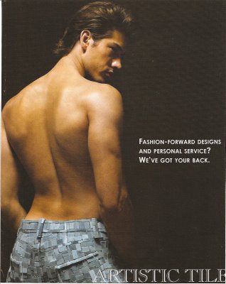
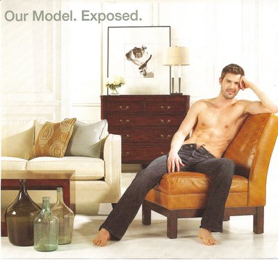
I thought these two images were interesting because they are using sexualized images of men in a magazine called Metropolitan Home. It struck me at first because it’s pretty unusual to find sexualized male bodies used in ads targeting a general audience that might include straight men. Then I started thinking–maybe the fact that it’s in an interior design magazine means advertisers assume the readership is mostly female or, if male, gay, so there is little fear of offending straight men with these types of ads.
.