Archive: Sep 2012

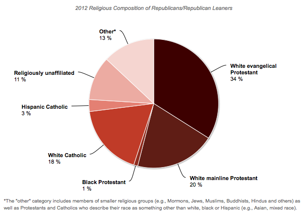
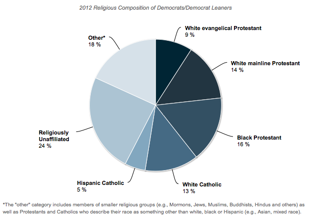
Peter N. sent in some data compiled by Chris Cillizza of the Washington Post.  It reveals the intersection of race and religion among Democrats and Republicans.   As Cillizza concludes, it’s “overblown” to say that the Republican party is made up of White Protestants and the Democratic of minorities and atheists, but there is definitely an argument to be made that each party is disproportionately so.

This first pie chart shows the racial and religious affiliation of people who identify with or lean towards the Republican party.  More than half are White Protestants, another 18% are White Catholics.  Only a small percentage of party faithfuls are religious Blacks and Hispanics (the two racial groups featured in in these data).

This second chart shows the same data for Democrats and Democratic-leaning individuals.  Almost a quarter of Democrats are White Protestants, but a slightly larger percentage of Democrats are religiously unaffiliated.  One in five Democrats identifies as either Black or Hispanic and religious.  The larger “other” category conceals smaller blocs that nonetheless add diversity to the party.

This is just one way to slice the pie, so to speak, but these are the kinds of data that both the Obama and the Romney campaigns are working with.  When they aim to bring out their “base,” this is what they’re talking about.  These numbers may give us a clue as to why they pick the strategies they do, such as the sudden spike in the inclusion of the word “God” in the Republican party platform.

Lisa Wade, PhD is an Associate Professor at Tulane University. She is the author of American Hookup, a book about college sexual culture; a textbook about gender; and a forthcoming introductory text: Terrible Magnificent Sociology. You can follow her on Twitter and Instagram.

Confirmation bias is the tendency to search for or interpret information in a way that reaffirms our pre-existing beliefs. We may selectively notice information; for instance, if we think the full moon makes people act weird, we’re likely to notice and remember strange things we see people doing during a full moon better than strange things we observe at other times (or than all the people we see acting perfectly normally during a full moon). We tend to perceive what we expect to see, our brains struggling to come up with reasons that justify what we already think.

Dmitriy T.C. sent in a video that illustrates this particular type of selective thinking. Jimmy Kimmel gave people on the street an exclusive look at the iPhone 5 and asked what they thought of it. Except, of course, the iPhone 5 isn’t available yet. What he actually gave them was an iPhone 4S. But when told they’re looking at a new version of the iPhone, everyone immediately perceives clear improvements that make it better than the iPhone 4.

You might expect this from people who don’t have much knowledge of iPhones; they don’t have a clear basis for comparison, so whatever features seem neat, they assume are new. But even people holding their own iPhone 4 up for direct comparison perceive the “iPhone 5” Kimmel hands them to be superior, noting a range of details — it’s lighter, faster, just clearly better. They think a new version of a gadget must be way more awesome than the previous version, and Apple has an aura of coolness that leads people to expect their new products should be extra amazing. Since people expect a new iPhone to be awesome, they notice, or invent, features that confirm that it is, indeed, awesome.

It’s a really fun demonstration of this cognitive bias:

I’m supervising senior theses this semester and so I have to be a super stickler about something that makes most students’ eyes roll back in their heads: operationalization.  Wait!  Keep reading!

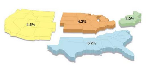
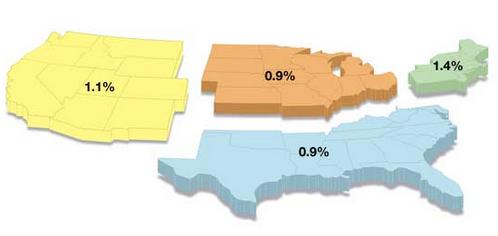
The term refers to a careful definition of the variable you’re measuring and it can have dramatic influences on what you find.  Dmitriy T.C. sent in a great example.  It involves whether you include church donations in your definition of “charity.”   Friendly Atheist breaks it down.

If you include church donations, the South appears to be the most generous U.S. region:

But if you don’t, everyone looks a whole lot stingier and the Northeast comes out on top:

All you budding sociologists out there remember!  Think long and hard about how to define what you’re measuring.  It can make a huge difference in your results.

Lisa Wade, PhD is an Associate Professor at Tulane University. She is the author of American Hookup, a book about college sexual culture; a textbook about gender; and a forthcoming introductory text: Terrible Magnificent Sociology. You can follow her on Twitter and Instagram.
Cross-posted at Montclair SocioBlog.

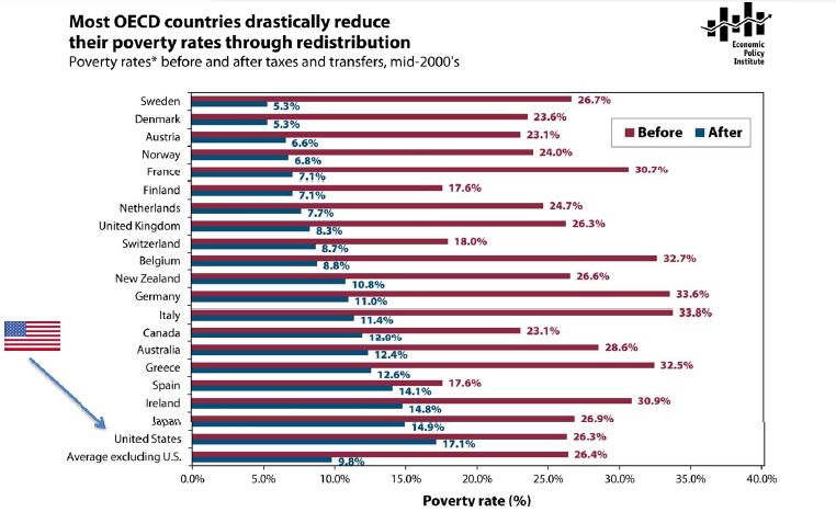
The poverty rate in the US in the mid-2000s was about 17%.  In Sweden, the poverty rate was 5.3%; in Germany, 11%.   That was the rate after adding in government transfers.  In Germany, the poverty rate before those transfers was 33.6%, ten points higher than that in the US.  Sweden’s pre-transfer poverty rate was about the same as ours.

Jared Bernstein has this chart showing pre-transfer and post-transfer rates for the OECD countries (click to enlarge):

Three  points:

1.  Governments have the power to reduce poverty, and reduce it a lot.  European governments do far more towards this goal than does the US government.

2.  It’s unlikely that America’s poor people are twice as lazy or unskilled or dissolute as their European counterparts.  Individual factors may explain differences between individuals, but these explanations have little relevance for the problem of overall poverty.  The focus on individual qualities also has little use as a basis for policy.  European countries have fewer people living in poverty, but not because those countries exhort the poor to lead more virtuous lives and punish them for their improvident ways.  European countries have lower poverty rates because the governments provide money and services to those who need them.

3.  The amount of welfare governments provide does not appear to have a dampening effect on the overall economy.

Cross-posted at Jezebel.

In 2009 R&B singer Chris Brown pled guilty to assaulting singer Rihanna.  At the time of the incident, photographs of her bruised and swollen face were passed all over the internet.  This week we learned that Brown has tattooed the face of a battered woman on a very public part of his body, his neck.

I was particularly impressed by Amanda Marcotte’s analysis of his decision, sent in by Tom Megginson.   I encourage you to read it at Pandagon, but I’ll also summarize here.

People, Marcotte begins, are “… scrambling to claim that Brown’s tattoo is somehow not what it seems. But it is what it seems.”

What it is, she contends, is a way of bragging about the beating.

Men who beat and rape women want to feel powerful. They want to feel manly. And because hitting women and raping women makes them feel these things, they want to brag about it… A tattoo commemorating beating down your girlfriend is a trophy.

A desire to brag is the reaction of violent men — instead of, say, shame — because they don’t feel ashamed.  Citing research by psychologist David Lisak, who found that certain men will happily tell stories about successful sexual assaults, Marcotte argues that batterers and rapists are proud of what they’ve done because they believe that they are right.

[Many perpetrators] are defiant. They believe they are entitled to dominate women, and they feel victimized by a world that doesn’t give them what they believe is theirs. They act out, looking for little ways to assert the right to dominate they believe is theirs.

Because they believe that they are in the right, they aren’t troubled by other people’s outrage.  Marcotte again:

…telling others about it and watching them recoil basically means reliving the power trip… Not only did they dominate the victim, but they have provoked anger and disgust in you, and that makes them feel powerful all over again.

As a further example, she includes a two-minute clip of TV evangelist Pat Robertson recommending, gleefully, that a man beat his wife into submission:

Robertson’s advice here is plain: Women should be subordinate to their husbands and, if they are not, husbands have a right to beat them into subordination.  Husbands can get together and chuckle about this; getting women into line is a good thing, not a bad thing.  Actor Sean Connery — and many other people — agree that it’s “absolutely right” to slap a woman.  It’s part of being a real man.  Those men who might object to your treatment of women?  They’re pathetic and weak and upsetting them makes us laugh.

In sum, while it might be hard to believe, I think Marcotte’s analysis here is right on.  The tattoo — especially on such an exposed and public part of the body — is a giant “fuck you” to everyone who thinks he shouldn’t have beaten Rihanna.   It seems that way and “it is what it seems.”

Lisa Wade, PhD is an Associate Professor at Tulane University. She is the author of American Hookup, a book about college sexual culture; a textbook about gender; and a forthcoming introductory text: Terrible Magnificent Sociology. You can follow her on Twitter and Instagram.
Cross-posted at Family Inequality.

In 2010, 28% of wives were earning more than their husbands. And wives were 8-times as likely as their husbands to have no earnings.

I still don’t have my copies of The End of Men, by Hanna Rosin, or The Richer Sex, by Liza Mundy. But I’ve read enough of their excerpts to plan out some quick data checks.

Both Rosin and Mundy say women are rapidly becoming primary earners, breadwinners, pants-wearers, etc., in their families. It is absolutely true that the trend is in that direction. Similarly, the Earth is heading toward being devoured by the Sun, but the details are still to be worked out. As Rosin wrote in her Atlantic article:

In feminist circles, these social, political, and economic changes are always cast as a slow, arduous form of catch-up in a continuing struggle for female equality.

Which is right. So, where are we now, really, and what is the pace of change?

For the question of relative income within married-couple families, which is only one part of this picture — and an increasingly selective one — I got some Census data for 1970 to 2010 from IPUMS.

I selected married couples (called “heterogamous” throughout this post) in which the wife was in the age range 25-54, with couple income greater than $0. I added husbands’ and wives’ incomes, and calculated the percentage of the total coming from the wife. The results show and increase from 7% to 28% of couples in which the wife earns more than the husband (defined as 51% or more of the total income):

(Thanks to the NYTimes Magazine for the triumphant wife image)

Please note this is not the percentage of working wives who earn more. That would be higher — Mundy calls it 38% in 2009 — but it wouldn’t describe the state of all women, which is what you need for a global gender trend claim. This is the percentage of all wives who earn more, which is what you need to describe the state of married couples.

But this 51% cutoff is frustratingly arbitrary. No serious study of power and inequality would rest everything on one such point. Earning 51% of the couple’s earnings doesn’t make one “the breadwinner,” and doesn’t determine who “wears the pants.”

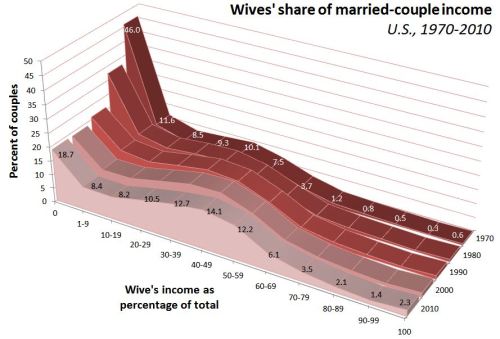
Looking at the whole distribution gives much more information. Here it is, at 10-year intervals:

These are the points that jump out at me from this graph:

  • Couples in which the wife earns 0% of the income have fallen from 46% to 19%, but they are still 8-times as common as the reverse — couples where the wife earns 100%.
  • There have been very big proportionate increases in the frequency of wives earning more — such as a tripling among those who earn 50-59% of the total, and a quadrupling among those in which the wife earns it all.
  • But the most common wife-earning-more scenario is the one in which she earns just over half the total. Looking more closely (details in a later post) shows that these are mostly in the middle-income ranges. The poorest and the richest families are most often the ones in which the wife earns 0%.

Maybe it’s just the feminist in me that brings out the stickler in these posts, but I don’t think this shows us to be very far along on the road to female-dominance.

Previous posts in this series…

  • #1 Discussed The Richer Sex excerpt in Time (finding that, in fact, the richer sex is still men).
  • #2 Discussed that statistical meme about young women earning more than young men (finding it a misleading data manipulation), and showed that the pattern is stable and 20 years old.
  • #3 Debunked the common claim that “40% of American women” are “the breadwinners” in their families.
  • #4 Debunked the description of stay-at-home dads as the “new normal,” including correcting a few errors from Rosin’s TED Talk.
  • #5 Showed how rare the families are that Rosin profiled in her excerpt from The End of Men

If you followed media coverage of the Democratic party convention last week, you may have heard about the short-lived controversy that broke out over the lack of the word “God” in the party platform (as well as the platform not explicitly mentioning Jerusalem as the capital of Israel). Fox News picked up on the lack of religious references and highlighted it as a major failing. Both items were hastily added to the platform.

Over at Organizations, Occupations and Work, Chris Prener posted a graph showing the number of times “God” appears in the party platforms over the last century. As Prener mentions, explicit references to a deity  were rare before World War II. After including it a few times in the ’40 and ’50s, the Democratic party platform mostly left it out until the 1996. The Republican party has much more consistently included “God” at least once in each platform since 1948, but 2012’s platform stands out, since it has more than double the mentions as in any prior platform:

Using the word “God” in official party platforms isn’t a tradition inherited from the earliest days of the two parties. It’s a relatively recent change, illustrating a trend toward more explicit inclusion of or reference to religion in U.S. politics and by political candidates.

Cross-posted at Reports from the Economic Front.

The media has focused on the lack of jobs as a major election issue.  But the concern needs to go beyond jobs to the quality of those jobs.

As a report by the National Employment Law Project makes clear, we are experiencing a low wage employment recovery.  This trend, the result of an ongoing restructuring of economic activity, has profound consequences for issues of poverty, inequality, and community stability.

The authors of the report examined 366 occupations and divided them into three equally sized groups by wage.  The lower-wage group included occupations which paid median hourly wages ranging from $7.69 to $13.83.  The mid-wage group range was from $13.84 to $21.13.   The higher-wage group range was from $21.14 to $54.55.

The figure below shows net employment changes in each of these groups during the recession period (2008Q1 to 2010Q1) and the current recovery (2010Q1 to 2012Q1).   Specifically:

  • Lower-wage occupations were 21 percent of recession losses, but 58 percent of recovery growth.
  • Mid-wage occupations were 60 percent of recession losses, but only 22 percent of recovery growth.
  • Higher-wage occupations were 19 percent of recession job losses, and 20 percent of recovery growth.

The next figure shows the lower-wage occupations with the fastest growth and their median hourly wages.  According to the report, three low-wage industries (food services, retail, and employment services) added 1.7 million jobs over the past two years, 43 percent of net employment growth.  According to Bureau of Labor Statistics projections these are precisely the occupations that can be expected to provide the greatest number of new jobs over the next 5-10 years.

 As the final figure shows, the decline in mid-wage occupations predates the recession.  Since the first quarter of 2001, employment has grown by 8.7 percent in lower-wage occupations and by 6.6 percent in higher-wage occupations.  By contrast, employment in mid-wage occupations has fallen by 7.3.


Significantly, as the report also notes, “the wages paid by these occupations has changed. Between the first quarters of 2001 and 2012, median real wages for lower-wage and mid-wage occupations declined (by 2.1 and 0.2 percent, respectively), but increased for higher-wage occupations (by 4.1 percent).”

A New York Times article commenting on this report included the following:

This “polarization” of skills and wages has been documented meticulously… A recent study found that this polarization accelerated in the last three recessions, particularly the last one, as financial pressures forced companies to reorganize more quickly.

“This is not just a nice, smooth process,” said Henry E. Siu, an economics professor at the University of British Columbia… “A lot of these jobs were suddenly wiped out during recession and are not coming back.”

Steady as she goes is just not going to do it and changes in taxes and spending programs, regardless of how significant, cannot compensate for the increasingly negative trends generated by private sector decisions about the organization and location of, as well as compensation for production.