
These dolls have been available for purchase for at least 6 years (when I first found out about the website) and I’m surprised they haven’t made it on Soc Images yet!
I want to clarify that while these dolls are created for the use by the anti-choice movement, I’m not trying to make a pro-choice argument here. Rather, I think it is interesting to think about how fetal development is depicted (especially to children), and how these micropreemie dolls compare to medical depictions of fetal development. Not to mention that these are among some of the creepiest things I’ve ever seen.
According to the website:
Micropreemie models are life size portrait models of real micropreemie human babies.
[…]
All models are portraits of real babies. Models 6 weeks and 7 weeks are original one of a kind sculpts. They can have a hat and tiny blanket. They are fragile and not poseable. Models eight weeks and over have jointed bodies and come dressed or undressed. All are medically accurate in size and human development. They have been checked for accuracy by Physcians, [sic] Neonatal Intensive Care Nurses, Dulas and the actual parents of the babies represented here. We recommend dressed models for use with children. Children are naturally drawn to these models.
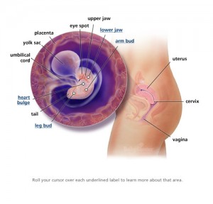
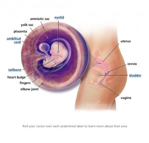
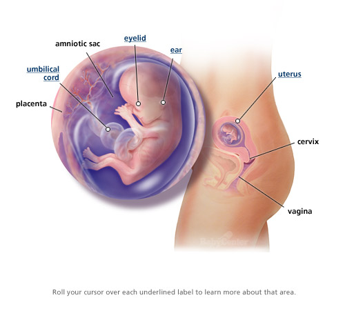
The comparison pictures are from this website.
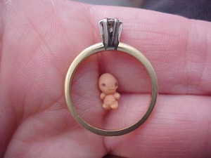
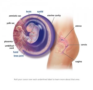
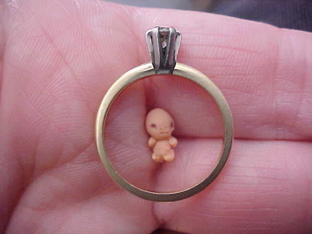
6 weeks gestation:
7 weeks gestation:
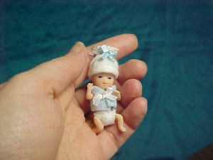
8 weeks gestation:

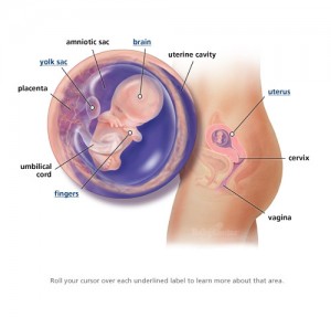
10 weeks gestation:
12 weeks gestation:


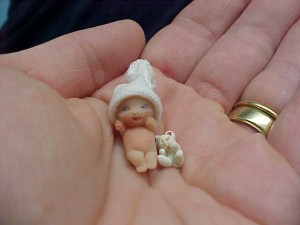
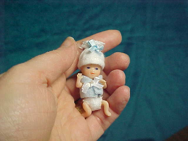
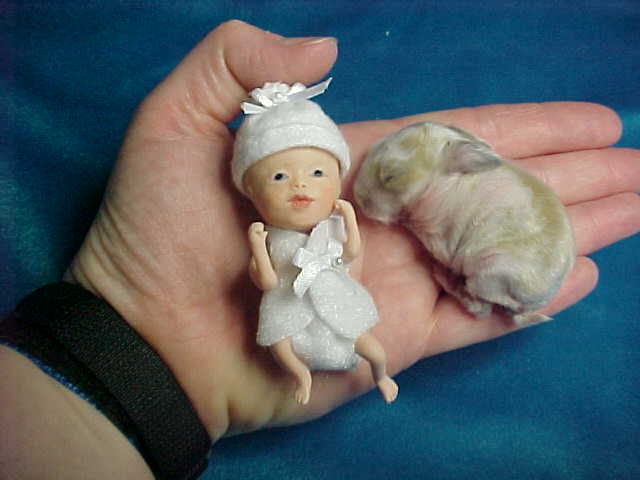
And some other random micropreemie images from the website:
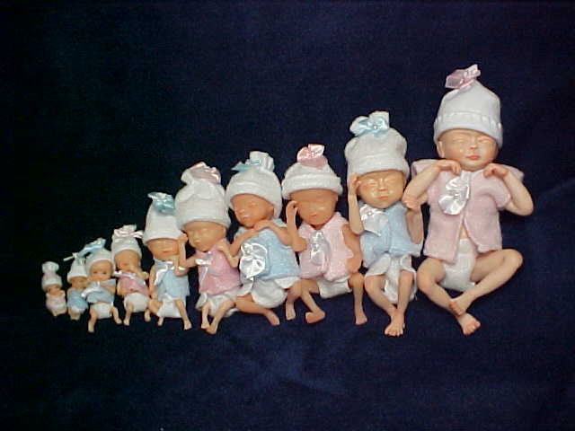
8-18 weeks gestation:
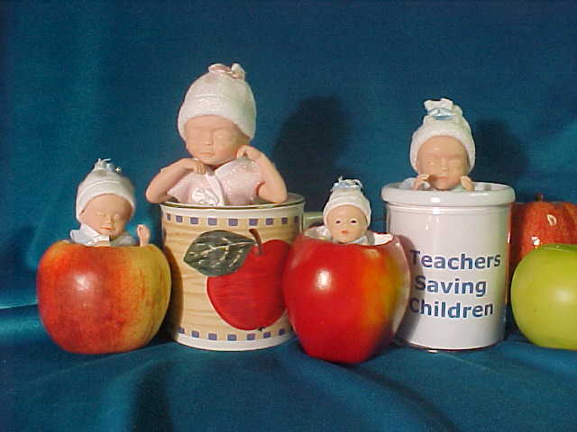
In apples and cups:
And there is one non-white micropreemie on the website:

Size comparison with gummy bear and quarter:

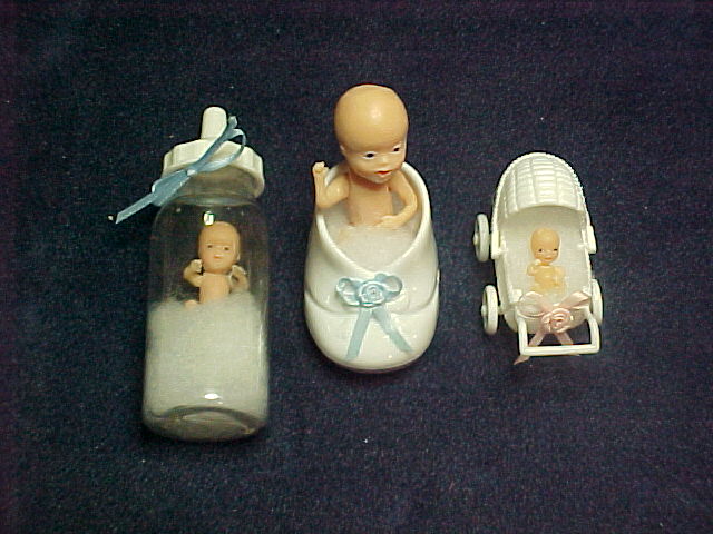
Featured accessories: (yes, that is a micropreemie in a baby bottle. Yikes!)


