Helvetica, the 2009 documentary about the meteoric rise of a Modern minimalist typeface, chronicles the recent history of design theory and describes a continuing clash between hyper-functional Modern design and expressive post-Modern (“grunge”) design. Interestingly, the design trends that characterize the field of typeface design seem to directly parallel the history of Web design.

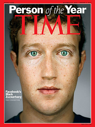
Today, we take for granted the simple, sleek minimalism that has come to define the Web. It is evidenced in the two-tone, single-logo body of the iPad; the bold, spare, and instantly recognizable typeface of the Facebook “f” logo; or the isomorphic convergence of browsers toward an uncluttered and relatively standardized interface. Of course, various products have strayed from Silicon Valley’s prevailing design standard of Modernist minimalism, but the dominance of this design aesthetic is only further revealed by the ridicule that these companies and products receive.
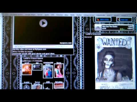
The dominance of Modernist minimalism on the Web was not always a given. For example, even at its peak popularity, Myspace afforded users a wide range of customizable with respect to this individual profiles. In fact, profiles on Myspace continue to vary so widely that there is hardly any coherence to the site as a whole. But, users seem to enjoy the freedom to customize their own profiles. Beyond the content, the design itself becomes a medium of self-expression. If you are an outward and expressive person, be sure to have music blaring when a visitor lands on the page. If you are the dark and brooding type, exhibit this by selecting font and background colors from the bruise palate. These observations, no doubt, echo the wisdom of Marshall McLuhan, who famously told us that “the medium is the message.” more...
 Christina Campbell wrote