 Will Davies, a politics professor and economic sociologist at Goldsmiths, University of London, summarized his thoughts on Brexit for the Political Economy and Research Centre, arguing that the split wasn’t one of left and right, young and old, racist or not racist, but center and the periphery. You can read it in full there, or scroll down for my summary.
——————————–
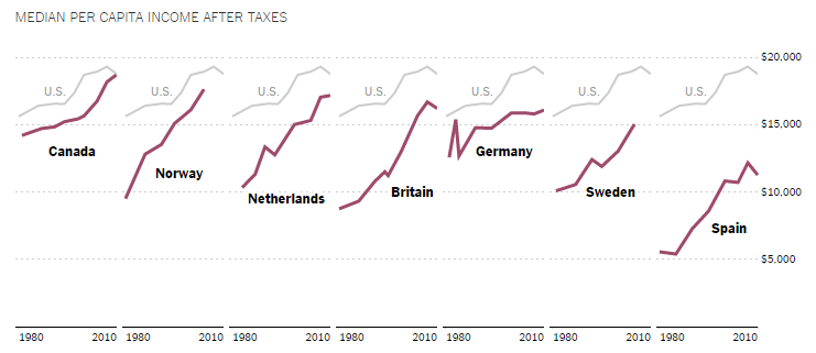
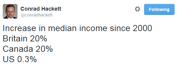
Many of the strongest advocates for Leave, many have noted, were actually among the beneficiaries of the UK’s relationship with the EU. Small towns and rural areas receive quite a bit of financial support. Those regions that voted for Leave in the greatest numbers, then, will also suffer some of the worst consequences of the Leave. What motivated to them to vote for a change that will in all likelihood make their lives worse?
Davies argues that the economic support they received from their relationship with the EU was paired with a culturally invisibility or active denigration by those in the center. Those in the periphery lived in a “shadow welfare state” alongside “a political culture which heaped scorn on dependency.”
Davies uses philosopher Nancy Fraser’s complementary ideas of recognition and redistribution: people need economic security (redistribution), but they need dignity, too (recognition). Malrecognition can be so psychically painful that even those who knew they would suffer economically may have been motivated to vote Leave. “Knowing that your business, farm, family or region is dependent on the beneficence of wealthy liberals,” writes Davies, “is unlikely to be a recipe for satisfaction.”
It was in this context that the political campaign for Leave penned the slogan: “Take back control.” In sociology we call this framing, a way of directing people to think about a situation not just as a problem, but a particular kind of problem. “Take back control” invokes the indignity of oppression. Davies explains:
It worked on every level between the macroeconomic and the psychoanalytic. Think of what it means on an individual level to rediscover control. To be a person without control (for instance to suffer incontinence or a facial tick) is to be the butt of cruel jokes, to be potentially embarrassed in public. It potentially reduces one’s independence. What was so clever about the language of the Leave campaign was that it spoke directly to this feeling of inadequacy and embarrassment, then promised to eradicate it. The promise had nothing to do with economics or policy, but everything to do with the psychological allure of autonomy and self-respect.
Consider the cover of the Daily Mail praising the decision and calling politicians “out-of-touch” and the EU “elite” and “contemptuous”:
From this point of view, Davies thinks that the reward wasn’t the Leave, but the vote itself, a veritable middle finger to the UK center and the EU “eurocrats.” They know their lives won’t get better after a Brexit, but they don’t see their lives getting any better under any circumstances, so they’ll take the opportunity to pop a symbolic middle finger. That’s all they think they have.
And that’s where Davies thinks the victory of the Leave vote parallels strongly with Donald Trump’s rise in the US:
Amongst people who have utterly given up on the future, political movements don’t need to promise any desirable and realistic change. If anything, they are more comforting and trustworthy if predicated on the notion that the future is beyond rescue, for that chimes more closely with people’s private experiences.
Some people believe that voting for Trump might in fact make things worse, but the pleasure of doing so — of popping a middle finger to the Republican party and political elites more generally — would be satisfaction enough. In this sense, they may be quite a lot like the Leavers. For the disenfranchised, a vote against pragmatism and solidarity may be the only satisfaction that this election, or others, is likely to get them.
Lisa Wade, PhD is an Associate Professor at Tulane University. She is the author of American Hookup, a book about college sexual culture; a textbook about gender; and a forthcoming introductory text: Terrible Magnificent Sociology. You can follow her on Twitter and Instagram.