politics

Cross-posted at Montclair SocioBlog.

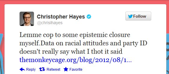
About two weeks ago, Chris Hayes said, “It is undeniably the case that racist Americans are almost entirely in one political coalition and not the other.”

The case, it turns out, is very deniable.  Alex Tabarrok at Marginal Revolution denied it with data from the 2002 and 2008 General Social Survey (GSS).  He looked at three questions…

  • Favor laws against interracial marriage
  • Would vote for a Black for president
  • Blacks should not be pushy

…and concludes:

It is undeniable that some Americans are racist but racists split about evenly across the parties.

Hayes then tweeted a retraction.

End of story?

To begin with, the sample sizes Tabarrok uses are small.  In the 2002 GSS, only 87 respondents went on record against interracial marriage, and in 2008, only 80 said they wouldn’t vote for a Black for president.  (All the tables and graphs presented here and in Tabarrok’s post are based on Whites only.)

Only about 5% of the sample takes the racist response to these items.  But I would run the table differently.  Instead of asking what percent of each party is racist, I would ask where do those few racists go.

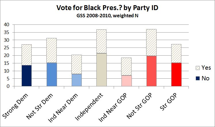
The differences are small, but the edge goes to the Republicans.

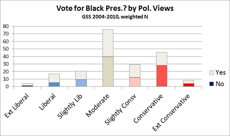
Second, there is a difference between party identification and political ideology.  If you ask not about party but about political views, the differences become sharper.

The GSS has other questions that might stand as a proxy for racism.  For example:

On the average (negroes/blacks/African-Americans) have worse jobs, income, and housing than white people. Do you think these differences are because most (negroes/blacks/African-Americans) just don’t have the motivation or willpower to pull themselves up out of poverty?

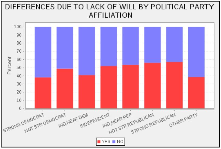
Again, the differences are small, with White Republicans slightly more likely (50% vs. 45%) to say Blacks’ economic problems are caused by lack of motivation and will power.  And again, the differences are larger when the independent variable is political ideology rather than party identification.

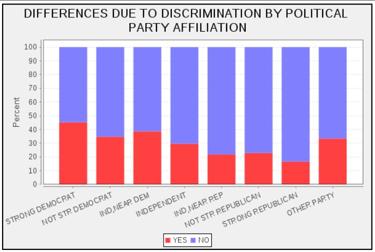
In that same GSS question about the cause of Black economic troubles, another choice is:

Do you think these differences are mainly due to discrimination?

The differences for both Party ID and Political views are clear.  White Democrats and liberals are much more likely to see discrimination as a major cause.

But is this racist?  Not necessarily.  It might well be part of a general view of the causes of human behavior, one that emphasizes personal factors (ability, motivation, etc.) and downplays structural forces the individual has little power over (discrimination).   Conservatives might use that same  explanation for unemployment and low income among Whites as well.  But I do not know of any GSS questions about the causes of White economic problems.  (Perhaps these exist, but I am not a GSS expert.)

We do know that racists (those who say they would not vote for a Black president) are more likely to take the conservative position on the “Willpower” explanation (76% vs. 50%) and on the Discrimination explanation (78% vs. 64%) compared with those who say yes, they would vote for a Black president.  But that does not mean that the other conservatives who agree with them and who deny that racial discrimination affects the lives of Black people are also racists. People can come to the same position from different places.  But people can also hide their racism behind seemingly non-racial issues.  In the 1960s ,70s, and 80s, many observers thought that the Republicans were using first school busing and then crime as a proxy for race, as Republican strategist Lee Atwater famously explained.  And some observers today (Tom Edsall, for example) argue that the Republicans are using welfare in the same way this time around.

Other bloggers have written about the questions Hayes raised — Tabarrok has links to three of these.  The most interesting I’ve come across is Will Wilkinson’s (here).  His original views apparently were individual-centered and much in line with Margaret Thatcher’s dictum that “there is no such thing as society.”  But that was “when I was a Rand-toting libertarian lad.”

He has now come to see that individuals, with their ideas and attitudes and “non-coercive” behavior, can add up to something greater than the sum of its parts, i.e, society.  But he got to this idea by walking down the left fork of the libertarian road – the road not to serfdom but to sociology.

Eventually I realised that actions that are individually non-coercive can add up to stable patterns of behaviour that are systematically or structurally coercive, depriving some individuals of their rightful liberty. In fact, rights-violating structures or patterns of behaviour are excellent examples of Hayekian spontaneous orders—of phenomena that are the product of human action, but not of human design.

Originally posted at YouGov.

Race has recently taken center stage in the presidential campaign.  From Joe Biden’s suggestion that a Romney-Ryan presidency would re-enslave African-Americans, to some liberal commentators’ contentions that the Romney campaign is using racial code words like “welfare” and “anger” to mobilize anti-black sentiments against President Obama, charges and counter-charges of playing the race card now abound.

Part of this racialized turn in the campaign involves Romney’s welfare ad earlier this month—an ad that questionably accused Obama of ending welfare for work requirements.  While that charge may seem race-neutral, there is a long-standing and strong association in white Americans’ minds between welfare and “undeserving” African-Americans (see here and here).  According to Jonathan Chait, then, “the political punch of this messaging derives from the fact that white middle-class Americans understand messages about redistribution from the hard-working middle-class to the lazy underclass in highly racialized terms.”  An extensive body of social science research described as racial priming seems to support Chait’s contention.  That research shows that such code words as “welfare” and “inner-city,” especially when combined with racial imagery (e.g., the hardworking whites in Romney’s ad), can make racial attitudes a more central determinant of political evaluations (see: 12345).  One might therefore expect the welfare ad to activate racial attitudes in public opinion.

We can test that expectation thanks to some unique experimental data collected last week by YouGov.  The survey randomly assigned half of its 1,000 respondents to view the Romney welfare ad (see above) while the remaining half of the sample did not see the ad.  Respondents then answered a series of questions to discern whether and how the ad affected their opinions.  Unfortunately, these follow-up questions did not include vote choice or candidate favorability, which were asked earlier in the survey.  We did, however, ask respondents how well Mitt Romney and Barack Obama’s policies would benefit the following groups in society: the poor, the middle class, the wealthy, African-Americans and white Americans.  Answers were then recoded to range from 0 (“hurt them a great deal”) to 100 (“help them a great deal”).

The welfare ad did not appear to affect people’s overall answers to those questions.  However, it did make attitudes toward blacks a stronger predictor of respondents’ views about the consequences of Romney’s policies for the poor, the middle class, and African-Americans.  To measure attitudes toward blacks, we use a scale called “racial resentment” in the scholarly literature.  For respondents to this survey, we actually assessed racial resentment much earlier, when these respondents were first interviewed in a December 2011 survey.  The four questions that make up this measure are here.

The figure below shows that there was almost no relationship between racial resentment and the opinions of people who did not see the ad.  But among those who saw it, racial resentment affected whether people thought Romney will help the poor, the middle class, and African-Americans.  Moreover, seeing the ad did not activate other attitudes, such as party or ideological self-identification.  It only primed racial resentment:

(Note: Predicted values were calculated from OLS coefficients by setting partisanship, ideology, and race to their sample means.  Source: YouGov Survey, August 2012)

At the same time, the ad failed to “racialize” views of whether Romney’s policies would benefit whites and the wealthy.  This likely stems from the fact that Romney favorability ratings are strongly related to thinking his policies will help the poor, the middle class, and blacks, but only weakly related to believing he’d help whites and the wealthy.

Interestingly, the ad did not appear to further racialize the perceived consequences of Obama’s policies, either.  This is probably because racial attitudes are already linked to Obama, and a single political ad isn’t enough to significantly strengthen an already strong relationship.

Nevertheless, the results from our experiment suggest that ads like the one in this post may well contribute to the growing polarization of public opinion by racial attitudes beyond the voting booth in the age of Obama.

[I thank Brendan Nyhan for suggesting a study of this topic, and John Sides and Lynn Vavreck for help in designing the survey questions.]

—————

Michael Tesler is Assistant Professor of Political Science at Brown University and co-author of Obama’s Race:The 2008 Election and the Dream of a Post-Racial America.

The Washington Post and the Kaiser Family Foundation released the results of a survey of 3,130 adults about their position on same-sex marriage. The survey found that just over half of all adults and registered voters thought same-sex couples should be able to get married:

Unsurprisingly, this varies greatly by political affiliation, with Democrats and Republicans mirroring each other — 2/3rds of Democrats support same-sex marriages, while the same proportion of Republicans oppose it. Well over half of Independents also agree that same-sex marriage should be legal:

You can also see the results by party clusters — that is, different groups within the parties (the Post unfortunately doesn’t describe the clusters). Urban liberals were most supportive (93%), while those identifying with the Tea Party were least (6%):

These numbers tell us a lot about why the Democratic party appears to be on the verge of adopting a platform that explicitly includes marital equality as a goal. This position is unlikely to alienate many people within the party or Independents who might lean Democratic, since only a small minority of both groups “strongly” oppose same-sex marriage. We’re at a point where a major political party can make the calculation that openly stating they support allowing gay and lesbian couples to get married helps its political chances more than it potentially hurts them.

Via the New Civil Rights Movement.

Cross-posted at Reports from the Economic Front.

It’s election season and Republicans and Democrats are working hard to demonstrate that they support dramatically different policies for rejuvenating the economy.

While the Democratic Party’s call for more government spending makes far more sense than the Republican Party’s call for cuts in government spending (see below), the resulting back and forth hides the far more serious reality that our existing economic system no longer appears capable of supporting meaningful social progress for the great majority of Americans.

The chart below helps to highlight our economy’s worsening stagnation tendencies.  Each point shows the 10 year annual average rate of growth and the chart reveals a decade long growth trend that is moving sharply downward.

As David Leonhardt explains:

The economy’s recent struggles arguably began in late 2001, when a relatively mild recession ended and a new expansion began. The problem with this new recovery was that it wasn’t especially strong. From the fourth quarter of 2001 through the fourth quarter of 2007 (when the financial crisis began), the economy grew at an average annual rate of only 2.7 percent. By comparison, the average annual growth rate of both the 1990s and 1980s expansions exceeded 3.5 percent.

This mediocre expansion was followed by the severe recession and weak recovery brought on by the financial crisis. The combined result is that, in recent years, the economy has posted its slowest 10-year average growth rates since the Commerce Department began keeping statistics in 1947.

In fact, the economic growth figures for the period 1995 to 2007 were artificially propped up by a series of bubbles, first stock and then housing.  Once those bubbles popped, average growth rates began steadily falling.

The weakness (and unbalanced nature) of our current weak recovery is well captured in the following chart from Catherine Rampell, which compares the percent change in various indicators in the current recovery (which began in June 2009) with previous post-war recoveries.  The first point to stress is that the current recovery lags the average in all indicators but one: corporate profits.  The second is that government spending has actually been falling during the current recovery, no doubt one reason that the percent increase in so many indictors remains below the average in previous recoveries; the public sector is actually smaller today than it was three years ago.

The relative strength in the performance of corporate profits helps to explain why the two established political parties feel no real pressure to focus on our long term economic problems; corporations just don’t find the current situation problematic despite the economy’s weak overall economic performance.

Even more telling of the growing class divide is the explosion in income inequality over the last thirty years, which is illustrated in the following chart.

In other words, while corporations have succeeded in raising profits at the expense of wages, those in the top income brackets have been even more successful in raising their income at the expense of almost everyone else.  Notice, for example, that median household income in 2010 is roughly where it was in the late 1980s while the median income of the top households racked up impressive gains. Thus, the very wealthy have every reason to do what they are currently doing, which is using their wealth to ensure that candidates restrict their economic proposals to reforms that will do little to change the existing system.

The takeaway: without a mass movement demanding change, election debates are unlikely to seriously address our steady national economic decline.

Last month the president of fast-food chain Chik-fil-A publicly stated that the company opposed same-sex marriage. The restaurant then became a flash point in the struggle around who has the right to get married. Supporters of marriage equality called for boycotts, but opponents of same-sex marriage participated in Chik-fil-A, organized by Republican former governor of Arkansas (and Fox News commentator) Mike Huckabee. Huge numbers of people turned out to patronize the store last Wednesday, leading to enormous lines and long waits at some locations, and intense media coverage of the event.

So Chik-fil-A became clearly associated with the anti-same-sex marriage camp, and more generally with the conservative movement. But what about other restaurants?

Reader Peter N., of Pitzer College, sent in an image posted by the Los Angeles Times showing the politics and political engagement of patrons of a number of restaurants, as well as Whole Foods. A market research firm’s survey asked respondents if they had gone to any of these restaurants in the past 30 days (7 for Whole Foods), political leanings, and likelihood of voting. In this graph, the larger the bubble, the more respondents said they had gone to the restaurant. Those left of the center line had a disproportionate number of Democratic customers, while those to the right attracted Republicans. The higher the bubble on the graph, the more likely its customers were to vote:

Aside from the political patterns, notice the differences in likelihood of voting. Generally, customers at sit-down restaurants like P.F. Chang’s and Macaroni Grill were more likely to vote than those at fast-food places, though there are a few exceptions (Denny’s, Hooters). This probably reflects class differences in voting: the restaurants in the upper half of the graph are generally more expensive than the fast-food places or chains like Denny’s, and they require more leisure time for a meal compared to getting a pre-made, or quickly-made, combo at the drive-through. Those with the money and time to spend on such restaurants are the same groups who are more likely to vote in general.

If you pay much attention to politics in the U.S., especially during this presidential election year, you’ve probably heard someone assert that politics is getting more polarized — that is, that there is less consensus and fewer people in the middle, making it more difficult to agree on policies or get anything done. But is it true?

A recent Pew poll sent to us by Katrin indicates that it is. The Pew Research Center has tracked responses about 48 political values for over 25 years now. Over time, the percentage-point gap between Democrats and Republicans has nearly doubled:

Which issues do Republicans and Democrats most disagree about? Providing a social safety net, environmental protection, the role of labor unions, the role of government in ensuring equal opportunity, and the overall scope of government had particularly large gaps, and all have grown substantially since 1987:

Political scientists Keith Poole and Howard Rosenthal looked at polarization among federal legislators from the late 1800s through 2011. If we look at party means for members of the House, we see that after a decrease in polarization mid-century, the gap has increased again since the 1980s. Though Democrats have become somewhat more liberal, the change is is largely due to Republicans in the House becoming more conservative on average:

The Senate:

David Roberts posted about the trend at Grist. The changes we’re seeing in the Pew data, he argues, are not due to big value changes among the electorate. Instead, we see that people are sorting themselves politically in a more consistent fashion. The parties used to contain coalitions that united liberal and conservative voting blocs, but both parties are becoming more ideologically consistent.

There are Blue Dog Democrats, who are more conservative than the party overall, and some moderate Republicans who are fairly liberal on social issues. However, there is less and less room for these individuals. Those seeking elected office find it difficult to win primaries within their parties. Citizens increasingly associate conservatism with Republicans and liberalism with Democrats, and choose their party affiliation accordingly. Thus, without any great change in the actual values of Americans, we get a more starkly politically divided nation and federal legislature.

Cross-posted at Reports from the Economic Front.

The Supreme Court has ruled favorably on the legality of the Affordable Care Act.  Actually, despite its name, the Act has more to do with extending and attempting to improve private health insurance coverage than it does with improving care or reducing its cost.

Unfortunately for us, the effort to improve our health care system has remained within bounds set by the needs of private health care providers and insurers.  As President Obama made clear from the start of his push for health care reform, there would be no consideration of a universal system.

Critics of such a universal system are always quick to argue that only market forces driven by the private pursuit of profit can ensure an efficient health care system.  Of course, in determining whether this is true, we need to recognize that efficiency is a complex term and that our health care system, like all systems, produces multiple outcomes.  The most obvious ones are private profit as well as the quality and cost of the relevant health care.

In terms of private profit there can be no doubt that our health care system functions well.  However, the story is quite different if we evaluate it in terms of quality and cost.  The fact that we continue to embrace a private health care system makes clear which measures of efficiency are considered most important and by whom.

The following map shows the countries, colored green, that have adopted a universal health care system.

mf-healthcaremap-p-thumb-615x314-91612.jpg

As Max Fisher explains:

What’s astonishing is how cleanly the green and grey separate the developed nations from the developing, almost categorically. Nearly the entire developed world is colored, from Europe to the Asian powerhouses to South America’s southern cone to the Anglophone states of Australia, New Zealand, and Canada. The only developed outliers are a few still-troubled Balkan states, the Soviet-style autocracy of Belarus, and the U.S. of A., the richest nation in the world.

The handful of developing countries that provide universal access to health care include oil-rich Saudi Arabia and Oman, Latin success story Costa Rica, Kyrgyzstan, and, famously, Cuba, among a few others. A number of countries have attempted universal health care but failed, such as South Africa, which maintains a notoriously inefficient and troubled public plan to complement the private plans popular among middle- and upper-class citizens…

That brings us to another way that America is a big outlier on health care. The grey countries on this map tend to spend significantly less per capita on health care than do the green countries — except for the U.S., where the government spends way more on health care per person than do most countries with free, universal health care. This is also true of health care costs as a share of national GDP — in other words, how much of a country’s money goes into health care.

The OECD just published a major study on the health care systems of its 34 member nations.  It found that:

 Health spending accounted for 17.6% of GDP in the United States in 2010, down slightly from 2009 (17.7%) and by far the highest share in the OECD, and a full eight percentage points higher than the OECD average of 9.5%. Following the United States were the Netherlands (at 12.0% of GDP), and France and Germany (both at 11.6% of GDP).

The United States spent 8,233 USD on health per capita in 2010, two-and-a-half times more than the OECD average of 3,268 USD (adjusted for purchasing power parity). Following the United States were Norway and Switzerland which spent over 5,250 USD per capita. Americans spent more than twice as much as relatively rich European countries such as France, Sweden and the United Kingdom.

combined1.jpg
What does all of this mean in terms of health outcomes?  According to the OECD report:

Most OECD countries have enjoyed large gains in life expectancy over the past decades. In the United States, life expectancy at birth increased by almost 9 years between 1960 and 2010, but this is less than the increase of over 15 years in Japan and over 11 years on average in OECD countries. As a result, while life expectancy in the United States used to be 1½ year above the OECD average in 1960, it is now, at 78.7 years in 2010, more than one year below the average of 79.8 years. Japan, Switzerland, Italy and Spain are the OECD countries with the highest life expectancy, exceeding 82 years.

One possible explanation for this lagging performance, highlighted in an earlier OECD report, is that the U.S. ranked 26th in terms of the number of practicing physicians relative to its population, 29th in terms of the number of doctor consultations per capita, 29th in terms of the number of hospital beds per capita, and 29th in terms of the average length of hospital stay.  At the same time, the “U.S. health system does do a lot of interventions… it has a lot of expensive diagnostic equipment, which it uses a lot. And it does a lot of elective surgery — the sort of activities where it is not always clear cut about whether a particular intervention is necessary or not.”

Private health care providers and insurers are clear about how they measure health care efficiency.  And as long as we rely on them to set the terms of the debate we will continue to suffer the consequences.

Cross-posted at Montclair SocioBlog.

What’s familiar isn’t so bad, even if it’s bad.

One of the things I remember from my days in the crim biz is that people’s perceptions of crime don’t have a lot to do with actual crime rates.  This was back in the high-crime decades, and people were more afraid of crime than they are now.  But people felt safer in their own neighborhoods than in other neighborhoods, even when their own neighborhoods had a higher crime rate.

These were the days when I would give someone directions to my building — “Get off the IRT* at 72nd St…” — and they would often ask, “Is it safe?”

“Of course it’s safe.  It’s my neighborhood,” I would say, “I live here. I ought to know.”   Yet when I would go to a party in the East 20s or, God forbid, Brooklyn, I would emerge from the subway and follow the directions with a certain sense of apprehension and caution.

Apparently, the same link between far and fear holds true for people’s perceptions of economic well-being.  A recent Gallup poll asked people how the economy was in places ranging from their own city or area to the world generally.  The closer to home, the better the economy.  The farther from home, the lower the percent of people rating economic conditions as excellent or good.And the farther from home, the higher the percent of people rating economic conditions as “only fair” or poor.Republicans were the most pessimistic about the economy, regardless of location.  Democrats were the most sanguine, with Independents in between. The graph shows the percent who rated the economy positively minus the percent who rated it Poor.This obviously has nothing to do with familiarity but with contempt.  Apparently, for Republicans, a Democrat – especially a Kenyan socialist Democrat – in the White House means that the economy must be bad everywhere.

* These old subway line designations – IRT, BMT, IND – are no longer in official use.  But when did the MTA jettison them?  If you know the answer, please tell me.

———————

UPDATE, June 22 Andrew Gelman has formatted the data as line graphs, making the comparisons and trends clearer.  He has also added his own observations – things I wish I had known or thought of.