nation: United Kingdom

1
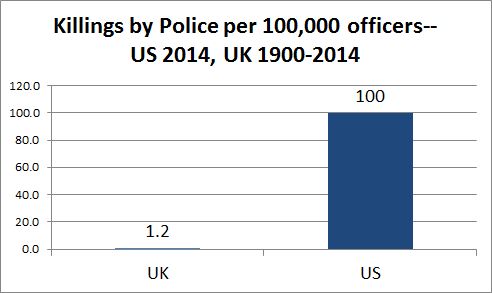
Just after the United Kingdom voted to leave the European Union, a commentator at the lauded US News and World Report claimed that the “general consensus” was that the vote was a “veritable dumpster fire.” Since then, most citizens of the EU, many Americans, and lots of UK citizens, including many who voted to leave, seem to think that this was a terrible decision, sending the UK into treacherous political and economic territory.

The Prime Minister agreed to step down and, rather quickly, two women rose to the top of the replacement pool. Yesterday Theresa May was the lone contender left standing and today she was sworn in.

.

Is it a coincidence that a woman is about to step into the top leadership position after the Brexit?

Research suggests that it’s not. In contexts as wide-ranging as the funeral business, music festivals, political elections, the military, and law firms, studies have found a tendency for women to be promoted in times of crisis. As a result, women are given jobs that have a higher risk of failure — like, for example, cleaning up a dumpster fire.  It’s called the “glass cliff,” an invisible hazard that harms women’s likelihood of success. One study found that, because of this phenomenon, the average tenure of a female CEO is only about 60% as long as that of the average male CEO.

As one Democratic National Committee chair once said: “The only time to run a woman is when things look so bad that your only chance is to do something dramatic.” Maybe doing “something dramatic” is why so many women are promoted during times of crisis, but the evidence suggests that another reason is because men protect other men from having to take precarious positions. This was the experience of one female Marine Corps officer:

It’s the good old boys network. The guys helping each other out and we don’t have the women helping each other out because there are not enough of us around. The good old boys network put the guys they want to get promoted in certain jobs to make them stand out, look good.

If women are disproportionately promoted during times of crisis, then they will fail more often than their male counterparts. And they do. It will be interesting to watch whether May can clean up this dumpster fire and, if she can’t, what her legacy will be.

Lisa Wade, PhD is an Associate Professor at Tulane University. She is the author of American Hookup, a book about college sexual culture; a textbook about gender; and a forthcoming introductory text: Terrible Magnificent Sociology. You can follow her on Twitter and Instagram.

Ah, capitalism.

The thing about our time is that we just might value individuality more than at any other point in the history of human life and, yet, at the same time, we have more capacity to mass produce goods and ideas than ever.

Enter: the marketing of mass-produced individuality. That is, the new Sex Pistols-themed Mastercard. Now available at virginmoney.com/virgin/credit-cards/rebellion.

Now that is a URL of the times.

Their slogan? “Bring a bit of rebellion to your wallet.”

2

I know almost nothing about punk music but I know that the Sex Pistols were foundational and that the message of the music was anti-establishment. So, the appearance of the band on credit cards with an APR of 18.9% is, sociologically speaking, hilarious.

Hey, maybe you can buy a replica of a famous punk musician’s guitar with it! It comes pre-stressed, so it totally looks like you play it a lot and probably treat it like shit because who the fuck cares. And it also comes with some stickers that look vaguely anarchical and you can make it your own depending on which stickers you choose and where you put them!

3 4

Sociologist Brady Potts wrote a post about this guitar a few years ago. He asked: “What can we unpack from this guitar?” And wrote:

Pretty much the history of modernity. You start with “the guitar” – an instrument traditionally produced by artisans called luthiers. But this particular style of guitar – the Fender Telecaster – is the first commercially successful mass-produced solidbody electric guitar. (Henry Ford:Driving::Leo Fender:Rocking.) Introduced in 1950 as the Esquire… assembled on a factory line from mass-produced interchangeable parts, sold in stores and catalogs, heard most often via media and broadcast for most music consumers, the 1966 Fender Telecaster is truly a Modern guitar.

And now you can buy it with a Sex Pistols credit card. Nope, looks like they’re sold out. Sorry, you’ll just have to buy your identity somewhere else.

Thanks to @NotDrSnit for the tip!

Lisa Wade, PhD is an Associate Professor at Tulane University. She is the author of American Hookup, a book about college sexual culture; a textbook about gender; and a forthcoming introductory text: Terrible Magnificent Sociology. You can follow her on Twitter and Instagram.

This story from Daily Kos has been quickly circling through the left portion of the Internet. The headline reads:

American police killed more people in March (111) than the entire U.K. police have killed since 1900.

Let’s assume that the numbers are accurate.*

The author, Shaun King, writes:

Don’t bother adjusting for population differences, or poverty, or mental illness, or anything else. The sheer fact that American police kill TWICE as many people per month as police have killed in the modern history of the United Kingdom is sick, preposterous, and alarming.

But let’s bother adjusting, anyway.

The U.S. has a much larger population, and it has more police officers:2

…but even adjusting for that, the U.S. killings by cops dwarf the U.K. figure.**12

Adjusting for the number of cops, U.S. cops killed 8 times as many people in a single year as U.K. cops did in 115 years. But before we conclude that U.S. law enforcement is “sick and preposterous” and dominated by homicidal racists, we might look at the other side – the number of cops who get killed. The entire U.K. police force since 1900 has had 249 deaths in the line of duty. The U.S. tally eclipses that in a couple of years.14

In this century, 25 U.K. officers died in the line of duty. The figure for the U.S., 2445, is nearly one hundred times that. Adjusting for numbers of officers, U.S. deaths are still ten times higher.

My guess is that what accounts for much of the U.K./U.S. difference is guns. Most British cops don’t carry guns. Last August, I posted a video of a berserk man wildly swinging a machete in a London street (here – it’s gotten over 25,000 page views ). The police come, armed only with protective shields and truncheons. Eventually, they are able to subdue the man. In the U.S., it’s almost certain that the police would have shot the man, and it would have been completely justifiable. More cops with guns, more cops killing people.

But more civilians with guns, more cops getting killed. Since 2000, six U.K. cops have died from gunshots; in the U.S., 788.  We have 11 times as many cops, but 130 times as many killed by guns. (The other two leading causes of police deaths are heart attacks and car accidents.)777

(I did not include the yearly data for the UK since it would not have been visible on the graph. In most years, total cop deaths there ranged between 0 and 2.)

Thanks to the ceaseless efforts of gun manufacturers and their minions in legislatures and in the NRA and elsewhere, U.S. cops work in a gun-rich environment. They feel, probably correctly, that they need to carry guns. If that man in London had been wielding an AR-15 (easily available in many states in the U.S. – in the U.K., not so much, not at all in fact), the cops could not have responded as they did. They would have needed guns. There would probably have been some dead civilians, perhaps some dead cops, and almost certainly, a dead berserker.

Cross-posted at Montclair SocioBlog.

—————-

* We don’t have a good source of data on how many people the police kill. An unofficial source since 2013 is KilledByPolice.net.

** The denominator for the U.K. – the number of police officers over the last 115 years  – is my own very rough estimate.

Jay Livingston is the chair of the Sociology Department at Montclair State University. You can follow him at Montclair SocioBlog or on Twitter.

On average, U.S. workers with jobs put in more hours per year  than workers in most OECD countries. In 2012, only Greece, Hungary, Israel, Korea, and Turkey recorded a longer work year per employed person.

2

A long work year is nothing to celebrate. The following chart, from the same Economist article, shows there is a strong negative correlation between yearly hours worked and hourly productivity.

3.5

More importantly, the greater the number of hours worked per year, the greater the likelihood of premature death and poor quality of life.  This reality is highlighted in the following two charts taken from an article by Angus Chen titled “8 Charts to Show Your Boss to Prove That You Can Do More By Working Less.”

1 (2) - Copy

1 (2)

In sum, we need to pay far more attention to the organization and distribution of work, not to mention its remuneration and purpose, than we currently do.

Martin Hart-Landsberg is a professor of economics at Lewis and Clark College. You can follow him at Reports from the Economic Front.

Over at The Global Sociology Blog, SocProf put up some interesting visuals about social mobility, the likelihood that you have a significantly different economic status than your father.  Social mobility is important because it measures the degree to which a society has a caste system (in which you are restricted to the class you are born into, by whatever means) or one that gives people equal opportunities to ascend or descend the class hierarchy according to their hard work and talent.

Compared to similar countries, the U.S. has low social mobility (though most Americans think the opposite), along with Italy, the U.K., Chile, and Slovenia .  Scandinavian countries, Canada, and Australia have the most (see SocProf’s data here).

SocProf, however, asked a question I’ve never seen asked before: does this mobility differ by gender?  It does.  She found that daughters are more upwardly mobile than sons.

This first graph shows the percent of sons, born to a low-earning father, who will end up the top 40% of earners (orange) or the bottom 40% (blue).  Social mobility in the U.S. is lowest among the countries featured; almost 70% of American sons of low-earners stay in the bottom 40%.

The second graph is the same data for daughters.  Mobility for daughters is higher in all countries, but it is especially so in the U.S.  While 70% of sons stay in the bottom 40%, we can say the same for less than half of daughters.

Reflecting on the fact that the difference between daughters and sons was higher in the U.S. than in the comparison countries, SocProf suggests that “[g]reater mobility seems to go together with greater gender equality” in mobility.

See also this interactive graph mapping social mobility where you can see how you compare to the rest of the U.S.

Lisa Wade, PhD is an Associate Professor at Tulane University. She is the author of American Hookup, a book about college sexual culture; a textbook about gender; and a forthcoming introductory text: Terrible Magnificent Sociology. You can follow her on Twitter and Instagram.

Cross-posted at Reports from the Economic Front.

There is big trouble brewing in Europe.  John Ross, in his blog Key Trends in the World Economy, highlights this brewing crisis in a series of charts, some of which I repost below.

This first chart shows the extent of the recovery from the recent economic crisis in the U.S., the EU, and Japan.  While the U.S. GDP has finally regained its past business cycle peak, the same cannot be said for Europe (or Japan).  As of the 3rd quarter 2011, EU GDP was still 1.7% below its previous business cycle peak.  The Eurozone was 1.9% below.

Recent GDP estimates for the 4th quarter show European GDP once again contracting, which strongly suggests that the region is headed back into recession without having regained its previous business cycle peak.  This development implies that Europe faces serious stagnationist pressures.

gdp1.jpg

This chart looks at the growth record for the 5 largest European economies.  Germany has regained its previous GDP peak.  France is making progress toward that end.  These two countries account for 36.2% of European GDP.  However, things are quite different for the UK, Italy, and Spain.  These three countries account for 34.7% of European GDP and not only do they each remain far below their respective previous GDP peaks, their economies are once again heading downward.

gdp2.jpg

The third chart highlights the economic performance of the three countries which have received the most media attention because of fears that their governments will be unable to repay their respective debts.  They are clearly in trouble, adding to the downward pressure on European GDP.  However, despite all the attention paid to them, their combined economies are only one-eighth the size of the combined economies of the UK, Italy and Spain.

gdp3.jpg

The next two charts highlight the fact that economic trends are also dire throughout much of Eastern Europe.

gdp4.jpg

gdp5.jpg

The take-away is that European economic problems are not limited to a few smaller countries.  Some of the largest are also performing poorly and apparently headed back into recession without ever having regained their past business cycle peaks.  It is hard to see Europe escaping recession.  And it is hard to see the U.S., Asia, and Africa escaping the consequences.