gender

The Home Made Simple Squad is a new ad campaign for Proctor & Gamble cleaning products. Five women make up the Squad. From Lori’s bio:

‘I love to entertain in my home, and when people come over, I want them to walk in and immediately feel welcome and comfortable. So I make sure my house is always looking good and smelling fresh.’ Lori, 37, prides herself on her clean and well-organized home that’s always ‘company-ready’. Lori is disciplined about more than just caring for her home – she’s also recently lost 95 lbs, and keeps fit with a regimen of healthy eating, power walking and yoga.

So not only is she a good housekeeper, she keeps herself fit and trim, too!

Although all of the bios mention that the women have children and are busy, not a single one mentions a husband, partner, or other adult who might have some role in keeping a house clean. Or, for that matter, making the kids clean up after themselves.

Thanks to an anonymous commenter on another post for bringing my attention to this one!

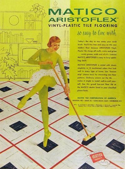
NEW! This vintage ad relates sweeping the floor to dancing… because cleaning vinyl-plastic tile flooring, unlike cleaning other kinds of floors, is a kick!
6a00d83451ccbc69e2011570fdce1f970c-400wi

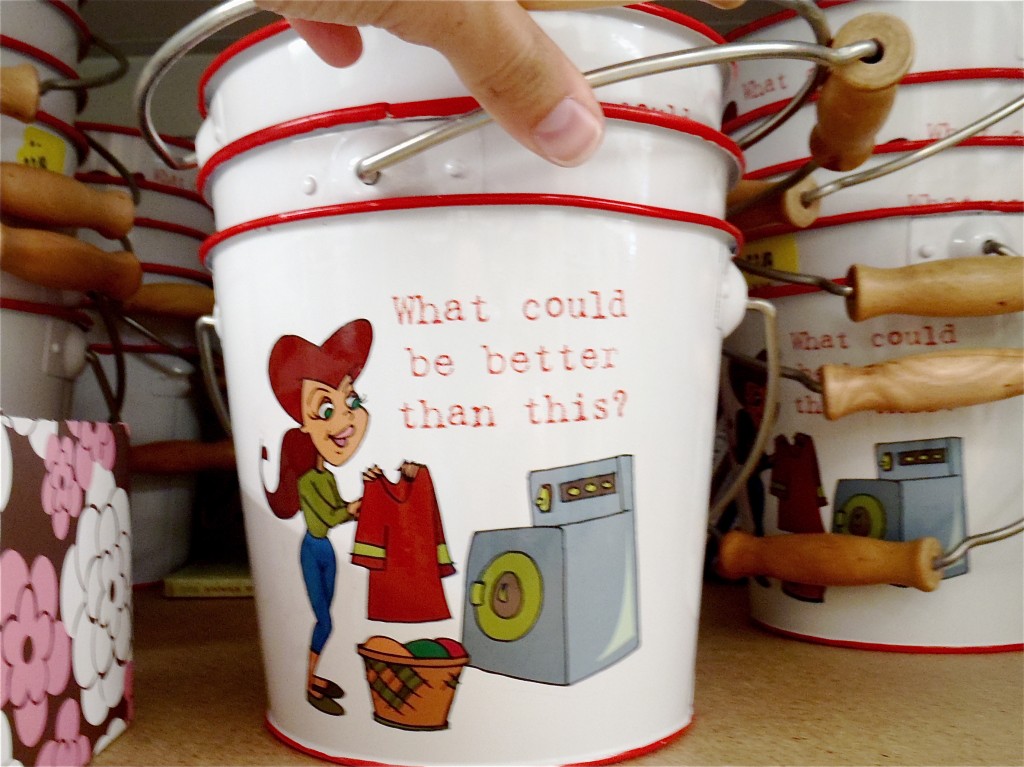
An Anonymous Reader sent another example of the message that women absolutely love cleaning!  The bucket reads, “What could be better than this?”  I suppose it could be tongue-in-cheek, but I’m not getting that vibe.

Gwen Sharp is an associate professor of sociology at Nevada State College. You can follow her on Twitter at @gwensharpnv.

Here is an image for the website from Just for Men’s Touch of Gray line:


This product covers most, but not all, of a man’s gray hair. From the website:

Why use Touch of Gray? A little gray to show your experience, but not so much
that it hides your vitality.

There are a range of shades available and you can control how much gray is hidden.

The website has a total of four images of men with women. As Vanessa V., who sent this one in, pointed out, none of the women have a “touch of gray.” Nor could she imagine a product like this marketed to women.

Here is another example of an ad that gives men permission to age in a way women never are.

Other men’s hair dye posts: here, here, and here.

Thanks, Vanessa!

NEW: Corey O. found a Just for Men commercial that references Woodstock (sadly, I can’t find a video of it). Corey says,

It has everything you could want in an advertisement: classic rock soundtrack, co-opted counterculture, mixed messages about aging, demonstrations of male virility, minorities on the margins, gender disparity, and attempts to sell a “natural” look. The total package. What really got to me, though, was the gender aspect. Can you imagine a line of hair dye marketed toward women which is meant to leave some grey intact? I don’t think that Just for Men can either — in contrast to the silver-streaked men, none of the women in the ad are sporting a natural look and some look like they’ve had rather recent visits from the botox fairy. This ad is a nice way of illustrating the double-standard that women face in regards to aging: while men can benefit from grey hair as an illustration of their maturity without sacrificing their virility, women must always strive to look as young as possible. Because this is an ad for men’s hair dye, however, it also illustrates that while men may benefit from less scrutiny of their appearance than women, their appearance is also satisfactory only with the use of beauty aids.

I also like the appropriation of Woodstock and the counter-culture movement of the ’60s.

Thanks, Corey!

Gwen Sharp is an associate professor of sociology at Nevada State College. You can follow her on Twitter at @gwensharpnv.

This image demonstrates the disproportionality in the marriage market across the United States (found here). Basically, if you’re a single, heterosexual woman on the west coast or a single, heterosexual man in the New York area, you’re in luck!

NEW! This map is now available in an interactive form in which you can choose which age group to look at.  Below I’ve pasted in screen shots of my current dating pool (30-45) and what I have to look forward to (yikes!).  Click here to interact with the map yourself.

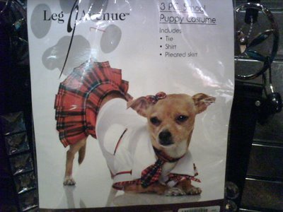
One of my students took a picture of this outfit at the mall–I believe she said it’s for sale at Spencer’s. For the sexy Catholic (?) school-dog of your dreams!

Thanks, Blanca M.!


I found these two Miller Lite ads in QVegas, a magazine aimed at the GLBT community.

It would be interesting to pair with these ads for Skyy vodka to illustrate how companies make different ads to target different audiences. If you find an ad offensive or dumb, it’s not necessarily an ineffective ad, it’s that you probably aren’t the target consumer and it’s not supposed to appeal to you.

NEW! Philip D. sent in a link to a post by Sister Toldja at Me, Myself An Eye about slightly different versions of ads for Crown Royal. This one is presumably aimed at a general audience:

cr

Text: “Have you ever seen a grown man cry?”

Sister Toldja suspects that this one is targeted more specifically at African Americans:

crb

Text: “Oh, hell no.”

Now, just to be clear, I’m not arguing these are racist ads. I just think they would provide a good example to start students thinking about the fact that a) advertisers actively market to various groups by trying to appeal to them in specific ways that may differ from an ad made for a “mainstream” or “general” audience (i.e., one that would presumably appeal to just about everybody) and b) they do this by playing on stereotypes or cultural assumptions about what different groups like (or are like). What separates these two ads into “mainstream” and “Black” ones? Simply the presence of a phrase that many people associate with African Americans (although I have to admit I mostly associate it with one of my male cousins more than anyone else). You might start with this example, which is fairly innocuous, I think, and then start asking students to think about other ways advertisers might indicate who an ad is supposed to appeal to (men or women, gay or straight, or more broadly to “everyone”). When do these efforts become problematic?

The first time I saw this, I was suspicious that it might be a hoax. But it turns out it’s real (at least Snopes says so).

Thanks, Orla H.!

Here’s a strange Australian ad for U, a feminine hygiene product. It shows women hanging out with beavers…the animal type, of course. Men look on approvingly, so I guess the message is if you take appropriate care of your girly bits, men will like you.

Here’s the website.

Might be good for a discussion of hygiene and women’s bodies or the history of feminine hygiene products and the way we think about menstruation.

Thanks, Patrick C.!

This is a tough one, but there is something about this image advertising the Metropolitan Museum of Art that just screams privilege. Is it the perfect blonde hair? The perfect white teeth? The neat upper-class masculinity? The turtleneck? I can’t quite put my finger on it!

Thanks Jason!