gender

One of my favorite things to do in class is to show students that advertisers target their images to the audience. Students are often resistant to the idea that advertisers consider every aspect of an image, or that gendered or racialized elements are used intentionally. Showing ads for the same product that are targeted at very different audiences can be a way to get students to think about the fact that marketing is very deliberate and nothing in a multi-million-dollar ad is left to chance.

I previously posted this Cadillac ad:
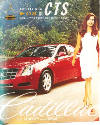

Then I found this one in QVegas, which targets the GLBT community:
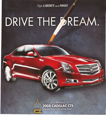

These might be useful for sparking a discussion of how advertisers alter their message based on the desired consumers, and that they know what kind of image will resonate with various demographics. And note that the second ad doesn’t have the menacing tone of the first one. Other examples: here and here.

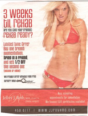
This ad reminds women that they need to get their bodies ready before Rehab–and no, not that kind of rehab; it’s a big party being put on here in Vegas. Without new boobs, you simply won’t be “ready”–i.e., attractive enough–for this event. This could be useful as a really extreme case of ads that try to make people feel inadequate and provide a solution in the form of a product or service.

And as far as I can tell, what you’re supposed to be “ready” for is to be sexually available–she’s pulling her bikini bottom down and has a seductive look on her face.

Also, notice the doctor is having a “buy one, get the second 1/2 off” special if you bring in a friend. So women should encourage each other to feel uncomfortable about their bodies.

From Las Vegas Weekly.


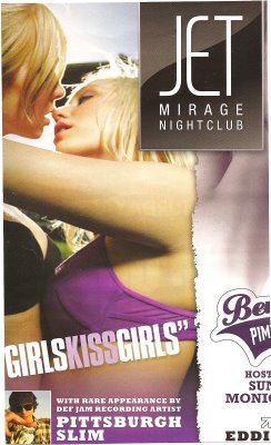
I have a feeling this ad is not meant for lesbians (the other half of the page showed a half-naked woman; both were for mainstream, non-lesbian-oriented clubs). This might be useful for discussing different attitudes toward gays and lesbians–it is difficult to imagine an ad of two men kissing aimed at straight women. In this case, women kissing is not about THEIR sexual pleasure, but about that of the audience–presumably straight men. The assumption accompanying images such as these, of course, is that the women are not actually lesbians–they’ll still be sexually available to men. This is another difference in cultural views of gays and lesbians–lesbians’ sexual orientation is often doubted (they just need to find the right man) in a way gay men’s usually isn’t.

From Las Vegas Weekly.


This clip, from the newly televised This American Life, shows what happens when (mostly) black women and (mostly) white men living in racially-segregated Chicago are brought together and the social rules of decorum are suspended. It is highly, highly disturbing. I’d love it if some social psychologists could comment on what we see happening here!

[youtube]http://www.youtube.com/watch?v=vo1LPf9mnyU[/youtube]

Thanks to Alicia T. for sending us the link!

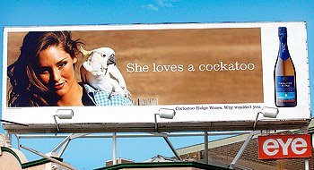
UPDATE: According to Tim at Ad Freak, the model in this photograph, ex-Miss Universe contestant Erin McNaught, was not pleased with the copy added to her image. Tim wrote:

[She said:] “I wasn’t thrilled with what that line was implying,” she says. The vineyard has stopped short of apologizing, saying it e-mailed all of the campaign’s lines to McNaught—and never heard back. McNaught says she was traveling and didn’t see the e-mails until it was too late. “You know, she is a bit of a cheeky thing,” says a Cockatoo rep. “But we certainly did not want to harm her image or ours.”

See the news story here.

Miguel in Barcelona sent us this government-sponsored poster aimed at promoting egalitarian relationships. He translates the text as:

The love has to be free
Free of machismo
Free of fights
Free of jealousy

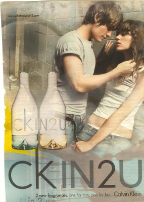
This image, as a representation of idealized egalitarian love, is a nice contrast to the representations of love common in the U.S. (and in Spain?) that make power asymmetry sexy, desirable, and constitutive of love. Consider the love affair between this apple and pear and these two images (which look more like the fruit than Miguel’s image above):

Thanks to Miguel for sending us our first image from Spain!>

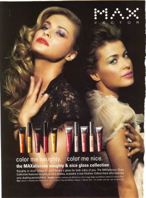
The new virgin/whore dichotomy: We should be both! But at different times, of course.

Text:

Color me naughty. Color me nice. MAXalicious naughty & nice gloss collection. Naughty or nice? Virtue or vice? Here’s a gloss for both sides of you. The MAXalicious Gloss Collection features naughty or nice shades, available in two finishes. Collect them all to express your dueling personalities.

See also this post about the virgin/whore dichotomy.

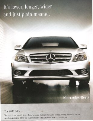
The last line says, “Then we engineered in a mean streak a mile wide.” Can you imagine such a marketing campaign for a Honda Civic or a VW Passat? This is a man’s car–it takes up more space, and it’s mean–characteristics we allow (some) men, but not women, to have.

Note: I like the commenters’ points that this intersects with class more (as well?)–see the comments. They did a better job with the analysis on this one than me.

NEW:

This ad (found here) plays up the fact that some cars are designed to look “mean,” so the Jaguar is actually afraid of the BMW:

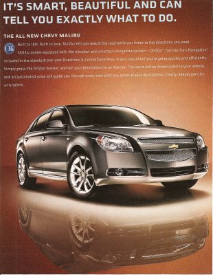
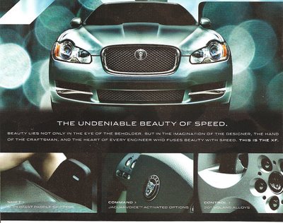
Compare the ads above to these two that link a car and beauty. The first one seems to be portraying the car as a beautiful but bossy woman (“…can tell you exactly what to do”):

It’s an interesting contrast–these three cars all look very similar, and yet one is mean/masculine and the other two are beautiful/feminine. I like to show comparisons like these in class to make it clear to students that advertisers have many different motifs and meanings to draw from when creating marketing strategies, and that the ones they pick are just that–CHOICES among many, many different ways you could advertise a product, none of which are necessarily more “obvious” or “natural” than others.