
Select text: “These well-stacked Sno-Balls have more than sex appeal… they have sales appeal!”
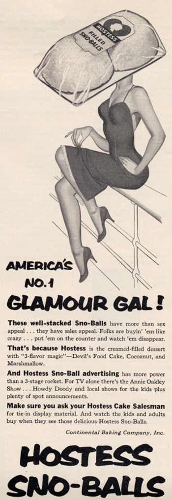
The 1960s via Found in Mom’s Basement.
More sexualization of food here, here, here, here, here, here, and especially here.
Tessa G.S. sent in a link to the online game Miss Bimbo. Here are some images from the game:
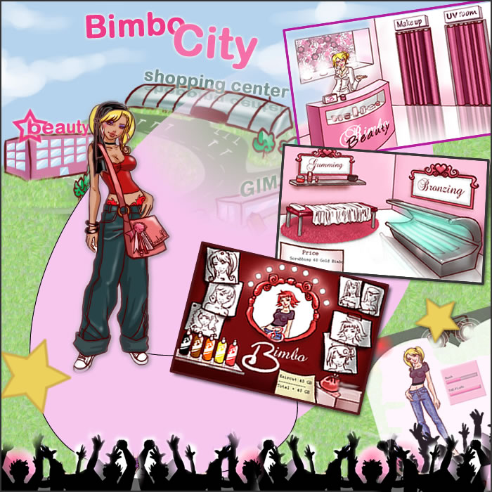


Tessa says,
In this case, you build a “bimbo” by placing your character on diets, getting plastic surgery, shopping for clothes, attending a-list parties, dating handsome men— all with the aim of becoming the most popular bimbo in the game…[According to the website] MissBimbo is an educational tool, a social meeting place and a hot pot of bimboism. It is free to enjoy bimboland.
An educational tool? Really?
According to CNN, parents have expressed concern that pre-teen girls are playing a game that encourages them to have their characters get breast implants and facelifts, as well as go on diets.
The game also reinforces the idea that girls are always rivals, whether competing for popularity or men (or the perfect wedding, as the movie “Bride Wars” shows).
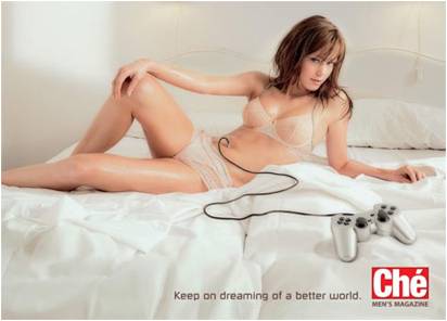
While we’re on the topic of video games (sort of), Burk M. told me about Sexy Beach 3. In the game, you get to pick a female character, what she’s wearing, which of several beach-related activities she’s involved in (playing tag, “playful floating,” limbo, etc.), the location (beach, reef, waterfall, and so on) and the time of day. And then you can take the role of a disembodied hand that rubs various parts of her body while her nipples get hard and she moans in delight and eventually appears to orgasm. Here’s an example (Not Safe for Work):
Jo B. sent us a link to Icebreaker, a New Zealand clothing company. One of their products is wool underwear. As she pointed out, there are some distinct differences in how the men’s and women’s underwear lines are depicted.
The men’s line is called beast. When you go to the site, there’s a little intro part. The following phrase shows up on the banner at the top:

As Jo says,
The overall idea seems to be that men have some kind of innate, primordial aggression (thought I’m not sure how this is supposed to relate to woollen underwear).
Indeed, socialization “cages” men’s true nature, but just barely–its hold is “frail and fragile” and, I presume, could burst forth if you aren’t really careful. I don’t quite follow how the city “brings the beast alive,” or how reconnecting with nature “balances” the beast; since the beast is supposedly men’s real nature, I think reconnecting them with nature would bring out the beast, but whatever. I’m clearly applying too stringent a level of logic. Also, for the record, if all it takes to reconnect with nature is a natural material (made from a domesticated source), then cotton, angora, and mohair would work just as well.
The women’s line is called Nature. When you go to its site there’s also an intro, but without any useful summary of what women are like to compare to the Beast.
Again from Jo:
The female models are slim, delicate, and tend to pose in a way that suggests passivity (static poses, arms held behind body…) and instability (balancing on her toes). The images in the female range focus more on being attractive, while the men’s range is about being active and aggressive.
The marketing campaign also reinforces the difference in the way we talk about men and women and their association with nature. When we connect men to nature, it’s in an aggressive, predatory sense (the beast). When women are associated with nature, it’s often in a way that implies harmony, an appreciation for the natural world, perhaps some intuitive sense that women have (or, you know, their connection to the moon and stuff because of menstrual cycles). The background is part of this; the grey background of the men’s line doesn’t look nearly as peaceful as the serene white background for the female models.
Thanks, Jo!
FYI: Jo sent an email to the company complaining and this was their response:
Hi Josephine,
Apologies for the delayed reply. I am writing on behalf of Jeremy Moon to thank you for taking the time to give us your views about Icebreaker’s marketing of its underwear lines for men (Beast) and women (Nature). We understand your concerns, and we really appreciate the level of thought you have put into sharing them with us.
Gender representations are a sensitive issue in marketing, and Icebreaker certainly had no intention of promoting negative or damaging images of men or women in our Winter 08 campaign.
In most of our collections, our marketing approaches to men and women are almost identical. We aim to make Icebreaker garments as stylish as possible, but our clothes are based on performance above all – regardless of the gender of the wearer.
In our Bodyfit, Icebreaker_GT and Superfine collections, for example, women are photographed in exactly the same way as men – pushing their physical boundaries in the outdoors. Our marketing for the garments in these core collections centre on photographs of athletic-looking women skiing, hiking and climbing mountains. None of the images are of women in a passive or decorative role: they’re of women who are confident, independent, adventurous and strong.
We chose a different approach for our underwear ranges. For obvious reasons, we couldn’t adopt our usual approach of showing women taking part in outdoor sports – clearly they wouldn’t play sport in their underwear alone. The other factor we took into consideration is that Nature and Beast, although both underwear collections, are very different ranges.
Men tend to buy underwear for its practical benefits. Our aim was to position Beast as a premium range that has the same performance factors (such as breathability, a critical benefit for underwear) as Icebreaker’s outdoor clothing and yet is sufficiently stylish to be worn at work. Our marketing approach refers not to aggression, but to energy – the same energy (or performance benefits) that works equally well in both outdoor and urban environments. You’ll notice our marketing refers to “creative energy” and also the “harmoniousness” of nature.
The Nature range is our most feminine range by far, and much of our marketing focuses on the way it looks – its styles and its nature-inspired designs. Nature is made from the lightest, most luxurious grade of 100% pure merino, as we understand customers’ concerns against wearing traditional wool (rather than merino) against their skin, so our marketing talks about concepts like “100% pure”. While the photography for the rest of our collections is based around the outdoors, Nature images are designed to show off the styling and softness of the garments.
Our campaigns are designed to be edgy, and we’re very sorry if in this instance you feel our approach conveyed the wrong messages. Please be assured this was not our intention. Thank you for writing, and be assured we will bear your concerns in mind when planning future campaigns. I hope this email helps lesson your disappointment with our brand,
Regards
Alice
Gwen Sharp is an associate professor of sociology at Nevada State College. You can follow her on Twitter at @gwensharpnv.
Parameswaran (2002) writes:
The [National] Geographic’s August 1999 cover dramatically deploys women’s bodies as detailed blueprints, maps that busy readers could use to instantly trace the passage of non-Western cultures from tradition to global modernity…
More of her description of this cover after the image (found here):
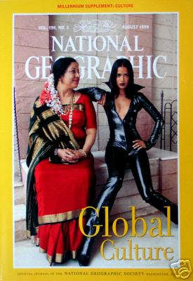
An older middle-aged Indian woman, with streams of white and orange flowers pinned to her hair at the base of her neck, symbolizes tradition. The deep red silk sari with a gold border, the gold necklaces around her neck, and the thick gold bangles on her wrists clearly mark her as a traditional upper-class woman… The older Indian woman’s body and posture also announce her alignment with tradition. She is heavyset, almost stocky, and her sari demurely covers her large breasts. Her feet are placed moderately close together and her folded hands rest in her lap. Avoiding the direct eye of the camera, her face, with the trademark dot of the Hindu tradition etched between her eyes, is turned sideways as she bestows a tender maternal gaze on the young woman sitting beside her…
In contrast to the gentle passivity and the slack middle-aged body that index tradition, bold assertiveness, feminine youthfulness, and an androgynous firm body register cosmopolitan modernity in the cover of image. These biological and emotional transformations in the modern, non-Western woman’s physical appearance and personal demeanor appear to be wrought by Westernization. The young, slender Indian woman sitting next to the middle-aged woman has short, shoulder length hair framing her face. The marked absence of the dot on her forehead as well as her clothing, instantly herald her identity as a modern woman. She is dressed in a black, shiny PVC catsuit, unzipped down to the middle of her chest to display her small, almost flat breasts, while her feel are encased in sharply pointed black boots. Disdaining the gaze of the older woman directed towards her, she defiantly stares at the camera and claims her personal space with arrogant confidence. Her legs and felt, unlike the older woman’s feet, are splayed wide apart and her knees point in opposite directions. Her left arm is poised akimbo style while her left palm grips her hip in a strong masculine gesture.
In the magazines sharply polarized, binary rendering of the “new and hip” as radically different from the “old and outmoded,” one woman symbolizes ethnic tradition and the other global modernity…
Citation: Parameswaran, Radhika. 2002. Local Culture in Global Media: Excavating Colonial and Material Discourses in National Geographic. Community Theory 12, 3: 287-315.
Arrive Alive is an anti-drunk driving organization. As part of one educational campaign, they designed these…stickers? posters? stick-ons? I’m not sure what you call them, but things to stick on the wall of public bathrooms to make people think before driving drunk. Here are two examples (found at copyranter):
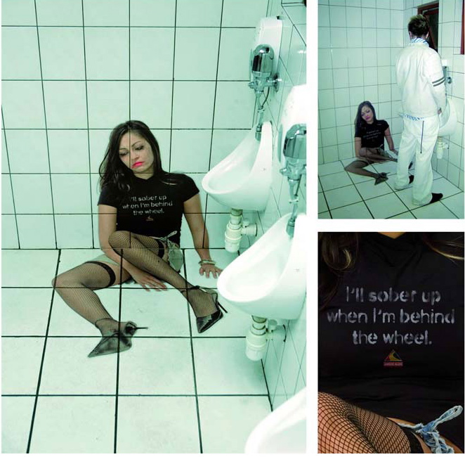
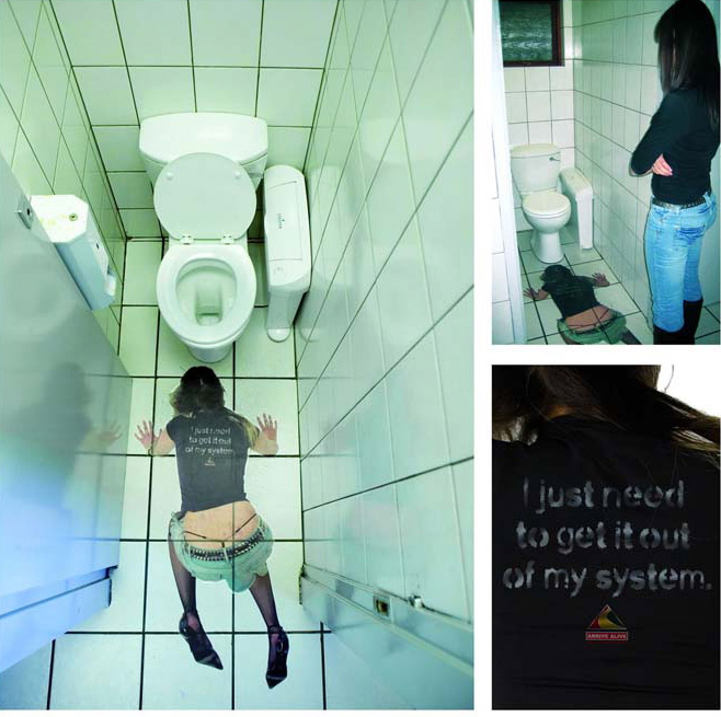
I don’t quite know what to make of these. I mean, they definitely get your attention. But I also question the outfit they chose to show her in–what’s with sexing her up so much? With fishnet thigh-highs, a visible g-string, and stilettos, no less. And as copyranter points out, for the type of guys (and I know this is a specific group–this isn’t referring to men in general) who look for drunk women to have sex with, I think that top image might have a totally different effect than the organization is getting at. Maybe that’s part of the point–to scare women with the threat of making bad sexual choices (or being forced into sexual activities) while drunk. But then why put it in the men’s bathroom? I’m kind of stumped, really. Readers?
Just a side note, I’m thinking the poster at the top, next to the urinal, is just going to get peed on a lot (after all, there are already lots of urinals shaped like women), while the bottom one is likely to get puked on now and then.
This just strikes me as another example of a PSA that manages to be creepy without necessarily being effective.
Here’s a somewhat similar example. These ads are for Feed SA, a New Zealand-based organization to provide food to people in South Africa. They paid some supermarkets to put these ads in shopping baskets (images posted by copyranter at Animal New York):
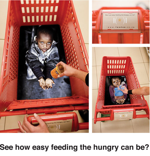
I guess part of the point here is to make people feel uncomfortable while they’re filling their baskets with lots of food, in the hopes that they’ll go home and make a donation. And that, in and of itself, doesn’t surprise me; I used to foster dogs for a dog rescue, and let me tell you, we weren’t above occasionally using guilt or desperate appeals if we were in dire shape, and I think it’s a fairly standard (though not necessarily effective) practice among charity organizations. I’m not entirely certain why I find them disconcerting. Maybe there’s no good reason for it.
Readers, what do you think?
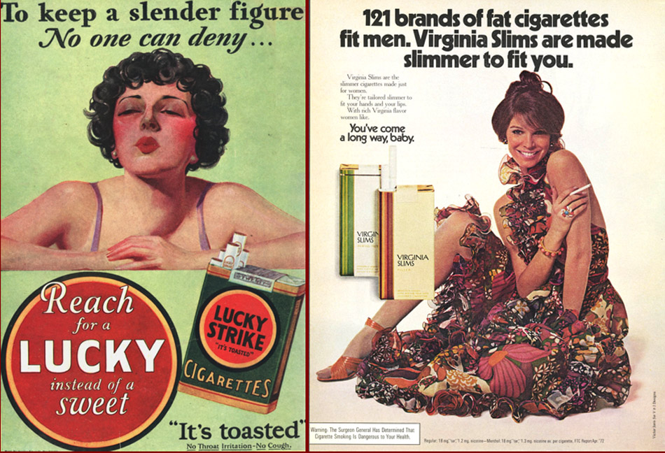
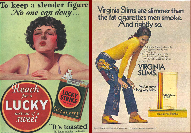
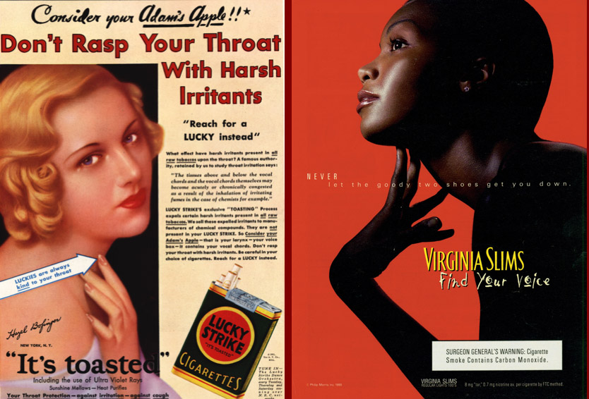
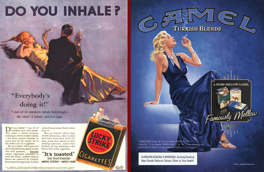
This archive of cigarette commericals, sent in by Kay W., makes some interesting comparisons of vintage and contemporary cigarette ads.
First, they compare vintage ads that try to sell cigarettes by pointing to the fact that they suppress your appetite with contemporary-ish Virginia Slims ads which seem to suggest so indirectly.
Second, they compare vintage advertisements that argue that some brands are smooth and good for your voice with the contemporary “Find Your Voice” campaign:
Third, this set of ads nicely shows how the association of glamour with cigarette smoking has transcended history:
Rachel M. sends us this story: The cover for the 1976 Scorpions album “Virgin Killer” apparently not considered problematic enough for censorship at the time, was pulled from a Wikipedia webpage for being “a potentially illegal indecent image of a child under the age of 18.” The image, included after the jump, features a naked prepubescent girl in a provocative pose: