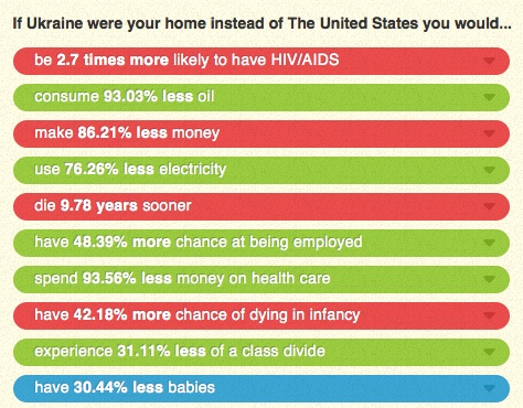
Dmitriy T.M. sent in a link to the website If It Were My Home. The site allows you to select two nations and then explains how your life would compare if you lived in each one in terms of rates of HIV/AIDS, employment, energy consumption, infant mortality, class inequality, and other factors (based on CIA data). As an example, Dmitriy chose to compare the U.S. and Ukraine, “the 2 greatest countries in the world, as determined by the poll conducted in my head”:
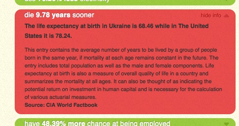
You can then choose one of the items for more details; I selected life expectancy:
The site is set up with the U.S. as one of the default comparisons, but at the top there’s a button that lets you select a non-U.S. comparison. (Note: Reader Parodie says it appears to detect whatever country you’re accessing the site from and set that as one of the default comparisons.) It’s a fun site that you can spend quite a bit of time playing around with.
UPDATE: Just a caution–a couple of readers seem to have found situations where the math doesn’t add up in the comparisons of some countries. And other readers noted that this does an enormous amount of averaging, which definitely hides the differences in quality of life in various countries, which are so extreme in some nations that “averages” might be nearly meaningless.

