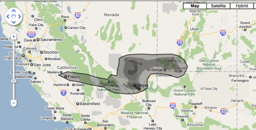
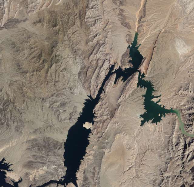
disaster

Lake Mead (1958):

Lake Mead (2010):

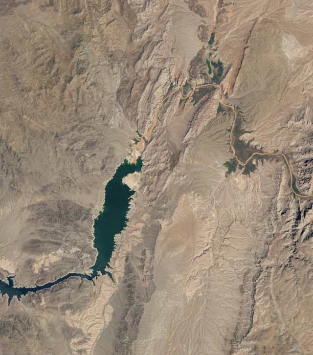
Via the Earth Observatory.

These two starkly different and somewhat frightening images don’t represent a linear diminishment of Lake Mead. Instead, they are two extremes on a naturally fluctuating water level:

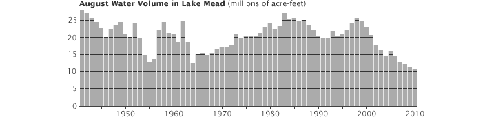
This fluctuating water level isn’t, further, a natural problem. It has, however, become an increasingly social problem. It provides water for the Southwest, a portion of the country that has become thirstier and thirstier. From Maggie Koerth-Baker at BoingBoing:

Take, for instance, Las Vegas, which gets 90 percent of its water from Lake Mead. Back in the 1940s, fewer than 9,000 people lived there. In 2006, the population was estimated at more than 550,000, and growing. Rapidly.

This makes large numbers of people vulnerable to these natural fluctuations in ways that they never were before and potentially creates human disasters out of our own poor planning and resource management. If climate change exacerbates this problem, and it very well might, then the reliability of our water supply is even more fragile.

Lisa Wade, PhD is an Associate Professor at Tulane University. She is the author of American Hookup, a book about college sexual culture; a textbook about gender; and a forthcoming introductory text: Terrible Magnificent Sociology. You can follow her on Twitter and Instagram.

James O’Byrne and Doug MacCash retrace their steps through the post-katrina devastating, comparing the photos of flooded neighborhoods with photos of those neighborhoods today.

Via www.nola.com.

Lisa Wade, PhD is an Associate Professor at Tulane University. She is the author of American Hookup, a book about college sexual culture; a textbook about gender; and a forthcoming introductory text: Terrible Magnificent Sociology. You can follow her on Twitter and Instagram.

Allie B. sent us a link to an image at GOOD that presents some pre- and post-Katrina information about New Orleans. The map indicates levels of population recovery; the darker the shade of green, the more the population has rebounded:

A close-up of one section (areas with black shading had over 6 feet of floodwater):

Notice that the Lower Ninth Ward, one of the hardest-hit areas, has among the lowest level of redevelopment.

There’s a much larger version of the map (with a not-too-specific list of sources) here.

Changes in the populations of different parishes:

The income distribution has changed somewhat as well, with a smaller proportion in the lowest income categories (though notice that the dollar range included in each color isn’t consistent as you get into the higher incomes):

This 8-minute video from Powering A Nation documents the fight of Kindra Arnesen to save her family and her Gulf Shores community. It’s a stirring portrait of how one family has been affected by the oil spill and is trying to fight back:

Via NPR.

Lisa Wade, PhD is an Associate Professor at Tulane University. She is the author of American Hookup, a book about college sexual culture; a textbook about gender; and a forthcoming introductory text: Terrible Magnificent Sociology. You can follow her on Twitter and Instagram.

These Bed Stü shoes, sent in by Dmitriy T.M., are meant to appear as if they are covered in oil accumulated while cleaning up the BP oil spill in the gulf.

According to Selectism, 100% of the proceeds are going to help wildlife affected by the spill.

So Bed Stü makes no money on this collection, but gains a great deal of publicity and, potentially, good will from consumers.  And then some dude is going to be wearing shoes that look like they’re covered in oil at a garden party.

This looks to me like an example of “conspicuous conservation.”  The term was originally derived from the phrase “conspicuous consumption,” defined by Wikipedia as “lavish spending on goods and services acquired mainly for the purpose of displaying income or wealth.”  Conspicuous conservation, then, is the (often lavish) spending on “green” products designed mainly to advertise one’s environmentally-moral righteousness.

If you wear regular shoes and donate to the gulf spill clean up, your altruism is entirely invisible.  But if you buy these hideous things, everyone gets to know what a nice guy you are.

Lisa Wade, PhD is an Associate Professor at Tulane University. She is the author of American Hookup, a book about college sexual culture; a textbook about gender; and a forthcoming introductory text: Terrible Magnificent Sociology. You can follow her on Twitter and Instagram.

[Note: A couple of readers have sent in info that calls into question the graphic below — not the relative sizes and such, but the specific numbers cited for the size of various spills (making them look larger than other reports). This may be a reflection of how the organization defines “spilled” oil (they say “lost to the environment”), and I provide their definition below. Thanks to T for providing a list of generally accepted estimates of major spills. Given that the organization providing the data is an association of oil tanker owners, it seems unlikely that they would be intentionally exaggerating the sizes of spills for political purposes or something. So while the graphic’s illustration of the relative size of these spills is still accurate in a general sense, unless I can track down a clear explanation for the cited numbers, I wouldn’t rely on them. Sorry for the confusion, and I’ll continue updating if I can figure out what’s going on.]

———-

Allie B. sent in a graphic comparing the BP leak to major tanker oil spills (and I forgot to add the numbers reported are in tonnes, which is about 2,240 pounds each):

The info is based on data from The International Tanker Owners Pollution Federation Limited, an industry group that provides a lot of data on spills from oil tankers (so that doesn’t include leaks or spills from pipelines, wells, and so on). From the website:

It should be noted that the figures for the amount of oil spilt in an incident include all oil lost to the environment, including that which burnt or remained in a sunken vessel. There is considerable annual variation in both the incidence of oil spills and the amounts of oil lost. Consequently, the figures in the following tables, and any averages derived from them should be viewed with caution.

UPDATE: Commenter T points out that some of the numbers here (especially the Gulf War spill) don’t match up with more widely-reported data and seem to exaggerate the size of some of the spills. The relative sizes still hold up in general, but be cautious with the actual reported sizes of the spills. It may be that their way of defining spills (all oil “lost to the environment”) includes significantly more oil than what is traditionally counted as being part of a spill. I’m trying to track down exactly what’s going on here.

Given how much media coverage BP leak is getting, it’s a bit shocking to see it in comparison to the tanker spills represented here. That isn’t to say that somehow by comparison the BP leak isn’t that bad; rather, it made me aware of how little I usually hear about the environmental impacts of the global petroleum industry as long as they don’t happen along the U.S. coastline.

For instance, a recent NYT article discusses the impacts of oil leaks and spills in Nigeria:

The Niger Delta…has endured the equivalent of the Exxon Valdez spill every year for 50 years by some estimates. The oil pours out nearly every week, and some swamps are long since lifeless…leaving residents here astonished at the nonstop attention paid to the gusher half a world away in the Gulf of Mexico. It was only a few weeks ago, they say, that a burst pipe belonging to Royal Dutch Shell in the mangroves was finally shut after flowing for two months…

I think the illustration brings into perspective how our perceptions of environmental disasters are shaped (not surprisingly, I know) by the amount of media coverage it gets and whether it occurs in a place we’re familiar with. Some pollution gets national and international media attention (at least for a while), and some is largely ignored outside the local area directly affected. The BP leak is by no means the largest oil-related ecological disaster in history — not even close yet, and hopefully it won’t get there — but media coverage and clean-up efforts aren’t distributed equally. And, again, I’m not saying that somehow this means we shouldn’t be too concerned about the Gulf leak. But it does make clear that we’re not equally concerned about, say, all people whose livelihoods are devastated by petroleum leaks/spills in waterways.

And just out of curiosity about the link between U.S. oil consumption and Nigerian oil production, I went to the webpage of the U.S. Energy Information Administration to see how much oil the U.S. imports from Nigeria. It’s currently our 4th-largest source of crude imports, and our daily Nigerian imports are up quite a bit over a year ago (about 1.1 million barrels in April ’10 compared to 673,000 a day in April ’09):

And I’m a bit embarrassed to admit that I had no idea Canada is currently our biggest source of imported crude oil (and total petroleum imports as well).

Gwen Sharp is an associate professor of sociology at Nevada State College. You can follow her on Twitter at @gwensharpnv.

The website If It Was My Home (and yes, they know about the grammar error) allows you to get a better grasp on the size of the area affected by the BP oil leak.  They use National Oceanic and Atmospheric Administration’s daily updates on where the oil will reach in the next 24 hours and allow you to use Google Maps to position it anywhere you want. It’s easier for me, at least, to get an idea of the dimensions of the area we’re talking about when I can imagine it on an area I’m familiar with than seeing it on a map of the ocean.

Here’s the oil leak area centered over Las Vegas, where I live:

The darker the shade of gray, the denser the oil. Here is the current NOAA surface oil projection for the next 24 hours; red indicates places oil may hit shores:

Today’s 72-hour projection, which shows the range extending qute a bit to the west, and more affected shoreline:

Thanks to Kate W. for the link!

Related posts: using the oil spill to advertise cheap flights, should we clean up oil-soaked wildlife?, the Gulf oil industry, BP buys Google search terms, BP gives Florida money for advertising tourism, protesting BP, and the power of images of environmental disasters.

Talking Points Memo has an article about a new advertising campaign from Spirit Airlines (as of this morning the images are still available on their homepage, though I presume — hope — they’ll be taken down soon). In order to highlight their fares to coastal locations no affected by the oil spill, they created an ad campaign titled “Best Protection”:

Get it? BP? Oh, funny.

The ads show bikini-clad women sunning themselves on the beach and carry the tagline “check out the oil on our beaches.” Two examples:

Honestly, I’m just stunned. Seriously, how do these things get made? Who comes up with this, and how is it that nowhere along the line from the idea to actually putting the images up on the website does someone in authority say, “Um, I think this is a really bad idea.”

Classy, Spirit Air. Classy.