
Marc sent in this image (found here):
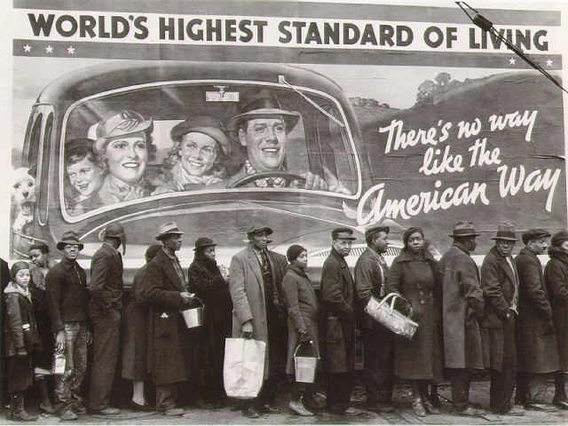
According to this site, the photo was taken by Margaret Bourke-White; this site, where you can buy old issues of LIFE magazine, lists the photo in the index for the February 15, 1937, issue. Apparently the people standing in line were flood victims.
This is a great image for sparking discussion about “the American Way” and what that was meant to be (clearly white and presumably middle-class, from the mural), and the ways in which non-whites (and poor whites) are often invisible in depictions of what America is. And, of course, it could be a great image for a discussion of rhetoric and propaganda (for instance, murals proclaiming how wonderful the standard of living is even though the Great Depression was by no means over).
Thanks, Marc!


