class

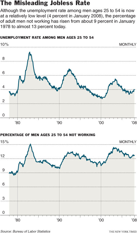
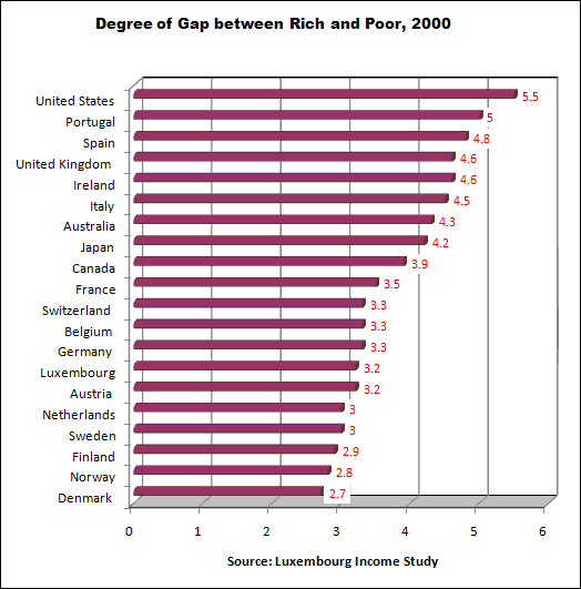
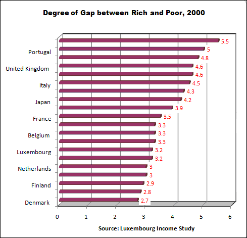
The graph below shows the different results when using two different measures of joblessness (notice how the use of two different scales on these graphs–10% and 15%–visually interrupts a fair comparison). Visit the New York Times story that accompanied this image for a historically-grounded discussion of the problematics and politics of measuring joblessness.

First, defining our terms:

Income is the money in your paycheck.  It’s what you make from your job.  Wealth, in contrast, is everything else. It includes stocks and bonds, home equity, other properties, investments, your retirement funds etc.  Importantly, you can inherit wealth directly, but you cannot inherit income directly (most of the time).

The relationship between IQ and income is somewhat correlated; in general, people with higher IQs make more money:

But the relationship between IQ and wealth is all over the map:

This suggests that there is some meritocracy in the distribution of income, not so much in who owns yachts and has deep investment portfolios.

———————————–

From Zagorsky, Jay. 2007. Do you have to be smart to be rich? The impact of IQ on wealth, income and financial distress. Intelligence 35: 489-501.

Thanks to Conrad H.

This image illustrates what class inequality would look like if our level of income/wealth were reflected in our height (click to enlarge). Class inequality was first described this way by economist Jan Pen. The image was reproduced for an Atlantic article (view here). Even though the illustration is for 1971 and Britain, it would be useful, especially if we had evidence that income inequality is greater now than in 1971 and greater in the U.S. (or wherever you are) than in Britain (which I think is true… anyone?). An excerpt explaining the illustration is included below. (By the way, what first looked to me like a dark green blob behind the tallest guy is actually the foot of the next tallest guy.)

Excerpt:

Suppose that every person in the economy walks by, as if in a parade. Imagine that the parade takes exactly an hour to pass, and that the marchers are arranged in order of income, with the lowest incomes at the front and the highest at the back. Also imagine that the heights of the people in the parade are proportional to what they make: those earning the average income will be of average height, those earning twice the average income will be twice the average height, and so on. We spectators, let us imagine, are also of average height.

Pen then described what the observers would see. Not a series of people of steadily increasing height—that’s far too bland a picture. The observers would see something much stranger. They would see, mostly, a parade of dwarves, and then some unbelievable giants at the very end.

As the parade begins, Pen explained, the marchers cannot be seen at all. They are walking upside down, with their heads underground—owners of loss-making businesses, most likely. Very soon, upright marchers begin to pass by, but they are tiny. For five minutes or so, the observers are peering down at people just inches high—old people and youngsters, mainly; people without regular work, who make a little from odd jobs. Ten minutes in, the full-time labor force has arrived: to begin with, mainly unskilled manual and clerical workers, burger flippers, shop assistants, and the like, standing about waist-high to the observers. And at this point things start to get dull, because there are so very many of these very small people. The minutes pass, and pass, and they keep on coming.

By about halfway through the parade, Pen wrote, the observers might expect to be looking people in the eye—people of average height ought to be in the middle. But no, the marchers are still quite small, these experienced tradespeople, skilled industrial workers, trained office staff, and so on—not yet five feet tall, many of them. On and on they come.

It takes about forty-five minutes—the parade is drawing to a close—before the marchers are as tall as the observers. Heights are visibly rising by this point, but even now not very fast. In the final six minutes, however, when people with earnings in the top 10 percent begin to arrive, things get weird again. Heights begin to surge upward at a madly accelerating rate. Doctors, lawyers, and senior civil servants twenty feet tall speed by. Moments later, successful corporate executives, bankers, stock­brokers—peering down from fifty feet, 100 feet, 500 feet. In the last few seconds you glimpse pop stars, movie stars, the most successful entrepreneurs. You can see only up to their knees (this is Britain: it’s cloudy). And if you blink, you’ll miss them altogether. At the very end of the parade (it’s 1971, recall) is John Paul Getty, heir to the Getty Oil fortune. The sole of his shoe is hundreds of feet thick.

This bar chart puts the United States as the dubious front runner with the highest income inequality among 20 wealthy nations. With the exception of Japan, all the countries have European heritage. In 2000 the United States’ inequality stood well above all other rich nations. At the other end of the scale the Nordic countries plus the Netherlands had very low inequality ratios. Most Western European nations, as well as Australia and Canada fell in between.

These data come from the Luxembourg Income Study, the most rigorous data source for cross-national income and wealth. The chart’s income gap indicator in each country is the disposable (after tax) annual income of the top 10% divided by the disposable income of the bottom 10%. In other words, the income gap is the ratio of the 10% of persons with the highest income to the 10% with the lowest. For instance, in the USA the income of the top-earning 10% was 5.5 times that of the bottom 10%.

The statistics in this chart can be found on page 4 of a document on the Contexts website: http://www.contextsmagazine.org/resources_vol6-3.php That document is a supplement to an article by Peter Dreier, “The United States in Comparative Perspective,” in the Summer 2007 issue of Contexts.

Some may read these statistics and say “inequality in the US is overblown” because the bottom 10% live better off than most people in the rest of the world. That is true if Americans are compared to countries where the average income is less than a dollar a day. But if the American poor are compared to the poor in other wealthy countries, American poor are far worse off.

Here is a link to the Oklahoma Marriage Initiative, a publicly-sponsored marriage-promotion program. The idea behind it is that increasing marriage, particularly among poor women, would decrease poverty and, therefore, welfare rolls.

Here is a link to the parenting section. Among other things, couples will learn “the benefits of marriage” and “strengthening the father-child bond.” Nothing is said about the mother-child bond–presumably it’s just fine. Note also that in the artwork for the page is very gendered–the woman is holding the baby, the male figure is standing over or protecting her. If you go to the photos section (pictures of actual participants), there are pictures of men holding their babies.

It might be useful to read the article “The Marriage Cure,” by Katherine Boo, in the August 18 & 25, 2003, issue of The New Yorker as well–Boo follows several poor black women as they go through the program and try to figure out how to find marriagable men (and it is made clear to them that they need to look for a man, any man).

I’m going to use this in my Intro to Sociology course as a way to discuss the idea that poor women wouldn’t be poor if only they would get married–to anyone.

This is a really interesting comparative analysis of the Kerry and Bush logos from the most recent presidential election. Notice how gender and class operate in the design and analysis.

Richard also pointed me to this slide show, also from the New York Times, commenting on logos for the candidates in the current primaries.

This campaign ad from 1988 is part of the larger politicization of the black underclass. “Willie Horton” and the “welfare queen” both emerged as symbols during this period with which to demonize poor blacks for political clout. Ultimately, using the name Willie Horton became a powerful tool to criticize politicians for being weak on crime and not protecting the innocent white population from the guilty black population.

[youtube]https://www.youtube.com/watch?v=Io9KMSSEZ0Y[/youtube]

Ultimately, increasing toughness of the criminal justice system led to a situation, today, where about 1/2 of all black men are in the prison system. See an interesting entry on Willie Horton on wikipedia here.


Clearly this ad is making a connection between being “tough” and doing blue-collar work. The implication is that desk jobs are not “tough.”

Here’s what’s really fascinating about this: I found the ad in a magazine called Entrepreneur, a magazine clearly aimed at an upper-middle or upper class audience who do desk jobs. Since I find it unlikely they’re trying to actually alienate the readers of the ad, I’m guessing the point is to let these desk workers gain some “toughness” by buying a Ford truck.