class


This clip, from the newly televised This American Life, shows what happens when (mostly) black women and (mostly) white men living in racially-segregated Chicago are brought together and the social rules of decorum are suspended. It is highly, highly disturbing. I’d love it if some social psychologists could comment on what we see happening here!

[youtube]http://www.youtube.com/watch?v=vo1LPf9mnyU[/youtube]

In this nine and a half minute clip, Tim Wise describes the way in which race was invented by elites in early America in order to divide and conquer the working class… and is still used to do so.

Found here via Alas A Blog.

Lisa Wade, PhD is an Associate Professor at Tulane University. She is the author of American Hookup, a book about college sexual culture; a textbook about gender; and a forthcoming introductory text: Terrible Magnificent Sociology. You can follow her on Twitter and Instagram.

This is a tough one, but there is something about this image advertising the Metropolitan Museum of Art that just screams privilege. Is it the perfect blonde hair? The perfect white teeth? The neat upper-class masculinity? The turtleneck? I can’t quite put my finger on it!

Thanks Jason!


Truthfully, I don’t think I have ever seen so many symbols of masculinity mobilized in so short a time. I had to watch it three times:

[youtube]http://www.youtube.com/watch?v=Anl_7Q05C8c[/youtube]

Thanks a bunch to Christine who recommended this in our comments.

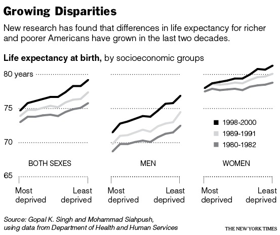
Perhaps related to increasing wealth and income inequality in our society, the gap between the life expectancy of the rich and the poor is also increasing. This image is from a New York Times article on the topic:

Dr. Singh, who was part of the study, explains:

In 1980-82… people in the most affluent group could expect to live 2.8 years longer than people in the most deprived group (75.8 versus 73 years). By 1998-2000, the difference in life expectancy had increased to 4.5 years (79.2 versus 74.7 years), and it continues to grow.

[youtube]http://www.youtube.com/watch?v=ZaPcBwmCtiM[/youtube]

Sexism in commercials is sadly just so, well, typical. But every once in a while a commercial comes along that goes above and beyond, like this one from Hungry Man. Take note of the ending where the Hungry Man meal crushes the feminized fruit drinks.

This commercial has multiple layers of sexism. One is obviously gendering food choices. Why are healthy foods (fruit and yogurt) feminized and unhealthy meat and potatoes in large quantities (sans green vegetables) associated with masculinity and being tough? And what kind of prescriptions about class and work are made as well? Why are these blue collar “working men” when drinking fruit shakes and health drinks are typically associated with white collar, upper class women (and men)?

As the commercial says… you are what you eat.

I wonder why a recent study found that “the gender divide starts over dinner.”

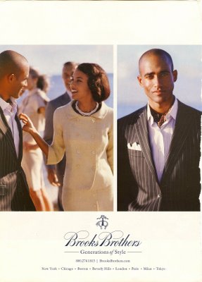
This 3-page ad for Brooks Brothers uses the tagline “Generations of Style.” I think it’s useful because the ad naturalizes the passing down of class (both economic class and classiness) from generation to generation, thus justifying class inequality. Also notice the racial segregation in the images.

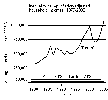
This first graph shows the relative increase in the incomes (inflation adjusted) of the top 1% of income earning households, the middle 60% and the lowest 20% (percentages, presumably, approximate) since 1979.

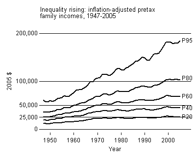
This second graph shows a more detailed picture of the relative increase in the incomes (inflation adjusted) of households in the 95th , 80th, 60th, 40th, and 20th percentile since 1949. Note how household incomes were rising at about the same rate prior to 1970, at which point those households in the 95th percentile started out growing other percentiles, those in the 20th stayed stagnant, and those in between were somewhere in between.

I borrowed these graphs from Lane Kenworthy, who also offers a truly excellent and detailed explanation of the measures.

.