
Strawberry Shortcake socializes girls into a man-crazy, materialistic, mid-life disguised as liberation:
Via Jezebel.
Strawberry Shortcake socializes girls into a man-crazy, materialistic, mid-life disguised as liberation:
Via Jezebel.
Daniel T. Lichter and Domenico Parisi provide a couple of interesting images using 2000 Census data in a recent article about rural poverty. They use Census block-group data (block-groups are significantly smaller than counties) to identify non-metro areas of concentrated poverty. This map shows all block-groups with more than 20% poverty in 2000:
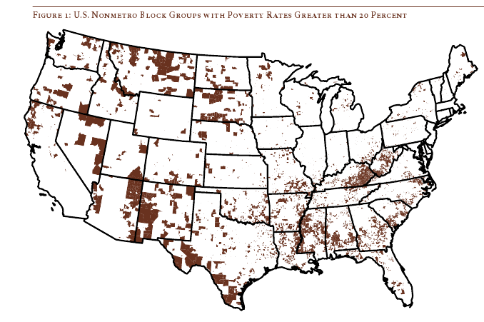
If you overlaid this map onto a map of American Indian reservations, you’d notice that many of these high-poverty block-groups are on reservations–particularly in the Dakotas, Idaho, Montana, Arizona, and New Mexico.
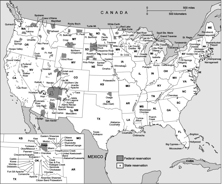
UPDATE: Here’s a map of state and federal reservations put out by Pearson (you can find very detailed maps of individual reservations at the Census Bureau):
And TOTALLY AWESOME reader Matt Wirth overlaid the poverty map on the reservations map. The two maps weren’t exactly the same so some of the state outlines don’t line up perfectly, but you can get a good sense of how high-poverty block-groups (blue areas) and reservations (red areas) overlap:
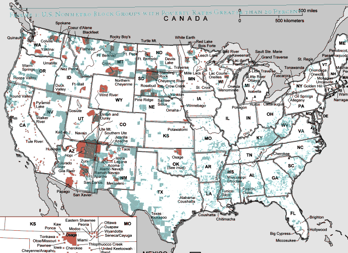
Clearly there are many poor block-groups in the west that aren’t associated with reservations, but we see an awful lot of overlap of blue on red, as well as in the regions directly surrounding reservations. Thanks so much, Matt!
We also see a band of high-poverty block-groups in border counties in Texas with high numbers of Latino residents, and of course the band along the Mississippi River and through the Black Belt up to North Carolina, and the ever-present Appalachian section.
Another note about the map: As Lichter and Parisi point out, if they had mapped poverty at the county level instead of the block-group level, many of these areas of high poverty would not have shown up. These are areas of concentrated poverty in counties that are not, overall, particularly poor. The authors note that studies of poverty that look at county-level data often miss isolated rural areas with extremely high poverty rates.
On a side note, see that little blotch of brown in north-central Oklahoma? That’s where I grew up! According to the 2000 Census, my specific hometown has a 17.6% individual poverty rate and the median home value is $24,400. That doesn’t matter to you, I know, but it does make me acutely aware of the problems of rural poverty.
The following bar graph shows how geographically concentrated poverty is among three racial groups. The graph shows what percent live in Census blocks of concentrated poverty–that is, areas where 20% or more of the population is poor (20% is the standard baseline among researchers for defining an area as “high poverty”):
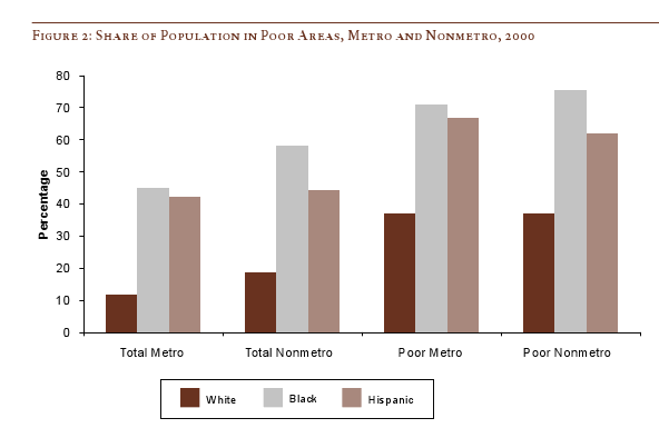
Clearly, in both metro and non-metro areas, a much higher percentage of all Blacks and Hispanics (both the poor and non-poor) than Whites live in areas of concentrated poverty. Notice (in the last two sets of bars) that less than 40% of poor Whites live in neighborhoods with such high proportions of poverty, whereas the vast majority of both Blacks and Hispanics who are poor live in areas where many of their neighbors are poor as well.
Lichter and Parisi argue that the concentration of poverty matters, particularly when it indicates that the poor are socially isolated. Such isolation can mean lack of access to social services, decent schools, and the types of social networks that provide job leads, recommendations, and so on. This type of social isolation can be much more harmful than being poor in and of itself, a topic also investigated by William Julius Wilson in When Work Disappears: The World of the New Urban Poor and The Truly Disadvantaged.
From “Concentrated Rural Poverty and the Geography of Exclusion,” Rural Realities, Fall 2008, p. 1-7, available from the Rural Sociological Society.
Wandering through the junior section of the Palo Alto mall after Christmas this year, my stepsister Holly noticed the suggestive nature of some of the brands. We took pictures:


Considering the graph below comparing the percent of GDP spent for economic stimulus during The Great Depression (1940s) and today (from the Tax Policy Center), Ezra Klein concludes:
We’re spending a lot right now, but this is hardly the most aggressive fiscal experiment in history.
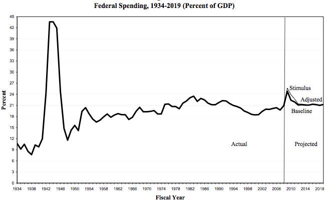
Contrast that summation with this ad from the American Issues Project:
[youtube]https://www.youtube.com/watch?v=eZ_Chroi4oc[/youtube]
This is what sociologists call a framing war. Is the economic stimulus big or small? You can make arguments either way, and people will. The question is: Which frame will resonate more with (which members of) the American public? We’ll have to wait and see.
(Via Alas A Blog.)
Lisa Wade, PhD is an Associate Professor at Tulane University. She is the author of American Hookup, a book about college sexual culture; a textbook about gender; and a forthcoming introductory text: Terrible Magnificent Sociology. You can follow her on Twitter and Instagram.
Much of the discourse around the benefits of being thin revolves around the assumption that extra pounds are harmful to health. Ampersand at Alas A Blog posted about a study in the New England Journal of Medicine (citation below) that shows that those who are overweight (according to the BMI scale) are not at a higher risk of premature death than those who are deemed of “normal” weight. The boxes in red are categories in which the risk for premature death is equal to or less than the reference group (normal weight people).
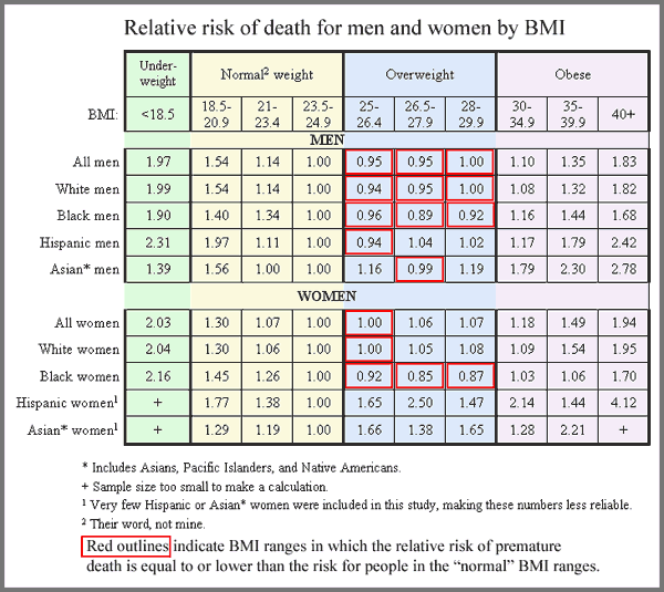
This is Ampersand’s conclusion (and his table, too).
The authors of the study, as commenter A.C. pointed out, come to the opposite conclusion. They argue, after looking at the data in different ways, say that overweight persons are at a higher risk for death.
Ampersand doesn’t buy it. He offers a critique here where, among other things, he points out:
In order to produce the finding that “overweight” is less healthy than “normal weight,” Dr. Adams did a very dishonest statistical manipulation – he compared just one “normal” BMI range, representing the heaviest people in the “normal” range, to the entire “overweight” range. This is because the majority of people in the “normal weight” categories had a greater risk of death than the majority of people in the “overweight” category.
This might be a great way to discuss how methods and statistics never speak for themselves.
Relatedly, this post offers a really great visual critique of the BMI scale.
Citation: Adams, K., et al., “Overweight, Obesity, and Mortality in a Large Prospective Cohort of Persons 50 to 71 Years Old.” New England Journal of Medicine, 2006. 355(8): p. 763-8. Here if you have a subscription to ProQuest.
I’ve previously blogged about how, during World War II, Americans were expected to sacrifice in ways that we simply do not expect Americans to sacrifice today. Specifically, my post addresses how people were encouraged to save gas and carpool (“Hitler rides in the empty seat!”), but people made all sorts of sacrifices: from going to work, to victory gardens, to eschewing panty hose.
Penny R. sent in another example that I found really interesting, staying off of phone lines during the hours when soldiers were likely to call home. These government-sponsored ads were found in a 1944 Southern California Telephone Company phone books for West Los Angeles (found at This Book Is for You):
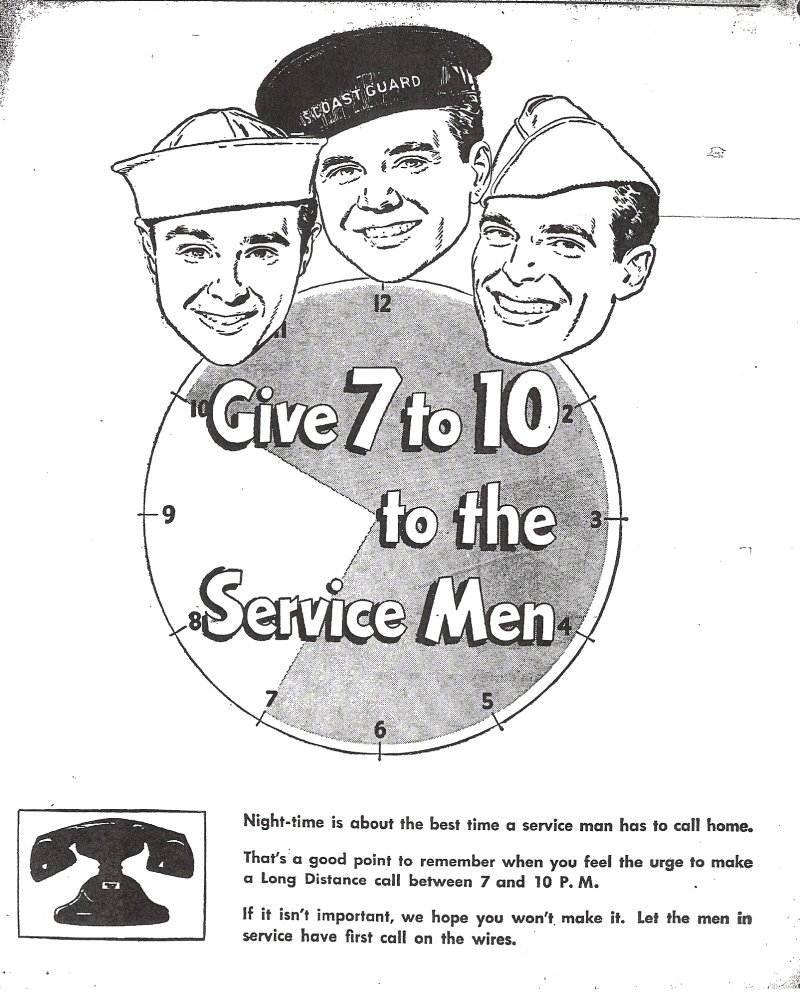
Text: “Night-time is about the best time a service man has to call home. That’s a good point to remember when you feel the urge to make a Long Distance call between 7 and 10 P.M. If it isn’t important, we hope you won’t make it. Let the men in service have first call on the wires.”
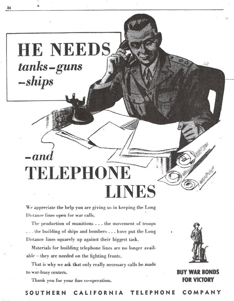
Text: “We appreciate the help you are giving us in keeping the Long Distance lines open for war calls. The production of munitions . . . the movement of troops . . . the building of ships and bombers . . . have put the Long Distance lines squarely up against their biggest task. Materials for building telephone lines are no longer available — they are needed on the fighting fronts. That is why we ask that only really necessary calls be made to war-busy centers. Thank you for your fine co-operation.”
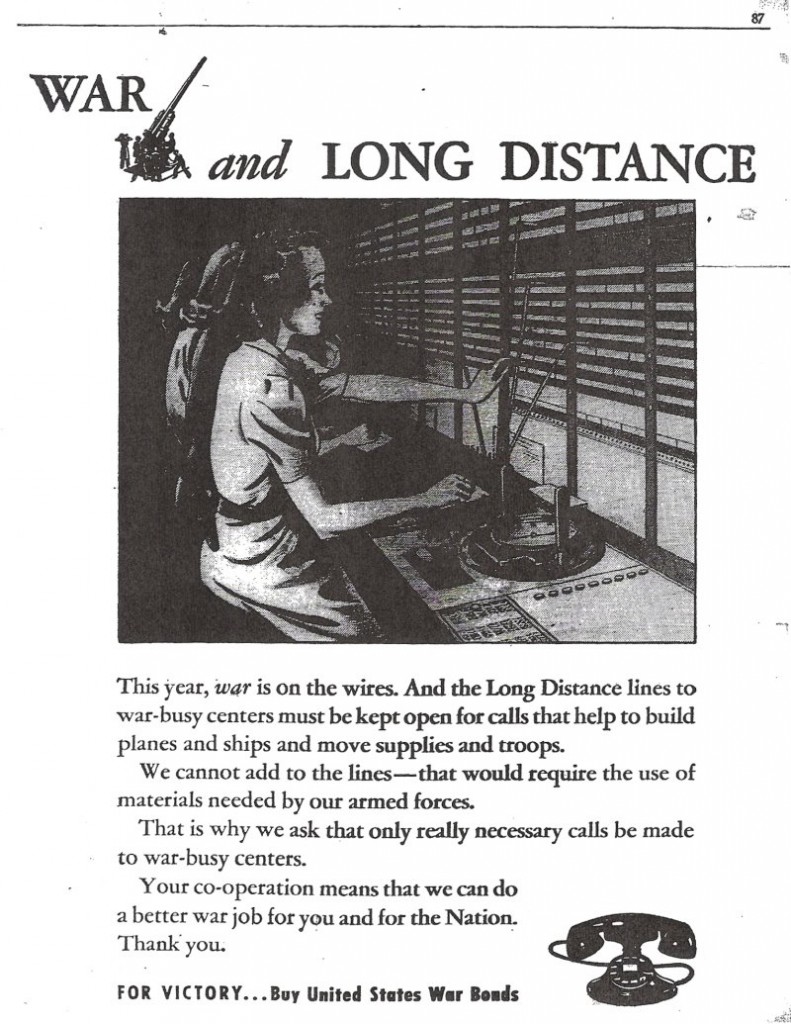
Text: “This year, war is on the wires. And the Long Distance lines to war-busy centers must be kept open for calls that help to build planes and ships and move supplies and troops. We cannot add to the lines–that would require the use of materials needed by our armed forces. That is why we ask that only really necessary calls be made to war-busy centers. Your co-operation means that we can do a better war job for you and for the Nation. Thank you.”
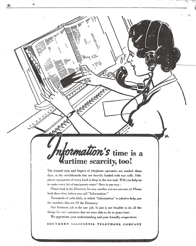
Text: “The trained eyes and fingers of telephone operators are needed, these days, at the switchboards that are heavily loaded with war calls. Telephone equipment of every kind is deep in the war task. Will you help us to make every bit of equipment count? Here is one way: Please look in the Directory for any number you are not sure of. Please look there first before you call ‘Information.’ Thousands of calls daily, in which ‘Information’ is asked to help, are for numbers that are IN the Directory. Our foremost job is the war job. It just is not feasible to do all the things for our customers that we were able to do in peace time. We appreciate your understanding and your friendly cooperation.”
Can you imagine being asked to stay off the internet every evening? Impossible!!!
“Polls have always shown that the vast majority of Americans believe religion is “an important part of their daily lives” — 65% in a recent Gallup poll versus just 34% who said it wasn’t.
But that national average obscures a stunning variety by region.”
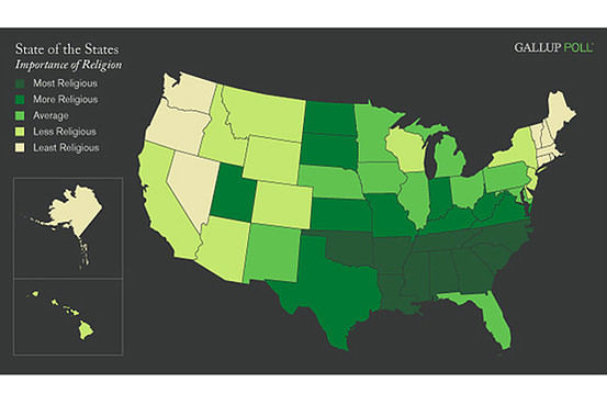
More precise data can be found at Gallup. In the comments, Jay pointed out work by John Sides at The Monkey Cage, that re-maps the data using absolute levels and accounts for a full range of responses, showing that “even in the least religious states, there’s plenty of that old-time religion.” Given that the dot-plot and map use the same data, it could make for an interesting debate on how to present data and the implications of differing analytic categories.
Nate Silver, over at FiveThirtyEight.com, points out that whereas sales of beer have generally been relatively unaffected by economic conditions, the current financial situation led to a rather dramatic decrease in beer sales in late 2008:
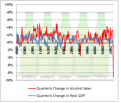
I don’t have any sociological point here. I just think it’s interesting, and since I thought so, I thought I’d make you look at it too. Nate Silver (who I have a bit of a geek crush on) hazards a few theories (in particular, perhaps people are substituting cheaper beers for more expensive ones, meaning they’re drinking as much or more, but spending less); it’s worth checking his post out.
As I said, absolutely no point to this post other than “Huh. Look at that.”