Yesterday NPR reported that Wisconsin is considering repealing its ban on margarine in private businesses and public buildings. What is that all about!? This old post offers some great historical context.
—————————
Grass fed cows tend to produce milk that, when made into butter, has a slightly yellow color. When margarine was invented as a butter substitute and they began producing it for U.S. consumption in the late 1880s, one marketing problem was its color. The vegetable-based product has a clear, white-ish color and looks something like lard; many people found it unappetizing. So the margarine people wanted to dye margarine yellow.
The dairy industry rightly saw margarine as a threat and they lobbied politicians both to outright ban margarine or to ban dying it to look like butter. The federal government imposed a two cent per pound tax on the product in The Margarine Act of 1886 (the tax was quintupled in 1902). Many states, especially dairy states, made dying margarine illegal (e.g., New York, New Jersey, and Maryland). By 1902, “32 states and 80% of the U.S. population lived under margarine color bans.”
The ad below is for “Golden Yellow” margarine and specifies that it is “ready to spread” in 26 states (more text transcribed below):
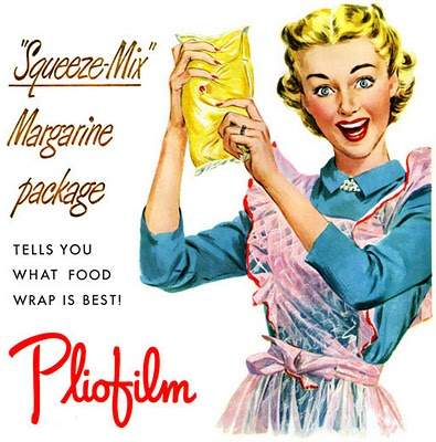
In some states, margarine manufacturers would sell margarine in plastic bags with a small bead of dye that the buyer had to knead into the spread (“Color-Kwik bags”). This practice continued through World War II. If you judge by this ad, it was quite a good time:
Over time, as supply and demand for butter and margarine ebbed and flowed alongside federal rules and penalizing taxes on margarine, the popularity of each ebbed and flowed too. Then, in 1950, margarine was apparently the “the talk of the country” and President Truman put an end to the oppression of margarine, in part because the National Association of Margarine Manufacturers had begun to build enough power to compete with dairy associations. Wisconsin, the cheese state, was the last anti-margarine state hold out (till 1967), but it continued to forbid margarine in public places (unless requested; as of Sept. 2011).
By 1957, sales of margarine exceeded those of butter. Margarine still outsells butter today. And, in a bizarre reversal, butter manufacturers now regularly dye butter yellow.
—————————
All that said, here is an excerpt from Audre Lorde’s The Uses of the Erotic in which she uses the bead of dye in the bag of margarine as a metaphor for sexuality:
During World War II, we bought sealed plastic packets of white, uncolored margarine, with a tiny, intense pellet of yellow colloring perched like a topaz just inside the clear skin of the bag. We would leave the margarine out for a while to soften, and then we would pinch the little pellet to break it inside the bag, releasing the rich yellowness into the soft pale mass of margarine. Then taking it carefully between our fingers, we would knead it gently back and forth, over and over, until the color had spread throughout the whole pound bag of margarine, thoroughly coloring it.
I find the erotic such a kernel within myself. When released from its intense and constrained pellet, it flows through and colors my life with a kind of energy that heightens and sensitizes and strengthens all my experience.
Sources: Vintage Ads, Found in Mom’s Basement, Britannica, Margarine.org, and FoodReference.
Lisa Wade, PhD is an Associate Professor at Tulane University. She is the author of American Hookup, a book about college sexual culture; a textbook about gender; and a forthcoming introductory text: Terrible Magnificent Sociology. You can follow her on Twitter and Instagram.