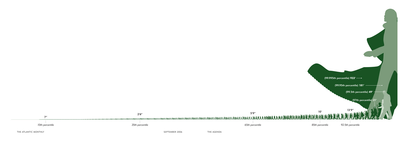
This image illustrates what class inequality would look like if our level of income/wealth were reflected in our height (click to enlarge). Class inequality was first described this way by economist Jan Pen. The image was reproduced for an Atlantic article (view here). Even though the illustration is for 1971 and Britain, it would be useful, especially if we had evidence that income inequality is greater now than in 1971 and greater in the U.S. (or wherever you are) than in Britain (which I think is true… anyone?). An excerpt explaining the illustration is included below. (By the way, what first looked to me like a dark green blob behind the tallest guy is actually the foot of the next tallest guy.)
Suppose that every person in the economy walks by, as if in a parade. Imagine that the parade takes exactly an hour to pass, and that the marchers are arranged in order of income, with the lowest incomes at the front and the highest at the back. Also imagine that the heights of the people in the parade are proportional to what they make: those earning the average income will be of average height, those earning twice the average income will be twice the average height, and so on. We spectators, let us imagine, are also of average height.
Pen then described what the observers would see. Not a series of people of steadily increasing height—that’s far too bland a picture. The observers would see something much stranger. They would see, mostly, a parade of dwarves, and then some unbelievable giants at the very end.
As the parade begins, Pen explained, the marchers cannot be seen at all. They are walking upside down, with their heads underground—owners of loss-making businesses, most likely. Very soon, upright marchers begin to pass by, but they are tiny. For five minutes or so, the observers are peering down at people just inches high—old people and youngsters, mainly; people without regular work, who make a little from odd jobs. Ten minutes in, the full-time labor force has arrived: to begin with, mainly unskilled manual and clerical workers, burger flippers, shop assistants, and the like, standing about waist-high to the observers. And at this point things start to get dull, because there are so very many of these very small people. The minutes pass, and pass, and they keep on coming.
By about halfway through the parade, Pen wrote, the observers might expect to be looking people in the eye—people of average height ought to be in the middle. But no, the marchers are still quite small, these experienced tradespeople, skilled industrial workers, trained office staff, and so on—not yet five feet tall, many of them. On and on they come.
It takes about forty-five minutes—the parade is drawing to a close—before the marchers are as tall as the observers. Heights are visibly rising by this point, but even now not very fast. In the final six minutes, however, when people with earnings in the top 10 percent begin to arrive, things get weird again. Heights begin to surge upward at a madly accelerating rate. Doctors, lawyers, and senior civil servants twenty feet tall speed by. Moments later, successful corporate executives, bankers, stockbrokers—peering down from fifty feet, 100 feet, 500 feet. In the last few seconds you glimpse pop stars, movie stars, the most successful entrepreneurs. You can see only up to their knees (this is Britain: it’s cloudy). And if you blink, you’ll miss them altogether. At the very end of the parade (it’s 1971, recall) is John Paul Getty, heir to the Getty Oil fortune. The sole of his shoe is hundreds of feet thick.


