Click here and scroll down for a map showing the number and % of Muslims in various European countries. From NPR.
An ad for a floral shop: “He chose her. She chose us.”

Found in Zions Bank Community magazine, January/February 2008 issue.
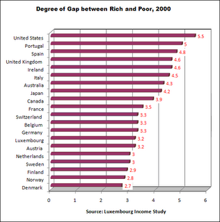
These data come from the Luxembourg Income Study, the most rigorous data source for cross-national income and wealth. The chart’s income gap indicator in each country is the disposable (after tax) annual income of the top 10% divided by the disposable income of the bottom 10%. In other words, the income gap is the ratio of the 10% of persons with the highest income to the 10% with the lowest. For instance, in the USA the income of the top-earning 10% was 5.5 times that of the bottom 10%.
The statistics in this chart can be found on page 4 of a document on the Contexts website: http://www.contextsmagazine.org/resources_vol6-3.php That document is a supplement to an article by Peter Dreier, “The United States in Comparative Perspective,” in the Summer 2007 issue of Contexts.
Some may read these statistics and say “inequality in the US is overblown” because the bottom 10% live better off than most people in the rest of the world. That is true if Americans are compared to countries where the average income is less than a dollar a day. But if the American poor are compared to the poor in other wealthy countries, American poor are far worse off.
EU observers agreed the vote processes were flawed and results were denounced as rigged by the main opposition party. Protesters were shot by police leading to rioting and repeated demonstrations. Hundreds of thousands of Kenyans fled their homes and hundreds lie dead as the conflict became an ethnically charged civil war.
Two years ago I had the good fortune of spending four days in Kenya. To my amazement Nairobi’ downtown felt like a Midwestern city: orderly, friendly, uncongested, clean, and mostly absent of beggars. But Nairobi has over three million people, a half million of which live in Africa’s largest slum.
Poverty in many rural villages was evident, but the Kenyan people, especially the women, work very hard. In the first photo is a typical rural scene where the women do back breaking work in the fields.
During our brief stay the papers headlined several major political events: President Kibaki, who is still the uncompromising president, fired his entire cabinet. The next day he suspended all of parliament. On the third day, major public demonstrations took place in the streets by the opposition party calling for new presidential elections.
I watched these demonstrations on the streets of Nairobi and felt the tension and anger. The demonstrations, however, ended without incident. But apparently it has not been uncommon for people to die in Nairobi demonstrations.
I took the 2nd photograph of the demonstrations in the central city. Notice that it could pass for football game day in a small US city.
What can sociology add to help us understand Kenya’s tragic, unfolding story? Here are three perspectives that may help:
Social Class Perspective: The images we are given by the American network media are suggestive of warring savages. In fact, the riots and ethnic strife are phenomena of the poverty class, not the wealthy and middle classes, although the leaders of both warring factions are wealthy politicians. Sharp inequality and festering poverty lay beneath the surface of this formerly peaceful country.
Historical Conflict Perspective: The British spent decades trying to keep the Luo and Kikuyu divided to preserve colonial order. (Now these are the two major warring ethnic groups.) During the decolonization process the British drew electoral boundaries to cut the representation of groups they thought might cause trouble. This only fanned the flames of tension among these groups. In the past few years tribal factions fighting over cattle rights in the Rift Valley have left over 100,000 refugees. These conditions helped ignite recent spontaneous rioting, looting and killing.
Race/Ethnicity Perspective: Both sides of the conflict are accusing the other of genocide, and both may be right. It will take months if not years to assess the horrendous damage. Ethnic hatreds run deep and prolonged, but the first cause of this war was political. It was the common practice of rigging elections followed by a refusal of the President to negotiate a coalition government.
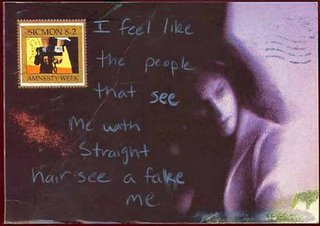
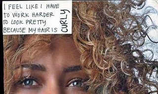
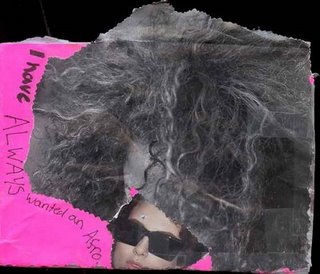
These three confessions, from Post Secret this week, illustrate that “ethnic” hair carries meaning (in the first authenticity, in the second ugliness, and in the third it’s left open) and how some women feel about that:
 Image via: Sports Image Times
How is the U.S. Border Patrol marketing itself to possible recruits in Southern states? Yup, by sponsoring the #28 NASCAR race car.
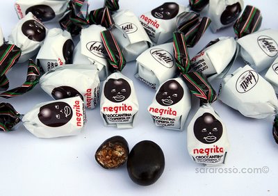
These are Italian candies with chocolate inside. You can read a description of them here (scroll down the page quite a bit). I’m not sure what the point of the shiny dot on the forehead is.
Thanks to Denise H. for finding this image! 
NEW! Kathleen T. sent in this photo she took in Segovia, Spain, of a popsicle that had a stereotypical Asian figure on it:
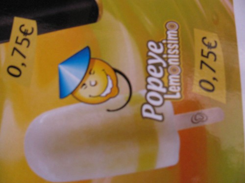
Notice that the “Asian” face is in the shape of a lemon; Kathleen suggested that the idea might be “lemon = yellow = Asian.”
Gwen Sharp is an associate professor of sociology at Nevada State College. You can follow her on Twitter at @gwensharpnv.

