More entertaining figures for your methods classes! These are from Indexed and were suggested by Moonsinger. Thanks!
Positive:
Negative:
Positive and Negative:
U-shaped:
Bell curve:
No correlation:
More entertaining figures for your methods classes! These are from Indexed and were suggested by Moonsinger. Thanks!
Positive:
Negative:
Positive and Negative:
U-shaped:
Bell curve:
No correlation:
This first graph shows the relative increase in the incomes (inflation adjusted) of the top 1% of income earning households, the middle 60% and the lowest 20% (percentages, presumably, approximate) since 1979.
This second graph shows a more detailed picture of the relative increase in the incomes (inflation adjusted) of households in the 95th , 80th, 60th, 40th, and 20th percentile since 1949. Note how household incomes were rising at about the same rate prior to 1970, at which point those households in the 95th percentile started out growing other percentiles, those in the 20th stayed stagnant, and those in between were somewhere in between.
I borrowed these graphs from Lane Kenworthy, who also offers a truly excellent and detailed explanation of the measures.
.
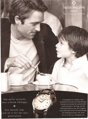
This is an ad I found in The New Yorker for Patek Philippe watches. The text in the lower-left corner says “You never actually own a Patrick Philippe. You merely take care of it for the next generation.” So by buying an expensive, new watch, you’re creating a “tradition.” I’m going to use this in the future when I talk about inventing traditions.

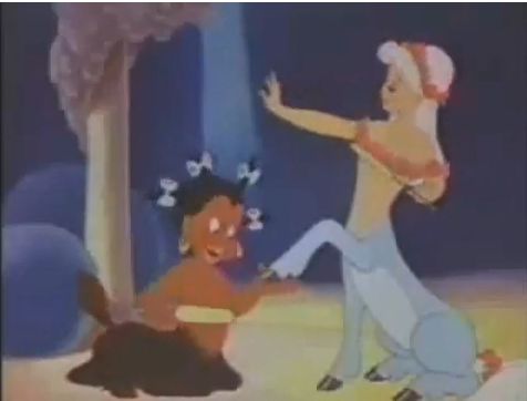
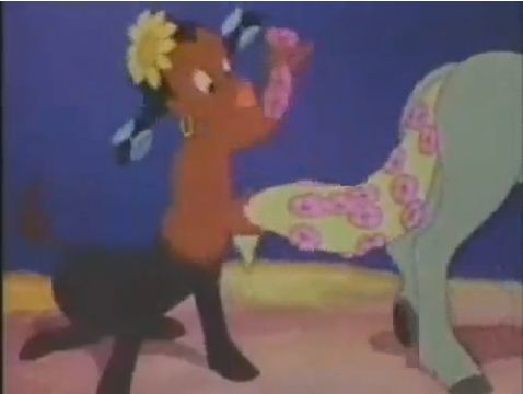
The centaur scene in Disney’s highly acclaimed cartoon Fantasia (1940) clearly communicates gendered expectations for men and women, but there are also racial politics. First, note that, in the film as released, all of the centaurs end up in color-matched heterosexual pairs. Second, most people do not know that the original centaur scene included a pickaninny slave to the centaur females and exotic, brown-skinned zebra-girl servants.
Here’s a link to the whole thing (embedding disabled, but it works as of Feb. ’11).
A clear still in black and white:
Fuzzy color stills from the youtube clip:


Don’t miss our post showing bugs bunny in blackface, too.

Another one from Jason.
The graph below shows the different results when using two different measures of joblessness (notice how the use of two different scales on these graphs–10% and 15%–visually interrupts a fair comparison). Visit the New York Times story that accompanied this image for a historically-grounded discussion of the problematics and politics of measuring joblessness.
How do we feel about this campaign, by Keep A Child Alive, to encourage people to donate money to Africa on the basis that we are all African? (Apparently we only care about ourselves, so if we suggest that Africa is ourselves, then we’ll donate?)
Do Americans, many of whom are white people with privilege based in race, class, and nation, get to claim Africa as theirs? Do white people now get to have blackness too? Is this insulting? Some people think so. Here is a larger version of the poster with Gwyneth Paltrow (scroll down for a response):
I borrowed this image from Blackademic.
NEW! Julie C. noticed that the Canadian Centre for Diversity put out a similar campaign. There’s something very interesting about it, but I’m having a hard time putting it into words. Click here to watch the short commercial. What do y’all think of it?