If you don’t eat this Snickers bar I’m going to smash your bleeping face in.

Get some nuts, fool!

Lisa Wade, PhD is an Associate Professor at Tulane University. She is the author of American Hookup, a book about college sexual culture; a textbook about gender; and a forthcoming introductory text: Terrible Magnificent Sociology. You can follow her on Twitter and Instagram.

Thus far in American history, the fact that men have escaped an onslaught of advertising for beauty products is a triumph of gender ideology over capitalism. Companies, after all, could double their market if they could convince men that they, too, were unsightly without make-up.

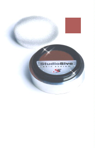
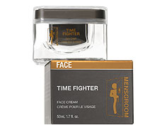
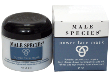
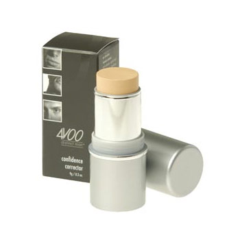
If a company were to try to market make-up and beauty regimes to men, however, their smartest move might be to masculinize make-up. And, this is, indeed, what some companies are doing. Here are some products. Their design is interesting, but their names are the most fun. Some of them are subtle, others not so much.

Studio Five Sport and Sun Tone Enhancer (or, as the ladies say, blush):
MensGroom Time Fighter (we call it anti-aging cream):
Male Species Power Face Mask (when you need a power face to go with your power tie):
4VOO Distinct Man Confidence Corrector (because you’re going to need confidence when you go on your mission):
Ener-C After Shave Mission Balm (Is the shave itself a mission or are you going on a mission after you shave? And, is it impossible?):

Ken Men Battle Scars Healing Anti-Inflammatory Repair Cream (I guess you need this post mission):

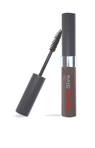
Studio 5ive Double Stroke Cream Mascara (get it?):
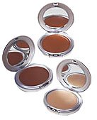
Ken Men Cream Me Face Base (oh come on!):
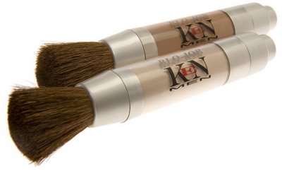
Ken Men Blo-Job Bronzing Powder (you’ve got to be kidding!):
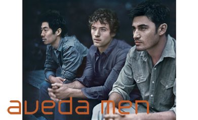
Also interesting is the Aveda marketing for hair and skin products aimed at men.

The products are called Pure-formance:
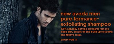
Notice the scruffiness of the men in the images, the dark blue-grey-black colors, and the use of nature. Below you can see the design of the products: brown, orange, grey, and sage colors with angular shapes (on a blue background, of course).
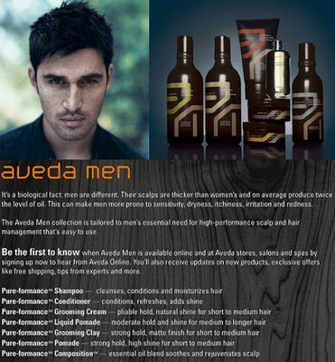
The first two paragraphs of text:

It’s a biological fact: men are different. Their scalps are thicker than women’s and on average produce twice the level of oil. This can make men more prone to sensitivity, dryness, itchiness, irritation and redness.

The Aveda Men collection is tailored to men’s essential need for high-performance scalp and hair management that’s easy to use.

So men are different than women. This is simply biology. They are more: “thicker” and “twice.” And, of course, no matter what it is, it must be “high-performance.

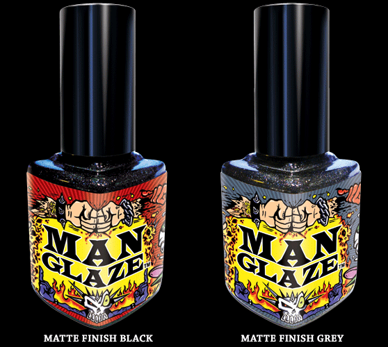
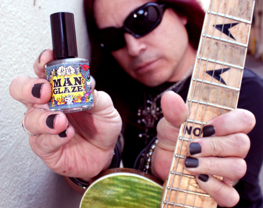
NEW! Mordicai points us to Man Glaze:
NEW! (Jan. ’10): David B. let us know about On the Job, a line of lotions targeting men. The line includes hand lotion, cleaner, and “armor,” which isn’t lotion, it’s a polymer glove.

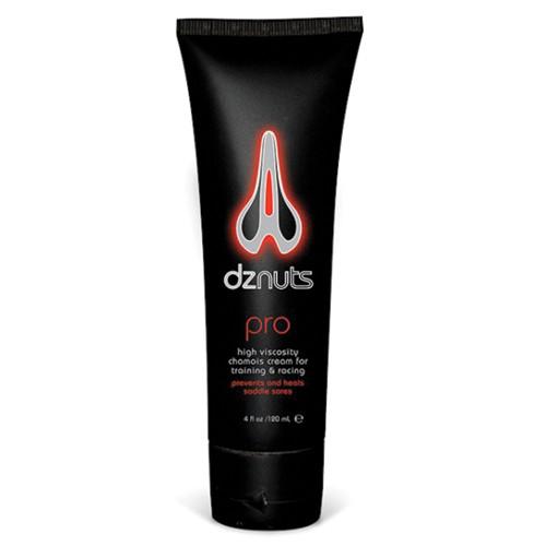
NEW! (Feb. ’10): Andrea let us know about dznuts, a “high viscosity chamois cream” marketed to men as a way to minimize chafing while riding a bike:
Ladies, you can buy a shirt that designates you as an Official Applicator:
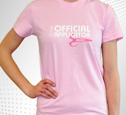
What Andrea found interesting is that, despite the name and logo, the product isn’t actually for a guy’s testicles at all. As the product description page says, it’s to prevent saddle sores in the perineal area…something both men and women have, as it turns out. But the creator apparently thinks the “for men only” marketing scheme–in which women aren’t riding bikes, they’re taking care of men who do–will be highly effective, because it costs twice as much as similar, but non-gendered, products.

Lisa Wade, PhD is an Associate Professor at Tulane University. She is the author of American Hookup, a book about college sexual culture; a textbook about gender; and a forthcoming introductory text: Terrible Magnificent Sociology. You can follow her on Twitter and Instagram.

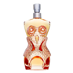
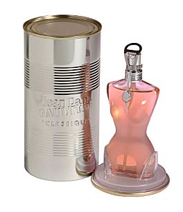
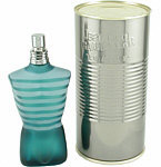
The first two are from the Gaultier Classique line. The third image is called Le Male. The final image is Fleur Du Male. You can see other examples of the women’s line here.

Thanks, Melissa C.!

I saw this energy drink this morning at a gas station. Notice that it’s sugar-free. According to the website, a portion of proceeds goes to fight breast cancer, though it’s unclear if they mean a portion of the profits of the drink, or just things bought at the online store. Another example of the idea of doing good through consumption, not by just donating money directly to an organization addressing an issue you care about (for other examples see here, here and here). Also, the website says Go Girl is not a rehydration drink (such as Gatorade), but a “functional beverage,” whatever that is.

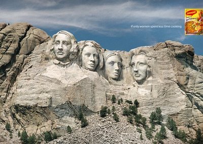
This ad “liberates” women from the kitchen through technology and capitalism… but not, alas, through true partnerships with men. Women should spend less time cooking, but it’s still HER job.

Oh, also, the reason women haven’t achieved greatness in the United States is because she’s too busy to be bothered. It has absolutely nothing to do with sexism and institutional constraints.

Thanks to Julie C!

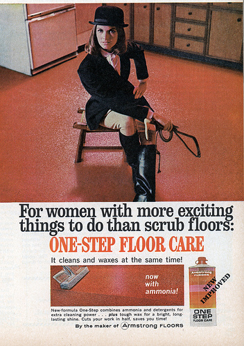
This ad, from the 1970s (I think), has the exact same message:  “For women with more exciting things to do than scrub floors: ‘One-step floor care.'”  Congratulations women, now you can scrub floors faster… but don’t think you can get out of scrubbing floors.

Found at Vintage Ads.

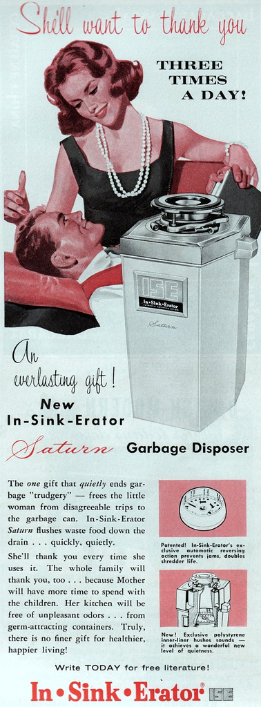
And this one, from the 1950s (I think) is extra creepy (found here).  Like the other ads, it replaces “women’s work” with a technological solution.  And that solution a gift from her husband.  The text:

The one gift that quietly ends garbage ‘trudgery’ — frees the little woman from disagreeable trips to the garbage can… She’ll thank you every time she uses it…

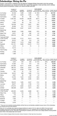
Those of you teaching classes in sports or education might find this graph useful (click to enlarge). It shows which sports receive the most money in sports scholarships (Division I and II men’s and women’s teams) and what percentage of a full scholarship, on average, students in each sport are awarded. The take home message of the accompanying New York Times article is that while students and parents work tremendously hard to get sports scholarships, they rarely pay off in the long run, even when they get them. In the meantime, students are overworked on the field and suffering academically.

This quick video presents an American and a Swedish military recruitment commercial back-to-back.

Our member blogger, Wendy, who is writing her dissertation on the military, had this to say:

The most striking difference between these ads to me is what these commercials choose to show and what they don’t show to recruit new members.

The Marines’ commercial focuses on the duty, bravery, glory, honor aspects of service. And this is entirely focused inward– toward the Marines and the country’s goals (and in that order– Marines’ loyalties are to “unit, Corps, God and country” in that order). Where is the “other” in this commercial (that is such a part of the Sweden commercial)? Who is the “for honor” for? Who is the “for courage” for? It seems implicitly to be to the corps.

This is right in line with most Marine discourse. All of their recruitment info is the same– the focus is on the corps, and on the highly specialized ways Marines serve. As a popular Marine slogan says “The USMC: When it absolutely, positively must be destroyed overnight.”

And the Swedish commercial is even more fascinating. There is no focus on the actual members of the Nordic Battlegroup. Instead it is all about everyday people– both in Sweden and in countries experiencing conflict. The focus is on the privilege of living in a country not at war (”everybody’s everyday is not like ours”).

The images of war in this commercial are disturbing– hectic, scary and out of control. This is the exact opposite of the Marine commercial where everything is ordered and organized and machines (helicopters, guns) are shown as extension of this order and control– instead of in a context of chaos. There’s a HUGE disconnect between the weapons shown and what they actually DO during war.

War in all its chaos is present in the Swedish commercial, and absent from the Marines commercial. That in and of itself is interesting.

Via Spiked Humor

Thanks to Julie C. for this tip!

More entertaining figures for your methods classes! These are from Indexed and were suggested by Moonsinger. Thanks!

Positive:

Negative:

Positive and Negative:

U-shaped:

Bell curve:

No correlation: