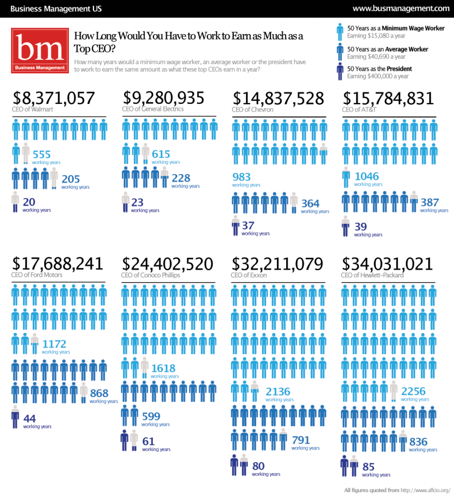
Business Management offers this great visual for understanding income in equality in the U.S. Each light blue figure in this visual represents 50 years of work at minimum wage (making $15,080 a year); the medium blue figures represent 50 years of work at the average wage (making $40,690 a year); the dark blue figures represent 50 years as the President of the United States (making $400,000 a year).

Let’s take the most dramatic example, just for fun: Hewlett-Packard.
A minimum wage worker would have to work for 2,256 years to make what what the CEO of Hewlett-Packard makes in a year.
The average worker would have to work 836 years to match his yearly salary.
And Barack Obama would have to President for 85 years before he made what the CEO of Hewlett-Packard makes in one year.
See other posts on income inequality here, here, here, here, and here.
Via Chartporn.
—————————
Lisa Wade is a professor of sociology at Occidental College. You can follow her on Twitter and Facebook.

Comments 18
Portia — October 27, 2009
I'm pretty sure the math is way off regarding Ford Motors and average-income workers.
But still an interesting chart. I'll be sending that webpage to the professor who teaches my Law, Ethics, and Wall Street class when we talk about exorbitant executive compensation.
mordicai — October 27, 2009
Wealth works when it moves. This is what economic has been slowly figuring out since it started putting itself together as a discipline. Fat paychecks for plutocrats doesn't help.
Michael Alan Miller » Chief entitled oligarch — October 27, 2009
[...] | Posted by Chill on 27 Oct 2009 at 01:27 pm | How long in years workers would have to work to earn as much as top CEOs make in a year. [...]
AG — October 27, 2009
Interesting that they didn't include any companies from the financial sector in this graphic.
Pay Inequity Continues for Female CEOs « Feminist Looking Glass — October 27, 2009
[...] a related point, check out this graphical depiction from Sociological Images of income differences in the United States. The [...]
Beelzebub — October 27, 2009
Here's another nifty look at income inequality: http://lcurve.org/
Duran2 — October 27, 2009
lisa, where did the post on online dating go?
Carla — October 27, 2009
I don't get why people get so bent out of shape about CEO compensation. CEOs make up such a miniscule portion of the population, getting outraged over their big paychecks is a worthless (and ultimately not very enlightening) endeavor.
lex — October 27, 2009
Carla, the WHOLE POINT is the amount of wealth (and consequently, power) that is concentrated into just a few pockets. The point is how resources are distributed in the world and where those resources could go if more equitably distributed. You cannot separate 'individual income' from larger patterns that affect society. To say that CEO compensation can be considered in isolation from other sociological factors is to gravely misunderstand the point of this post.
LS — October 28, 2009
And the argument used to justify the huge compensation packages is that CEO's are "more valuable" to the company. Well, maybe they are -- the good ones anyway -- but there is no way you're going to convince me that ANYone is 555 times (to use the least dramatic example up there) more valuable than the people actually working in the stores. (WalMart, as I understand it, doesn't pay much more than minimum wage to most employees.) 500 times more valuable? No. Just... no.
85 Years as President… « This So-Called Post-Post-Racial Life — October 28, 2009
[...] to make what the CEO of Hewlitt-Packard makes in 1 year. This, according to the graphic reproduced here (from this original piece). Of course, we cannot all be leader of the fee world. If you are an [...]
Daily Digest: 2009-10-29 « The Mushkush Digest — October 30, 2009
[...] Images also has some nice images illustrating income inequality in the US. [...]
Ryan — December 5, 2009
Maybe I missed that this data is only for men? Otherwise, I can't help noticing that the universal symbol for the male gender (and shades of blue) was used to represent workers. Maybe just a coincidence, but still...
Home Depot Average Wage | Home and Design Interior — June 6, 2014
[…] Comprehending Income Inequality Sociological Images source […]
Home Depot Average Salary | Home and Design Interior — June 6, 2014
[…] Comprehending Income Inequality Sociological Images source […]