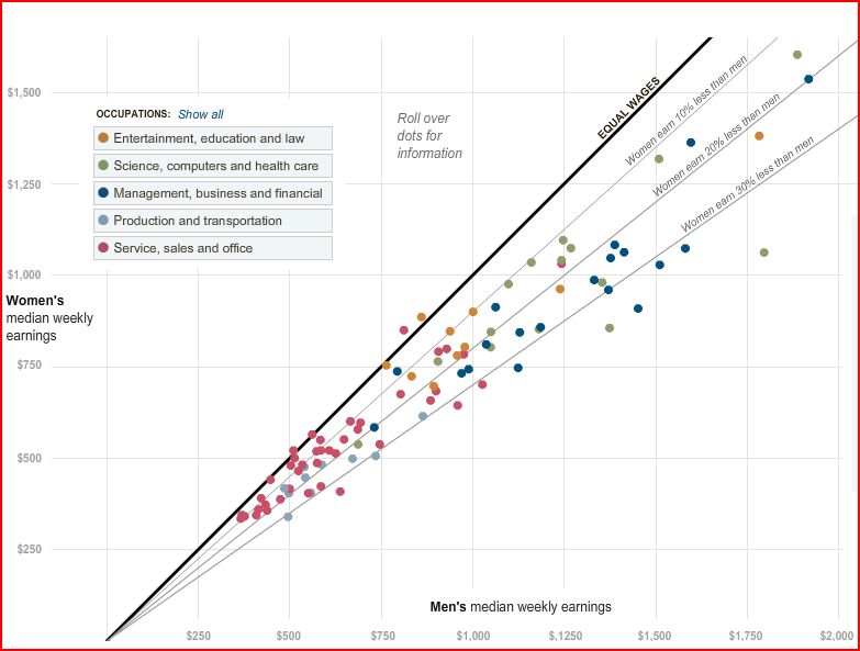
The New York Times features an interactive graphic about the wage gap between men and women. It shows how different types of professions are distributed along the wage gap. At the website, you can see click on each dot to see wage gaps for specific professions (e.g., female professors make 22% less than male professors).

Also about the wage gap, see posts here, here, here, and here.

Comments 4
PiYouCanEat — March 16, 2009
Something that I've learned from my dad (who used to be in upper management) is that when men come in for an interview, they nearly all negotiate with the employer about pay, and they actually ask for raises as well.
The women? In 10 years, not ONE tried to negotiate for a higher salary, and only 5 or 6 ever asked for a raise. I'm not trying to imply that it's their fault, because I'm sure there are some instances when the women simply get paid less because they're women, but I do strongly believe that this has a LOT to do with why men get paid more on average.
Punkie — March 18, 2009
That's very interesting if it's in fact true for the majority of people. Why do you think it may be?
FrustratedExpression — March 20, 2010
It could be a fear of rejection thing. You can sometimes see the same thing in women in a social way. Many women don't feel comfortable asking men out on dates for fear of rejection. Women tend to feel it is acceptable to wait for good things to come to them.
As such, women may not feel comfortable asking for a raise, as their request may be rejected, and they may feel judged for overstepping a boundary or a taboo.
FrustratedExpression — March 20, 2010
Other than that, women are known to have self image issues, and this may hit their confidence, and as a result do you think perhaps many women undervalue themselves?