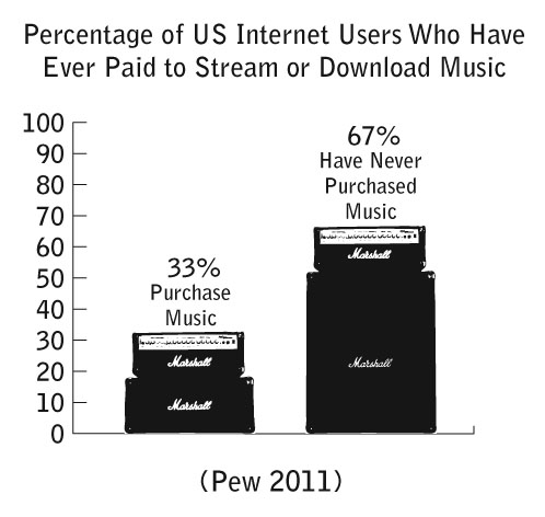
Pew released some new data on music streaming and downloads. I compiled a new chart illustrating the findings. Only one-third of Internet users in America have purchased music through the Web. This leaves us with the question: Are the majority of Internet users pirating music or using advertisement-based services like Pandora, Last.fm, or Grooveshark? Share your thoughts in the comments section.
Founder Jimmy Wales celebrating Wikipedia’s 10th birthday. The site gets 400,000,000 per month.
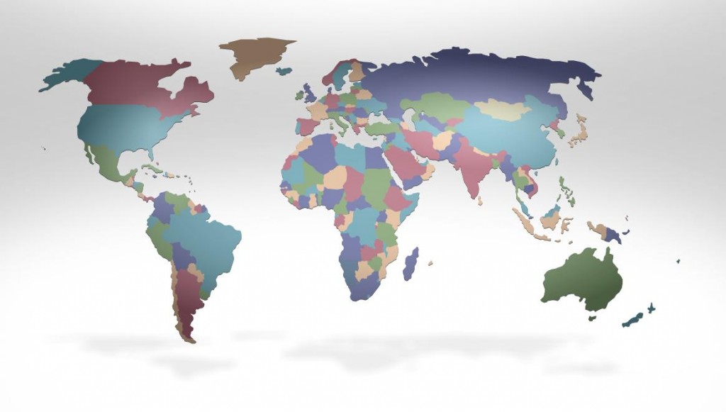
Fed-Ex has created an interactive global data experience on their website to offer “customers intriguing and insightful information to help them stay ahead of their customers’ needs in a continually changing world” (quote is from here). Putting aside the business speak, some of the data and especially its presentation is indeed intriguing. For instance, here is the globe with countries sized, as usual, by geographic size.
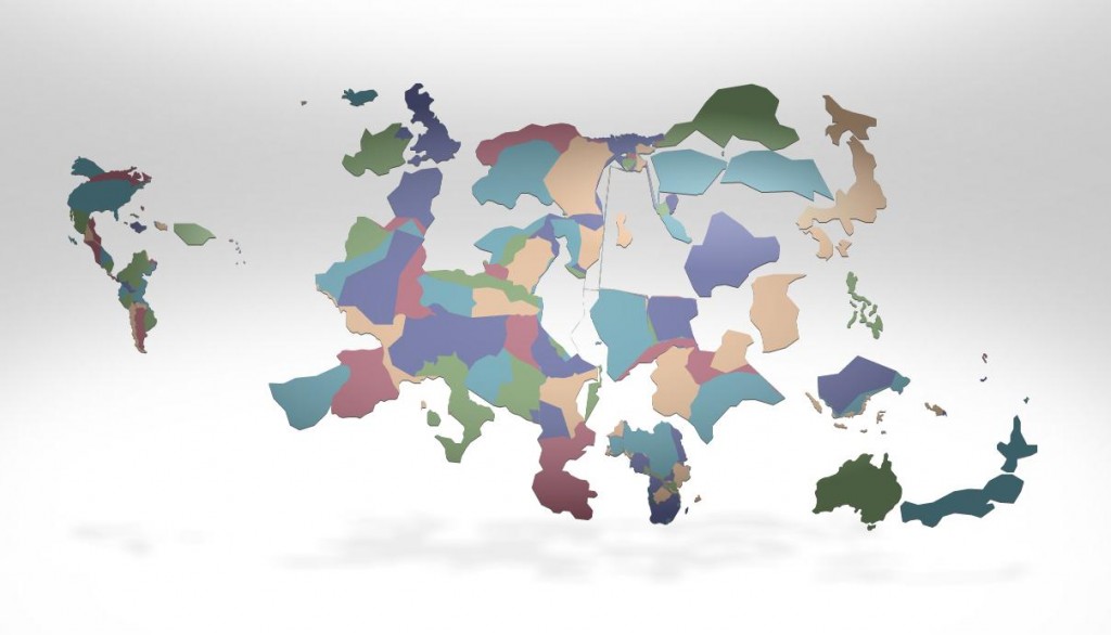
Next, we can have the size of the countries displayed based on all sorts of things. Below they are sized by access to the mobile web:

Jon Rafman is a Canadian artist who provocatively uses Google Street View images. His project is titled “The Nine Eyes of Google Street View,” named after the Google vehicles that roam around the globe with a 9-eyed lens to create panoramics of nearly every inch of road in the free world. Naturally, many compelling stills can be found within the mountain of imagery.
The Google camera photographs by utility – shooting in all directions at a given interval. This is opposed to the artistic model of photography where a human edits the world into the frame with some creative intent. As Rafman states in an essay about the project,
Google Street Views present a universe observed by the detached gaze of an indifferent Being. Its cameras witness but do not act in history. For all Google cares, the world could be absent of moral dimension.
However, and more critically, we should note that Google is not so nuetral at all. They are seeking total surveillance in an effort to make money. And this is partly why these images are so compelling: the juxtoposition of the “neutral” corporate Google gaze and the raw, candid reality so voyeuristically depicted.
 The debate over the extent to which the design and infrastructure of the Web privileges certain demographic groups is not new, but, nevertheless, continues to be important. Perhaps, most attention has been given to the way traditional gender hierarchies are reproduced by the masculine infrastructure of the Web. Cyborgology editor Nathan Jurgenson, for example, has previously covered the Wikipedia’s bias toward masculine language. Saskia Sassen warns “it may be naïve to overestimate the emancipatory power of cyberspace in terms of its capacity to neutralize gender distinctions.”
In an NPR interview this week, Wikipedia founder Jimmy Wales addressed the masculine bias of Wikipedia:
“The average age [of Wikipedia users] is around 26,” Wales says. “We’re about 85 percent male, which is something we’d like to change in the future. We think that’s because of our tech-geek roots.”
While the organization’s acknowledgment that the gender disparity on Wikipedia is promising, Wales seems to address the need for making the site more inclusive to women only from a marketing perspective. Sociologically speaking, there is a far more important reason to attract women to Wikipedia. Feminist sociologists have long argued the the types of knowledges that men and women produce are fundamentally different (in no small part due to their distinct social experiences). As Wikipedia is increasingly accepted as the primary source of collected human wisdom, it is important to ask whose voices are being left out, and as such, what ways of thinking are absent in the conversation. For Wikipedia, design and accessibility are not merely questions of customer service, but, in fact, have profound epistemological implications.
 Wonderful new cover story from the New York Times Magazine about death on Facebook. Read it here.
Yes, even a CGI-filled big-budget glowing Disney spectacle can provide opportunity for theorization. Of the recent Internet-themed blockbusters – namely, Avatar (2009); The Social Network (2010) – Tron: Legacy (2010) best captures the essence of this blog: that the digital and the physical are enmeshed together into an augmented reality.
This seems surprising given that the film is premised on the existence of a separate digital world. Indeed, the first Tron (1982) is all about a strict physical-digital dualism and the sequel plays on the same theme: physical person gets trapped in a digital world and attempts to escape. However, Tron: Legacy explores the overlapping of the physical and digital. The story goes that Flynn, the hero from the 1982 film, develops a digital world that does not have the imperfections of its physical counterpart. His grand vision was to gloriously move humanity online. Simultaneously, the beings in the digital world want to export their perfection out of the digital world and to colonize the offline world, removing all of its imperfections (i.e., us). Flynn comes to realize that enforced perfection (read: Nazism) is unwanted. Instead of a highly controlled and orderly universe, what has to be appreciated is what emerges out of chaos. And it is here that the film makes at least two theoretical statements that are well ahead of most movies and popular conceptions of the digital.
First is the tension between more...
Via.
Helvetica, the 2009 documentary about the meteoric rise of a Modern minimalist typeface, chronicles the recent history of design theory and describes a continuing clash between hyper-functional Modern design and expressive post-Modern (“grunge”) design. Interestingly, the design trends that characterize the field of typeface design seem to directly parallel the history of Web design.

Today, we take for granted the simple, sleek minimalism that has come to define the Web. It is evidenced in the two-tone, single-logo body of the iPad; the bold, spare, and instantly recognizable typeface of the Facebook “f” logo; or the isomorphic convergence of browsers toward an uncluttered and relatively standardized interface. Of course, various products have strayed from Silicon Valley’s prevailing design standard of Modernist minimalism, but the dominance of this design aesthetic is only further revealed by the ridicule that these companies and products receive.
The dominance of Modernist minimalism on the Web was not always a given. For example, even at its peak popularity, Myspace afforded users a wide range of customizable with respect to this individual profiles. In fact, profiles on Myspace continue to vary so widely that there is hardly any coherence to the site as a whole. But, users seem to enjoy the freedom to customize their own profiles. Beyond the content, the design itself becomes a medium of self-expression. If you are an outward and expressive person, be sure to have music blaring when a visitor lands on the page. If you are the dark and brooding type, exhibit this by selecting font and background colors from the bruise palate. These observations, no doubt, echo the wisdom of Marshall McLuhan, who famously told us that “the medium is the message.” more...
This post by Adriano Farano originally appeared on owni.eu on January 5, 2011.
The news that in 2010 Facebook overtook Google as the most visited website in the United States is absolutely astonishing. But one might wonder what meaning this has for the way we use the web today?
Facebook and Google seem to me the frontrunners of two separate conceptions of today’s Internet.
 On one hand, Mountain View’s giant is the empire of the reason, the quintessence of what I would call the ‘cold web’. Google is used, deterministically, to search for something you are looking for. It can be extremely useful, though rarely exciting; we like it because its algorithms provide an order to the infinite data on the Internet. In this sense, Google is Apollonian. Like the Greek god of sun, light and poetry, later identified with order and reason, Google helps us to shed some light into the abundant mass of information available online.
On the other hand, Facebook symbolizes the ‘hot web’. more...


