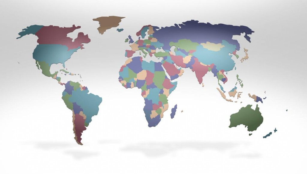
Fed-Ex has created an interactive global data experience on their website to offer “customers intriguing and insightful information to help them stay ahead of their customers’ needs in a continually changing world” (quote is from here). Putting aside the business speak, some of the data and especially its presentation is indeed intriguing. For instance, here is the globe with countries sized, as usual, by geographic size.
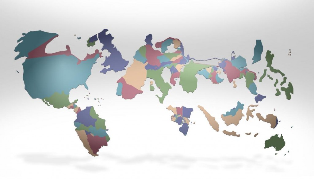
Next, we can have the size of the countries displayed based on all sorts of things. Below they are sized by access to the mobile web:
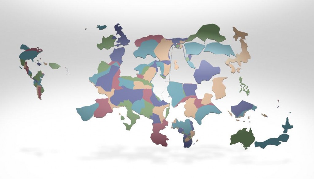
Here’s another, this time sized by the proportion of Facebook users: