Flashback Friday.
Emma M.H., Rebecca A., Natalee B., Josh L., Anna M., Jordan G., and an anonymous reader all sent in a link to a new analysis released by OkTrends, this time of members’ profile essays and the likes/interests/hobbies the essays mention, broken down by race/ethnicity and gender. They list items that were statistically unevenly distributed by race/ethnicity, showing up much more in some groups’ profiles than others’; these aren’t necessarily the most common items listed by each group.
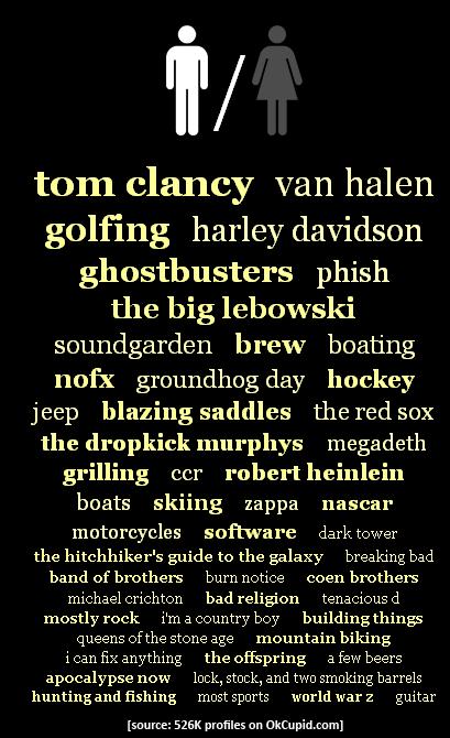
White men:
White women:
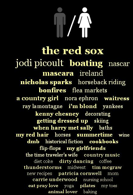 Christian Rudder, the author of the OkTrends post, points out an interesting trend: rural identifying/mythologizing. White men mention “I’m a country boy,” while for White women, being a “country girl” features prominently, meaning both groups are more likely to use this term than other racial/ethnic groups. The men also mention liking hunting/fishing, while White women include horses/horseback riding, bonfires, and the “midwest,” as well as country music/musicians. Most OkCupid users, according to Rudder, are in large metro areas. Of course, you can live in a city and still go riding or fishing, or these can be things you did before you moved to the city that you still really wish you could do and so remain an important part of your identity; and given current demographics, it’s more likely that a former rural resident would be White than non-White, thus showing up more in Whites’ profiles. But I also suspect that references to the “midwest,” or things associated with romanticized rural life (you know, running around in a beautiful wheat field during a thunderstorm and stuff) are a code for a certain type of masculinity and femininity. Among Whites, hunting/fishing indicates you’re a particular type of “guy’s guy,” while being “a country girl” who likes horses and thunderstorms is, I think, a stand-in for implying you’re down-to-earth, nice, not superficial. Being “country” is thus, a lot of the time, shorthand for being authentic.
Moving on, here’s the image for Black men:
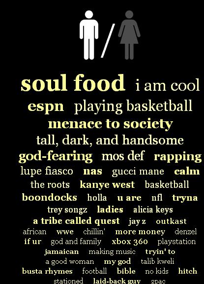 We see more self-description than in White men’s profiles — “I am cool,” “tall, dark, and handsome,” “god-fearing,” “calm,” “laid-back guy.” White men (and to a lesser extent women) seem to focus on what they like, not really what they are like, with only “I’m a country boy” and “I can fix anything” showing up in the analysis.
Black women:
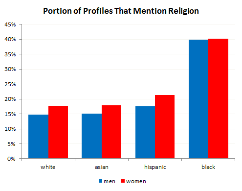
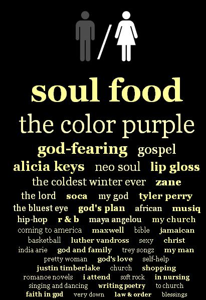 If you combined general references to religion, they would stand out even more. In fact, African American men and women are quite a bit more likely than other groups to mention religion:
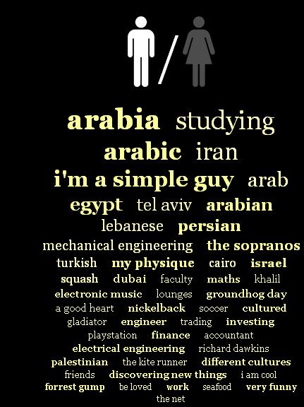
 Data for Latino men:
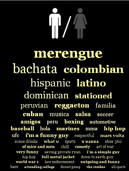 Like Black men, they more frequently than White men mention personality characteristics — “I’m a funny guy,” “respectful,” “I’m a simple guy,” “outgoing and funny,” etc.
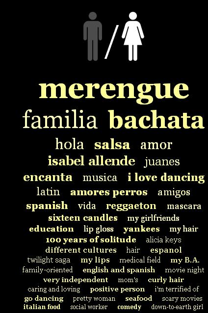
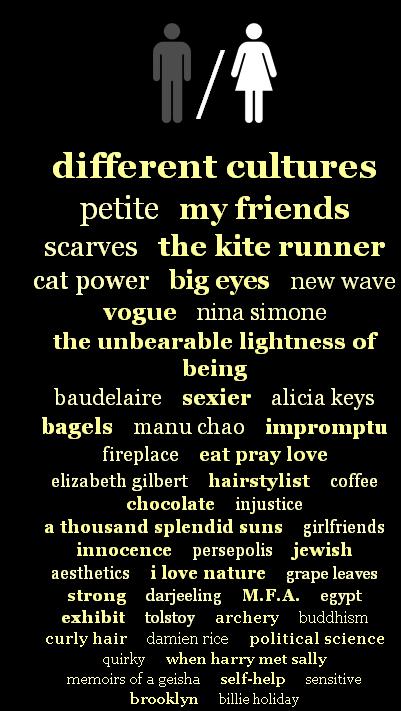
Latinas, like Latino men, mention specific dances, not just a love of music or musicians:
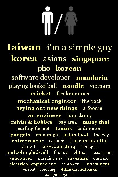
 Rudder notes that Asian men are the most likely of any group to highlight a specific ethnic/national identity in addition to the more general “Asian” label:
 I see that above with Latino men, too — references to being Peruvian, Colombian, Dominican, etc. If I had to take a stab at explaining this, I’d guess it was related to differences in how racial/ethnic categories have been applied to different groups. In the U.S. over time, White ethnic categories (say, being Dutch-American vs. Polish-American) have largely faded into the background, all subsumed under the powerful racial label “White.” Distinctions within that grouping have become largely optional, a neat thing to mention, perhaps, but not very socially meaningful. African Americans have often found themselves in the same situation, but due to much more negative forces. The generally shared experience of slavery, racism, and discrimination, as well as negative stereotypes of anyone perceived as Black, mostly erased ethnic identifications among African Americans. Being Black became a master status, such a socially important racial categorization that even those who wanted to be recognized as from a specific location (South Africa, Jamaica, etc.) often found themselves unable to get others to recognize their ethnic distinction.
The broader “Asian” and “Hispanic” labels emerged more recently in U.S. history, and members of both groups often actively fought to preserve distinctions within them. It wasn’t until the ’60s that a pan-Asian identity really began to emerge, such that being called “Asian” really meant anything to people, as opposed to thinking of themselves as Chinese, Vietnamese, etc. And “Hispanic” refers to ethnicity, not race (most Hispanics identify as White); ethnic identities are generally more flexible than racial categories. Aside from personal attachments, many groups thrown into the labels Asian and Hispanic have seen clear advantages to preserving distinctions based on nationality, believing that, say, being Japanese American would be less negatively stereotyped than being simply “Asian.”
So I wasn’t extremely surprised to see that Latino and Asian men specified identifies within those categories…but look back at the Latina image, and then this one for Asian women:
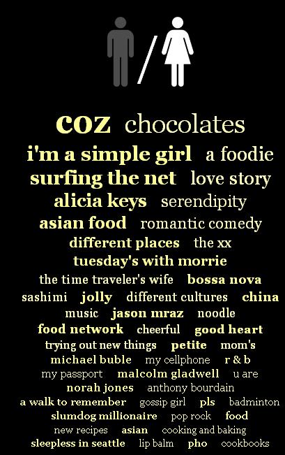 Nothing. Not one specific identifier for either group stood out. I don’t know what to make of that, and would love to hear your suggestions.
There are also specific breakdowns for Asian Indians and Pacific Islanders on the OkTrends, if you’re interested.
Middle Eastern men (a sort of odd category, but whatever) also specify nationalities, which is to be expected as this is another group that has engaged in active contests about their racial categorization in the U.S. (in particularly, fighting to be considered White, not Asian or Black) and also focus on technical/financial careers or expertise:
 Middle Eastern women are the only group who prominently mention something about their physical appearance (“petite”), for whatever that’s worth, and again, no nationalities listed:
 Of course, as Anna pointed out when she sent in the link, this data isn’t necessarily about people’s actual likes/interests, it’s about what they present as their likes/interests in the dating marketplace. On a dating website, you’re trying to present a profile of yourself…but one tailored to be attractive to others. She wonders to what degree social stereotypes of your racial group, as well as the group you’re interested in dating (if you have any preference) affects how you would describe your interests. That is, it’s possible that in some cases people highlight interests or hobbies that seem to fit social expectations of what they’ll like doing…or what they think the individuals they want to date will want to do, or want their date to want to do. To interpret these results, as OkTrends does, as straightforward evidence of differences in preferences by race/ethnicity, ignores the important fact that these are interests presented as part of an intentional performance for strangers, and may or may not reflect what we actually spend time doing, learning about, or paying attention to in our daily lives.
Originally posted in September, 2010.
Gwen Sharp is an associate professor of sociology at Nevada State College. You can follow her on Twitter at @gwensharpnv.
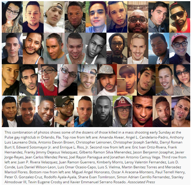
 It was “Latino night” at a gay club. When the story finally broke, that’s all I heard. Orlando’s tragedy at the Pulse puts Latina/o, Latin American, Afro-Latinos, and Puerto Ricans and other Caribbean LGBT people front and center. Otherness mounts Otherness, even in the Whitewashing of the ethno-racial background of those killed by the media, and the seemingly compassionate expressions of love by religious folk. The excess of difference—to be Black or Brown (or to be both) and to be gay, lesbian, bisexual, or transgender (or queer, as some of us see ourselves) serves to shock, through difference, how news are reported. Difference – the very basis of feminist and ethnic politics in the 20th century – has been co-opted and ignored, sanitized even, to attempt to reach a level of a so-called “humanity” that is not accomplishable. We know this, but we don’t talk about it.