The U.S. once led the world in middle class affluence, but thanks to a recovery from the Great Recession that involves giving all the money to the already-rich, we’re losing that distinction.
“In 1960,” said Harvard economist Lawrence Katz, “we were massively richer than anyone else. In 1980, we were richer. In the 1990s, we were still richer.”
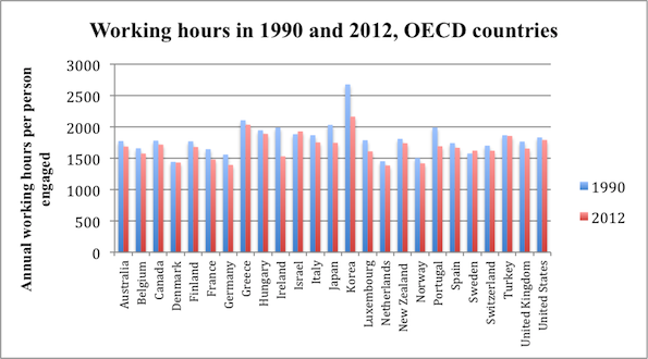
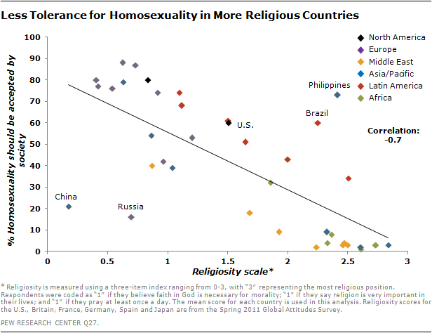
Not so much anymore. This chart shows that many countries have been closing the gap.
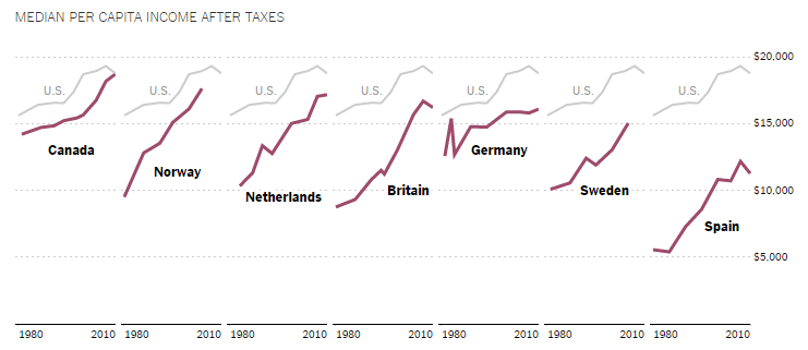
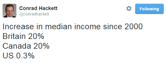
Good for them, of course, but the American middle class is struggling, too. Pew Research Center demographer Conrad Hackett summed it up:
Lisa Wade, PhD is an Associate Professor at Tulane University. She is the author of American Hookup, a book about college sexual culture; a textbook about gender; and a forthcoming introductory text: Terrible Magnificent Sociology. You can follow her on Twitter and Instagram.