nation: Norway

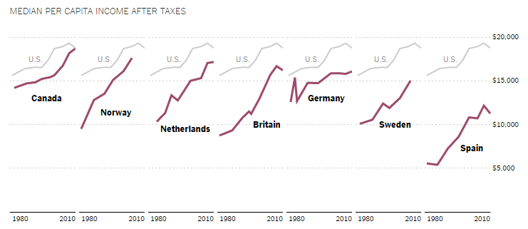
The U.S. once led the world in middle class affluence, but thanks to a recovery from the Great Recession that involves giving all the money to the already-rich, we’re losing that distinction.

“In 1960,” said Harvard economist Lawrence Katz, “we were massively richer than anyone else. In 1980, we were richer. In the 1990s, we were still richer.”

Not so much anymore. This chart shows that many countries have been closing the gap.

9

Good for them, of course, but the American middle class is struggling, too. Pew Research Center demographer Conrad Hackett summed it up:

8

Lisa Wade, PhD is an Associate Professor at Tulane University. She is the author of American Hookup, a book about college sexual culture; a textbook about gender; and a forthcoming introductory text: Terrible Magnificent Sociology. You can follow her on Twitter and Instagram.

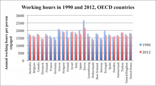
On average, U.S. workers with jobs put in more hours per year  than workers in most OECD countries. In 2012, only Greece, Hungary, Israel, Korea, and Turkey recorded a longer work year per employed person.

2

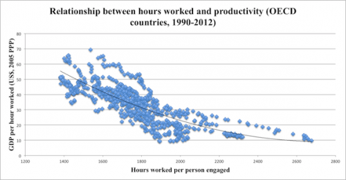
A long work year is nothing to celebrate. The following chart, from the same Economist article, shows there is a strong negative correlation between yearly hours worked and hourly productivity.

3.5

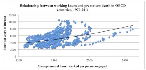
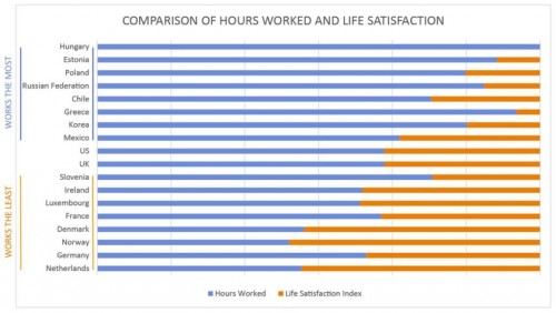
More importantly, the greater the number of hours worked per year, the greater the likelihood of premature death and poor quality of life.  This reality is highlighted in the following two charts taken from an article by Angus Chen titled “8 Charts to Show Your Boss to Prove That You Can Do More By Working Less.”

1 (2) - Copy

1 (2)

In sum, we need to pay far more attention to the organization and distribution of work, not to mention its remuneration and purpose, than we currently do.

Martin Hart-Landsberg is a professor of economics at Lewis and Clark College. You can follow him at Reports from the Economic Front.

Our favorite economist, Martin Hart-Landsberg, has written a detailed account of what is causing the rise of income inequality around the world.  Here I’d like to highlight just one of his really interesting observations.

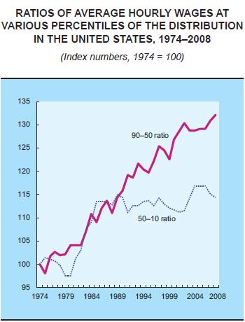
While we usually think that rising income inequality is caused by the rich getting richer and the poor getting poorer, a more complex picture is emerging.  The graph below plots the hourly wages of the 90th percentile (Americans who make more than 89% of the population) relative to the wages of the 50th percentile (the purple line) and the wages of the 50th compared to the 10th percentile (the dotted blue line).

In English: it asks how quickly the richest people (90th) are pulling away from the average person (50th) and how quickly the average person is pulling away from the poorest (10th).  The answer?  Income inequality has been increasing since the 70s but, since the late ’80s, rich people have continued pulling ahead of the average American, but the average American has not been gaining on the poor.

Wage-ratios

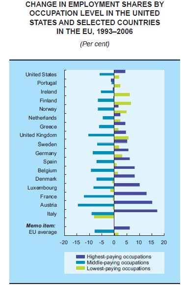
Another indicator that the middle class is shrinking is changes in the share of jobs that are low-, middle-, or high-paid.  The next graph shows that, across a wide range of countries, high- and low-paying jobs are on the rise, but middle-paying jobs are on the decline.  So, middle income jobs are disappearing, but there are more of both high- and low-income jobs.

Jobs (1)

Hart-Landsberg suggests that the reason for this shift in the economy involves the globalization of production.  For more, visit Reports from the Economic Front.

Lisa Wade, PhD is an Associate Professor at Tulane University. She is the author of American Hookup, a book about college sexual culture; a textbook about gender; and a forthcoming introductory text: Terrible Magnificent Sociology. You can follow her on Twitter and Instagram.
Paraphrasing Donald Rumsfeld, there are things we know and things we don’t know, and things we know we don’t know, and things we don’t know we don’t know.

One thing many working people in American don’t know that they don’t know is how poor our social benefits are compare with those enjoyed by workers in other countries.  No doubt one reason is the general media blackout about worker experiences in other countries.  A case in point: vacation benefits.

The Center for Economic and Policy Research recently completed a study of vacation benefits in advanced capitalist economies.  Here is what the authors found:

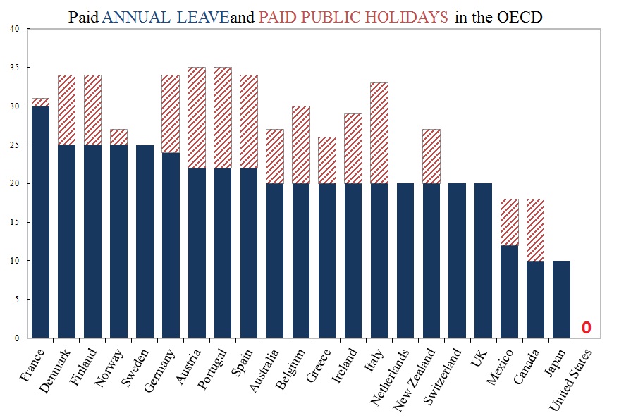
The United States is the only advanced economy in the world that does not guarantee its workers paid vacation. European countries establish legal rights to at least 20 days of paid vacation per year, with legal requirements of 25 and even 30 or more days in some countries. Australia and New Zealand both require employers to grant at least 20 vacation days per year; Canada and Japan mandate at least 10 paid days off. The gap between paid time off in the United States and the rest of the world is even larger if we include legally mandated paid holidays, where the United States offers none, but most of the rest of the world’s rich countries offer at least six paid holidays per year.

vacations

Even though paid vacations and holidays are not legally required in the United States, some employers do provide them to their workers. The table below shows the paid vacations and paid holidays offered in the U.S. private sector based on data from the 2012 National Compensation Survey.  The first two columns show the percentage of private sector workers that receive paid leave, vacation and holidays.  The next two columns show the average number of paid vacation and paid holidays provided to those employees that receive the relevant benefit.  The last two columns show the average number of paid vacation and paid holidays for all private sector workers, meaning those that receive and those that do not receive the relevant benefits.

US data

Thus, on average, private-sector workers in the United States receive ten days of paid vacation per year and six paid holidays.  This total still leaves U.S. workers last in the rankings even when compared with the legal minimums highlighted above.  And many employers in these other countries also offer more paid leave than legally required.

Moreover, several countries require additional paid leave for younger and older workers, additions that are also not included in the legal minimums highlighted above.  For example, “in Switzerland, workers under the age of 30 who do volunteer work with young people are entitled to an additional five days of annual leave. Norway offers an additional week of vacation to workers over the age of 60.”

And some countries provide additional leave for workers with difficult schedules.  For example, “Australia offers some shift workers an additional work week of leave. Austria offers workers with ‘heavy night work’ two to three extra days of leave, depending on how frequently they do this shift work, and an additional four days of leave after five years of shift work.”

Several countries offer additional paid leave for jury service, moving, getting married, or community or union work.  For example, “French law guarantees unpaid leave for community work, including nine work days for representing an association and six months for projects of ‘international solidarity’ abroad and leave with partial salary for ‘individual training’ that is less than one year. Sweden requires employers to provide paid leave for workers fulfilling union duties.”

Austria, Belgium, Denmark, Greece, and Sweden even require employers to pay workers at a premium rate while they are on vacation.

There is more to say, but the point should be clear.  Ignorance of experiences elsewhere has narrowed our own sense of possibilities.

Martin Hart-Landsberg is a professor of economics at Lewis and Clark College. You can follow him at Reports from the Economic Front.

Over at The Global Sociology Blog, SocProf put up some interesting visuals about social mobility, the likelihood that you have a significantly different economic status than your father.  Social mobility is important because it measures the degree to which a society has a caste system (in which you are restricted to the class you are born into, by whatever means) or one that gives people equal opportunities to ascend or descend the class hierarchy according to their hard work and talent.

Compared to similar countries, the U.S. has low social mobility (though most Americans think the opposite), along with Italy, the U.K., Chile, and Slovenia .  Scandinavian countries, Canada, and Australia have the most (see SocProf’s data here).

SocProf, however, asked a question I’ve never seen asked before: does this mobility differ by gender?  It does.  She found that daughters are more upwardly mobile than sons.

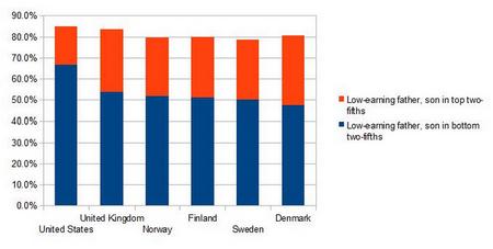
This first graph shows the percent of sons, born to a low-earning father, who will end up the top 40% of earners (orange) or the bottom 40% (blue).  Social mobility in the U.S. is lowest among the countries featured; almost 70% of American sons of low-earners stay in the bottom 40%.

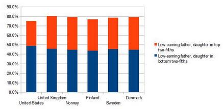
The second graph is the same data for daughters.  Mobility for daughters is higher in all countries, but it is especially so in the U.S.  While 70% of sons stay in the bottom 40%, we can say the same for less than half of daughters.

Reflecting on the fact that the difference between daughters and sons was higher in the U.S. than in the comparison countries, SocProf suggests that “[g]reater mobility seems to go together with greater gender equality” in mobility.

See also this interactive graph mapping social mobility where you can see how you compare to the rest of the U.S.

Lisa Wade, PhD is an Associate Professor at Tulane University. She is the author of American Hookup, a book about college sexual culture; a textbook about gender; and a forthcoming introductory text: Terrible Magnificent Sociology. You can follow her on Twitter and Instagram.

Cross-posted at Montclair SocioBlog.

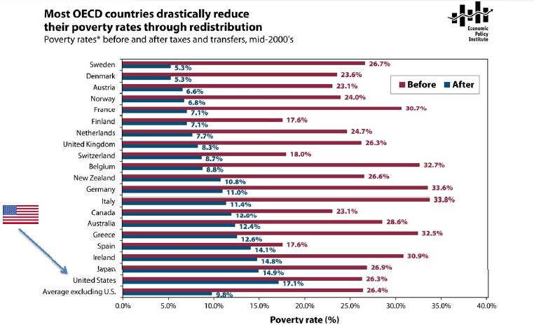
The poverty rate in the US in the mid-2000s was about 17%.  In Sweden, the poverty rate was 5.3%; in Germany, 11%.   That was the rate after adding in government transfers.  In Germany, the poverty rate before those transfers was 33.6%, ten points higher than that in the US.  Sweden’s pre-transfer poverty rate was about the same as ours.

Jared Bernstein has this chart showing pre-transfer and post-transfer rates for the OECD countries (click to enlarge):

Three  points:

1.  Governments have the power to reduce poverty, and reduce it a lot.  European governments do far more towards this goal than does the US government.

2.  It’s unlikely that America’s poor people are twice as lazy or unskilled or dissolute as their European counterparts.  Individual factors may explain differences between individuals, but these explanations have little relevance for the problem of overall poverty.  The focus on individual qualities also has little use as a basis for policy.  European countries have fewer people living in poverty, but not because those countries exhort the poor to lead more virtuous lives and punish them for their improvident ways.  European countries have lower poverty rates because the governments provide money and services to those who need them.

3.  The amount of welfare governments provide does not appear to have a dampening effect on the overall economy.

Cross-posted at Montclair SocioBlog.

As I speculated years ago (here and here), it may be hard for Americans to imagine a world where the law guarantees them at least 20 paid vacation days per year.  But such a world exists.  It’s called Europe.*

Americans are the lucky ones.  As Mitt Romney has warned us “European-style benefits” would   “poison the very spirit of America.”  Niall Ferguson, who weighs in frequently on history and economics, contrasts America’s “Protestant work ethic” with what you find in Europe – an “atheist sloth ethic.”

The graph is a bit misleading. It shows only what the law requires of employers.  Americans do get vacations.  But here in America, how much vacation you get, or whether you get any at all, and whether it’s paid – that all depends on what you can negotiate with your employer.

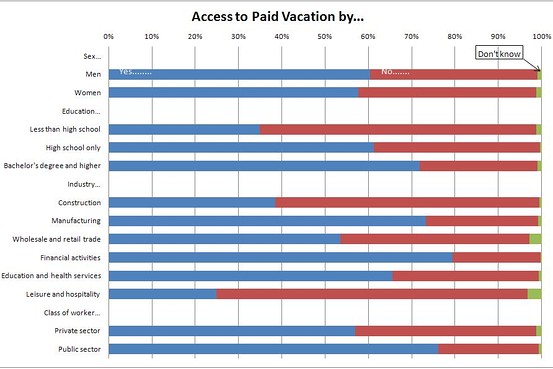
Since American vacations depend on what the boss will grant, some people get more paid vacation, some get less, and some get none.  So it might be useful to ask which sectors of our economy are beehives of the work ethic and which are sloughs of sloth.  (Ferguson’s employer, for example, Harvard University, probably gives him three months off in the summer, plus a week or two or more in the winter between semesters, plus spring break, and maybe a few other days.  I wonder how he would react if Harvard did away with these sloth-inducing policies.)

The Wall Street Journal recently (here) published a graph of BLS data on access to paid vacations; they break it up by industry near the bottom.

Those people who are cleaning your hotel room and serving your meals while you’re on vacation — only about one in four can get any paid vacation days.  And at the other end, which economic sector is most indulgent of sloth among its workforce?  Wall Street.  Four out of five there get paid vacation.

How much paid vacation do we get?  That depends on sector, but it also depends on length of service.  As the Journal says,

Europeans also get more time off: usually a bare minimum of four weeks off a year. Most Americans have to stay in a job for 20 years to get that much, according to BLS data.

—————————

* The graph is from five years ago, but I doubt things have changed much. The US still has no federal or state laws requiring any paid vacation days.

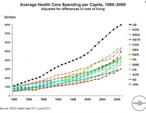
U.S. presidential candidate Mitt Romney recently traveled to Britain, Israel, and Poland, presumably to shore up his foreign policy credentials. Among a number of other statements that got a lot of attention, Romney praised Israel’s health care system, comparing it positively to the U.S. He stressed the cost differences, pointing out that Israel spends significantly less of its GDP on health care. This drew media attention because Israel has universal coverage provided by the state, and the glowing statements seemed a little odd in light of the Republicans’ opposition to the Affordable Care Act and the demonizing of the program as socialism.

But all that aside, how much do Americans spend on health care? Well…a lot. Elizabeth McM. sent us a link to a story at The Atlantic comparing U.S. medical spending to a number of other nations:

What are we spending it on? Hospital care is the single largest expense, followed by the cost of doctor/clinic visits. Another 10% is prescription drugs. The remainder falls into a variety of categories:

With overall spending distributed among so many different sectors of the health care sector, reducing costs requires more than just increased efficiency by hospitals or lowered drug costs — it requires changes and savings throughout the system.