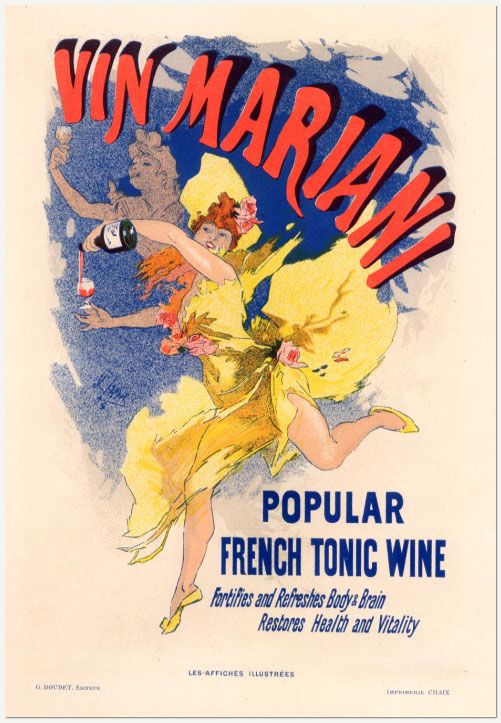
Originally posted at Racism Review.
The photos capture a woman lying serenely on a pebble beach. She is unaware of the four men as they approach. They wear guns and bulletproof vests, and demand the woman remove her shirt. They watch as she complies. This scene was reported in recent weeks by news outlets across the globe. More than twenty coastal towns and cities in France imposed bans on the burkini, the full body swimsuit favored by religious Muslim women.
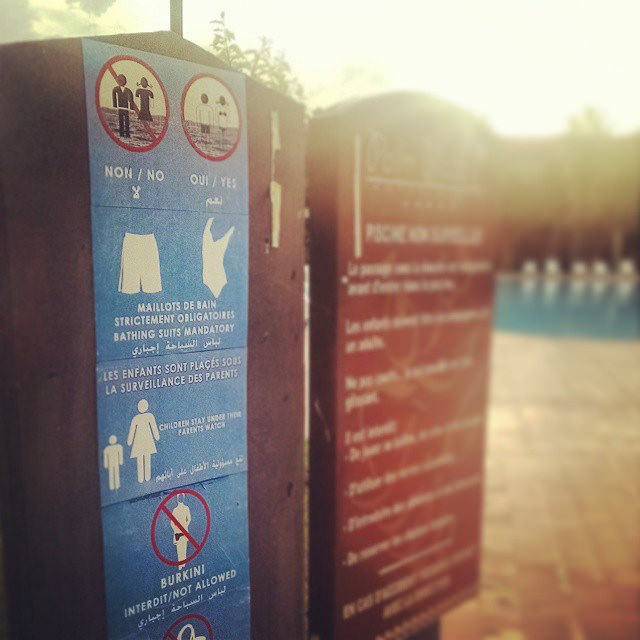
French politicians have falsely linked the burkini with religious fundamentalism. They have employed both blatant and subtly racist language to express indignation at the sight of a non-white, non-Western female body in a public space designated as “white.” Like many, I have been transfixed by the images of brazen discrimination and shaming. Although the woman in the photographs, identified only as Siam, was not wearing a burkini, her body was targeted by a racist institution, the State.
Olivier Majewicz, the Socialist mayor of Oye-Plage, a town on the northern coast of France, described a Muslim woman on the beach as appearing “a bit wild, close to nature.” Her attire, he said, was not “what one normally expects from a beachgoer… we are in a small town and the beach is a small, family friendly place.” France’s Socialist Prime Minister, Manuel Valls, utilized more direct language, stating that the burkini enslaved women and that the “nation must defend itself.” Similarly blunt, Thierry Migoule, an official with the municipal services in Cannes, said the burkini “conveys an allegiance to the terrorist movements that are waging war against us.”
These quotes reflect the pernicious limitations of the white gaze. When I look at the photos of Siam, I see a woman, a mother, being forced to undress before a crowd of strangers. I can hear her children, terrified, crying nearby. Siam’s encounter was a scene of trauma, and as Henri Rossi, the vice president of the League of Human Rights in Cannes, said “this trauma has not been cured; the convalescence has not yet begun.”
Some sixty years ago, Frantz Fanon in Black Skin, White Masks, explored the relationships between the white gaze and the black body, specifically in France and its colonies. In the age of the burkini ban, Fanon’s observations ring poignant and true. He writes: “…we were given the occasion to confront the white gaze. An unusual weight descended on us. The real world robbed us of our share. In the white world, the man of color encounters difficulties in elaborating his body schema. The image of one’s body is solely negating. It’s an image in the third person. All around the body reigns an atmosphere of certain uncertainty.” Fanon’s words could serve as the soundtrack to Siam’s encounter with the police. She was robbed of her share, her body negated and deemed a public threat by the white gaze.
In the wake of recent terrorist attacks in France, politicians have capitalized on the politics of fear in order to renegotiate the boundaries of institutional racism as expressed in the public sphere. In Living with Racism, Joe Feagin and Melvin Sikes quote Arthur Brittan and Mary Maynard (Sexism, Racism and Oppression) about the ever-changing “terms of oppression.” Brittan and Maynard write:
the terms of oppression are not only dictated by history, culture, and the sexual and social division of labor. They are also profoundly shaped at the site of the oppression, and by the way in which oppressors and oppressed continuously have to renegotiate, reconstruct, and re-establish their relative positions in respect to benefits and power.
As the burkini affords Muslim women the benefit to participate in different arenas of public space, the state recalibrates its boundaries to create new or revive previous sites of oppression. In the case of the burkini, the sites of oppression are both public beaches and women’s bodies – common sites of attempted domination, not only in France, but also the US.
Fanon, Feagin and Sikes all point to institutional racism as an engine that fuels white supremacy and its policies of discrimination. As Feagin and Sikes observe, these:
recurring encounters with white racism can be viewed as a series of “life crises,” often similar to other serious life crises, such as the death of a loved one, that disturb an individual’s life trajectory.
The photos of Siam capture the unfolding of life crisis and illustrate the power of institutional racism to inflict both individual and collective traumas.
Julia Lipkins is an archivist and MA candidate in American Studies at The Graduate Center, CUNY.