
If you’re looking for basic global demographic information, World Health Rankings provides a great overview, using World Health Organization, World Bank, UNESCO, and other data. The website allows you to select a country, then provides a detailed breakdown of many demographic details, such as population pyramids (you can select different years in the past, or look at predictions for the future), leading causes of death, etc. Here’s the 2010 population pyramid for the U.S.:

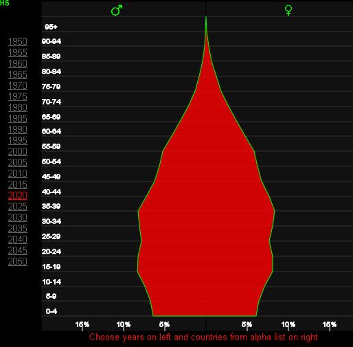
You can also easily access all the age pyramids here. The 2020 projections for Brazil show the changing demographics due to the dramatic decrease in the fertility rate, which Lisa posted about this weekend:
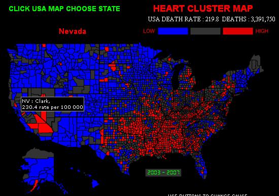
There’s an interactive map of the top 15 causes of death in the U.S., allowing you to look at variations by county. Here’s the map of deaths due to heart disease, with Clark County, Nevada, highlighted:
You can also look at life expectancy for different nations for every decade between 1960 and 20101, a “real-time” clock that tracks global deaths (you can look at how many have died in the last year or month, or you can click “now” and reset the clock and watch as the clock estimate how many people die of various causes of death worldwide), and maps showing the prevalence of various causes of death around the world. Lots of neat representations of rather depressing information.
Also, as I wrote this post I realized that now every time I see a population pyramid of the U.S., Community‘s song “Baby Boomer Santa” is going to play through my head.
Comments 2
Lunad — January 16, 2012
I feel like a vertical line marking the 0% point would make these pyramids much easier to read, as the difference between men and women is small but significant.
Population Pyramids | Toppli — January 29, 2012
[...] I’ve loved these types of charts since I first saw them used for insight into the Arab Spring discontent. What’s great about the version linked below is the country coverage that Worldlifeexpectancy.com has managed to pull together – it’s very impressive. If you wander the site, there are a lot of additional maps and charts on global causes of death, life expectancy, and other fun demographic topics. (via) [...]