
I’m putting together a public policy course for the first time since graduate school. It reminds me what I love about what I do. Public policy is about how we solve common problems. The palete from which to choose readings is unlimited. That’s been part of my problem…there’s so much interesting material to talk about out there it’s impposible to narrow it down.
One area that sorely lacking in public policy scholarship is the effect of the presentation of information on decision-makers. Im having my students read a few articles about Edward Tufte. Bonanos, C. (2007) The Minister of Information. New York Magazine. and Smith, F. (2007) Intelligent Designs. STANFORD Magazine. Tufte is a self declared arch-enemy of power point and is famous for pointing out NASA’s scientists’ inability to convey important information to higher-ups before the Challenger disaster.
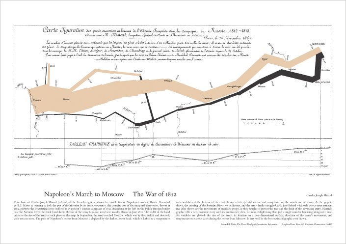
He’s also famous for popularizing this map by Charles Joseph Minard that shows the losses incurred by Napoleon’s army in the Russian campaign of 1812. The diagram show how Napoleon’s army thinned (beige band) as temperatures in Russia dropped (black band).
It makes me wonder how different our disciplines would be if most of us put thought into the form of our data presentations. We’re trained to focus solely on function but, mostly because of cost concerns, our conferences provide us little opportunity to use technologies that could bring our data to life. Would having LCD displays at academic conferences make them more policy relevant? Would they encourage more journalists to attend?
Comments 4
andrew m. lindner — January 16, 2009
I'm a big opponent of Powerpoint and highly interested in some of the creative data presentations we've seen on the Internet in recent years. That said, I think one of the biggest boundaries to more broad use is the high level of expertise needed to make them.
Jon Smajda — January 17, 2009
re: "high level of expertise." If you mean purely technical expertise, I'm not so sure that's the biggest factor. At least relative to what we do already anyway: academics spend hours futzing with Word to make their huge confusing tables work.
Every issue of Contexts, we have a single grad student (Wes Longhofer) go through all the ugly, poorly formatted tables and charts out authors give us and turn them into the clean, easy to read, good looking product you see in our issues. I'm not sure they rise to Tuftian (sp?) standards, but they're certainly much better than average and it's mostly just because we prioritize it.
Of course, it's also because we can strip the graphics down to their essentials, cutting out the sort of information a traditional journal would require.
By the way, in the next few days we'll be launching a new Contexts Blog called Graphic Sociology (no link yet because it's not public yet...but soon!). It'll be run by Laura Noren and be all about this sort of thing.
Jose marichal — January 19, 2009
Cool....I look forward to that blog. I know there are serious social norms against making your work "too flashy." It somehow is taken as a signal of poor academic work "all steak and no sizzle." But there's so much work out there you wonder who sees it all and what it's ultimate purpose is.
kenneth M. Kambara — January 22, 2009
I've used Tufte in classes & I was taught in the Oregon Psych. Dept. the value of graphical depictions of data. Remember good old stem & leaf plots.
Like Jakob Nielsen's usability pontifications, I sometimes wonder if these gurus sometimes drink their own Kool-Aid.
I do think more journalist would attend if the content could be made more intuitive. I think the main problem with most conferences and the academy in general is the fact that we write for our own kind. I'm writing a paper for a journal where stuff is meant to be read by a wider audience of academics + practitioners. it's a challenge to communicate a quantitative paper in plain language. this post reminded me of the value of a good graphic.