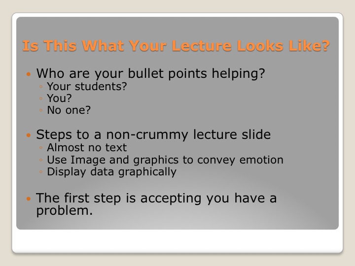
Who is your powerpoint presentation created for? That is, who benefits most from what you put on the slides? Do you put everything a student would need to know to do well on exams? Probably not. When you know a topic like the back of your hand do you put a whole lot of fine details on your slides? Most people don’t. Then who are bullet point slides designed for? Not our students/audience, but for you the presenter. It’s no wonder then that students eyes glaze over by the second slide.
Cognitive Overload:
Bullet point slides ask your students to listen to you, read what they see, and write it down in their notebook. Listen, read, write simultaneously. But the truth is, no one can really multitask, you can only do 3 things half heartedly. You know what I am talking about; the classroom gets silent when you progress your slides forward. If you want to ask a question you have to wait until everyone gets the slide copied in their notes. Bullet points force your students to ignore you. So then are your presentation slides an aide to your instruction or are you an aide to your PowerPoint’s instruction. You can reclaim your class, if you want to.
The Potential in PowerPoint.
Your lecture slides could captivate your students. They could communicate in a simple, straightforward manner a complex concept by using an image or metaphor. Instead of bullet points telling students about a current event, you could show them what it looked like. You could use your slides to convey the emotion connected to your concepts. Your slides could make your students laugh or want to cry. The potential is so amazing that it is near criminal that so many of us are leaving this opportunity on the table. See & download my examples below:
Current Events:

This slides doesn’t tell your class about the two students who spread cotton in front of the Black Culture Center at the University of Missouri, it takes them there. It shows them the smug look on the perpetrators face when they were arrested.
Presenting Concepts Visually:


Social Stratification as explained through rock stratification.

Racial Injustice

Lobbying
Conveying Emotion:

This photo shows the grieving mother of a Muslim American Solider Kareem Rashad Sultan Khan who was killed in Iraq serving his country. I use this photo when we talk about Islamophobia and what it means to be an American.
Graphically Explain Data


“But, My Students Expect To See My Notes”:
This could be put another way: “But, my students expect me to tell them what’s on the test.” This is a dangerous teaching model. It makes you “the expert” with all the information. It also encourages diametric thinking (i.e. that there is only right information and wrong information.) Students with this mindset will hate group work, because why would they want to talk to non-expert students when there is a sage in the room? Students at this level of thinking cannot understand how answers can be partially right or how complex certain situations can be. If you want to encourage higher level thinking you have to break students out of this model and changing your PowerePoints is a straight forward way of doing just that. If you don’t change them, you should ask yourself, “what type of thinking am I preparing my students for?”
I tell my students all the time, “If you want a different type of class, then you have to be a different type of student. I promise you that I will do everything in my power to be a different kind of teacher and make this a different kind of classroom experience.” Different in, different out. If you want a different experience with your students you have to try different things. I say so what if your students expect bullet point slides. Give them a well thought out, interesting, challenging class and they won’t complain that you didn’t follow some unwritten rules.
How You Can Do It:
I use Google Image search and Flickr’s Creative Commons search to find most of my images. These are free resources that you can use as long as you credit the owner or creator of the images (what’s know as attribution in creative commons lingo). Another option that I use a lot is iStockPhoto.com which is a website that has thousands of professional royalty free images for around $5 each. This is less attractive, but if you buy images that can be reused in many classes it can lesson the pain.
This post and all of my lecture slides were inspired by Garr Reynolds’s Amazing book Presentation Zen: Simple Ideas on Presentation Design and Delivery
. You owe it to yourself to read this book.
Lastly, I don’t use PowerPoint because I find that program infuriating. If you have a Mac you should at least try Keynote. It makes it dead simple to produce snazzy lecture slides in less time than it takes to fumble through PowerPoint.


Comments