sex


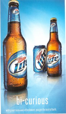
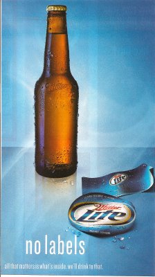
I found these two Miller Lite ads in QVegas, a magazine aimed at the GLBT community.

It would be interesting to pair with these ads for Skyy vodka to illustrate how companies make different ads to target different audiences. If you find an ad offensive or dumb, it’s not necessarily an ineffective ad, it’s that you probably aren’t the target consumer and it’s not supposed to appeal to you.

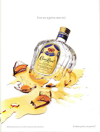
NEW! Philip D. sent in a link to a post by Sister Toldja at Me, Myself An Eye about slightly different versions of ads for Crown Royal. This one is presumably aimed at a general audience:
cr

Text: “Have you ever seen a grown man cry?”

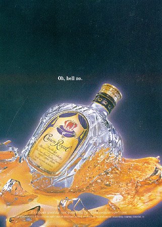
Sister Toldja suspects that this one is targeted more specifically at African Americans:
crb

Text: “Oh, hell no.”

Now, just to be clear, I’m not arguing these are racist ads. I just think they would provide a good example to start students thinking about the fact that a) advertisers actively market to various groups by trying to appeal to them in specific ways that may differ from an ad made for a “mainstream” or “general” audience (i.e., one that would presumably appeal to just about everybody) and b) they do this by playing on stereotypes or cultural assumptions about what different groups like (or are like). What separates these two ads into “mainstream” and “Black” ones? Simply the presence of a phrase that many people associate with African Americans (although I have to admit I mostly associate it with one of my male cousins more than anyone else). You might start with this example, which is fairly innocuous, I think, and then start asking students to think about other ways advertisers might indicate who an ad is supposed to appeal to (men or women, gay or straight, or more broadly to “everyone”). When do these efforts become problematic?

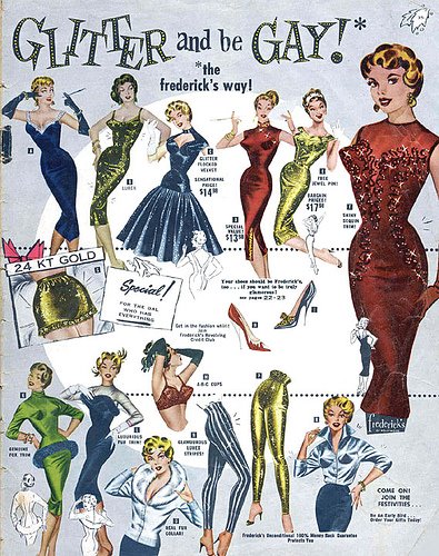
Then:

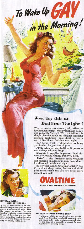
Then:

ovaltine_old_ad

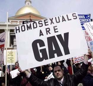
Now:

Thanks to Jason for sending along the first “then”!

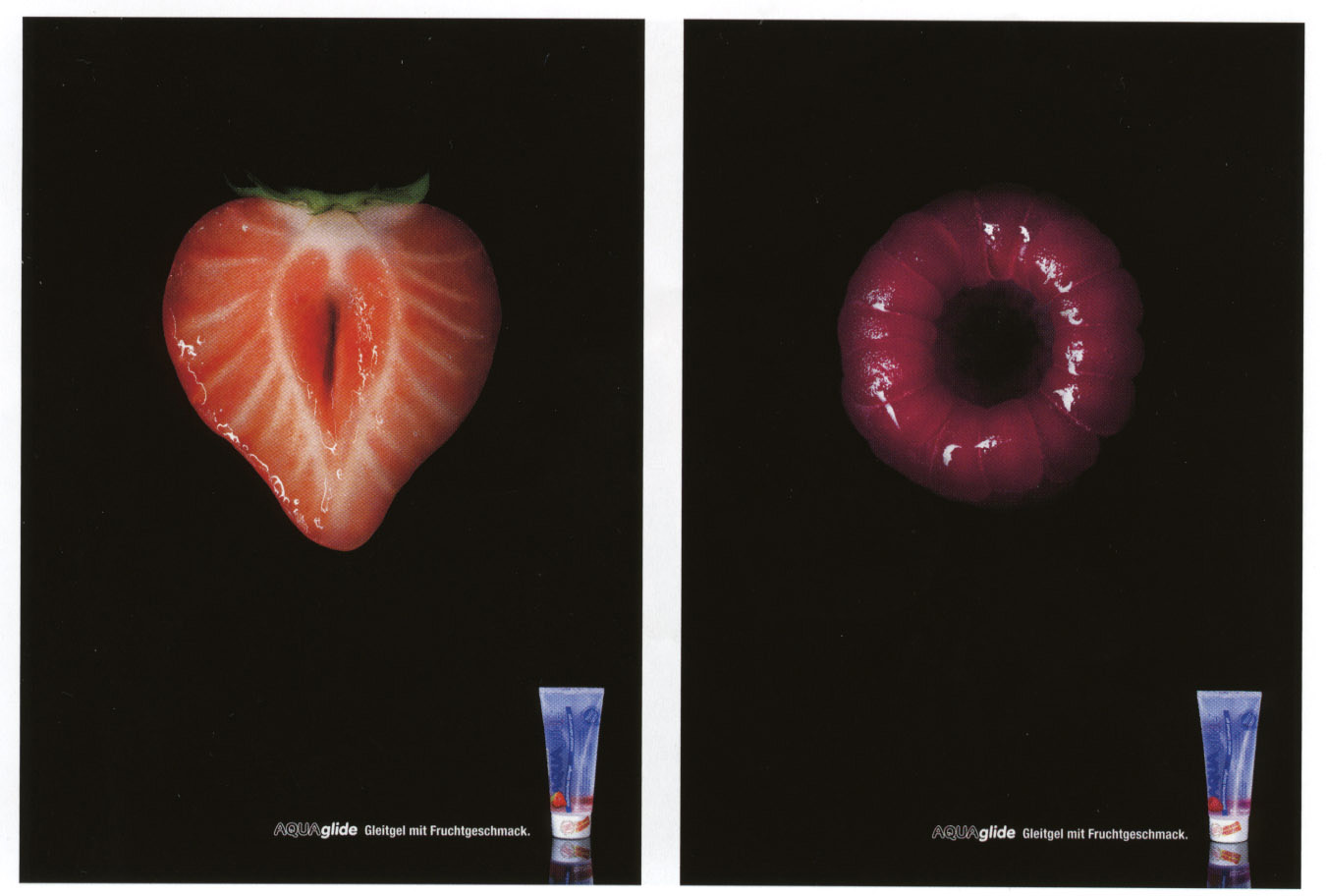
It seems the food-and-sex-themed images just won’t stop coming! In these astroglide ads, women (and men?) are nothing but a slick, tasty slit and hole (found here):

And Andrew sent these Puma ads (found here) (look closely):

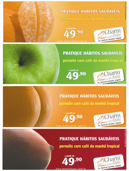
NEW (Feb. ’10)! Софи А. sent along a similar ad campaign:

Also in sexualized food: mustard and ketchup are sexy, do you desire white meat?, hot dog!, and a whole slew of examples.

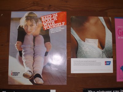
These two images were part of the campaign to raise awareness about breast cancer at my college this year. I think it is fascinating that, even when spreading a message about women’s health, the images include sexualization and objectification (on the right) and a woman posed to look insecure, vulnerable, and maybe slightly scared (on the left).

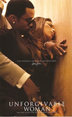
I posted this first image back in October. This ad is disturbing because you can’t really tell if it’s consensual or an attack. And the perfume is called “Unforgivable.”

One of my students recently pointed out the ad for Unforgivable for Men:

Could provide a really interesting discussion of differing images of masculine and feminine sexuality and power. Thanks, Laisa P.!


NEW: Here’s an ad for Isaia Napoli clothing that is very similar:

Thanks, Laura L.!

Gwen Sharp is an associate professor of sociology at Nevada State College. You can follow her on Twitter at @gwensharpnv.

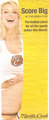
An ad for a bar at the Monte Carlo casino in Las Vegas. I found it in Las Vegas Living.

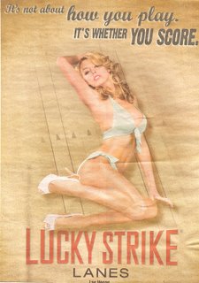
I just found this ad for a bowling alley in Las Vegas Weekly.

sc00c6c6d9.jpg

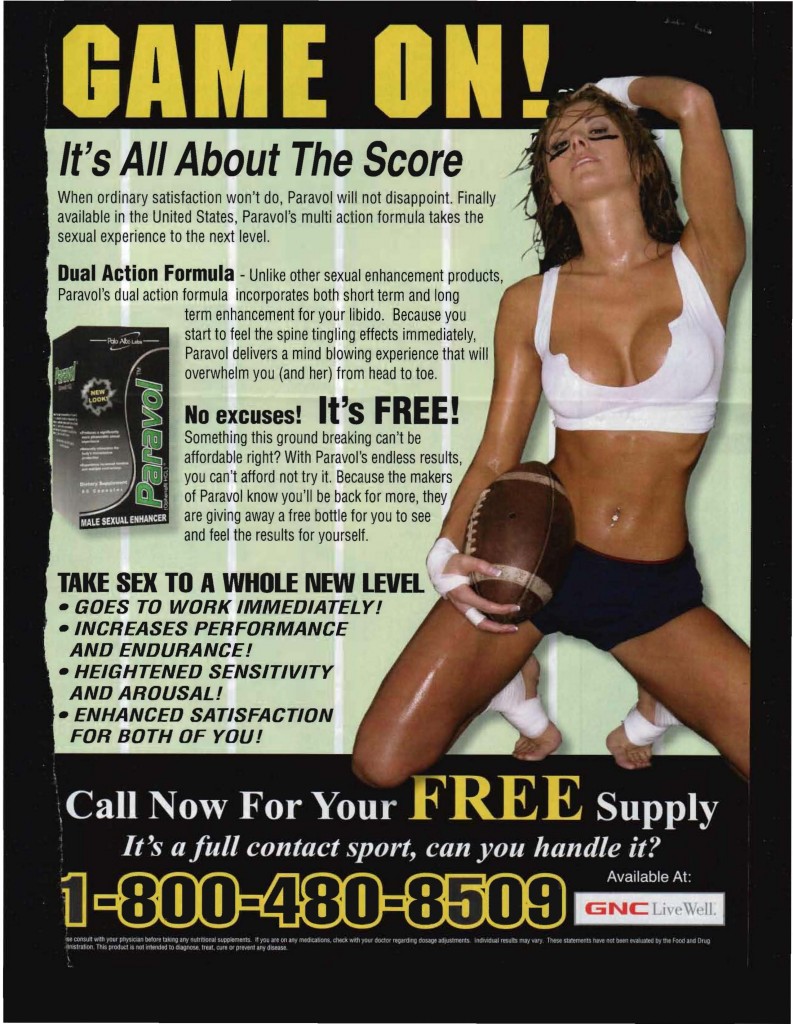
NEW! Here’s another ad that uses the idea of “scoring” to refer to sex:

score

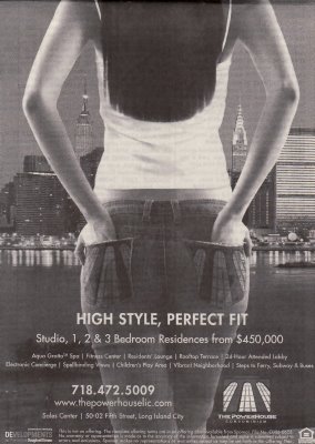
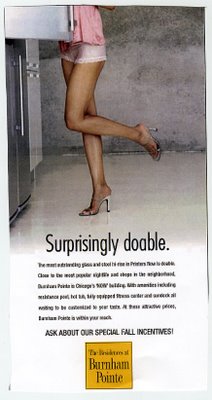
Copyranter has pointed me to a recent spate of ads for homes, apartments, and condos that use the idea of accessible women, or otherwise use sexuality, to sell their product.


Lindsey Dale, at Nobody, sent along this additional example:

Also in using women’s sexual availability to sell real estate.

This image, getting lots of negative attention in the blogosphere, is advertising a new Chinese restaurant in Rhode Island:

Warning! This image may not be safe for your workplace. 

more...