sex

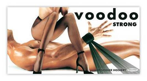
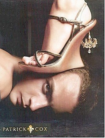
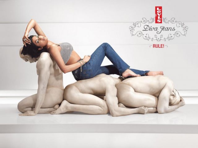
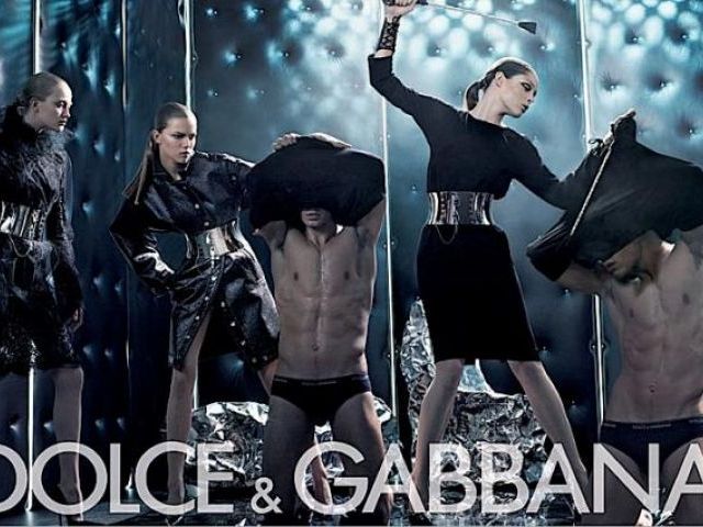
Miguel sent us a link to Galeria: Ellas Mandan, a set of advertisements that reverse the common images of male dominance by showing women in control:

For liquor:

For pantyhose:

Shoes:

Jeans:

Dolce & Gabbana:

A submission from Stumblng Tumblr from the Brylcreem website:

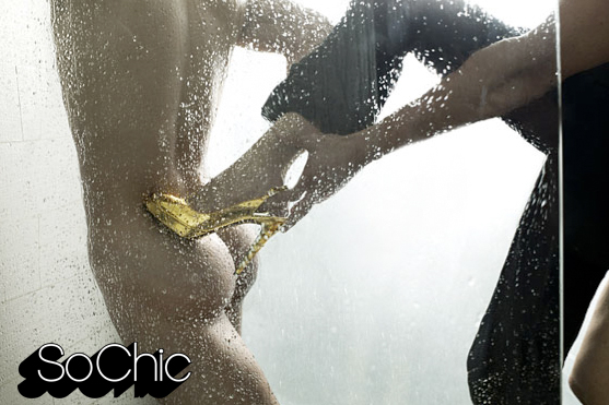
NEW!  A fashion ad from Phillip G.:
lrg-2765-brian_atwood_series2_03_jpg

These images show women in “control” of, or dominating men, but in a very sexualized manner that often references S&M or bondage. So women can have power, but have to be sexualized at the same time. This fits in well with our cultural beliefs that women have power over men because men want sex and will allow themselves to be manipulated by women in order to get it. So women can supposedly control men by threatening to withhold sex until they get what they want.

And is it not possible to just have some images where men and women are equals and no one has to be dominant? Is that out of the question?

Thanks, Miguel!

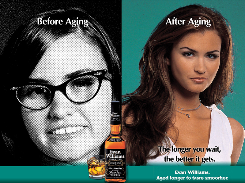
The following images are from an ad campaign by Evan Williams bourbon. Each features the tag line “The longer you wait…the better it gets.” The first is a scanned image of a print ad (sorry for the torn edge):

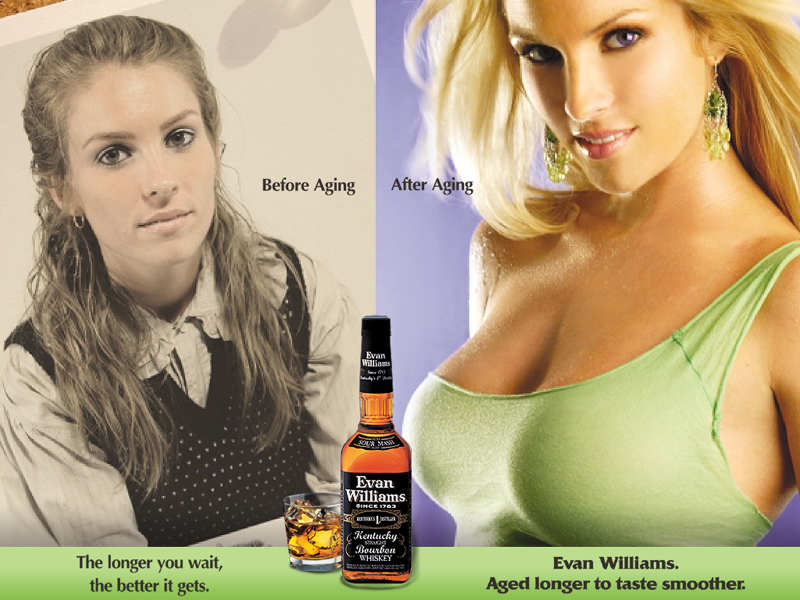
These images are from the Evan Williams website:

The images from the website also feature the “Before Aging: After Aging” slogan, which presumably applies to the increasing social demand for hypersexual feminine performance as time passes (and certainly not to an acceptance or appreciation of the fact that individual women age). I particularly enjoy this last ad, since it makes an observation that, in the old days, women wore frumpy sweaters, but now, thanks to “aging,” we can all expect women to wear asymmetrical lime-green halter tops with beads of moisture dripping into their copious cleavage.

And if that’s not a recipe for progress, I don’t know what is.

NEW! Here’s another one:

longer-you-wait


Camilla P. sent us this international sampler of Coke Zero ads. She says all of them that she found use the whole “zero” is manlier than “diet” strategy (see the first two below), except the one in Australia which links a sip of Coke Zero with orgasm (see the third video).

From Britain:

From Brazil (we’d love someone to translate, although we think we get the gist):

From Australia:

If you liked that, see this remarkable Orangina commercial.

Two readers, Breck and Miguel, sent in this post:

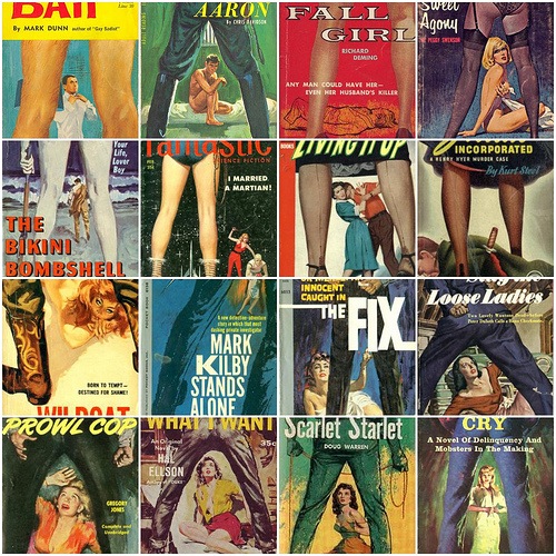
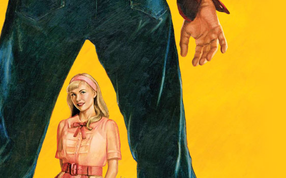
Boingboing put up this post that shows how common “spread legs” imagery is in old book covers. A commenter to that post pointed out this example (found here) from the Broadway version of Cry-Baby.:

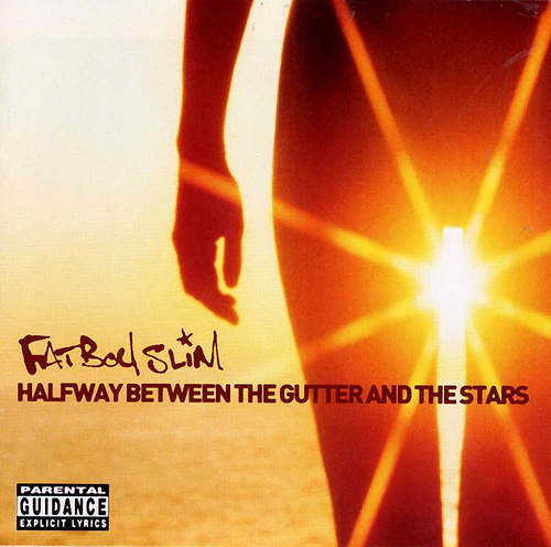
Another commenter thought this FatBoy Slim album cover is interesting:

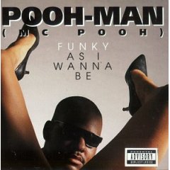
And there’s this Pooh-Man album cover:

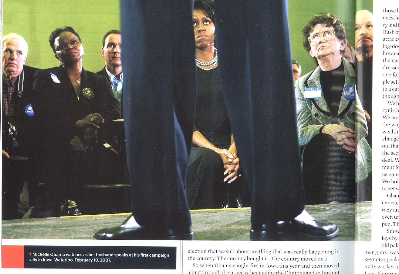
And:

Miguel pointed out that the exact same stance can seem threatening or sexual inviting, depending on whether it’s a man or a woman in the pose.

Thanks to Breck and Miguel for sending these along!

NEW: Larry sent along this image from the June 2008 issue of Esquire magazine (p. 112), which also uses the “spread legs” motif:

In case you thought this was a new phenomenon:

Found here thanks to Jason S.

Fellow blogger, Brett, specializes in counseling adolescent boys.  He says, no matter what they come in for–skipping school, fighting, arson–they always get around to asking, “How do you know when a girl likes you?”

One thing you may not know about the peoples of the pre-Columbian Andean region: they were fond of making pottery with exaggerated penises. These were often pipes or water vessels and forced the user to place his or her mouth on the gigantic penis. Images can be found herehere, here and here.

I like these because they remind students that sexual humor (making pottery that forces someone to drink out of a penis, for instance) is not even close to being a modern invention. I’m sure there are lots of other interpretations–that this actually shows an obsession with the penis than indicates a patriarchal culture, that it was part of a cult of warrior potency, and so on–but I bet there was also a level of joking going on too.

Gwen Sharp is an associate professor of sociology at Nevada State College. You can follow her on Twitter at @gwensharpnv.

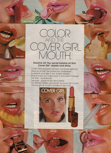
This old CoverGirl lipstick ad, found here, illustrates the infantilization of women we often see in ads-women (provocatively) licking ice cream cones, eating fruit, and so on. Thanks to Krystal-lynn M. for sending it in!

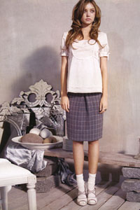
These Kenzie ads (available at the University of Michigan’s Sexual Assault Prevention and Awareness Center’s website) also have women in childlike poses, with their mary-jane shoes and ruffled socks. Thanks for sending them in, Laura L.!

These images illustrate two common trends in advertising: on the one hand, women are portrayed as little girls, as coyly innocent, as lacking in power and maturing. On the other hand, child-likeness is sexy, and girls are portrayed as Lolitas whose innocence is questionable.

NEW (Mar. ’10)! Jeff H. sent along this photo from a GQ spread in which Reille Hunter is posed with Kermit the Frog, Barney the Dinosaur, and Dora the Explorer:


Found here, here, and here thanks to Erin H.  Thanks!

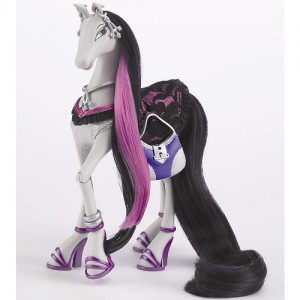
Erin writes:

This brings together the awful hypersexualisation of toys for young girls (recommended: ages 4 – 8 ) with the often bizarre and sometimes disturbing anthropomorphisation of animals. In this case, Bratz dolls (complete with impossible footwear and freakishly large eyes) meet My Little Ponies in an unholy combination of hinted-at cleavage, age-inappropriate costuming / accessories and come-hither glances! So many shades of ick. What would the equivalent for young boys be, I wonder?

Speaking of, is anyone else nostalgic for my little ponies and carebears?  Sigh.

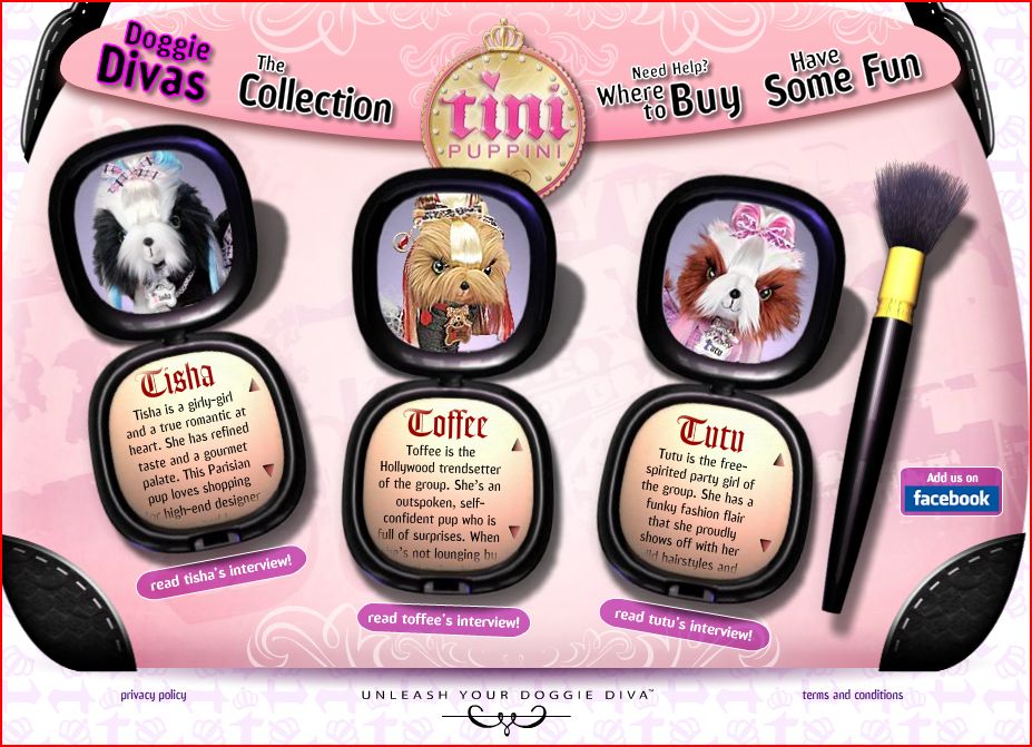
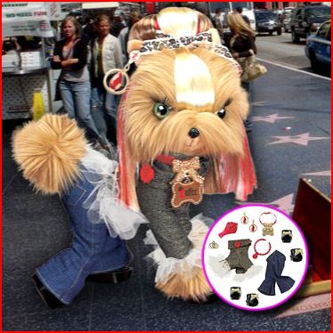
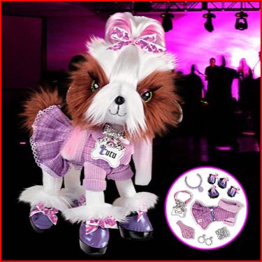
NEW!  In a similar phenomenon, I present you the Tini Puppini (found here via Jezebel):