rural/urban

The Scion is an interesting study in marketing.  Scion (noun: descendant) is a subsidiary of Toyota.  Why Scion? Well, Toyota wanted to sell cars to young, hip, urban guys but (as we all know) Toyotas are for fuddy duddies (yeah I’m talkin’ to you).  So Toyota started Scion.  Scions are really just Toyotas, less the fuddy duddy baggage.  Toyota has marketed Scions accordingly.   Here are some commercials:

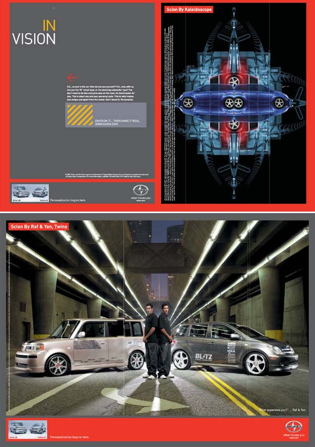
Scion advertising features young people of color, usually men, in urban spaces (found here):

1022scion14_big

I have a Scion.  This one:

dscf0127

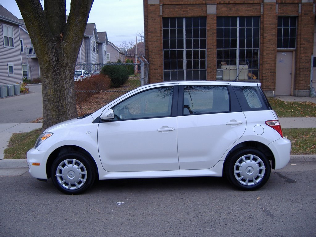
When I walked into the Madison, Wisconsin Toyota dealer to purchase it, there were a dozen middle-aged white men with pot-bellies, and a Latina that looked about 16 years old.  She was the Scion salesperson.  (Hi Celia!)

Also appealing to its intended customers, Toyota encourages you to customize your Scion.  When I purchased the car, I had the option of adding neon trim around the bottom of the car, glowing cup holders, and giant speakers that took up the entire back seat.  Factory installed.  (I opted for all three, of course.)

Scion encourages these additions.  As the commercials show, Scion emphasizes customization and the individualization of your car.  “United by Individuality” is one of their advertising themes (found here):

im-i-mb

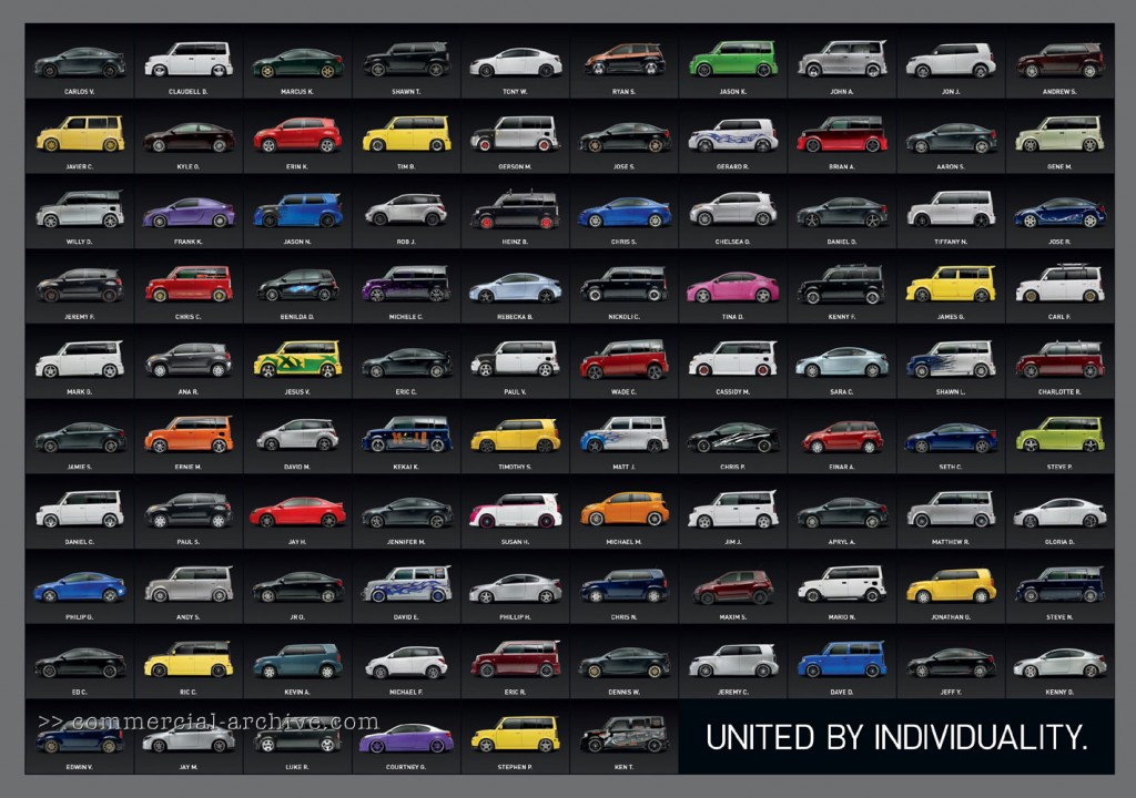
Underneath each of these unique Scions is the name of its owner.  These names include Carlos V., Claudell D., Javier C., Benilda D., Jesus V., Kekai K., Nickoli C., Mario N., Einar A., Jose S., and Jose R.  They’re definitely not marketing to the stereotypical Toyota crowd.

The marketing of the Scion points to how we separate old from young and then layer the binary with further binaries: boring/exciting, suburban/urban, conformity/individuality, and even white/non-white.  Toyota doesn’t sell Scions by constantly reminding us that Scions are Toyotas (with all the dependability and efficiency that Toyotas are known for), just the opposite.  And youth, Toyota appears to believe, want to differentiate themselves from dull, grown-up, suburban, whitebread conformity as much as possible.

But here’s the twist:

Celia (who I bought my Scion from in Madison, Wisconsin) told me that, despite all of their efforts, the “boxy” Scion (the one on the left in the first print ad) is bought disproportionately by elderly people.  Why?  Because the spacious interior holds a wheelchair just as easily as a mountain bike or a drum kit and the height of the car makes it easy to get in and out of without having to pull yourself up or lower yourself down.

Marketing, thanks to human creativity and free will, has its limits and marketers can’t always predict how their strategies will play.

The Environmental Working Group’s interactive database lets you look up farm subsidies paid by the USDA. You can get all kinds of information–subsidy payments by county or congressional district, top 100 recipients of subsidies, breakdowns into particular types of payments (conservation, crops, disaster, etc.), and so on. It’s an interesting source of information, given that the Obama administration wants to drastically reduce farm subsidies and we’re likely to see a big argument over what the impact will be on farmers. Some groups argue that mid-sized family farms will be devastated by the loss of price supports. Others point out that subsidy payments are highly concentrated, with the top 20% of recipients getting the overwhelming majority of payments, and that if large industrial operations were forced to compete with family farms on an even playing-field without welfare payments, many of them would go out of business, leading to lower production and higher prices for other producers.

This was a big debate among rural sociologists when I was in grad school, and I guess we may be about to see.

Fellow Contexts blogger Flaneuse over at Graphic Sociology posted this map showing increases in milk production by region:

milk_production_us

As we see, overall production has been more or less stable in most regions but has increased dramatically in the Pacific and Mountain regions.

This data hides another pattern, however: changes in average dairy herd size. Dairy operations in the West and Pacific regions tend to be significantly larger than dairy farms in the more traditional dairy states in the Great Lakes region and the Northeast. I went to the 2007 Census of Agriculture site and grabbed some data to do a few quick calculations. I chose two states in the western U.S. and two in the traditional Dairy Belt, just for illustrative purposes:

picture-18

All calculations use data available in Table 17 in the Census reports for the total U.S. and each individual state, which you can easily access at the link above if you want to check my numbers. I rounded everything off to the next highest whole number except for the two percentages in the lower right-hand cells, where doing so would greatly over-represent the percent of farms of that size.

In general, dairy farms with more than 500 milking cows are considered very large in the industry. Those with over 2500 cows are really extremely large, though there are dairies with more than 10,000 milking cows (including the Vander Eyk dairy, which supplies organic milk to be sold under the Horizon brand, as well as conventional, non-organic milk to other companies). But I digress.

Anyway, clearly we see that farms in California and Idaho (and the other Pacific/Mountain states) are larger, on average, than dairy farms in the traditional dairy states. The increase in milk production in the western U.S. is due predominantly to increases in the number (and herd sizes) of very large industrial dairies.

The growth of these large dairies depends on very cheap rates for water used to irrigate agricultural land. Those dairies have to grow lots of alfalfa and other feed crops to feed so many cows, since they certainly can’t afford enough land to have thousands of cows on pasture. And big dairies produce enormous amounts of manure that have to be carted off somewhere each day, meaning they often have big manure lagoons where they store it (as well as spraying as much as possible on fields). The lagoons are lovely, if you haven’t ever been really close to one, or perhaps nearly fallen into one while conducting research for your thesis. Not that I know anyone who has had such an experience. Point being, the competitive success of large western dairies is dependent on favorable political conditions (such as decisions to keep agricultural water rates lower than other water usage rates), and they have significant environmental consequences when we consider the use of water for irrigation in states that are often relatively arid and potential pollution from manure runoff.

I have some issues with Flaneuse’s implication that the growth of western dairies is a fairly natural result of population growth because milk is a localized commodity. I don’t know that you can really call milk a localized product these days–California milk is for sale in every state, and CA has aggressively marketed the state’s dairy industry with their “Happy cows” campaign. I can also buy milk from dairies in Minnesota here in Vegas, if I look a bit. So while I’m sure population growth has a role, I think it’s important to look at the political factors–particularly environmental laws as they apply to agriculture and local opposition to large dairies–that encourage the growth of huge industrial dairies in some regions more than others.

Also keep in mind, the production of milk when measured in pounds doesn’t just indicate there are more dairies or more dairy cows…it can also be the result of getting more pounds of milk per year per cow through the use of technologies such as bovine growth hormone (rBGH). I’m not up on rates of use of rBGH by region right at the moment, but I do know its use is nearly universal in industrial dairies; if smaller dairies in the midwest are less likely to use rBGH for various reasons (including concerns about customer opposition), that would also have an impact on where milk production is increasing most rapidly.

That was a lot of rambling to have just added one little image to what was in the original post at Graphic Sociology, but soc of ag is my specialty area and I geek out about it sometimes. You have no idea how much I reined myself in to tell you just this much about the dairy industry!

[Note: If you’re really super interested in this and don’t mind reading academic articles, I suggest an article by Jess Gilbert and Raymond Akor (1988) “Increasing Structural Divergence in U.S. Dairying: California and Wisconsin since 1950,” Rural Sociology 53(1): 56-72. They lay out some of the effects of politics, water subsidies, technological change, etc., and how they’ve favored a particular type of dairy system in the West. Also check out the Program on Agricultural Technology Studies at the University of Wisconsin, which has links to lots of easy-to-understand reports about trends in the dairy industry.]

Daniel T. Lichter and Domenico Parisi provide a couple of interesting images using 2000 Census data in a recent article about rural poverty. They use Census block-group data (block-groups are significantly smaller than counties) to identify non-metro areas of concentrated poverty. This map shows all block-groups with more than 20% poverty in 2000:

picture-17

If you overlaid this map onto a map of American Indian reservations, you’d notice that many of these high-poverty block-groups are on reservations–particularly in the Dakotas, Idaho, Montana, Arizona, and New Mexico.

UPDATE: Here’s a map of state and federal reservations put out by Pearson (you can find very detailed maps of individual reservations at the Census Bureau):

indian91

And TOTALLY AWESOME reader Matt Wirth overlaid the poverty map on the reservations map. The two maps weren’t exactly the same so some of the state outlines don’t line up perfectly, but you can get a good sense of how high-poverty block-groups (blue areas) and reservations (red areas) overlap:

poverty-over-20-and-indian-reservations

Clearly there are many poor block-groups in the west that aren’t associated with reservations, but we see an awful lot of overlap of blue on red, as well as in the regions directly surrounding reservations. Thanks so much, Matt!

We also see a band of high-poverty block-groups in border counties in Texas with high numbers of Latino residents, and of course the band along the Mississippi River and through the Black Belt up to North Carolina, and the ever-present Appalachian section.

Another note about the map: As Lichter and Parisi point out, if they had mapped poverty at the county level instead of the block-group level, many of these areas of high poverty would not have shown up. These are areas of concentrated poverty in counties that are not, overall, particularly poor. The authors note that studies of poverty that look at county-level data often miss isolated rural areas with extremely high poverty rates.

On a side note, see that little blotch of brown in north-central Oklahoma? That’s where I grew up! According to the 2000 Census, my specific hometown has a 17.6% individual poverty rate and the median home value is $24,400. That doesn’t matter to you, I know, but it does make me acutely aware of the problems of rural poverty.

The following bar graph shows how geographically concentrated poverty is among three racial groups. The graph shows what percent live in Census blocks of concentrated poverty–that is, areas where 20% or more of the population is poor (20% is the standard baseline among researchers for defining an area as “high poverty”):

picture-26

Clearly, in both metro and non-metro areas, a much higher percentage of all Blacks and Hispanics (both the poor and non-poor) than Whites live in areas of concentrated poverty. Notice (in the last two sets of bars) that less than 40% of poor Whites live in neighborhoods with such high proportions of poverty, whereas the vast majority of both Blacks and Hispanics who are poor live in areas where many of their neighbors are poor as well.

Lichter and Parisi argue that the concentration of poverty matters, particularly when it indicates that the poor are socially isolated. Such isolation can mean lack of access to social services, decent schools, and the types of social networks that provide job leads, recommendations, and so on. This type of social isolation can be much more harmful than being poor in and of itself, a topic also investigated by William Julius Wilson in When Work Disappears: The World of the New Urban Poor and The Truly Disadvantaged.

From “Concentrated Rural Poverty and the Geography of Exclusion,” Rural Realities, Fall 2008, p. 1-7, available from the Rural Sociological Society.

I am teaching Elijah Anderson’s Code of the Street in my Introduction to Sociology class, and I have found that an excellent supplement to the text is the “Street view” of Google Maps. With a simple internet connection, you can type in addresses into maps.google.com and show students the places Anderson describes in the book.

Anderson begins the book with a descriptive tour of Germantown Avenue, starting in the wealthier and middle class neighborhoods and continuing through the ghettos described throughout the book.  As you read the introduction, you can follow his description of the street with Google maps.  The “Street view” allows you to “drive” up and down the street, look all around, and actually see how the ghettos are different from the middle-class neighborhoods that are his comparative foil.

The entire street is not photographed in this way, but much of it is.  You can detour off Germantown Avenue as well, following other major arteries and smaller streets through the city.

Here are the instructions and some screenshots. I don’t know much about Philadelphia; this is only based on Anderson’s descriptions.  Perhaps those more knowledgeable than I can fill in some details?

Go maps.google.com and type in the following addresses. Then click on “Street view” and navigate up and down the street as you desire.

“8500 Germantown Ave., Philadelphia, PA” takes you to a little shopping district in Chestnut Hill, the upper-middle class nighborhood that Anderson starts out with. You can go all the way up to about 9500 or so.

“7600 Germantown Ave., Philadelphia, PA” transitions into the Mt. Airy neighborhood, a more racially mixed middle class neighborhood. The street view ends at 7200.

“4600 Germantown Ave., Philadelphia, PA,”  Here the Street View starts up again and goes for a few blocks before turning off on Windrim Ave.

“3700 Germantown Ave., Philadelphia, PA”–Corner of Broad St, “one of the centers of the North Philadelphia ghetto”

picture-15
“2900 Germantown Ave., Philadelphia, PA.” Here, you start to see the empty lots, barred windows, and shuttered buildings.

picture-25
“1000 Germantown Ave., Philadelphia, PA.” Where the street ends under the interstate:

picture-35

———————

Peter Hart-Brinson is a Ph.D. candidate at the University of Wisconsin-Madison.  He is a cultural sociologist and is working on a dissertation about gay marriage.  His post is inspired by Elijah Anderson’s Code of the Street… so it’s for serious sociological nerds.

If you would like to write a post for Sociological Images, please see our Guidelines for Guest Bloggers.

Shelby Lee Adams is a photographer most famous for his pictures of Appalachia. Here is the cover one of his books:

This post is based on a documentary about Adams work called The True Meaning of Pictures.

Adams has come under severe criticism.  Critics argue that his photography exploits the poverty and disempowerment in Appalachia and reproduces negative stereotypes. The idea the Appalachian people are imbred, dumb, and barbaric was made famous in the movie Deliverance. Here is the (at once charming and chilling) dueling banjo scene:

Critics argue, also, that Adams features the worst conditions of life in Appalachia.  Bill Gorman, the Mayor of Hazard, Kentucky, says:

“I don’t think this is average… I think it’s the kind of thing that sells.”

For example, one picture is argued to be staged. Adams admits to buying the pig and arranging the butchering (the family was too poor to have pigs).

In the documentary, we also see Adams instructing his subjects in how they should stand and what facial expression to make.

A.D. Coleman, an art critic, thinks that images are purposefully made to seem “ominous” and “spooky.”  And, while Adams gets permission from the people in his pictures to use their images, Coleman suggests that they are not necessarily capable of understanding exactly what they are consenting to.  He explains:

“They [the pictures] call for a very sophisticated kind of reading.  And I’m not sure that these people have the education, the visual educational background, to understand how these pictures read.”

Others suggest that that doesn’t give the Appalacians enough credit.

Adams argues that he’s taking pictures of his own culture. In fact, Shelby did grow up in Appalachia, though he was middle class compared to those he photographs.  He also abdicates responsibility for any objective representation.  He says:

“I’m trying to express myself with that culture. So it’s not an objective document. It’s not an object. It’s me. It’s life. And it’s my subjects lives. Who are my friends.”

You can see more of his photographs here and here.

The controversy over Adams’ work brings up some interesting questions regarding art and representation:

1.  What is art for?  Is it for representing things as they are?  Is it for the expression of the artist?  Is it for the furtherance of social justice?

2.  Who decides the meaning of a picture?  Does Adams’ intention count?  Or does the only thing that counts what the viewer sees?  Which viewer?  How many viewers must we predict will judge Appalachia badly upon viewing the pictures before we decide that they undermine social justice efforts (if, in fact, we decide social justice is relevant to art)?

3.  If, in fact, the pictures do represent the poorest Appalachians, does that mean they should not be photographed?  Is that criticism, in itself, a good one?  Who gets to decide who really represents Appalachia?

4.  So what if Adams is making money off of the pictures?  Does this make him a bad person?  Does it make the pictures exploitative?  When things are done for money, does that mean that they are automatically not about love and care?  Many of us, I imagine, sure hope that’s not true for preachers and teachers.  So how do we decide whether the fact that Adams benefits is a problem?

Thoughts?  Other questions we could ask?

Lisa Wade, PhD is an Associate Professor at Tulane University. She is the author of American Hookup, a book about college sexual culture; a textbook about gender; and a forthcoming introductory text: Terrible Magnificent Sociology. You can follow her on Twitter and Instagram.

Nate Silver of FiveThirtyEight.com has a new column, The Data, in Esquire. In his innaugural article, he revisits how Obama won the election, looking specifically at rural/suburban/urban voters.

Francisco (from GenderKid) sent in a cartoon that questions the benefits of the One Laptop per Child program, which aims to give a simple version of a laptop with internet access to kids in less-developed nations, and also Alabama (available at World’s Fair):

From the OLPC program’s website:

Most of the more than one billion children in the emerging world don’t have access to adequate education. The XO laptop is our answer to this crisis—and after nearly two years, we know it’s working. Almost everywhere the XO goes, school attendance increases dramatically as the children begin to open their minds and explore their own potential. One by one, a new generation is emerging with the power to change the world.

There are a number of interesting elements you might bring up here, such whether introducing laptops is necessarily the best method to improve education wordwide, or who decided that this was an important need of children in these regions (my guess is the MIT team behind OLPC didn’t go to communities and do surveys asking what local citizens would most like to see for their educational system). I recently heard a story about OLPC on NPR, and while there seemed to be benefits in some Peruvian communities, in others the teachers spent so much time trying to figure out how to use the machines to teach subjects, without really feeling comfortable with them, that almost nothing was accomplished during the day. But once the laptops were introduced, they overtook the classroom; teachers were pressured by the Peruvian government to use the laptops in almost every lesson, even if it slowed them down or it wasn’t clear that students were benefiting from them. Another problem was that, though the laptops are built to be very strong and difficult to break, on occasion of course one will break. Families must pay to repair or replace them, which of course most can’t do, meaning kids with broken laptops had to sit and watch while other kids used theirs in class.

Benjamin Cohen uses the OLPC in an engineering class and brings up  concerns about…

technological determinism — [the idea] that a given technology will lead to the same outcome, no matter where it is introduced, how it is introduced, or when. The outcomes, on this impoverished view of the relationship between technology and society, are predetermined by the physical technology. (This view also assumes that what one means by “technology” is only the physical hunk of material sitting there, as opposed to including its constitutive organizational, values, and knowledge elements.) In the case of OLPC, the project assumes equal global cultural values & regional attributes. It also assumes common introduction, maintenance, educational (as in learning styles and habits), and image values everywhere in the world. Furthermore, it lives in a historical vacuum assuming that there is no history in the so-called “developing world” for shiny, fancy things from the West dropped in, The-Gods-Must-Be-Crazy style, from the sky.

How could the same laptop have the same meaning and value in, say, Nigeria and Indonesia, Papua New Guinea and Alabama, Malawi and Mongolia?

These critiques aren’t to say there is no value in OLPC, but that there are some clear questions about whether this is the most effective way to improve education in impoverished or isolated communities and what its consequences are. I doubt the OLPC creators meant for teachers to face government pressure to use the laptops for every lesson, no matter what, but that’s what has happened in at least some areas.

Another problem the NPR story highlighted was that the kids they reported about in Peru live in areas where there are absolutely no jobs available to capitalize on their tech skills, nor any reason to believe there will be any time soon. The government is pushing laptops in education, but without any economic development program to bring jobs to the regions to take advantage of these educated students. So the question is, after you get your laptop, you learn how to use it, you graduate…then what? Will the laptops spur more brain drain and out-migration? Is this necessarily good? Are countries like Peru using the laptop program as a quick, flashy substitute for the more boring, difficult, challenging process of economic development and job creation? As an educator, I’m thrilled with the idea of valuing learning and knowledge for its own sake, but on a more practical level, these questions seem like important ones.

Thanks, Francisco!

UPDATE: In a comment, Sid says,

…there’s kind of a vaguely imperialistic nostalgia in the first image of “Darkest Africa” as a simpler, more wholesome place where kids still play together in front of the hut and there’s a sense of community that you just don’t get in the modern world and blahdee blahdee blah.   The entire thing kind of smacks of a whitemansburden.org enterprise…

Gwen Sharp is an associate professor of sociology at Nevada State College. You can follow her on Twitter at @gwensharpnv.