nation: Poland

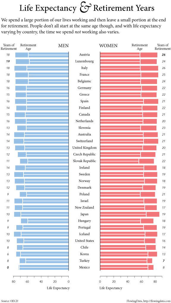
Does American prosperity translate into long retirements?  Not compared to other developed countries in the world.  Flowing Data borrowed OECD numbers on life expectancy and age of retirement to calculate the average number of years in retirement for men and women across many different countries.  The portion of each bar with the line is the average number of years working, while the non-lined portion represents years in retirement.

Largely because of life expectancy, women enjoy more years than men in all states except Turkey, but the number of years varies quite tremendously, from an average of zero years for men in Mexico, to an average of 26 years for women in Austria and Italy.  The United States is way down on this list, not doing so well relatively after all.

Lisa Wade, PhD is an Associate Professor at Tulane University. She is the author of American Hookup, a book about college sexual culture; a textbook about gender; and a forthcoming introductory text: Terrible Magnificent Sociology. You can follow her on Twitter and Instagram.

I am trying to re-enter society after several days being sick, so I’m going with something short and simple today. Eden H. sent in this chart, found at Business Insider, that compares hourly minimum wages in a number of European countries to the U.S.:

The European data are available from Eurostat (though note they report minimum wages in terms of Euros per month, not hour, so the data was converted for the chart).

Deeb K. sent in a story from the New York Times about who does unpaid work — that is, the housework, carework, and volunteering that people do without financial compensation. Based on time-use surveys by the Organisation for Economic Co-operation and Development (OECD), this chart shows how many more minutes per day women in various nations spend doing such activities compared to men:

Childcare stuck out as an area with a particularly large gap:

On child care in particular, mothers spend more than twice as much time per day as fathers do: 1 hour 40 minutes for mothers, on average, compared to 42 minutes for fathers…On average, working fathers spend only 10 minutes more per day on child care when they are not working, whereas working mothers spend nearly twice as much time (144 minutes vs. 74) when not working.

The full OECD report breaks down types of unpaid work (this is overall, including data for both men and women):

The study also found that non-working fathers spend less time on childcare than working mothers in almost every country in the study (p. 19). And mothers and fathers do different types of childcare, with dads doing more of what we might think of as the “fun stuff” (p. 20):

Source: Miranda, V. 2011. “Cooking, Caring and Volunteering: Unpaid Work around the World.” OECD Social, Employment and Migration Working Papers, No. 116. OECD Publishing.

In 2000, at the University of Wisconsin – Madison (UW), Diallo Shabazz was my student.  He was a senior.  At the very beginning of his Frosh year, someone snapped this picture:

Picture5

From that point forward, Diallo was featured in UW promotional materials again and again.  He became accustomed to seeing that smile everywhere.  Because diversity has become such a popular, even trendy thing for a college to have, many students of color find themselves used as representatives of their colleges disproportionately.

But Shabazz’s story takes a fascinating turn.  At the end of his senior year he paged through the next year’s application and didn’t see himself.  Hmmm.  Then, someone asked if he saw himself on the cover.  And he looked and didn’t see it and then he did.  Do you?

Capture1

That’s Diallo behind the excited girl on the left.  Except Diallo had never been to a UW football game.  You might recognize his face, transposed, from the original picture.  Indeed, someone at UW had photoshopped Diallo into the image below in order to give the impression that attendance at the game was more diverse than it was.  No Diallo:

Capture2

In that year 100,000 admission booklets went out with his face.  More insidiously, 100,000 admission booklets went out using his face to give the illusion of diversity at the University of Wisconsin – Madison.

Diallo sued.  He didn’t ask for a settlement.  He said that he wanted a “budgetary apology.”  He asked that, in compensation, the University put aside money for actual recruitment of minority students.  He won.  Ten million dollars was earmarked for diversity initiatives across the UW system.  The irony in the whole thing is that UW requested photos of Shabazz shaking administrators’ hands in reconciliation (i.e., photographic proof that everything was just fine).  Oh, and also, the Governor vetoed part of the earmark and many initiatives wore off with turnover.

What does this teach us?

First, notice that we have a commodification of diversity.  It is considered useful for selling an institution.

Second, if real diversity isn’t possible, cosmetic diversity will do.

Third, Shabazz himself was dismissed even as his image was used over and over.  Not only did they own the rights to his image and include him in many materials without the requirement that they ask or inform him, they literally took his image, cut it up, and used it to create a false picture.  When Shabazz complained, they first tried to blow him off.  So he wasn’t important to them, even as what he represented clearly was.

This suggests, fourth, that there was a real lack of a substantive dialog about and investment in race and diversity on the campus.  Talk: difficult.  Recruitment of minorities to a mostly white campus: tricky.  Addressing the systematic educational underinvestment in minorities prior to arriving at UW: expensive.  Retaining minorities in that environment: challenging.  Photoshop: easy.

Macon D., at Stuff White People Do, featured a similar situation in which Toronto’s Fun Guide (badly) photoshopped a black man onto their cover because their “goal was to depict the diversity of Toronto and its residents” (story here) (images also sent in by fds and Michael G.):

FUNphotoshop2

Original photo:

FUNphotoshop1

All of this puts into some perspective the recent Microsoft scandal that Jon S. and Dmitriy T. M. asked us to blog about.  If you were in the U.S. you would see the first image on the Microsoft webpage (with, as far as we know, real minorities) and, if you were in Poland, you would have seen the second image (with the black man replaced by a white man):

msft_sux_engadget

NEW! (Nov ’09):

Arturo Garcia pointed out that U.S. advertising for Couples Retreat included a black couple, but the advertising in the U.K. did not.

U.S. poster:

4113140933_210b27e6b6

U.K. poster:

4113141007_5a64763a21

The willingness to play with the presence of minorities–both by photoshopping them in and out–suggests that companies are making strategic, not ethical, decisions about what kind of public face (forgive the pun) to put on.  All of this avoids any real engagement with diversity itself.  This is probably largely because diversity is a minefield.  It’s incredibly difficult to even figure out how to define it, let alone how to build it, or how to manage it once you have it (something that my current institution struggles with).  And yet, these are the things that we must do.  Otherwise all of these strategic moves, both towards and away from minorities, are suspect.

NEW! In our comments, Jackie and Jasmine drew our attention to another example.  This is from the University of Texas, Arlington:

utarlington

See also our series on how people of color are included in advertising aimed primarily at white people, starting here.

If you’re really interested in these ideas, you might want to read MultiCultClassics, a blog specializing in how companies try to recruit minorities and present themselves as diverse institutions.

—————————

Lisa Wade is a professor of sociology at Occidental College. You can follow her on Twitter and Facebook.

Lisa Wade, PhD is an Associate Professor at Tulane University. She is the author of American Hookup, a book about college sexual culture; a textbook about gender; and a forthcoming introductory text: Terrible Magnificent Sociology. You can follow her on Twitter and Instagram.

Natasha L. sent in another example of stereotypes tied to nationality/region in the form of a set of comical visual distinctions between “Westerners” and “Asians,” found here, by an artist named Yang Liu. [Note: Natasha and I both assume they’re supposed to be comical or even satirical, particularly of the way that non-Western countries are generally stereotyped as being less professional, less punctual, less rational, and so on, though we might be wrong.] Some examples:

“Opinion”:

picture-13

“Punctuality”:

picture-21

“Traveling”:

picture-5

“In the Restaurant”

picture-41

“Queue when Waiting”

picture-3

Regardless of the artist’s intent (whether they’re supposed to be satires of this type of thinking, etc.), I’m sure many people will laugh and see some elements of truth to some of the images. But I’m betting you could tell people they represent almost any set of nationalities and people would also laugh and say “OMG, it’s totally true!” It’s Germany and Spain! It’s the U.S. and Mexico! It’s Venezuela and Greece! You could also probably change this to “men” and “women” and get the same reaction. It’s the stereotypical categorization we think is funny–the idea that groups of people are systematically different, whether it’s based on gender, class, race, nationality, region within a country, and so on (particularly if these differences might lead to sitcom-like hijinx and misunderstandings!).

For a fun little activity to get across the way in which stereotypes are inconsistent and meaningless, you might present these images, not tell your students what they’re supposed to represent, and ask them what groups they think are being portrayed (either out loud or in writing), then use their guesses, which will probably vary widely and draw on lots of different human categories such as class, gender, race, and so on, to talk about stereotyping (which may or may not be negative, of course) and how little we pay attention to what the actual contents of our stereotypes are. Another good example of this would be the way that ethnic groups are often defined as having uniquely loud and boisterous families–I think of it as the “My Big Fat Greek Wedding” syndrome. Well, if Italians, Irish, Greeks, Jews, Russians, Mexicans, Spaniards, Chinese, people from the Southern U.S., New Yorkers, etc. etc. etc., all have big loud families…doesn’t that kind of indicate that lots of families are just big and loud, regardless of background?

Thanks, Ashley and Natasha!

NEW! Robin sent in a link to an article in the Guardian about a Czech artist who pulled off a hoax by creating a set of sculpture that represent stereotypes of various European countries, which he said were created by 27 different artists.

Romania

gallery-eu-artwork-eu-art-011

Luxembourg is made of gold…and is for sale:

gallery-eu-artwork-eu-art-008

Poland has priests raising a rainbow flag. I didn’t know if the rainbow flag has the same association with gay rights in Poland as it does here, but Spiegel Online says it’s a gay pride flag:

gallery-eu-artwork-eu-art-0071

Bulgaria is apparently supposed to be the floor of a urinal, though Spiegel Online says it’s a Turkish toilet, apparently also called a squat toilet:

gallery-eu-artwork-eu-art-0062

Bulgaria’s not happy about it and has demanded the sculpture be taken down.

Holland has been flooded, but minarets stick out of the water to remind us about increasing concerns expressed by many Dutch about the Muslim community in the Netherlands since tension increased after the Mohammad cartoon incident:

gallery-eu-artwork-eu-art-004

There is ongoing debate about whether this image of Germany, showing the country’s many autobahns, is supposed to look like a swastika:

gallery-eu-artwork-eu-art-002

And of course France has a large banner that says “Strike!”

gallery-eu-artwork-eu-art-0011

Apparently Great Britain was represented simply as a blank space.

Gillian sent us a series of overtly sexist Polish commercials for MOBILKING.  Gillian says:

MOBILKING is a newest Polish cell phone operator. It is advertised as a telephon [company] for “real men only”, implying that it’s not for “girly chit-chats”, but rather for “serious bussines talks” (meaning talking about breasts, cars and beer).

Gillian tells us that, after complaints, the commercials were pulled, but after the negative publicity they went viral and gave the cell company more publicity than ever. 

[youtube]http://www.youtube.com/watch?v=Q2LBaJB5RT4[/youtube]

Two more of the commercials show a hyper-sexualized woman putting on football gear and a mechanics uniform and asking “But can she play like a man?” and “But can she fix anything like a man?” respectively.  The answer is, of course, “no.”