media: marketing

We’ve posted about Tom Ford‘s most recent provocative campaign (see here), but Urban Artiste drew our attention to an interesting development. The Italian Advertising Institute has banned one of his ads for being too “vulgar,” “sexually implicit,” “beyond bad taste,” and an “offensive gesture which insults women and the dignity of all” (quotes found at The Daily Telegraph). Which ad?

WARNING: The images in post are not safe for work.

more...

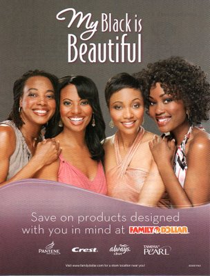
Toothpaste and tampons designed with your skin color “in mind.” MultiCult Classics says:

OK, Pantene offers products designed with Black women in mind. But Crest, Always and Tampax?

Also, apparently the black that is beautiful is light-skinned, with supposedly “European” facial features. See also: black models that don’t look black.

UPDATE: In the comments, Brian asked what I mean by “reification.” Thanks for the question, Brian! I mean “treating an abstraction as if it were real.” And, yep, race isn’t real. See racial categories as a historical artifact and check out this great website by the American Anthropological Association.

As I re-read… the contradiction between the two last paragraphs (black models that look white and there’s no such thing as black and white) is awesomely reflective of the reality of its race and its simultaneous non-reality!

.

This Absolut vodka ad (found here), which ran in Mexico, has caused quite the stir here in the U.S., since it implies than in a perfect world much of the U.S. would still be part of Mexico. A number of groups in the U.S. are boycotting Absolut. This is one of those cases where an ad aimed at once audience (Mexicans) is noticed by another audience it was never meant for.

Similarly, though I could be wrong, I bet most straight male Miller Light drinkers aren’t aware of these ads and wouldn’t be thrilled with them.

One of my favorite things to do in class is to show students that advertisers target their images to the audience. Students are often resistant to the idea that advertisers consider every aspect of an image, or that gendered or racialized elements are used intentionally. Showing ads for the same product that are targeted at very different audiences can be a way to get students to think about the fact that marketing is very deliberate and nothing in a multi-million-dollar ad is left to chance.

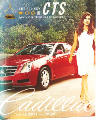
I previously posted this Cadillac ad:


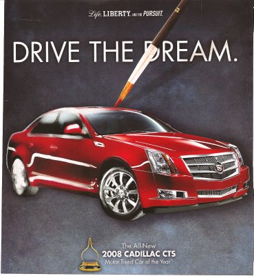
Then I found this one in QVegas, which targets the GLBT community:


These might be useful for sparking a discussion of how advertisers alter their message based on the desired consumers, and that they know what kind of image will resonate with various demographics. And note that the second ad doesn’t have the menacing tone of the first one. Other examples: here and here.


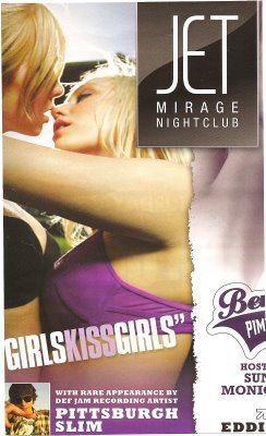
I have a feeling this ad is not meant for lesbians (the other half of the page showed a half-naked woman; both were for mainstream, non-lesbian-oriented clubs). This might be useful for discussing different attitudes toward gays and lesbians–it is difficult to imagine an ad of two men kissing aimed at straight women. In this case, women kissing is not about THEIR sexual pleasure, but about that of the audience–presumably straight men. The assumption accompanying images such as these, of course, is that the women are not actually lesbians–they’ll still be sexually available to men. This is another difference in cultural views of gays and lesbians–lesbians’ sexual orientation is often doubted (they just need to find the right man) in a way gay men’s usually isn’t.

From Las Vegas Weekly.

Here is the trailer for Resident Evil 5, which is not yet on the market:

The player is the sole white person in a dismal, threatening city, apparently in Africa. The locals engage in torture (which we see in some detail) and gleefully cheer at a hanging. At one point the hero is accosted by an angry mob, all of whom just make gutteral, animal-like sounds. In a beleagured voice he tells us he just doesn’t know “if it’s all worth fighting for. Who knows?” Oh, the white man’s burden, indeed!

Thanks once again, Patrick C.!

Jeff G. sent in links to several articles about the game, if you’re interested. Here’s one with the director, and here’s an article about a British government censorship agency officially ruling the game isn’t racist.

NEW! Ryan sent in an image of a character from the game:

1

Ryan points out it’s another example of non-White women being portrayed as exotic or animalistic. Thanks for the image!

The Home Made Simple Squad is a new ad campaign for Proctor & Gamble cleaning products. Five women make up the Squad. From Lori’s bio:

‘I love to entertain in my home, and when people come over, I want them to walk in and immediately feel welcome and comfortable. So I make sure my house is always looking good and smelling fresh.’ Lori, 37, prides herself on her clean and well-organized home that’s always ‘company-ready’. Lori is disciplined about more than just caring for her home – she’s also recently lost 95 lbs, and keeps fit with a regimen of healthy eating, power walking and yoga.

So not only is she a good housekeeper, she keeps herself fit and trim, too!

Although all of the bios mention that the women have children and are busy, not a single one mentions a husband, partner, or other adult who might have some role in keeping a house clean. Or, for that matter, making the kids clean up after themselves.

Thanks to an anonymous commenter on another post for bringing my attention to this one!

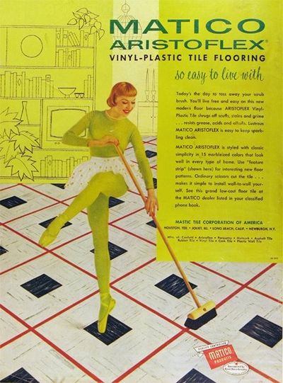
NEW! This vintage ad relates sweeping the floor to dancing… because cleaning vinyl-plastic tile flooring, unlike cleaning other kinds of floors, is a kick!

6a00d83451ccbc69e2011570fdce1f970c-400wi

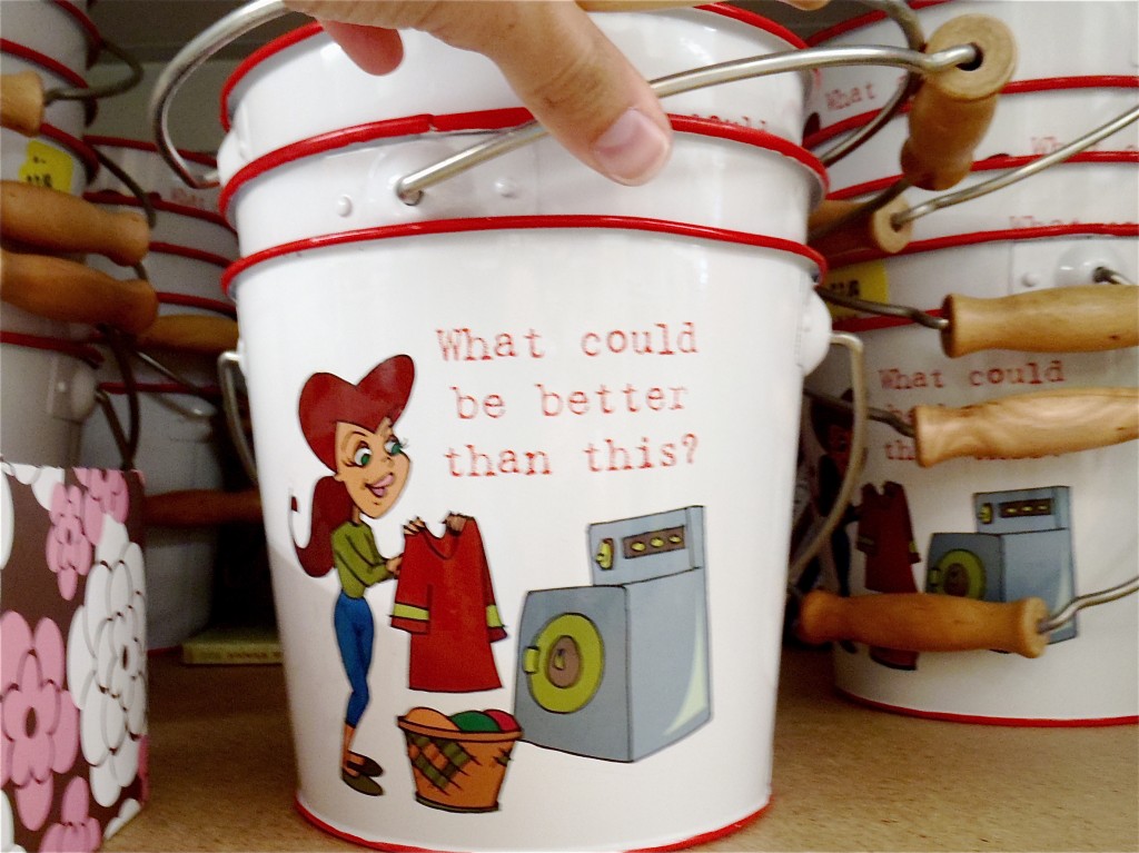
An Anonymous Reader sent another example of the message that women absolutely love cleaning!  The bucket reads, “What could be better than this?”  I suppose it could be tongue-in-cheek, but I’m not getting that vibe.

Gwen Sharp is an associate professor of sociology at Nevada State College. You can follow her on Twitter at @gwensharpnv.


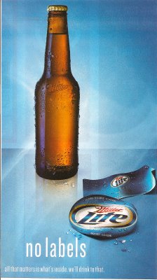
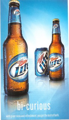
I found these two Miller Lite ads in QVegas, a magazine aimed at the GLBT community.

It would be interesting to pair with these ads for Skyy vodka to illustrate how companies make different ads to target different audiences. If you find an ad offensive or dumb, it’s not necessarily an ineffective ad, it’s that you probably aren’t the target consumer and it’s not supposed to appeal to you.

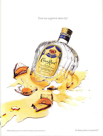
NEW! Philip D. sent in a link to a post by Sister Toldja at Me, Myself An Eye about slightly different versions of ads for Crown Royal. This one is presumably aimed at a general audience:

cr

Text: “Have you ever seen a grown man cry?”

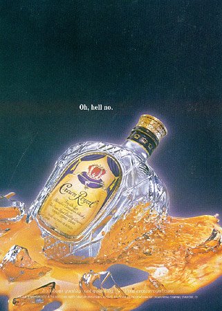
Sister Toldja suspects that this one is targeted more specifically at African Americans:

crb

Text: “Oh, hell no.”

Now, just to be clear, I’m not arguing these are racist ads. I just think they would provide a good example to start students thinking about the fact that a) advertisers actively market to various groups by trying to appeal to them in specific ways that may differ from an ad made for a “mainstream” or “general” audience (i.e., one that would presumably appeal to just about everybody) and b) they do this by playing on stereotypes or cultural assumptions about what different groups like (or are like). What separates these two ads into “mainstream” and “Black” ones? Simply the presence of a phrase that many people associate with African Americans (although I have to admit I mostly associate it with one of my male cousins more than anyone else). You might start with this example, which is fairly innocuous, I think, and then start asking students to think about other ways advertisers might indicate who an ad is supposed to appeal to (men or women, gay or straight, or more broadly to “everyone”). When do these efforts become problematic?