intersectionality

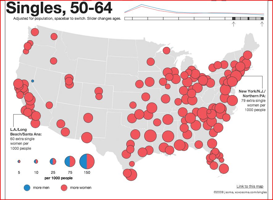
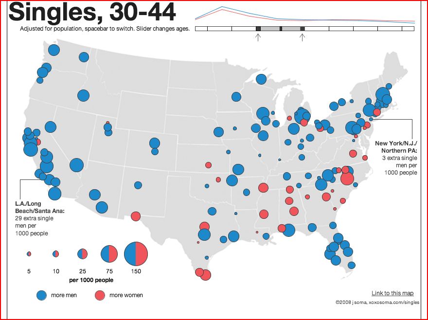
This image demonstrates the disproportionality in the marriage market across the United States (found here). Basically, if you’re a single, heterosexual woman on the west coast or a single, heterosexual man in the New York area, you’re in luck!

NEW! This map is now available in an interactive form in which you can choose which age group to look at.  Below I’ve pasted in screen shots of my current dating pool (30-45) and what I have to look forward to (yikes!).  Click here to interact with the map yourself.

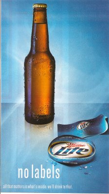
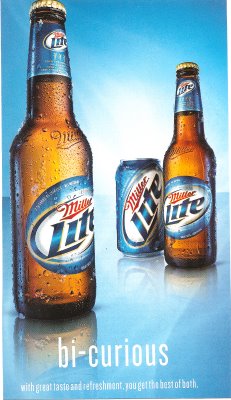
I found these two Miller Lite ads in QVegas, a magazine aimed at the GLBT community.

It would be interesting to pair with these ads for Skyy vodka to illustrate how companies make different ads to target different audiences. If you find an ad offensive or dumb, it’s not necessarily an ineffective ad, it’s that you probably aren’t the target consumer and it’s not supposed to appeal to you.

NEW! Philip D. sent in a link to a post by Sister Toldja at Me, Myself An Eye about slightly different versions of ads for Crown Royal. This one is presumably aimed at a general audience:

cr

Text: “Have you ever seen a grown man cry?”

Sister Toldja suspects that this one is targeted more specifically at African Americans:

crb

Text: “Oh, hell no.”

Now, just to be clear, I’m not arguing these are racist ads. I just think they would provide a good example to start students thinking about the fact that a) advertisers actively market to various groups by trying to appeal to them in specific ways that may differ from an ad made for a “mainstream” or “general” audience (i.e., one that would presumably appeal to just about everybody) and b) they do this by playing on stereotypes or cultural assumptions about what different groups like (or are like). What separates these two ads into “mainstream” and “Black” ones? Simply the presence of a phrase that many people associate with African Americans (although I have to admit I mostly associate it with one of my male cousins more than anyone else). You might start with this example, which is fairly innocuous, I think, and then start asking students to think about other ways advertisers might indicate who an ad is supposed to appeal to (men or women, gay or straight, or more broadly to “everyone”). When do these efforts become problematic?

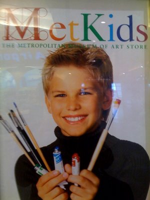
This is a tough one, but there is something about this image advertising the Metropolitan Museum of Art that just screams privilege. Is it the perfect blonde hair? The perfect white teeth? The neat upper-class masculinity? The turtleneck? I can’t quite put my finger on it!

Thanks Jason!


Truthfully, I don’t think I have ever seen so many symbols of masculinity mobilized in so short a time. I had to watch it three times:

[youtube]http://www.youtube.com/watch?v=Anl_7Q05C8c[/youtube]

Thanks a bunch to Christine who recommended this in our comments.

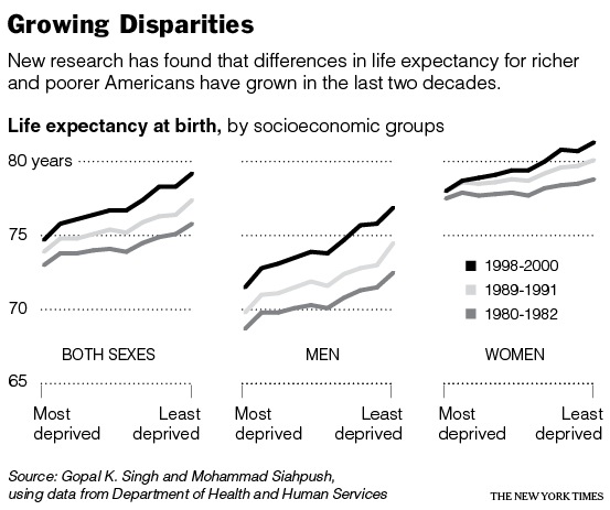
Perhaps related to increasing wealth and income inequality in our society, the gap between the life expectancy of the rich and the poor is also increasing. This image is from a New York Times article on the topic:

Dr. Singh, who was part of the study, explains:

In 1980-82… people in the most affluent group could expect to live 2.8 years longer than people in the most deprived group (75.8 versus 73 years). By 1998-2000, the difference in life expectancy had increased to 4.5 years (79.2 versus 74.7 years), and it continues to grow.

[youtube]http://www.youtube.com/watch?v=ZaPcBwmCtiM[/youtube]

Sexism in commercials is sadly just so, well, typical. But every once in a while a commercial comes along that goes above and beyond, like this one from Hungry Man. Take note of the ending where the Hungry Man meal crushes the feminized fruit drinks.

This commercial has multiple layers of sexism. One is obviously gendering food choices. Why are healthy foods (fruit and yogurt) feminized and unhealthy meat and potatoes in large quantities (sans green vegetables) associated with masculinity and being tough? And what kind of prescriptions about class and work are made as well? Why are these blue collar “working men” when drinking fruit shakes and health drinks are typically associated with white collar, upper class women (and men)?

As the commercial says… you are what you eat.

I wonder why a recent study found that “the gender divide starts over dinner.”

This is Jewel’s new video for her song “Stronger Woman.” I can’t figure out if Jewel thinks that all women are essentially the same (in the sense that we need to throw off patriarchy) or that contemporary American women are superior (and all women, then and now, should aspire to be like us… oh yeah, and by “us” I mean young, gorgeous, thin, white, blonde women who “love” themselves). In either case, I don’t like it:

[youtube]https://www.youtube.com/watch?v=QaXr2vGDQwk[/youtube]

Click here if the video doesn’t load.

Lisa Wade, PhD is an Associate Professor at Tulane University. She is the author of American Hookup, a book about college sexual culture; a textbook about gender; and a forthcoming introductory text: Terrible Magnificent Sociology. You can follow her on Twitter and Instagram.

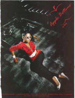
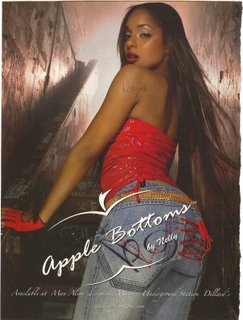
These advertisements, the first two for a brand of jeans called Apple Bottoms, all fetishize black women’s behinds:


Underneath Beyonce’s name it says: “The body, the booty, the backstabbing.”

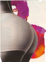
In this two-page spread, the body isn’t necessarily black… but it might be an interesting question as to whether the viewers assume, or might be expected to assume, it is.

Text:

MY BUTT is big
and round like the letter c
and ten thousand lunges
have made it rounder
but not smaller
and that’s just fine.
It’s a space heater
for myside of the bed
It’s my ambassador
to those who walk behind me
It’s a border collie
that herds skinny women
away from the best deals
at clothing sales.
My butt is big
and that’s just fine
and those who might scorn it
are invited to kiss it.

I think it’s interesting the way this poem pits “skinny women” against women with a big butt… so valorizing the big butt but only by taking down the skinny (white?) girl.

Divide and conquer.

You might pair these images with this post about a Pilates DVD.