gender: education

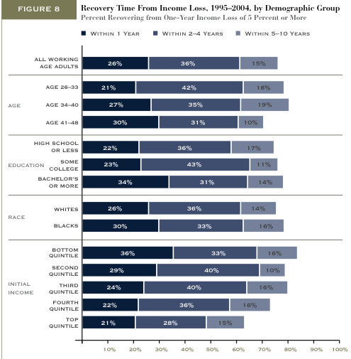
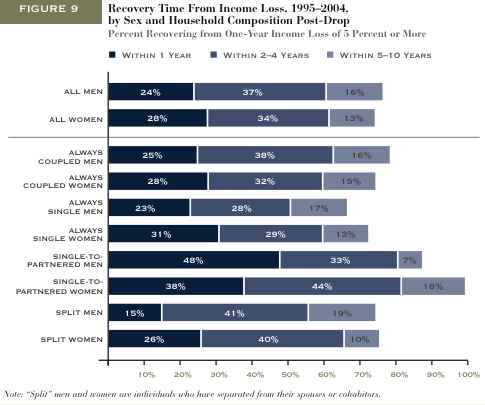
Matthew Yglesias featured two figures from the Pew Economic Mobility project.  They show how long different types of people tend to take to recover from income loss (within 1 year, 2-4 years, or 5-10 years).

This figure shows that people who are older, have more education, or are poor, working, or middle class have a harder time recovering from tough economic times:
recovery

This figure shows how marital status is related to recovery.  Most dramatically, people who get married before recovering financially (especially men), women who split with a partner, and women who are single have a more difficult time recovering.
recoverygender

Something to consider: As several commenters noted, I’m not sure how they defined “recovery” from income loss.  If you never made a lot of money to begin with, does recovery simply mean returning to a state of low income?  Then, does the income for an initially high income person need to return to its high state for it be counted as a “recovery”?

(Just FYI: I revised my interpretation of these figures.  Thanks to the early commenters who noticed I’d misinterpreted.  It was really late at night when I wrote this post!)

—————————

Lisa Wade is a professor of sociology at Occidental College. You can follow her on Twitter and Facebook.

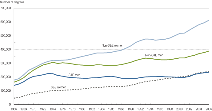
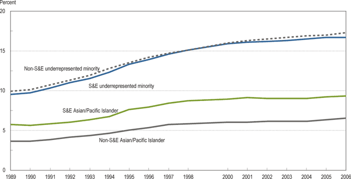
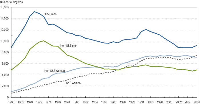
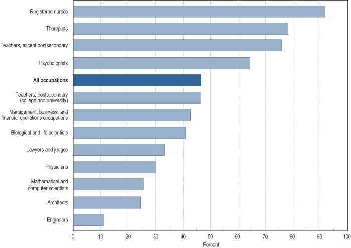
I happened upon a list of figures that display lots of information about who majors in science and engineering (S&E), all available at the NSF page on Women, Minorities, and Persons with Disabilities in Science and Engineering. All are for institutions in the U.S. only, as far as I can tell.

Here we see the number of bachelor’s degrees in S&E and non-S&E fields, by sex:

figc-12

Percent of S&E and non-S&E bachelor’s degrees earned by racial minorities:

figc-21

Number of doctoral degrees earned by sex:

figf-1

Percent of female workers in selected occupations in 2007:

figh-1

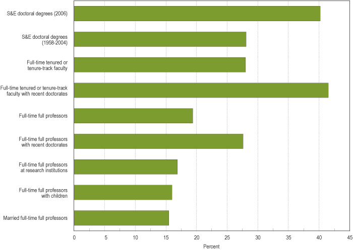
Percent of S&E Ph.D.-holding employees at 4-year colleges and universities that are women:

figh-3

Notice that while women are pretty well represented among “full-time tenured or tenure-track faculty,” they make up barely 15% of “full-time full professors with children,” “married full-time full professors,” and “full-time full professors at research institutions.” Some of this may be a matter of time, in that because being promoted to full professor takes years, an increase in the number of women getting Ph.D.s in a particular field will take a while to show up as a similar increase in number of women as professors in that field, everything else being equal.

But everything else isn’t equal. Women, even highly-educated ones, still do the majority of childcare and housework, and are more likely than men to consider how potential jobs could conflict with future family responsibilities when they are deciding what type of career to choose. So the lower proportion of female full professors at research institutions is likely a combination of some old-school unfriendliness to women in some departments, but also of women opting out of those positions–that is, deciding that the time and energy required to get tenure in a science/engineering department at a research school would conflict too much with family life, so they pursue other career options (for instance, women make up a higher proportion of faculty at community colleges, which are often perceived as being easier to get tenure at, since you don’t necessarily have to do lots of publishing–though anyone who has ever taught 5 courses a semester may question the assumption that it takes less time and work to teach than to publish).

And of course some women try to combine a tenure-track job with their family responsibilities and find it difficult, and either leave academia voluntarily or are turned down for tenure because they have not published enough or are not see as adequately involved and committed. Because of inequalities in the family, men are less likely to face those situations, though certainly some do.

I wish the report had a graph for non-S&E faculty, although it might just depress me.

UPDATE: Commenter Sarah says,

Check out the report “Women in Science: Career Processes and Outcomes” by Yu Xie and Kimberlee A. Shauman.  They find no evidence to support the hypothesis that women are under-represented at the tenure level due to a lag between getting PhDs and acquiring tenure track positions.  In the life sciences, women have been getting PhDs at the same rate as men for many years now, but inequality persists at the tenure-track level.  Xie and Shauman find that a variety of  social factors are responsible for actively hindering women at the highest levels of academia.

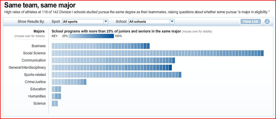
USA Today posted an interactive graphic demonstrating how different types of college athletes cluster into majors differently at different schools (via Montclair Socioblog).  For example, the screenshot below includes the data for all athletes in the study.  Each rectangle represents a school; the darker the blue, the more concentrated major choices are for that team at that school.   In this iteration, the darkest blue rectangle in the “social science” category represents Louisiana Tech at which 80 percent of male basketball players major in Sociology:

capture5

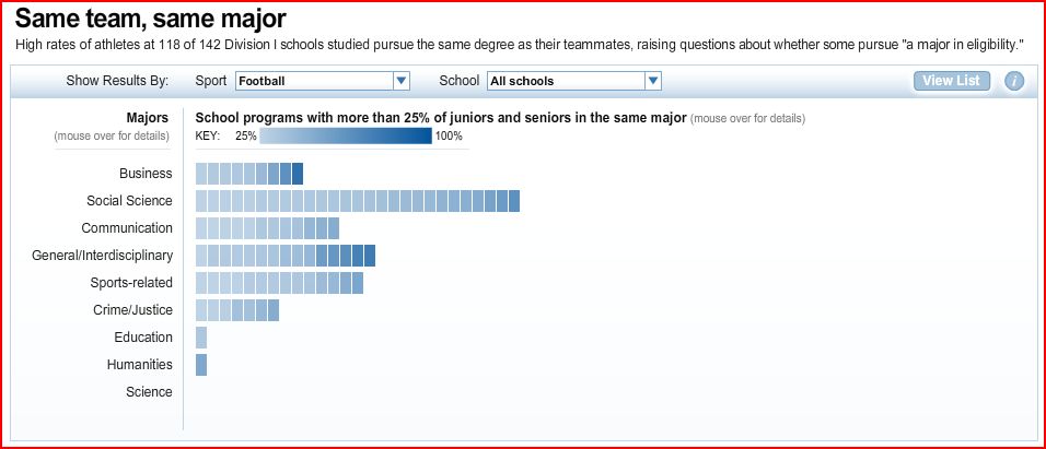
This screenshot features football players only.  At Georgia Tech, 82 percent of football players major in Business:

capture21

If you visit the site, you can manipulate the graphic as you like and see what school and team each rectangle represents.

Certain majors have long been rumored to be athlete friendly and I think this actual data sheds a lot of light on the false stereotype of both disciplines and athletes. 

The article doesn’t speculate as to why teammates cluster, but we could…

I was recently speaking to a colleague at my College who remembered a time during which a good percentage of the football players majored in Sociology.  He suggested that this was because one of the most high-profile football players, one who was very well-liked by his teammates and had a leadership role on the team, majored in Sociology.  Since that player has left the College, the percent of football players in our major has decreased.  In that sense, part of the explanation for why teammates cluster may be more social psychological than sociological.

What are your theories?

Lauredhel of Hoyden about Town sent in this ad for Brighton Grammar School, an Anglican boys’ school in Australia:

3273792366_59ff3131c1

Text:

BGS boys have mates…and dates. Some people think that our boys won’t know how to interact with girls. That’s not true. Our learning programs are carefully desgined to build each boys self confidence, especially through the awkward teenage years, allowing them to relate to each other, their teachers, and, on regular occasions…with girls.

Huh. I like how they’re using the promise of access to girls to market the school. And indeed, it appears that they do teach boys things, including to expect cute girls to gaze at them adoringly.

I don’t know much about the assumptions surrounding all-boys or all-girls schools. Is there a belief that kids who go to them won’t be able to interact with the other sex? Or is this about fears parents have about homosexuality at all-boys schools? Is the school letting them know they don’t have to worry because their sons will have tons of opportunities to hang out with pretty girls?


Aaron B. sent in this 1947 video clip (found here), titled “Are You Popular?”:

Notice the caution to women: if you go “parking with all the boys,” you might think you’re popular, but you’ll ultimately find yourself ostracized and friendless. To be really popular, you need to be well-dressed, have the respect of girls at school, and carefully guard your reputation.

Thanks, Aaron!

Gwen Sharp is an associate professor of sociology at Nevada State College. You can follow her on Twitter at @gwensharpnv.

In her famous video, Killing Us Softly, Jean Kilbourne mentions that women are often told to let their appearance “do the talking.”  And, in another post, we’ve talked about how women are encouraged to do anything, as long as they look good doing it.  Which brings me to this page from this month’s Seventeen:

Text:

Make a big impression!  On the first day of school, tell everyone about yourself without saying a word: Just pick the look that makes the right statement for you!

And:

17 Tip: To make your eyes look really open and awake [I guess ’cause class is boring and you were out late partying last night?], line both your top and bottom lash lines with gold shadow.

And:

Focused!  Subtle shadow lets people know you’re serious about school.

Jezebel reviews this month’s Seventeen magazine, chock full of anxiety-inspiring questions that all essentially translate into: “Are you sure you’re good enough?” 


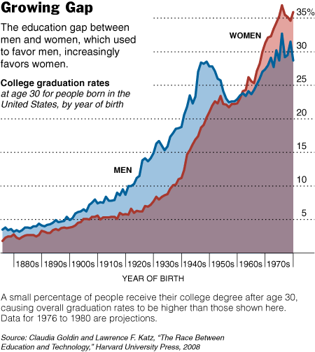
There are other things interesting about this graph too.  (1)  The overall increase in the percentage of the U.S. population who attends and graduates college… and thus changing ideas about who “needs” a college degree.  (2) The fact that the gender difference wasn’t extreme in the late 1800s at all and increased in the early 1900s. (This is in contrast to most students understanding of history, in my experience, as a linear story of progress from backwards to enllightened.)  (3)  The spike in college enrollment and graduation after WWII (GI Bill… but how does that explain the stats on women?).  (4)  The weird dip in 1950s (I don’t know what that’s all about).  And, (5) the period of near parity in the 1960s.  (In the comments, Penny points out that I mis-read the graph in haste.  I apologize.)   (3) The weird dip for people born in the 1950s and coming of age in the 1970s (I don’t know what that’s all about).  And, (4) the period of near parity for people born in the 1960s and coming of age in the 1980s. 

See the accompanying article at the New York Times.

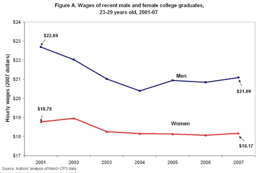
Kay Steiger blogs about the decline in wages since 2001 for college graduates. Figure A shows that both men and women college graduates are earning less than they did in 2001. The wage gap between women and men has decreased, but only because men’s wages have been falling. To top it off, Figure B shows that a lower percentage of college graduates are getting health insurance and pension coverage.

Might this be related to the shrinking middle class?

Via Matthew Yglesias.