Feast your eyes on this:

Social change makes life interesting.

Lisa Wade, PhD is an Associate Professor at Tulane University. She is the author of American Hookup, a book about college sexual culture; a textbook about gender; and a forthcoming introductory text: Terrible Magnificent Sociology. You can follow her on Twitter and Instagram.

The New York Times recently reported the results of a study of racial disparities in bankruptcy filings. When filing personal bankruptcy, most people have two options: Chapter 7 and Chapter 13. With Chapter 7, you have to turn over all non-exempt assets, which will be used to pay off as much of your debts as possible; you’re then free from any further obligation regarding the debts included in the case. Under Chapter 13, on the other hand, you have to continue to try to pay your debts for 3-5 years. There are reasons a person might sometimes prefer Chapter 13 (especially if they have particularly valuable assets they do not want to turn over), but generally it’s more expensive to file for and, obviously, provides less financial relief from debts. According to Braucher et al. (2012), the authors of the study, overall about 30% of personal bankruptcies are filed under Chapter 13.

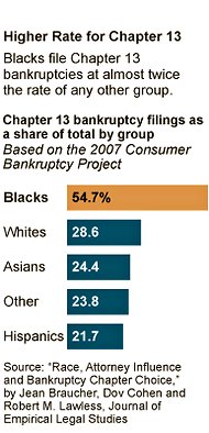
But in their study, Braucher et al. found that African Americans were significantly more likely to file for Chapter 13, and more likely than they would expect when controlling for things that might make Chapter 13 more attractive. As this NYT chart shows, over half of African Americans file under Chapter 13, compared to just over a quarter for Whites and even less for other groups:

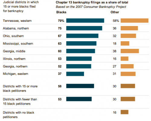
Rates of Chapter 13 filings vary quite a bit across different judicial districts, but African Americans consistently filed Chapter 13 at a higher rate than other groups, regardless of what the overall rate was:

Braucher et al. suggest that attorneys play a key role here. They sent surveys to 596 randomly-selected attorneys who represent individuals filing for bankruptcy, providing information about a married couple considering bankruptcy; 262 of the attorneys responded. When the potential filers gave the names Reggie and Latisha, attorneys were more likely to recommend Chapter 13 than when they gave the names Todd and Allison, suggesting that attorneys may play a role in tracking clients toward different bankruptcy options based on race.

The result is that African Americans are, overall, more likely to use the version of personal bankruptcy that costs them more and requires them to continue struggling to pay their debts for several more years, reducing the immediate relief most people assume bankruptcy provides.

Source: Braucher, Jean, Dov Cohen, and Robert Lawless. 2012. Race, Attorney Influence, and Bankruptcy Chapter Choice. Forthcoming in the Journal of Empirical Legal Studies. Available free online here.

Gwen Sharp is an associate professor of sociology at Nevada State College. You can follow her on Twitter at @gwensharpnv.

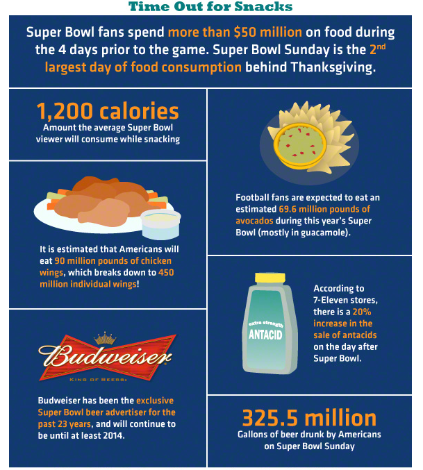
Dolores R. sent in an infographic with various statistics regarding the superbowl.  I thought this bit about food and drink consumption was especially great:

Lisa Wade, PhD is an Associate Professor at Tulane University. She is the author of American Hookup, a book about college sexual culture; a textbook about gender; and a forthcoming introductory text: Terrible Magnificent Sociology. You can follow her on Twitter and Instagram.

Feminists have done a powerful job of making the sexual assault of women by men a public issue.  Male victims, though, have remained largely invisible. In fact, one in ten victims of sexual assault is male.  Most of these men are raped by other men.

The Rape, Abuse, and Incest National Network is attempting to raise awareness of this issue.  As part of their campaign, they are sponsoring this really interesting two-minute video made by my colleague, Dr. Broderick Fox, professor of Art History and Visual Arts at Occidental College:

UPDATE: In the comment thread, Umlud posted a provocative paragraph from an article by Christopher Glazek at N+1 that I thought was worth including:

In January, prodded in part by outrage over a series of articles in the New York Review of Books, the Justice Department finally released an estimate of the prevalence of sexual abuse in penitentiaries. The reliance on filed complaints appeared to understate the problem. For 2008, for example, the government had previously tallied 935 confirmed instances of sexual abuse. After asking around, and performing some calculations, the Justice Department came up with a new number: 216,000. That’s 216,000 victims, not instances. These victims are often assaulted multiple times over the course of the year. The Justice Department now seems to be saying that prison rape accounted for the majority of all rapes committed in the US in 2008, likely making the United States the first country in the history of the world to count more rapes for men than for women.

Lisa Wade, PhD is an Associate Professor at Tulane University. She is the author of American Hookup, a book about college sexual culture; a textbook about gender; and a forthcoming introductory text: Terrible Magnificent Sociology. You can follow her on Twitter and Instagram.

In the 3 1/2 minute video below, CGP Gray explains the nonsense behind the word “continent.”  It’s a cultural construct, with some geological rationale, but not enough to rationalize the seven that we recognize.

Also from CGP Gray: What the Bleep is the United Kingdom?! and The Economics of Royalty.

Lisa Wade, PhD is an Associate Professor at Tulane University. She is the author of American Hookup, a book about college sexual culture; a textbook about gender; and a forthcoming introductory text: Terrible Magnificent Sociology. You can follow her on Twitter and Instagram.

In a previous post, Lisa referred to Peggy McIntosh’s famous essay on White Privilege: Unpacking the Invisible Knapsack. One of the many privileges that McIntosh identifies is that, as she writes, “I can turn on the television or open to the front page of the paper and see people of my race widely represented.”

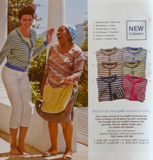
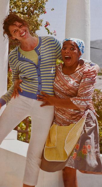
This statement resounded when I saw the images below from a 2011 Scottish Woolovers catalogue. Further, I was reminded that it’s not only a matter of whether we see people of our race widely represented, but also of how the media makes these portrayals.

The white woman in this ad is modelling a cardigan sweater. Meanwhile, the woman of colour in the photo is…well, that’s an interesting question. Nothing that she is wearing is for sale; she’s just there, wearing clothing that has no relevance to the advertisement.

Normally, you’d expect that a woman in a fashion catalogue would be there to model clothing, but in this case, the woman of colour doesn’t have such a role. She is a prop for the white model, there to frolic and help illustrate the benevolent and fun-loving nature of the fashionable white model, clad in an apron that marks her as potentially a servant of some kind. She’s not there to directly market clothes to a white target market.

SocImages has addressed other examples of privileged representations of white women in catalogues; a discussion of a Punjammies catalogue highlighted the exclusive reliance on white women as models, while portraying women of colour as labourers and beneficiaries of the good will of the white, female target market. In a similar vein, we also had a post illustrating a comparable trend in the representation (and lack thereof) of people of colour in films. It is a function of our unearned privilege that, when those of us in a privileged position come across racialized images and representations like these, it is all too easy to miss or ignore their problematic nature.

Thanks to Flickr user Wishiwerebaking for sending us these images.

—————

Hayley Price has a background in sociology, international development studies, and education. She recently completed her Masters degree in Sociology and Equity Studies in Education at the University of Toronto.

If you would like to write a post for Sociological Images, please see our Guidelines for Guest Bloggers.

Cross-posted at Jezebel.
American Studies professor Jo B. Paoletti has announced the publication of her book, Pink and Blue: Telling the Boys from the Girls in America.  I’ve been eagerly anticipating getting my hands on a copy. It was from Paoletti that I learned that the idea that pink was a feminine and blue a masculine color was a relatively new invention in American history (one that even now does not necessarily extend to other countries).  See, for example, this pink 1920s birthday card for a man (with a pre-Nazi swastika too).

The book asks “When did we startdressing girls in pink and boys in blue?”  To answer this question:

She chronicles the decline of the white dress for both boys and girls, the introduction of rompers in the early 20th century, the gendering of pink and blue, the resurgence of unisex fashions, and the origins of today’s highly gender-specific baby and toddler clothing.

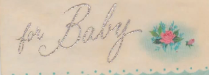
In an analysis of baby cards from the 1960s, she notes that many of the cards are gender-neutral and include both pink and blue, but that even the gender-specific cards (this particular baby was a girl) use both colors. These cards, then, reveal that pink and blue had emerged as recognizable baby colors by the 1960s, but the use of blue in the “for girl” cards and the preponderance of gender-neutral cards suggests that the importance of gender differentiation hadn’t taken hold.

She has a large collection of examples.

At her website Paoletti says she has a book planned on “old lady clothes, mother-of-the-bride dresses, cougars and other age-appropriate nonsense.” I can’t wait.

Lisa Wade, PhD is an Associate Professor at Tulane University. She is the author of American Hookup, a book about college sexual culture; a textbook about gender; and a forthcoming introductory text: Terrible Magnificent Sociology. You can follow her on Twitter and Instagram.

Dmitriy T.M. sent in a TED talk in which Ben Goldacre discusses the problems with many of the scientific findings we hear about in the media, highlighting the importance of scientific literacy and critical consumption of science reporting:

And while we’re on the topic of potentially misleading statistics, Dolores R. and Sarah E. sent in an image posted at boing boing as one of “the best set of infographics ever,” helpfully illustrating the difference between correlation and causation: