Like the segregation laws characteristic of Jim Crow, soon after Hitler came to power in the U.S. Germany (oops) he began establishing legal segregation of Jews from Aryan Germans.  The writing on the bench in this photo, taken in 1934, reads: “For Jews Only”:

slo-02

The source explains that benches were segregated, with others reading “For Germans Only.”

See our other posts on Nazi Germany: comparing German remembrance of the Holocaust and U.S. remembrance of slavery, Nazi symbolism, Nazi celebration of motherhood, the racialization of the Jews, and this sympathetic memorabilia website.

Lisa Wade, PhD is an Associate Professor at Tulane University. She is the author of American Hookup, a book about college sexual culture; a textbook about gender; and a forthcoming introductory text: Terrible Magnificent Sociology. You can follow her on Twitter and Instagram.

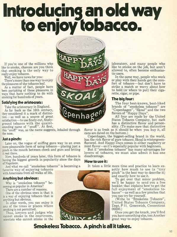
Vintage ads are an excellent way to illustrate how “the way things are” are not the way things have to be or always were.  In this post, I offer an ad for chewing tobacco.  Now, most Americans today associate chewing tobacco (eh em) “dip” with working class, rural, white men (hello family!) and, about ten years ago, baseball players (but I digress).

In contrast to this current social construction, this vintage ad suggests that dip is the province of the aristocracy (details after the ad):

1

Here are the parts that got my attention:

2

Text:

Take the aristocracy in England.  As far back as the 16th century, they considered it a mark of distinction — as well as a source of great satisfaction — to use finely-cut, finely-ground tobacco with the quaint-sounding name of “snuff.”  At first, this “snuff” was, as the name suggests, inhaled through the nose.

Then, the ad claims that “snuff” is enjoyed, today, by lawyers, judges, and scientists:

3

4

Selected text:

Why is “smokeless tobacco” becoming so popular in America?  There are a number of reasons.  One of the obvious ones is that it is a way of enjoying tobacco that is anything but obvious.  In other words, you can enjoy it any of the times or places where smoking is not permitted.  Thus, lawyers and judges who cannot smoke in the courtroom, scientists who cannot smoke in the laboratory, and many people who like to smoke on the job, but aren’t allowed to, often become enthusiastic users.

I just love the contrast between the current social construction and the attempt at social construction made in this ad.  I have no idea whether there was a time when dip wasactually enjoyed by the middle and upper classes.  Anyone?  Other comments welcome as well, of course.

Lisa Wade, PhD is an Associate Professor at Tulane University. She is the author of American Hookup, a book about college sexual culture; a textbook about gender; and a forthcoming introductory text: Terrible Magnificent Sociology. You can follow her on Twitter and Instagram.

The Modern Language Association has all kinds of awesome language-related data available that you can customize depending on your interests. Most basically, you can get an interactive map showing the percent or number of speakers of various languages spoken at home by county (or number by zip code). Here is English:

English

Spanish:

Spanish

Navajo:

Navajo

Notice that the scale of the maps changes, so the same color doesn’t indicate the same percent of speakers for each language. For some languages the darkest red only indicates 1 or 2 percent.

There was one odd category I noticed. This is the map for “African languages”:

African languages

I can understand why you might lump some languages from an area together if they are so rare in the U.S. that they’d barely show up. But what, exactly, is an “African” language? It doesn’t appear to include Arabic, though it is spoken in much of northern Africa. Many people in Africa speak European languages (particularly French and English) due to colonialism. Presumably this category includes “native,” non-Arabic languages. It’s a strange category.

For those of you wondering about the little pockets of African language speakers in, say, Iowa and Nebraska, I could be wrong, but I would suspect in some of those counties it might have something to do with slaughterhouses. In the last decade or so some packing houses have recruited African immigrants, particularly Somalis, to move to rural areas and work in the plants. Again, that’s just a guess, but some of the locations fit.

UPDATE: Commenter mordant.espier says,

I think you’re wrong about African languages and meatpacking in the midwest. I know that Omaha has a significant Sudanese community, about 7,000, many of whom are refugees and asylum seekers.  In Minneapolis, there are a number of Somali. They are there because of the US government, and even more because religious and charitable organizations, especially the Episcopal Church and Catholic Charities, have provided support through all stages of the immigration process.  The existance of a group of refugees who are able to enlist the support of locals has created such pockets.

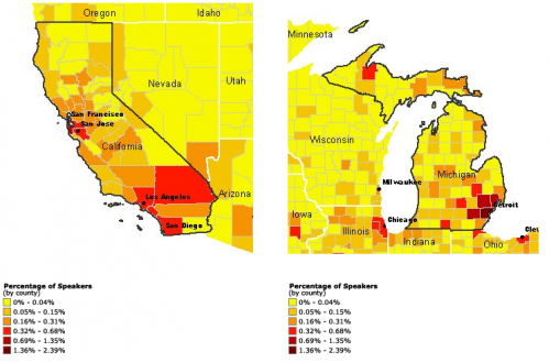
Anyway, moving on.You can also get side-by-side comparisons of two states. This shows the percentage of the population speaking Arabic in California and Michigan:

Arabic comparison

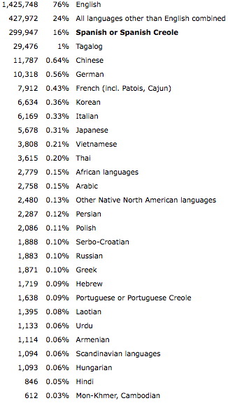
Number and percent of speakers of various languages:

Picture 1

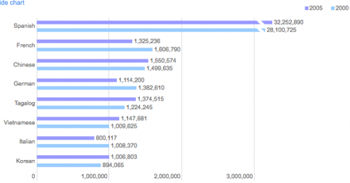
You can compare the number of speakers in 2000 and 2005:

Picture 3

If you go to “Language by State” in that last link and select a language, you can then look at “ability to speak English”. Annoyingly, it only shows raw numbers, not percentages, so you have to do the calculations yourself. But here’s the breakdown for German in Michigan; clearly the vast majority of people who speak German also say they speak English “very well”:

Picture 4

You can also get an age breakdown (again, just raw numbers) for each language, by state. Here’s a partial list for Chinese:

Picture 1

I’m warning you now, the site can turn into an enormous time-suck. You think you’ll just look up the state you live in, say, and then you get started comparing things, and the next thing you know, it’s a half hour later.

UPDATE 2: Commenters have also pointed out that a) “Chinese” is as much of a thrown-together category as “African” (does it mean Cantonese? Mandarin?) and b) the site doesn’t have any information about use of American Sign Language, both great points.

The figure below, borrowed from Good via Graphic Sociology, is a great example of the way that social problems are not given or automatic, but must be made.  It shows that, in 1998, gay marriage was not largely a social issue that needed to be addressed at the state level. Only Alaska had taken a stand on gay marriage.

gay_marriage_by_space_and_time

Somehow gay marriage became a threat. And, by 2004, many states had passed resolutions making it illegal. Note that they needed to do so specifically because the possibility of legal gay marriage had gained support for the first time in (recent?) U.S. history. This was, essentially, a backlash against gay marriage that proved that pro-gay marriage initiatives were gaining ground, even as states moved to counter them.

The backlash continues through 2009, with a handful of states saying “yes” to gay marriage, creating a conflict that simply did not exist in 1998.

This is a great example of how social “problems” are socially constructed. Social processes, like activism and media attention, affect what issues gain the attention of the day, whether that be homelessness, nuclear power, teen pregnancy, global warming, or same-sex commitment.

The figure also reminds us that all of those anti-gay marriage laws can be interpreted as progress for the pro-gay marriage effort.  The laws prove that gay marriage is on the agenda.

Lisa Wade, PhD is an Associate Professor at Tulane University. She is the author of American Hookup, a book about college sexual culture; a textbook about gender; and a forthcoming introductory text: Terrible Magnificent Sociology. You can follow her on Twitter and Instagram.

Capture

This is the lead to an article in the Daily Mail, sent in by Chris W., about the small victories accomplished in 2009 by one “fifty-something” Linda Kelsey.  In addition to letting a man see her naked, she lists putting together home-assembly furniture and singing happy birthday in tune:

Capture2

But back to the stripping.  The message she is trying to send is that she feels happy that she’s become more comfortable with her body.  She writes:

My fifty-something body, I believed, just wasn’t up to naked scrutiny. And if I couldn’t take my clothes off, that meant sex was also off the agenda.

But then she met someone she liked and yadda yadda yadda.

This is all fine and good, but the image they used to illustrate this particular victory is this:

Capture1

So the image they used to illustrate her comfort with her body and the fact that “sex is about how we connect, not what we look like” suggests just the opposite.  The picture includes two mostly naked models (who are models because they have ideal bodies already); there’s no bodily connection at all and the man’s pose doesn’t suggest emotional connection either.

So women are being told how liberating it is to take their clothes off for men (how convenient for the dudes) and that they should feel comfortable with their bodies, like those young, thin, white, properly-gendered, able-bodied models do.

Now, if good ol’ “fifty-something” Linda Kelsey had posed displaying her newfound body comfort, like she does with her cardboard boxes, it would have sent the message she intended.  Instead, it makes us feel bad for feeling icky about our bodies AND reminds us that they are (probably) icky indeed.

P.S.: I just have to say, do you see that picture of her?!  She looks fine!  What fifty-something woman wouldn’t be pleased with that body?!  What woman of any age shouldn’t be pleased with that body? What kind of message does it send when she trashes herbody.  She must think most of the population is hideous.  We all need to stop trashing our bodies in front of one another, there’s just-about-always someone who ends up feeling worse because they compare their own body to the self-trasher and feel like they don’t measure up even to the body being disparaged.  Enough.

Lisa Wade, PhD is an Associate Professor at Tulane University. She is the author of American Hookup, a book about college sexual culture; a textbook about gender; and a forthcoming introductory text: Terrible Magnificent Sociology. You can follow her on Twitter and Instagram.

I’ve got a special treat for you today: an interview with artist Nathan Meltz about his pieces on industrial food production. Nathan has shown his art in group shows around the country.  He received a Master’s degree in Art from the University of Wisconsin-Madison and is currently a graduate student at SUNY-Albany, where he will be graduating this spring with his MFA.  He lives in upstate New York with his wife, Abby Kinchy, and their infant son Aldo. His artistic and musical exploits can be followed at The House of Tomorrow.

I went to grad school with Abby, so that’s how I knew about Nathan’s work. As a sociologist who specialized in food issues and rural communities, I immediately loved these pieces and thought many of our readers would too, so I convinced Nathan to let me post an interview and some of my favorites. (And be forgiving of my amateurish interview questions. I am not a Creative Type, and my general reaction to art I like is “You made a pretty!”)

—————————-

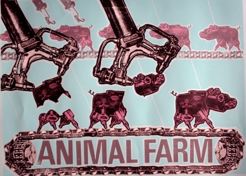
Animal Farm
ANIMALFARMBLUE

What drew you to the issue of food?

I have to give a lot of credit to Abby, who is a sociologist at the Rensselaer Polytechnic Institute, and has done a lot of research on controversies surrounding genetically-modified corn and canola. [She’s currently working on a book about conflicts over genetically modified crops in Canada and Mexico.–Gwen].  A lot of the themes in my art developed from kitchen-table discussions we had while in grad school in Madison.  What was technology doing to agriculture? And then, from my end, what would it look like?

How did you come up with the idea of representing food products as machines?

I wanted a visual metaphor that would reveal tech taking over plants and animals.  Unfortunately, our most current tech can be hard to visualize.  A series of ones and zeros?  Some sort of digital technology?  I decided to combine elements of Dada collage with early modernist German machine aesthetic [Oh, yes, the early modernist German machine aesthetic! Of course!–Gwen]  to create my own visual vocabulary. One that, while not exactly 21st century, would act as a symbol of science and technology for the viewer/audience.

What does your Animal Farm series convey about our modern food system?

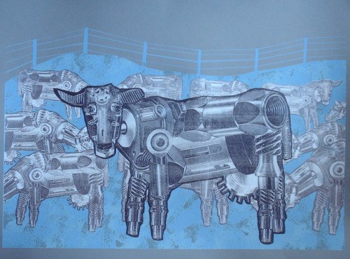
Waiting for My Mechanical BullCOWs

Enviropig
enviropig_paper

In my machine world, animals are put on assembly lines, cramped together in feed lots, and, in the case of the chickens in The Chicken Coup animation, reside in an agricultural system designed by sadists.  They all look the same because there is no diversity on the factory farm.

    The Chicken Coup, pt. 1

    The Chicken Coup, pt. 2

Many people have at least some knowledge of slaughterhouses and the treatment of animals, so the Animal Farm series is probably fairly accessible. But O Canola! is, I think, more complex and harder to understand if you’ve never thought much about bioengineering before, or why the song “O Canada” would be particularly meaningful in the context of discussing canola and bioengineering.

O Canola!
Ocanola

O Canola! was a project long in the making, very much piggybacking on the research Abby was doing at the time. I try to tell the story of Canada’s GMO [genetically modified organism] canola contamination* in a visual form. The clever riffing on the Canadian National Anthem (which Abby thought of) is meant to reflect the nationalist tensions inherent in the controversy, where a hybrid plant created by the Canadian government during WWII to produce a mechanical lubricant at the local level would years later be threatened by GMOs produced by agribusiness.

What about Food for Fuel?

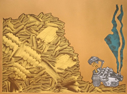
Food for Fuel
3

Food for Fuel came after news reports kept coming in about food shortages around the world, particularly in Mexico, because so much edible food was being turned into fuel for vehicles.  The message on this one is pretty straightforward.

Food for Fuel, along with Animal Farm, definitely reflects my interest in Agitprop.  At the time I made these, I was sharing a studio with printmaker/activist Josh MacPhee, a member of the Just Seeds print collective, which promotes socially activist printmaking.  A lot of the work he was doing really influenced me, and I think these two prints reflect my desire to have a clear social message.

How have people reacted to the series? Do you get a sense that people react more forcefully, or emotionally, to the ones about animals than the ones about crops?

Reaction has been positive, or at least the reaction I hear about.  A lot of the prints have traveled around in various shows.  I think the animation The Chicken Coup has maybe received a little more attention than the prints among the art audience.  Static prints on paper have a hard time competing with moving images with sound, music, etc.  And I don’t think people care any less about the crop-based works than the animal ones.  I find people who are really into food/agriculture issues care just as forcefully about what is happening to corn as they do cows.

—————————–

* GMO contamination occurs when genetically modified seeds migrate to fields that were not intentionally planted with them, an increasingly common occurrence. Aside from the problems this can cause farmers who want to sell their products as specifically not GMO, and concerns about the ecological effects that could occur if modified genes spread into other varieties (or even related wild species), it also puts farmers at legal risk. GMO crops such as marketed under the Roundup Ready label and engineered to be immune to the effects of Monsanto’s weedkiller Roundup, are patented. Farmers are not allowed to plant them without buying a license (including saving seeds from their own crop to plant the following year, a traditional practice of many farmers to eliminate the cost of buying seeds each year; so-called “terminator” varieties are even engineered to produce only sterile seeds, thus ensuring farmers must buy fertile seeds from the manufacturer annually). Monsanto has sued farmers for patent infringement in cases where a field was contaminated with Monsanto’s GMO seeds when they blew in from a neighboring field. Conversely, a group of Canadian organic farmers sued Monsanto on the grounds that genetic contamination had made it impossible for them to sell their products as organic.

If you’re interested in the topic, you might try to get a copy of Abby’s new article, “Anti-Genetic Engineering Activism and Scientized Politics in the Case of ‘Contaminated’ Mexican Maize,” Agriculture and Human Values.

Caspian P. and his roommates sent us a link to the newest Dungeons and Dragons (D&D) Playbook cover.  It seems it makes quite a departure from previous editions.  (D&D fans: I’m reconstructing this history from here, so let me know if I make any significant mistakes in my summary.)

Various versions of the D&D Playbook–e.g., regular or basic, advanced, and expert– have been published.  For the sake of simplicity, I’m going to treat them all equivalently.

The first D&D Playbook (1971):

dnd_Box1st

1981:

dnd_BasicRule_s

Playbooks from the late 1980s:

dnd_phb_8th_s

phb_v1_10th_s

phb_2ed_1s

You might have noticed that the covers include fantastical creatures and male warriors and wizards… but no women.

In 2000, ownership of the game changed hands and the new cover simply looked like this:

phb_v3

And then this (2003):

phb_v35

And then the Playbook went the way of the Evony ads:

28cejvc

Caspian wrote that he’s played D&D for years and always felt that it included great female characters.  So he was disappointed with the inclusion of a highly sexualized, part-naked woman on the recent cover, prompting him to send it to us.

Consider the new cover alongside our posts on Gossip Girl promotions, the New Beverly Hills 90210, the Burger King shower girl, this crazy post on hot horses and puppies, and the makeovers of Dora the Explorer, Holly Hobbie, Strawberry Shortcake, and the Sun Maid.


Lisa Wade, PhD is an Associate Professor at Tulane University. She is the author of American Hookup, a book about college sexual culture; a textbook about gender; and a forthcoming introductory text: Terrible Magnificent Sociology. You can follow her on Twitter and Instagram.

The figure below, sent in by Muriel M.M. and Josh P., shows the relationship between health care spending (on the left) and life expectancy (on the right). Perhaps the most stunning finding is what appears to be a rather loose correlation between the two. But a second finding is the inefficiency of U.S. spending (see it at the left top of the figure?): it is far above the other states included and is, nonetheless, translating into less-than-stellar results (if you measure by life expectancy).

6a00e0098226918833012876674340970c-800wi

Via National Geographic.

Lisa Wade, PhD is an Associate Professor at Tulane University. She is the author of American Hookup, a book about college sexual culture; a textbook about gender; and a forthcoming introductory text: Terrible Magnificent Sociology. You can follow her on Twitter and Instagram.