In honor of St. Patrick’s Day tomorrow, I thought I’d re-post this one from 2010…

Some recent ads making fun of redheads has brought gingerism — or hateful attitudes and behavior towards people with red hair, light skin, and freckles — into the news lately.

It appears to be an ongoing form of discrimination, especially in Britain.  Men and boys appear to be more frequent targets than women and girls, who at least are sometimes seen as uniquely beautiful.  A recent series of verbal and physical attacks  is nicely documented at Wikipedia.  They include a stabbing, a family who has had to move twice after their children were bullied, a woman who won a sexual harassment suit after being targeted for her red hair, and a boy who committed suicide after being teased relentlessly.

The prejudice may be related to the long-standing antagonism between Britain and Ireland; discrimination against the Irish by the British crossed the Atlantic with early Americans.  As late as the 1800s the Irish were demeaned, negatively stereotyped, and compared with apes in the United States.

Katrin brought our attention to this ad for Tesco. Tesco voluntarily withdrew their ad after complaints. And an ad for npower generated a handful of complaints to the Advertising Standards Authority.  The Authority declared that the humor was unlikely to cause widespread offense (BBC).

Katrin also sent in M.I.A.’s video for the song “Born Free.” It was pulled from YouTube for excessive violence and inappropriate content. Among other themes, it shows red-headed, freckled adolescents being rounded up by the police (this becomes clear at about 2:45), taken out to a deserted area, shot at or bombed, and physically attacked. The video is supposed to highlight ethnic cleansing, though a number of critics argue the gratuitous violence overshadows any political point. It’s about 10 minutes long, but you don’t have to watch the whole thing to get the idea:

M.I.A, Born Free from ROMAIN-GAVRAS on Vimeo.

Lisa Wade, PhD is an Associate Professor at Tulane University. She is the author of American Hookup, a book about college sexual culture; a textbook about gender; and a forthcoming introductory text: Terrible Magnificent Sociology. You can follow her on Twitter and Instagram.

Cross-posted at Montclair SocioBlog.

This graph tracks the share of income going to the top 1% in seven countries.  It’s from a paper by two Swedish economists, Jesper Roine and Daniel Waldenström (pdf).”’

The trend was towards greater equality up to 1980 — the share of the 1% was shrinking.    Since then, the 1% have increased their share of the income pie in all seven countries.  But the graph seems to show important differences, especially in recent decades.  Here is a  cropped version of the graph showing the 1980-2004 years.  I have added straight lines connecting those two points for Sweden and for the U.S.
Both changes are increases, but are they the same or are they different?  The answer is crucial.  The U.S. and Sweden have different economic policies.  If the changes are no different between countries, then inequality is just one of those inevitable things that’s happening no matter what governments do.  But if the growth of inequality in the US is much greater than in Sweden, maybe government policy can in fact mitigate the trend towards inequality.
The Swedish 1% share went from a little under 5% to about 7.5%.  In the U.S., the 1% share increased from about 7% to 16%.* You might see those increases as very similar.
In fact, Allan Meltzer in the Wall Street Journal takes precisely that view.  He stretches out the graph to de-emphasize the vertical differences, and adds a title implying that all countries are “together” in this shift of income to the top 1%.
He adds this explanation:
As the . . . chart . . . shows, the share of income for the top 1% in these seven countries generally follows the same trend line. That means domestic policy can’t be the principal reason for the current spread between high earners and others. Since the 1980s, that spread has increased in nearly all seven countries. The U.S. and Sweden, countries with very different systems of redistribution, along with the U.K. and Canada show the largest increase in the share of income for the top 1%. [emphasis added]
If your pay went from $5 an hour to $7.50 an hour while your co-worker’s went from $7 to $16, you might think that your co-worker had gotten a substantially heftier raise.  But if so, that’s because you’re not the Wall Street Journal.
Meltzer’s main point in the article is that we should not raise taxes on the very wealthy.  However, as Bruce Barlett points out (here), if the rich are getting just as rich in high-tax countries like Sweden and the Netherlands as they are in low-tax countries like the U.S., we may as well raise taxes on them. They’ll be doing just as well, like their Swedish and Dutch counterparts, and the nation will have more revenue to put towards Medicare, education, deficit-reduction, etc.But Meltzer is wrong.  Sweden and the Netherlands are very different from the U.S.  As the graph shows, the income share of the 1% in the U.S. is twice that of the 1% in Sweden and 3 times that of the 1% in the Netherlands.  And it has risen more rapidly.  Yet Meltzer claims that inequality trends are similar everywhere.

So who are you going to believe – the Wall Street Journal or your lying eyes?

Many people look at Asian-Americans’ relatively high incomes, compared to other racial/ethnic groups, and assume this minority group has achieved the American Dream.  In fact, Census data reveal Asians have higher average incomes and are less likely to live in poverty than whites (DeNavas, Proctor, & Smith, 2011).  Numbers like this lead many to conclude Asians are free from discrimination and are a “model minority” for others to emulate.

However, these numbers regarding Asian-American economic success are misleading.  For example, after controlling for factors such as education, number of workers in a household, and regional costs of living,, Asian-Americans’ economic advantages disappear (Kim & Mar, 2007).  Like other racial minorities, because of racial discrimination Asians must work harder to get the same economic returns as whites.

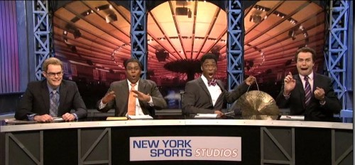
But the model minority stereotype is so distracting that many completely overlook overtly racist statements about Asians.  A Saturday Night Live clip about the “Linsanity” surrounding NBA player Jeremy Lin illustrates how the racial discourse is regulated quite differently for Asian Americans in comparison to African Americans, drawing on several actual incidents and comments that appeared in coverage of Lin. In this clip, the sportscasters celebrate a headline describing Jeremy Lin as “Amasian,” laugh at signs depicting him inside a fortune cookie, and make statements such as he’s “sweet not sour” and “turned Kobe [Bryant] into Kobe beef.”   They also talk about “loving [Lin] long time,” “wax on, wax off Mr. Miyagi,” and “domo arigato, Mr. Lin-boto” as they bow while grinning widely, bang gongs, and mimic martial arts moves.  The double standard is revealed as the sportscasters criticize and then fire their peer for saying similar things about Black basketball players, including  “Kobe ordered fried chicken,”  “Amar’e Stoudemire was dancing like Maury Povich just told him he’s not the father,” and “my homey Carmelo [Anthony] rolls in late”.

In fact, Chou and Feagin argue the “model minority” stereotype makes Asians more vulnerable to racism than other racial groups because over-exaggerated notions of success lead many to dismiss prejudice against this group as innocent or harmless.  They write, “This distinctive, supposedly positive stereotyping distracts people from seeing the discrimination Asian Americans face every day” (Chou & Feagin, 2008, p. 30). The SNL clip drives home the way this played out with the Jeremy Lin case.

Relevant Reading:

Chou, R. S., & Feagin, J. R. (2008). The Myth of the Model Minority: Asian Americans Facing Racism. Boulder: Paradigm Publishers.

DeNavas, C., Proctor, B. D., & Smith, J. C. (2011). Income, Poverty, and Health Insurance Coverage in the United States: 2010. U.S. Census Bureau.

Kim, M., & Mar, D. (2007). The Economic Status of Asian Americans. In M. Kim (Ed.), Race and Economic Opportunity in the Twenty-First Century (pp. 148-279). New York, SC: Routledge.

Potter, J., & Wetherell, M. (1987). Discourse and Social Psychology. Sage.

—————

Jason Eastman is an Assistant Professor of Sociology at Coastal Carolina University who researches how culture and identity influence social inequalities.

Hennessy Youngman is one of things-on-the-internetz that validates the entire enterprise. In the fast and fascinating 10 minute clip here, Youngman traces the history of performance art, linking it to Occupy and our contemporary engagement with the internet. Oh, and totally worth watching to the end.

(Hennessy, if you’re reading, I was the one that tweeted at you to do a video about The Levitated Mass.  Nobody could do it quite like you! PS – whisky is my drink too.)

Also from Hennessy Youngman:

Lisa Wade, PhD is an Associate Professor at Tulane University. She is the author of American Hookup, a book about college sexual culture; a textbook about gender; and a forthcoming introductory text: Terrible Magnificent Sociology. You can follow her on Twitter and Instagram.

Cross-posted at Reports from the Economic Front.

The Great Recession ended in June 2009, which means we have been in economic expansion for almost 3 years.  Lately the news has been filled with reports of positive economic trends, but how seriously should we take these reports?

One indicator worth looking at is median household income (the red line below).  Unfortunately its trend suggests little reason for cheer. In January 2012, median household income was $50,020.  That was 5.4% lower than it was in June 2009.  Even worse, as the chart below reveals, after a brief uptick it headed back down again.

untitled.jpg

It is true that employment is finally growing, a development reflected in the decline in the unemployment rate (the blue line above).  Unfortunately, this has done little to boost wages.  In fact, real wages actually fell in 2011.  The first chart below highlights the downward turn.  The second chart reveals just how far per capita earnings remain below historical trend.

us-real-wages_thumb.gif

real-wage-and-salary-disbursements-per-capita.jpg

This situation helps to explain why growth has been so anemic.  As the Wall Street Journal wrote:

Many economists in the past few weeks have again reduced their estimates of growth.  The economy by many estimates is on track to grow at an annual rate of less than 2% in the first three months of 2012.  The economy expanded just 1.7% last year.  And since the final months of 2009, when unemployment peaked, the economy has expanded at a pretty paltry 2.5% annual rate.

Without a dramatic change in median household income, growth will remain slow and even the limited employment gains we currently celebrate will likely prove impossible to sustain.  Given the current political climate, it is hard to see how this expansion will be either long lasting or bring meaningful improvements in majority living and working conditions.

A little over a month ago I posted a map of the legal status of same-sex marriage throughout the U.S. It was soon made obsolete by the legalization of same-sex marriage in the state of Washington. In addition, several readers pointed out that the map hid important differences within categories.

Ned Flaherty, Project Manager of Marriage Equality USA, sent in a link to an updated and more comprehensive map at their site. Green states have fully legalized same-sex marriage; yellow states recognize domestic partnerships or civil unions; and pink states do not allow either. The lettered codes provide more information on exactly what the status is in each state:

Click on the map or go to their website to look at the much larger version; they also have a round-up of pending or possible legislation and court cases in various states.

Amid accusations of racism, the European Union (EU) has withdrawn a two-minute video designed to raise awareness about Neighbourhood Policy,” an approach to establishing “deeper relations” with neighboring state the need for unity among EU nations and acceptance of candidate states hoping to enter.  In the video, sent to us by Claire P., the EU is personified by a white woman, who is facing attacks from all sides.

Bruno Waterfield, writing for the Telegraph, describes the scene:

First the EU heroine… is menaced by a Chinese Kung Fu master. Then a second threat appears as a urbaned practitioner of Kalaripayattu, a southern Indian martial art, levitates towards her brandishing a scimitar.

As she turns to face the new menace, a third black assailant with dreadlocks cartwheels aggressively towards her before striking a Capoeira pose, the Brazilian martial art.

Here’s screenshots of all of them, but for the full effect, you’ve got to watch (if just for the music and sound effects):

At this point, the woman takes a deep breath, multiples to represent the many states in the EU, and models peaceful behavior that her would-be attackers adopt.

The EU is expressing surprise that a video featuring a peaceful white person and violent, dangerous dark-skinned people might be considered racist.  They have released a classic non-apology that privileges intent over impact, denies that the clip was actually racist (it has just been “perceived” so), and identifies the main problem as other people (who got all hypersensitive and “felt offended”):

The clip was absolutely not intended to be racist and we obviously regret that it has been perceived in this way. We apologise to anyone who may have felt offended. Given these controversies, we have decided to stop the campaign immediately and to withdraw the video.

UPDATE: Reader Katrin says the video was about increasing integration and cooperation of states and the European Commission’s enlargement policy, not about the “neighborhood” policy as reported by the Telegraph:,

It was for greater unity of existing EU member states (which is why the video is entitled “Growing Together”) and candidates for membership (which is why it says “the more we are the stronger we are”) in order to show a united front to the rising powers China, India and Brazil. It was intended to portray that if the EU acts united, then China, India and Brazil will be willing to engage with the EU constructively…Current candidates of accession are e.g. Iceland, Macedonia, Montenegro, Turkey and Serbia. Enlargement and unity as a tool for greater power when facing rising economies was the intended message of the clip, not the ENP.

Lisa Wade, PhD is an Associate Professor at Tulane University. She is the author of American Hookup, a book about college sexual culture; a textbook about gender; and a forthcoming introductory text: Terrible Magnificent Sociology. You can follow her on Twitter and Instagram.

Cross-posted at Organizations, Occupations and Work.

Last week the Wall Street Journal printed an article describing how CEOs around the world spend their time.  The article drew on data from a larger study, the Executive Time Use Project , and relied on reports of time use by CEO’s personal assistants.  The article indicates that assistants only tracked activities that lasted over 10 minutes in a single week selected by researchers.  That assistants, rather than the CEOs themselves, were keeping track of time use leads me to believe the reports are relatively accurate.  After all, the assistant probably does most of the scheduling of a CEOs day and CEOs are likely too busy to track data time or to agree to record their time use.

Here’s the break-down of the typical 55-hour work week for CEOs:

The hype about the findings is about the finding regarding time spent in meetings — 18 hours per week (see “Where’s the Boss? Trapped in a Meeting”).  I’m more interested in the task that occupies the greatest amount of a CEO’s time in a typical week—the 20 hours of “miscellaneous” activities.  The fine print indicates that the “miscellaneous” activities include time spent travelling, in personal activity including exercise or lunch with a spouse, or in short activities like quick, unscheduled phone calls.

The project website advertises that knowing how CEOs spend their time can tell a lot about management style and differences in cultures and performances.  Maybe it can, and here arearticles that tackle these issues.  I think it tells us something slightly different and far more basic than this: what constitutes “work” depends on who does it.  Would a study of low wage workers calculate as part of the work week “exercise”?  Do we count travel time to and from a job as “work” among mid-level managers?  The BLS American Time Use Surveys (Table 5, see footnote 2) do not include travel related to work in measures of work time. Why did the authors include as part of a CEO workday things like personal time and activities unrelated to work?

Without this personal time, a CEO’s average work week—35 hours—looks closer or shorter than other workers.   For example, among employed people who worked on an average weekday in 2010, the average weekly hours spent working at all jobs (excluding travel related to work), for workers with a H.S. diploma was 40.05 hours, for women who worked full-time, the average was 40.80 hours, for all full-time workers, the average weekly work hours was 41.95 hours (to calculate these weekly averages from the BLS, I assumed people worked 5 days a week which is typical for full-time workers, but may overestimate the work hours of those with a H.S. diploma).

Perhaps it is time to re-evaluate how we measure “work” or at least pay close attention to the ways we do so differently for workers at different levels of the hierarchy.  Now I’m headed to the gym for some exercise.  Should I all that “work”?  I’ll leave it to you to decide.

—————————

Julie Kmec is an associate professor of sociology at Washington State University.  She has conducted research on organizations and work, in particular on issues of gender and race inequality at work, the glass ceiling, employment discrimination, and sex segregation.  She is part of a working group at the Clayman Institute for Gender Research at Stanford University investigating ways to redefine work.