I swore months ago to never post another Evony ad. I’ve seen so many, and the direction they’re going seems pretty clear.

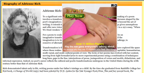
But today I’m breaking my vow. I submit to you this screencap, taken by spinach, of an Evony pop-up ad featuring a faceless woman’s torso, obscuring the website spinach was viewing at the time: a biography of feminist poet/theorist Adrienne Rich.

A moment of silence, please.

Michelle R. sent in a segment from CNN that asks children to associate positive or negative attributes with various skin tones, much like a famous 1940s experiment that asked children which doll they preferred. The original experiment, and recreations since then, have found that children of all races tend to view lighter-skinned dolls or images more positively (prettier, smarter, more desirable as a classmate) than darker-skinned ones, and to believe that adults do so as well (sorry for the ads before each segment).

Anderson Cooper then talks to some of the children about their answers:

It’s fascinating that kids pick up on competing cultural themes and use them in their answers — that is, skin color isn’t supposed to matter and you judge people as individuals, but people still do care about skin color. And they all agree that the “good” skin color (from their own perspective or what they think adults prefer) is lighter. And to hear a girl refer to her own skin color as “nasty”…heartbreaking.

NEW! (May ’10): Alex P., Dimitriy T.M., and Abeer K. sent in a final segment, in which a parent reacts to her child’s preferences:

Related posts: another recreation, and the original study.

Tom Schaller recently posted over at FiveThirtyEight about a new Hyundai commercial. The commercial suggests that you need to get a safe car because of all the young drivers on the road:

Here’s another:

Schaller argues that, while the commercials may be entertaining enough, he can’t help but wonder how people would react to similar commercials mocking the other age group over-represented in accidents — the elderly, according to the Insurance Institute for Highway Safety:

Is Hyundai wrong to say that teens, particularly those who just got their licenses, are more dangerous drivers than other age groups? No. But though people might joke about elderly drivers, I agree with Schaller — I can’t imagine a company putting out ads with a similar mocking tone and not immediately getting a ton of negative feedback ending in pulling the commercials and apologizing.

And this likely has a lot to do with the fact that older Americans are organized and represented by groups like the AARP and are thus able to wield political pressure and protest negative portrayals in a way that teens aren’t. This doesn’t mean that older people don’t get mocked (especially in TV shows and movies), but that a company is likely to be much more afraid of insulting them than insulting 16-year-olds.

Gwen Sharp is an associate professor of sociology at Nevada State College. You can follow her on Twitter at @gwensharpnv.


Tanita sent in this funny short video that addresses the sexism female authors have often faced when trying to get their work published or taken seriously in literary circles (some, such as Mary Ann Evans, better known as George Eliot, resorted to using male pen names to combat these problems).

What better way for female authors to deal with the situation than use their action-hero superpowers to combat sexist publishers? I present to you the Brontësaurus:

Confession: I know this will make many of you scream in horror, and that the book has all kinds of feminist overtones and is greatly beloved and majorly influenced literature, and I’m showing myself to be a literary heathen with no appreciation for the arts, but I read Jane Eyre once, and I think Charlotte Brontë’s most effective weapon might be her ability to get you bogged down reading lengthy Gothic descriptions of moors and stuff.

Though if you ever need to make me cringe and run, tell me you’re going to make me read Tess of the d’Urbervilles. I tried reading it just for fun once, and I have never been so pained.

Penny R. and p.j. sent in a link to the American Able project. A description from the artist’s website:

‘American Able’ intends to, through spoof, reveal the ways in which women with disabilities are invisibilized in advertising and mass media. I chose American Apparel not just for their notable style, but also for their claims that many of their models are just ‘every day’ women… Women with disabilities go unrepresented…in most of popular culture. Rarely, if ever, are women with disabilities portrayed in anything other than an asexual manner, for ‘disabled’ bodies are largely perceived as ‘undesirable’…

Too often, the pervasive influence of imagery in mass media goes unexamined, consumed en masse by the public. However, this imagery has real, oppressive effects on people who are continuously ‘othered’ by society. The model, Jes Sachse, and I intend to reveal these stories by placing her in a position where women with disabilities are typically excluded.

The goal is admirable. Individuals with disabilities are routinely ignored in pop culture, and if depicted, they are often either mocked or are devoid of sexuality (notable examples being the documentary Murderball and the depiction of a character in a wheelchair on the TV show Friday Night Lights, though both focus solely on men with disabilities who generally have relationships with women who do not).

That said, it brings up the eternal question regarding artistic endeavors, particularly those aimed at undermining prejudices: does it work? The idea here is to show a woman with disabilities in sexualized contexts and use humor to counter popular conceptions of those with disabilities as asexual (and parody American Apparel in the process). As with any use of parody/irony/etc., it poses a dilemma. Will viewers get it? Will they grasp the intent and look at the images through that lens? Will it lead some people to question why they might find these photos shocking, why a woman with a disability shown in sexual situations would be surprising, or the reason for any discomfort they might feel when looking at them?

Or will people respond by ridiculing Jes, or even feeling disgusted? Will they look further into those feelings and why they might have them? Will it change anything?

And how do you decide if it’s worth it? If half of viewers engage in some introspection and examining of their own prejudices, and half don’t, is that a sufficient trade-off? If 90% of people ridiculed the images and it reinforced their belief that bodies of those with disabilities are undesirable, but 10% would think about how women with disabilities are de-sexualized, or that American Apparel presents a very narrow range of body types as “normal,” everyday women, would you feel that you had accomplished something significant? Is it the artist’s responsibility to care?

Similar questions have been posed about photos of individuals from Appalachia: do they humanize people often depicted as backward “hillbillies,” or do they actually reinforce perceptions that everyone living in the area is poor and rural?

How do you negotiate the use of art to make social statements (whether questioning prejudices, pointing out inequalities, or humanizing stigmatized groups), considering that once you put something out in the public domain, you have little control over how people interpret it and whether they take from it the opposite message you intended, perhaps even ridiculing your subjects as a result of your project?

Gwen Sharp is an associate professor of sociology at Nevada State College. You can follow her on Twitter at @gwensharpnv.

Snehata K. sent in two commercials for Miller Lite that reproduce ideas of masculinity while encouraging men to do something usually seen as feminine: care about calories. In the commercials we see that it’s ok to drink beer with fewer calories than the regular, as long as you do it in a manly way:

What’s a feminine way of drinking light beer? Prioritizing calorie content over the taste. If you’re a guy, you can care about health/diet and thus want a lower-calorie beer, but only if you show you still care about beer the way men are supposed to: you appreciate the taste and won’t sacrifice it for anything.

Guys who forget that are embarrassingly girly. And being feminized is clearly stigmatizing, worthy of ridicule. Even women are disgusted by feminized men. So not only will men who fail to adequately perform masculinity be ridiculed by men, they’ll lose any chance with hot chicks, too. As they do so often, men are receiving a clear message: be sure you’re masculine in every way, all the time, or you risk losing any claim you have to a respected version of manhood.

Of course, if you really want to be manly, you need to stop caring about silly things like your health altogether and drink Miller High Life.

Photographs have played a major role in framing the environmental movement, and groups have used images to draw public attention and concern to specific issues. A famous example is the “Earthrise” image taken in 1968 from Apollo 8, the first time an image of this sort was taken by an actual person, rather than a satellite. The seeming fragility of the planet, clearly shown as an interconnected and isolated entity, has been largely credited with increasing concerns about and awareness of environmental issues:

Life magazine included it in a list of “100 photographs that changed the world.”

On June 22, 1969, the Cuyahoga River in Ohio caught on fire. News spread, and the story — the shock many Americans experienced when they heard that rivers were catching on fire — increased concerns about water pollution, eventually leading to the 1972 Clean Water Act. Dramatic photos of the Cuyahoga burning appeared.

There was one small detail with the images that often went unnoticed: as far as anyone can tell, no one took any photos of the river burning in 1969. If you look online now, you’ll find lots of images from a fire in 1952, but none from 1969. At the time, rivers catching on fire in the former industrial centers around the Great Lakes weren’t really shocking; it happened pretty frequently and had been for decades. The 1969 fire was, if anything, unexceptional. It only lasted half an hour and didn’t do much damage.

Of course, context and timing are everything. The story about the 1969 fire emerged at a time when concerns about environmental pollution and safety were increasing, so an event that might have been completely ignored outside the local area, as they had been in the past, instead became a flashpoint in the environmental movement, and images of rivers on fire now seem shocking to us. I think most Americans would see a river catching on fire as inherently problematic, an automatic sign of a major environmental problem, rather than an unavoidable and unremarkable outcome of economic progress.

Given the force of images in these instances (and others), I can’t help but wonder what the effects will be of photos of the current oil spill in the Gulf of Mexico, particularly as it approaches the coasts. Dmitriy T.M. sent in a set of images. The oil spill, and the images we’ll continue to get of it, come soon after President Obama announced his support for offshore drilling in a number of areas, including the Atlantic coast and the Gulf of Mexico. The plan, already controversial, is likely to meet even more resistance now, particularly from residents in communities that are not dependent on oil drilling for their livelihoods and fear the effects of an oil spill. Public concern is likely to increase even further when the oil hits coastal areas and we begin to see images of oil-covered wildlife, beaches, and so on, much as we did after the Exxon Valdez spill.

These images are already striking, but the power of an image is highly connected to the social/historical context in which is arises (much as photos of rivers on fire didn’t cause a huge national stir until they became emblematic of the need for environmental regulations). I can’t help but think that the last photo I posted above will have more resonance than it might have otherwise because of the way it will intersect with memories of Hurricane Katrina bearing down on New Orleans — I suspect that a story that would be attention-getting regardless will be even more so now that it will connect to ideas of New Orleans as a beleaguered city, endangered by a string of natural and human-caused disasters.

——————————-

See also our post on how photographs of the fetus changed how we think about pregnancy and abortion and, for an interesting controversy regarding photography, see our post on Shelby Lee Adam’s images of Appalacians.

Gwen Sharp is an associate professor of sociology at Nevada State College. You can follow her on Twitter at @gwensharpnv.

Asa D. sent in an animated 1958 Disney segment titled “Magic Highway USA.” The cartoon extols the virtues of the highway system of the future (the interstate highway system was authorized by President Eisenhower in 1956). Apparently it is farther into the future than 2010, as my windshield does not have a radar, and road construction around here doesn’t seem to be instantaneous:

The segment of course illustrates gender expectations of the time — dad goes off to work while mom and the kid(s) go shopping. But as Asa points out, this example of the “techno-utopianism” of the post-World War II era, with faith that modern technologies will lead to a happy future that increasingly frees us from unpleasant work, boredom, wasted time, and so on, is truly fascinating.

Providing a nice contrast to that earlier vision, Dmitriy T.M. let us know about the stop-motion short video Metropolis by Rob Carter. The entire video, which is 9 1/2 minutes long, gives an abridged history of Charlotte, North Carolina.

Here are the last 3 minutes (you can see the entire video here). In this segment, we see the unfolding of a large highway system and urban construction/destruction/reconstruction. At about a minute in, “the video continues the city development into an imagined hubristic future, of more and more skyscrapers and sports arenas and into a bleak environmental future” (quote found here):

Metropolis by Rob Carter – Last 3 minutes from Rob Carter on Vimeo.

NEW! (May ’10): Kris H. sent in another example of envisioning the future. The Futurama, an exhibit at the 1939 World’s Fair, promised a future in which interstate highways will allow people to bypass slums, relieving us of the work of fixing them (found at Neatorama):