The Centers for Disease Control report that pregnancy rates for U.S. girls age 15-19 vary quite significantly by state: from 66/1,000 in Mississippi to 20/1,000 in New Hampshire (dark and light green represent states with teen pregnancy rates lower than the U.S. average; dark and light purple represent states in which it is higher):
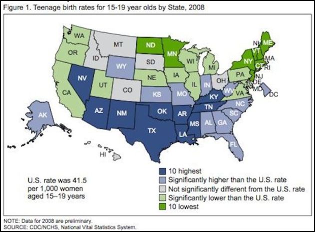
The map shows that, on average, southern states tend to have higher teen pregnancy rates than others.
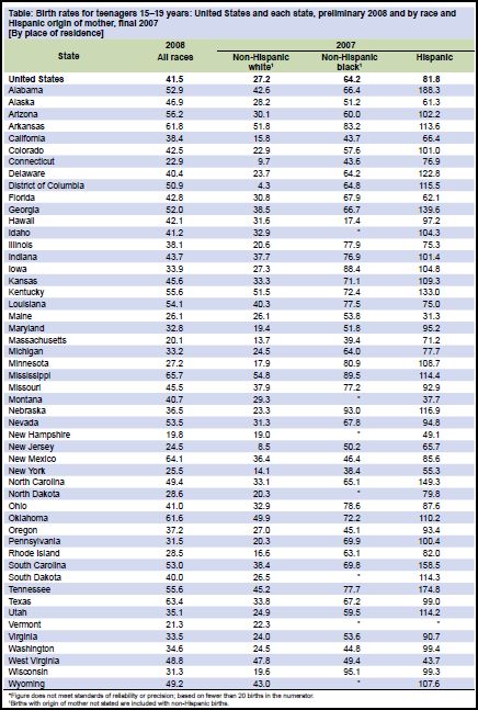
The Centers for Disease Control reports that the disparity can be explained, in part, by the fact that Blacks and Latinos tend to have higher rates of teen pregnancy than other racial groups such that states with higher proportions of Blacks and Latinos would have higher rates. However, rates among different racial/ethnic populations also vary quite tremendously by state. Among white teenagers the teen pregnancy rate ranged from 4/1,000 (in the District of Columbia) to 55/1,000 (in Mississippi), among Black teenagers, it ranged from 17/1,000 (in Hawaii) to 95/1,000 (in Wisconsin), and among Latinas it ranged from 31/1,000 (in Maine) to 188/1,000 (in Alabama).
Race, then, doesn’t predict differences in rates of teen pregnancy all by itself. In fact, White teenagers are more likely to get pregnant in some states than Black and Latina teenagers in others. There must be something region- or state-specific driving teen pregnancy rates.
The CDC doesn’t mention sex education, but Mike Lillis at The Hill compared teen pregnancy rates to a sex education policy report by the Guttmacher Institute. He writes:
All five states with the highest teen birth rates have adopted policies requiring that abstinence be stressed when taught as part of sex education, HIV education or both, the group found. Only one of the five states (New Mexico) mandates that sex education be a part of students’ curriculum.
Of the four states with the lowest teen birth rates, none requires that abstinence be stressed to students, according to Guttmacher.
For your perusal, the CDC data, by state and race (# of pregnancies/1,000 girls 15-19):
Hat tip to Annie Shields at Ms. magazine.
Lisa Wade, PhD is an Associate Professor at Tulane University. She is the author of American Hookup, a book about college sexual culture; a textbook about gender; and a forthcoming introductory text: Terrible Magnificent Sociology. You can follow her on Twitter and Instagram.
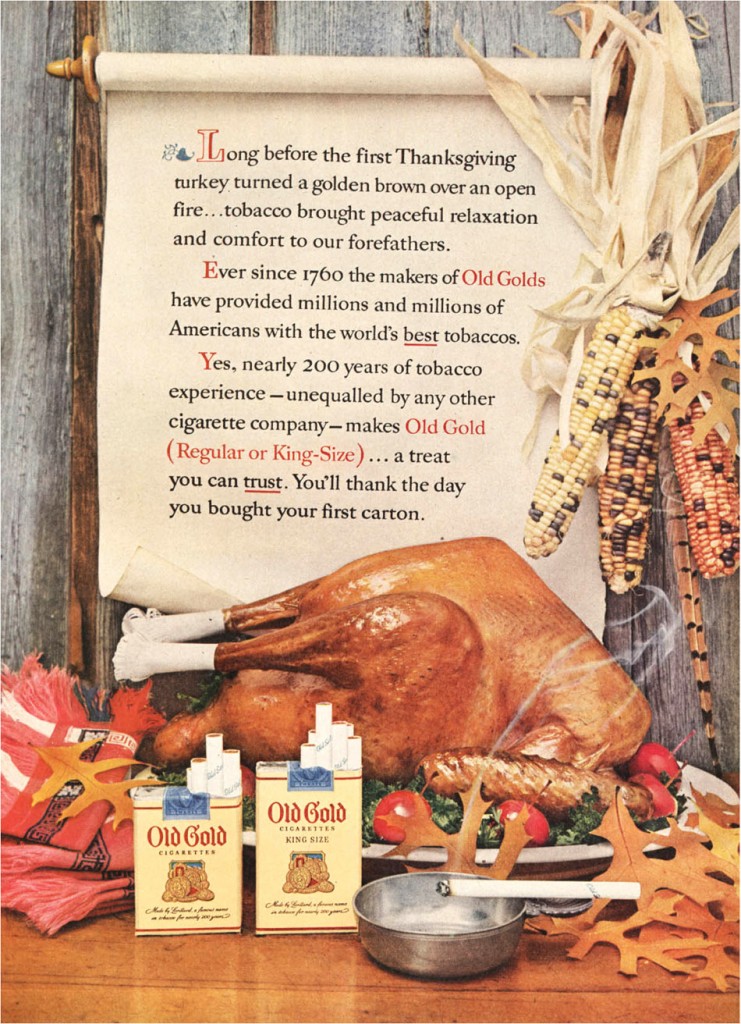


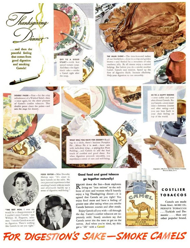 I am hard pressed to imagine that such an ad would fly today. That these ads would not only be un-palatable, but impermissible, is evidence that the power of corporations is not absolute.