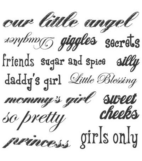
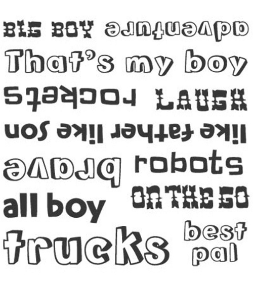
Lorë P. sent in examples of two stamp sets. She writes:
They are clear plastic you peel and put on blocks in order to stamp images… They are both made by a company called Sassafras Lass and are being sold at Joann Fabrics. One of the stamp sets is called “Girl Talk” and the other is “Boy Talk.”
Lorë did such a wonderful job describing these, I will leave it to her:
One of the first things that struck me was that both of these is that they have stamps that mention dad — “daddy’s girl” and “like father like son” but only the female one mentions mom (I guess it would be considered too emasculating to have “mommy’s boy?”)
Another interesting part of these stamps is that the “Girl talk” emphasizes the sweetness of girls – their giggles, their silliness, their angelic qualities (not to mention princess..). On the other hand, the male version has more objects – trucks, rockets, robots and “strong” traits – being brave and embracing adventure (and what does “all boy” mean anyway?).
The one overlap that I can see is the word “Laughter” – which on the girls segment is in very frilly cursive handwriting and on the male version written in an old cowboy font. This also points to the difference in fonts, where the male versions are more square and has no cursive. The girl version is almost all cursive, except for some very curly printing.
While I am not particularly shocked at finding this kind of stamps available to scrapbookers and cardmakers – I always wonder why we have to make the lines of difference so distinct… Of course these stamps are probably not being used by children, but by adults making things about or for children… of course, these stamps are couched in (from my experience) a predominately female dominated (although pretty conservative) hobby.
Thanks Lorë!
See also this post on gendered Disneyland T-shirts.
Lisa Wade, PhD is an Associate Professor at Tulane University. She is the author of American Hookup, a book about college sexual culture; a textbook about gender; and a forthcoming introductory text: Terrible Magnificent Sociology. You can follow her on Twitter and Instagram.


Comments 7
Nathan — January 14, 2009
Thought maybe I could add a little art/design context, because there is a lot of interesting things going on in the typography(although I make no claims at being a typographic expert).
There are a ton of juxtapositions between the type in the two categories:
Girls types are composed of thin strokes, suggesting dainty-ness, while the boys are thick, giving a solid, strong feel.
Many of the girls types are made to look calligraphic, or handmade. Most of the boys types are very machine-made lookings, having a 'stamped' feel.
Girls type has a lot more serifs, always an added 'decorative' touch, where the boys types are san serifs, in no need for that flowery bullshit.
A lot of the boys types seem drawn from venacular type of 1950's-60's comic books and cartoons. Dennis the Menace, anyone?
Overall, the girls types are organic, curvilinear, where the boys are all about hard-edge geometry, more of the boys=reason and girls=i'm not really sure.
oliviacw — January 14, 2009
On the girl one - that's not "Laughter", it's "Daughter". Upside down, the curlicue D does look like a fancy L, but if you rotate the image it's very clearly a D. So, the correspondent term to "laugh" on the boy's set is actually "giggles" on the girl's set, which has very different implications.
That also means that the girl's set has far more relationship terms (I count six - mommy's girl, daddy's girl, daughter, little blessing, friends, our little angel) than the boy's set (only 3: like father like son, that's my boy, best pal). Definitely stereotypical in assuming that girls and women are more relationship and family oriented than boys and men our.
There are other people who think about these things… « Grimsaburger — January 14, 2009
[...] the accompanying complaint about/explication of said stamps. See here for more fun criticism of gender in media, and here for similar commentary on the [...]
Penny — January 14, 2009
The manufacturer package the stamps that way, but it doesn't mean anyone HAS to use them according to the packaging. You can always buy your daughter brown corduroys in the boys department, and you can certainly use swirly fonts in your son's scrapbook, if you want to.
You could...buy both sets of stamps, throw away the packaging, and mix them up...or cut them up, so the words are separate--one snip and you can make phrases like "mommy's boy" or "like father like daughter"...or even rough up the fonts a bit--an xacto knife and some sandpaper can put a lot of dings and angles into a too-perfect curve.
I wouldn't look at Target for interesting clothes, and I wouldn't look at Joann's for edgy craft supplies. But they do exist, and they're usually sold smaller woman-run businesses; they're worth seeking out.
A quick hit… « random babble… — January 15, 2009
[...] The extreme sexism in the supplies and the gender stereotyping has always grated on me, such as w/ these stamp sets from Sassafrass Lass. It takes some creativity to choose products that don’t pander to this kind of crap. I [...]
Sabriel — January 16, 2009
The inclusion of the word "secrets" stands out to me, because it's a word related to silence. Do girls have more secrets than boys? What aren't girls supposed to talk about?
Perhaps it's just supposed to evoke a sense of shared moments between parent and child (a child whispering something silly into her mother or father's ear), but it's a bit strange.
Kathleen March — January 18, 2009
This is unacceptable gendering. Take these off the market.